Brand, campaign and print design for a New York wine and spirits importer.
COMPANY
MONSIEUR TOUTON SELECTION
ROLE
GRAPHIC DESIGNER
YEAR
2022 - 2026
SCOPE
ART DIRECTION, BRAND IDENTITY, EDITORIAL DESIGN
COMPANY
MONSIEUR TOUTON SELECTION
ROLE
GRAPHIC DESIGNER
YEAR
2022 - 2026
SCOPE
Art Direction, Brand Identity, Packaging Design, Editorial Design
01 · THE ROLE
Campaigns, labels and print for a portfolio of wine and spirits brands.
During a four-year tenure at Monsieur Touton Selection, managed end-to-end creative execution, visual governance, and brand strategy across a high-volume portfolio of 200+ global wine and spirits brands. Serving as the creative lead for key initiatives, orchestrated the comprehensive rebrand of the company’s top-selling asset, engineered production-ready packaging labels, and launched multi-channel campaigns from concept to execution. By standardizing editorial design systems and monthly publication frameworks, successfully eliminated systemic design debt while maintaining absolute brand equity across the entire commercial portfolio.
200 +
High-volume portfolio managed, maintaining cross-brand consistency and governance.
50+
Multi-channel marketing assets deployed monthly to optimize speed-to-market.
10
Bespoke packaging labels engineered from conceptual ideation through final press.
2
Consecutive months sold out, driving direct commercial demand for the Barolo launch.
02 · INTEGRATED CAMPAIGN
SCOPE | ART DIRECTION & VISUAL SYSTEMS
ARNALDO RIVERA × THE DEVIL WEARS PRADA 2
OVERVIEW
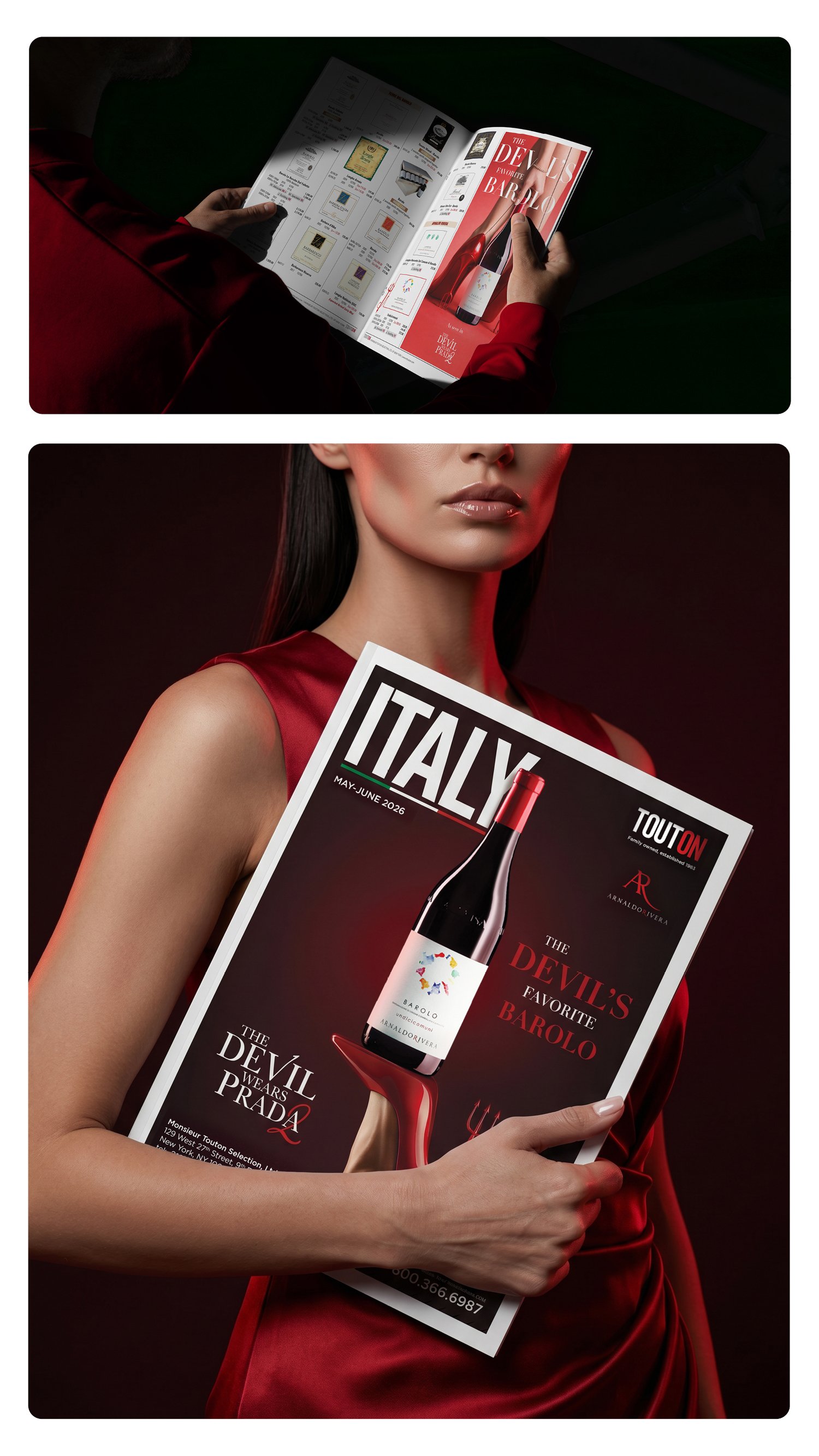
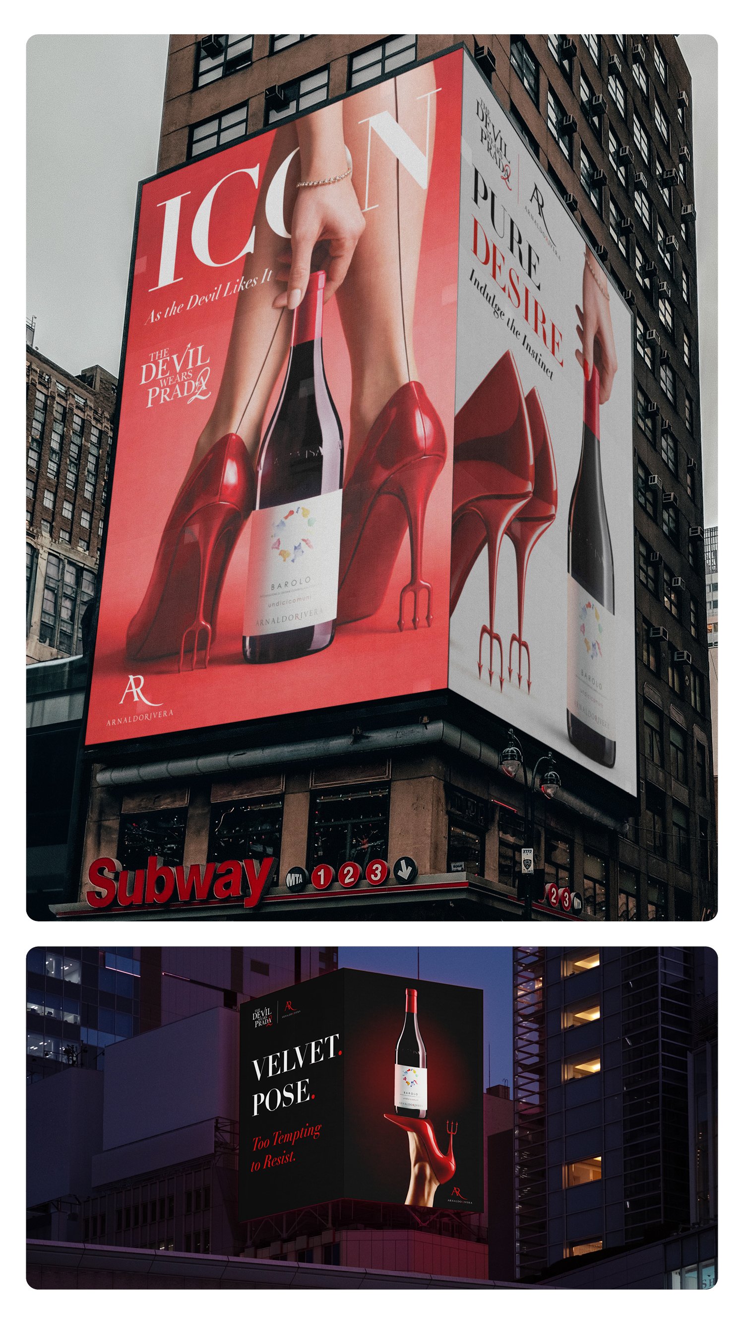
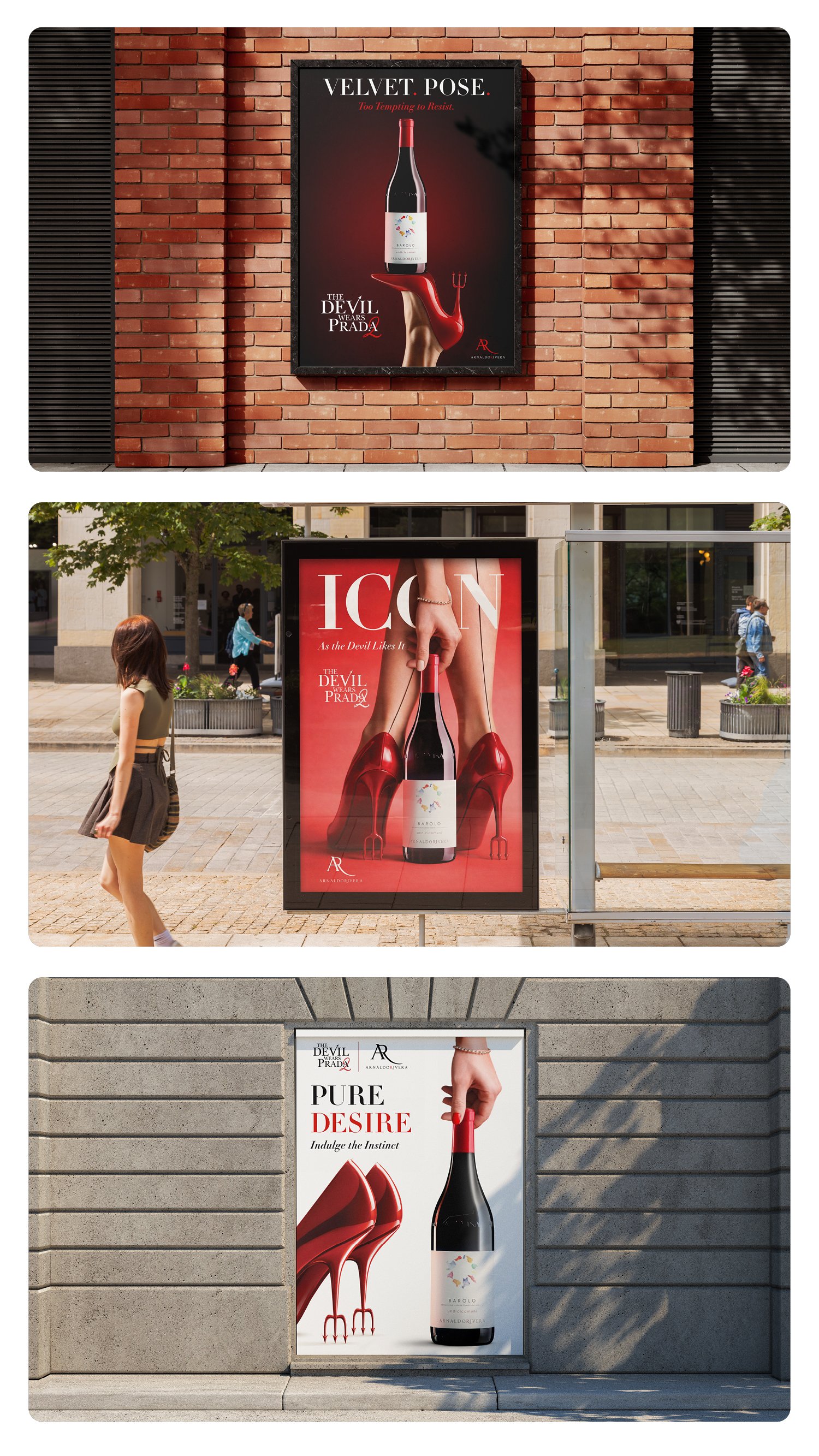
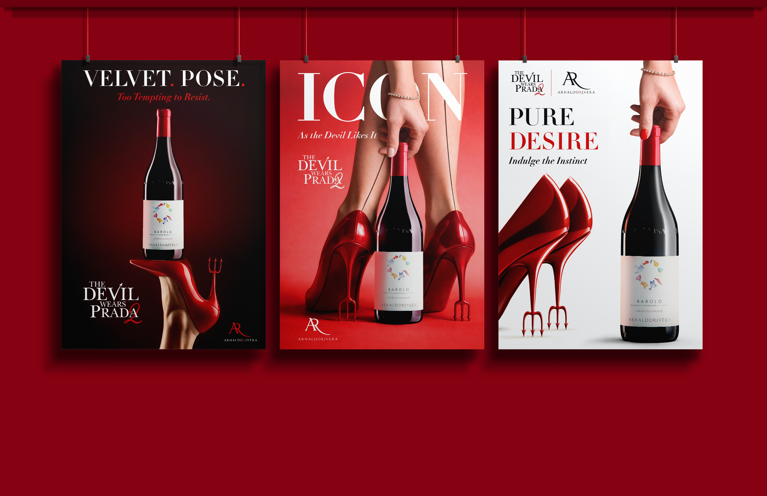
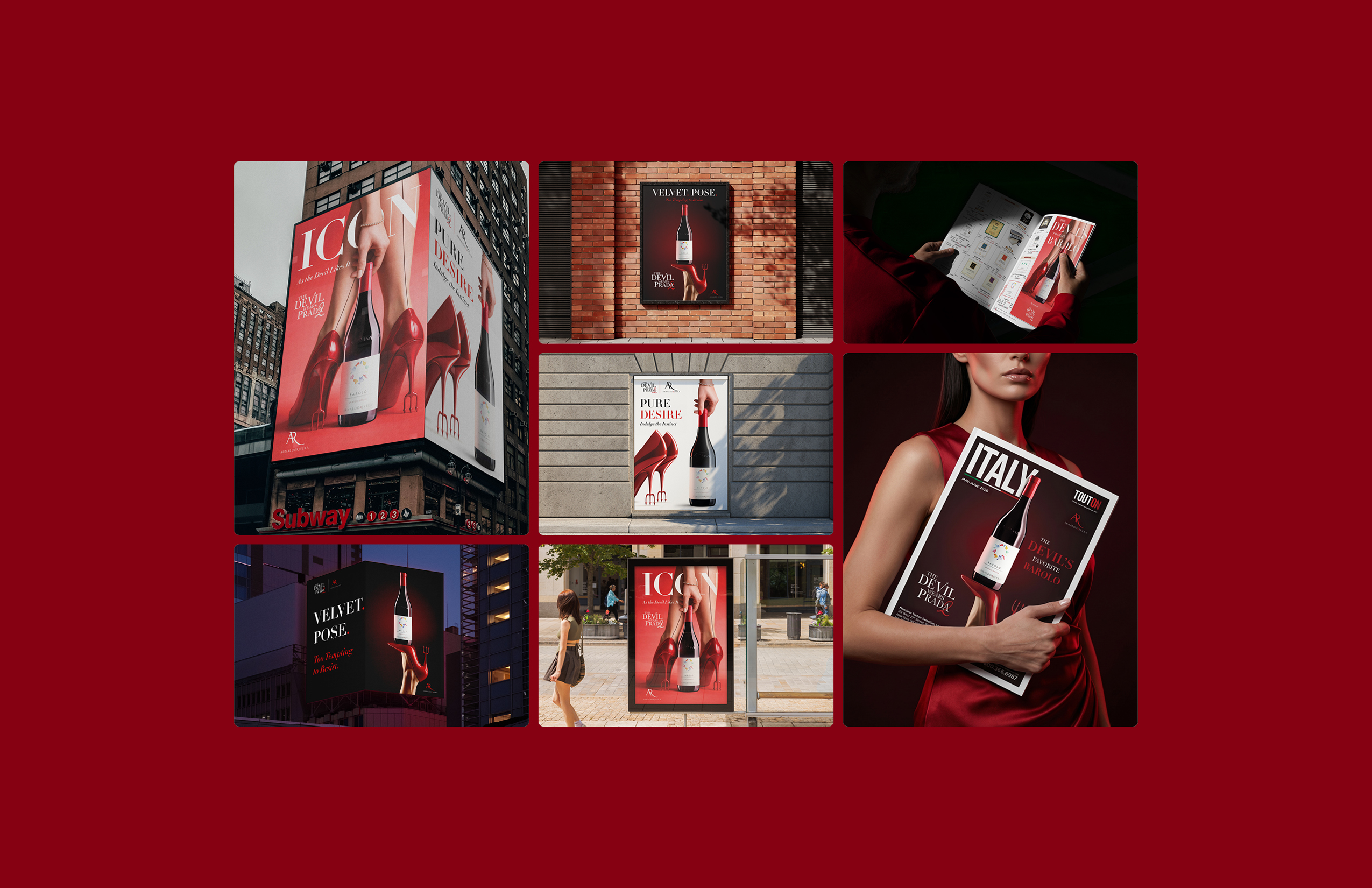
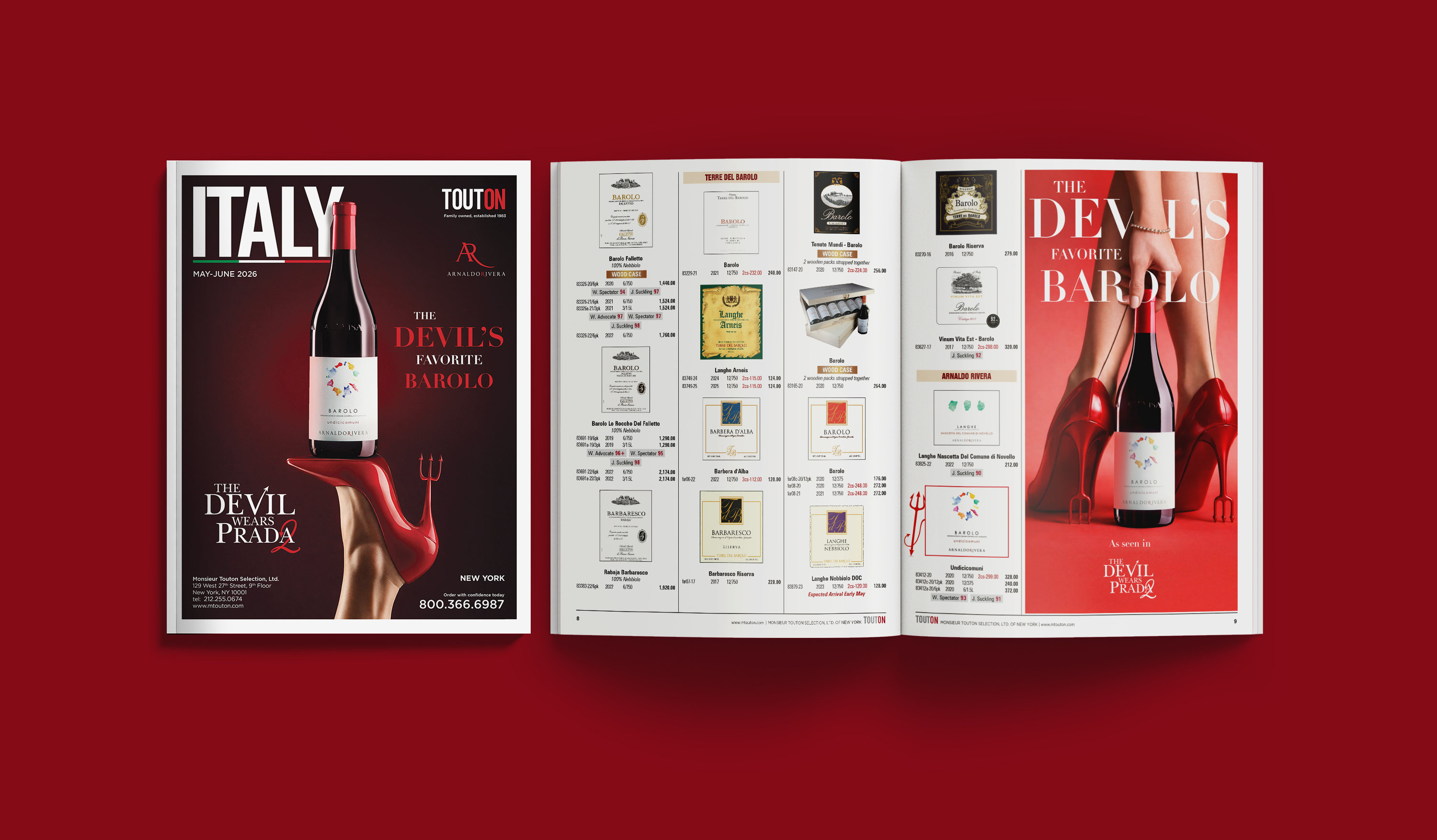
Commissioned by Monsieur Touton Selection, this project was engineered as a high-profile, cross-industry collaboration between Arnaldo Rivera and The Devil Wears Prada 2. The objective was to promote Undicicomuni Barolo through a cohesive visual campaign. Deliverables included three key poster designs, a catalog cover, and a multi-page catalog spread, all perfectly aligned with both luxury brand standards and high-fashion cinematic aesthetics.
CHALLENGE
The core challenge lay in merging two distinct visual languages: the heritage and sophistication of Barolo wine with the bold, fashion-driven identity of The Devil Wears Prada. The campaign needed to feel authentic to the film’s globally recognized aesthetic while maintaining product integrity and ensuring the asset remained the central hero. Balancing sensual, provocative fashion cues with premium advertising required a controlled and intentional art direction.
EXECUTION
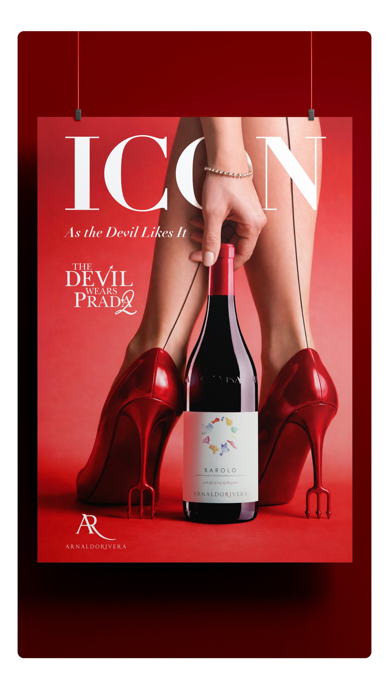
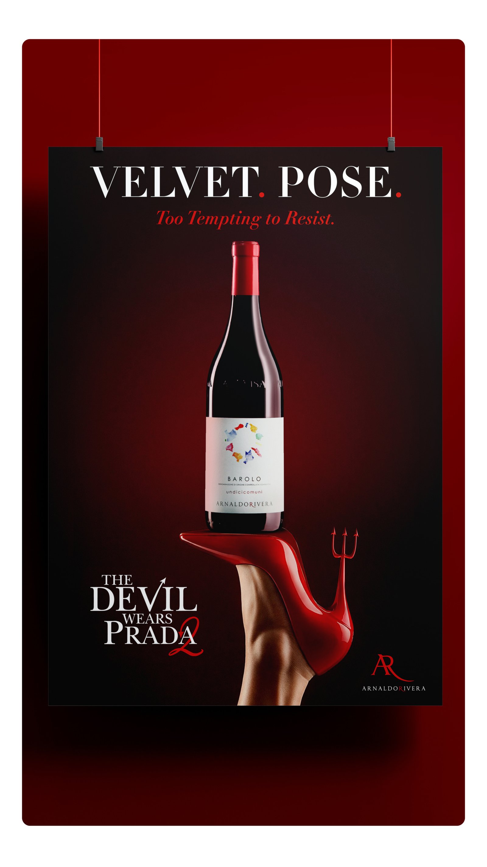
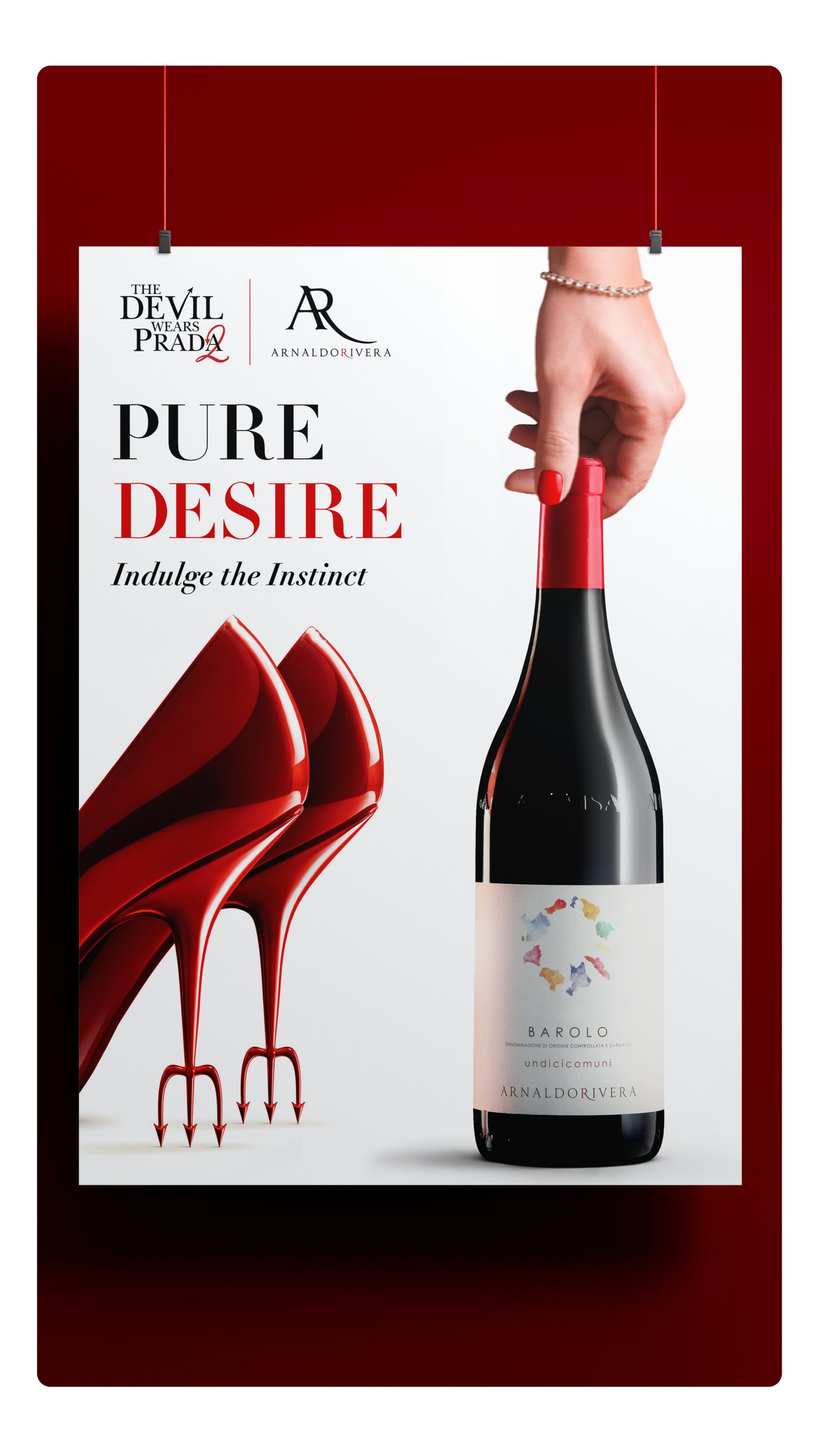
The creative direction was anchored in the film’s most iconic visual element: the red stiletto with the devil’s trident heel. This motif became the unifying symbol across all designs, reinterpreted to frame and elevate the wine bottle as the focal point.
Read More
Hero Visual | ICON A female model delicately yet provocatively engages with the bottle, creating a tension between elegance and desire. The monochromatic red environment amplifies drama, seduction, and brand recall.
Secondary Visual | VELVET. POSE. A bold, fashion-forward visual where the stiletto physically interacts with the bottle, emphasizing power, femininity, and visual impact.
Homage Visual | PURE DESIRE A minimalist reinterpretation of the original Devil Wears Prada artwork, maintaining global recognizability while integrating the wine product through subtle yet intentional modifications.
Typography
Typography played a critical role in reinforcing the fashion narrative. The use of Didot—a typeface synonymous with luxury editorial design and reminiscent of RUNWAY magazine—established an immediate connection to the fashion world while maintaining refinement and clarity.
Across all executions, strict attention was given to product fidelity, lighting realism, and composition hierarchy, ensuring the wine bottle remained the undisputed focal point.
OUTCOME
The resulting campaign successfully bridged luxury wine marketing with cinematic fashion storytelling, yielding a visually cohesive and highly distinctive advertising system. The assets elevated Undicicomuni Barolo beyond traditional product promotion, positioning it within a cultural and aspirational context tied tightly to film and fashion.
TOOLS
InDesign · Photoshop · Premiere Pro
03 · GLOBAL REBRAND
SCOPE | COMPREHENSIVE BRAND IDENTITY
THE LITTLE SHEEP
OVERVIEW
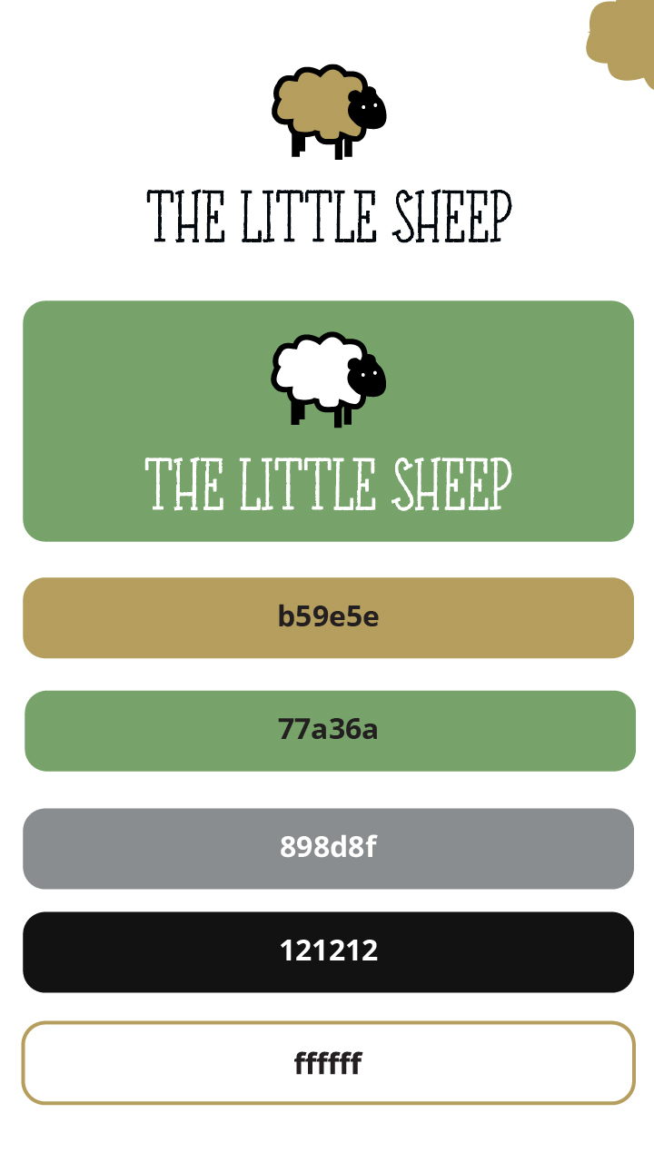
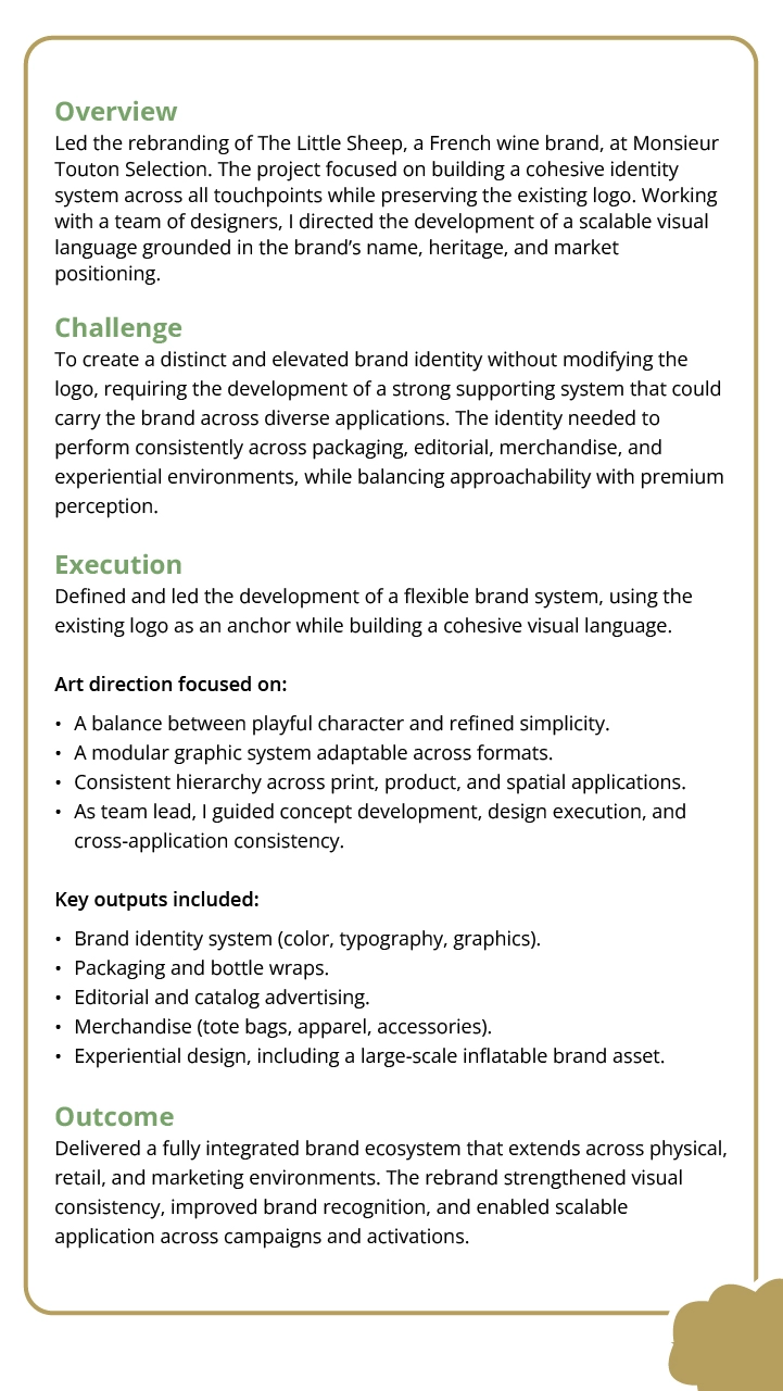
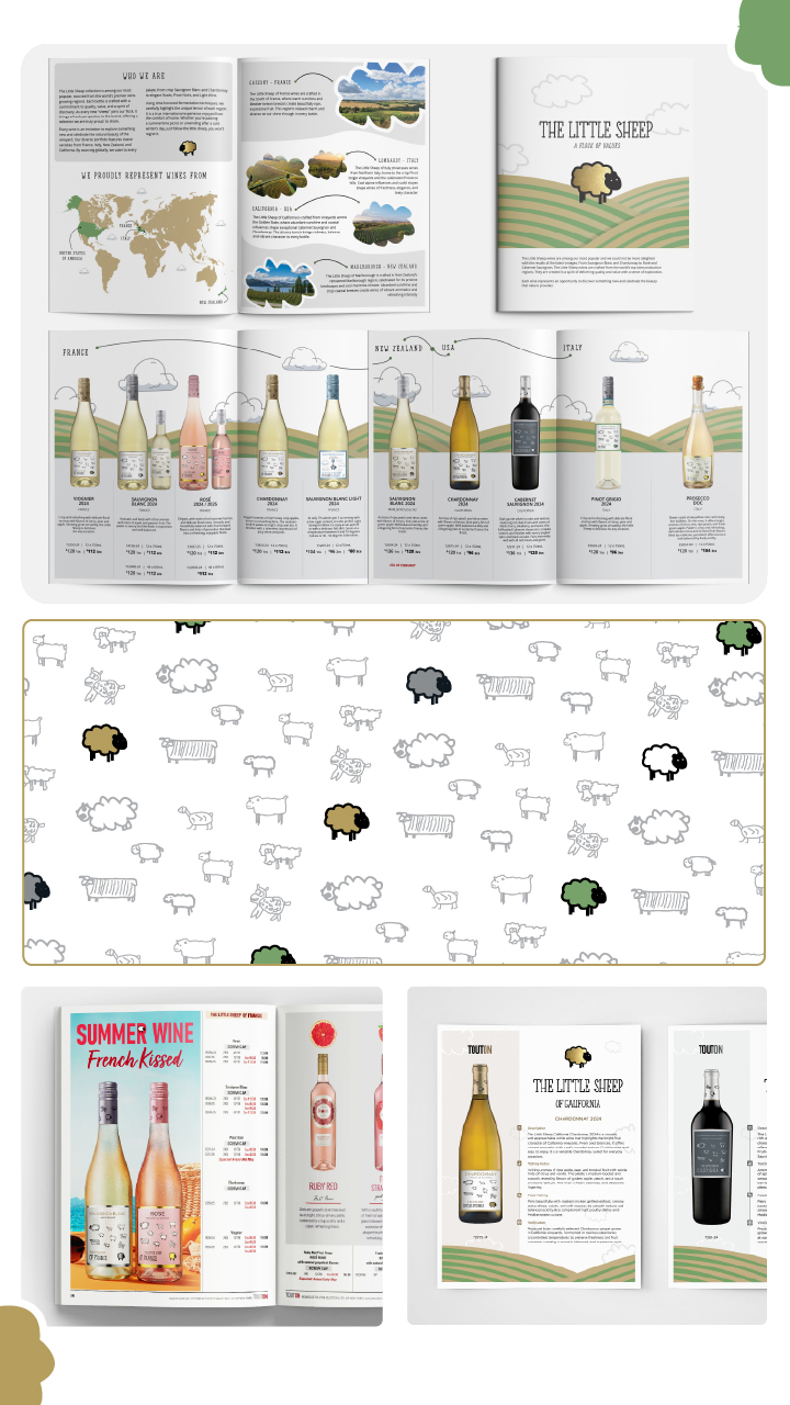
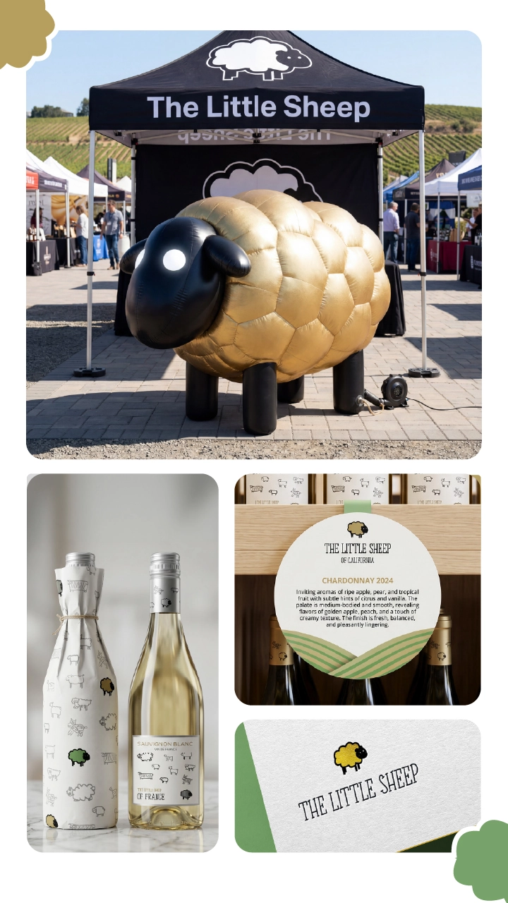
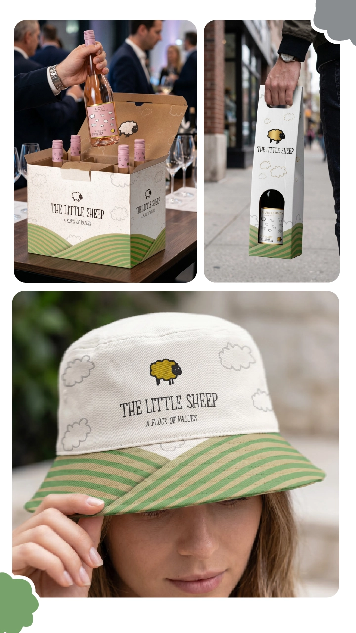
Led the rebranding of The Little Sheep, a French wine label at Monsieur Touton Selection. The project focused on building a cohesive identity system across all touchpoints while preserving the legacy mark. Working with a team of designers, I orchestrated a scalable visual language grounded in heritage, storytelling, and premium market positioning.
CHALLENGE
To create a distinct and elevated brand identity while retaining the original logo mark, requiring the development of a robust supporting system that could carry the visual presence across omni-channel touchpoints. The identity needed to perform consistently across packaging, editorial layouts, merchandise, and experiential activations, balancing approachable heritage with a premium market perception.
EXECUTION
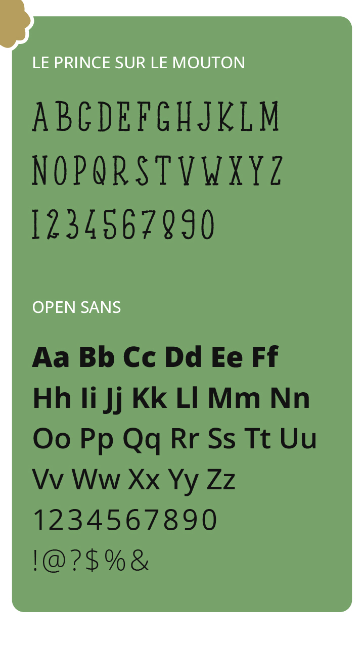
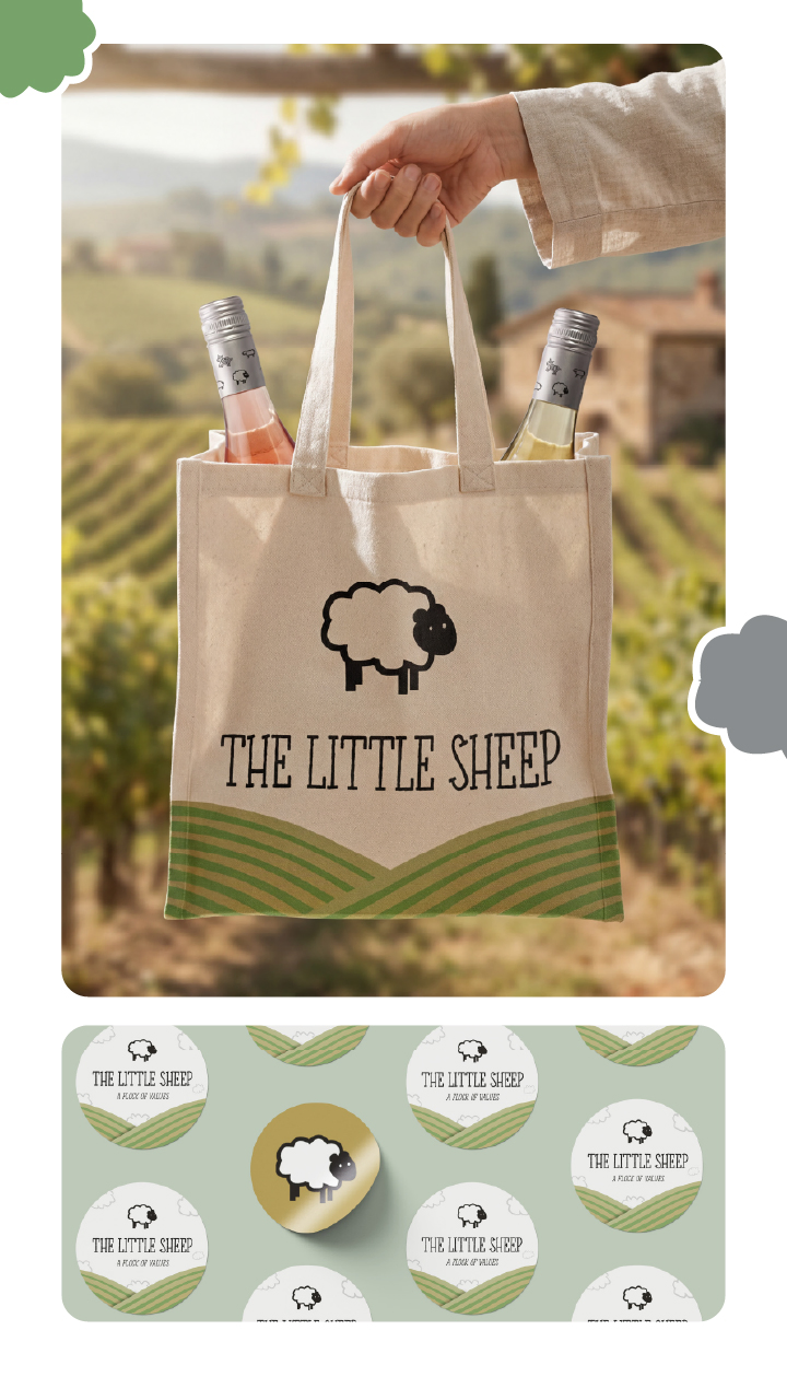
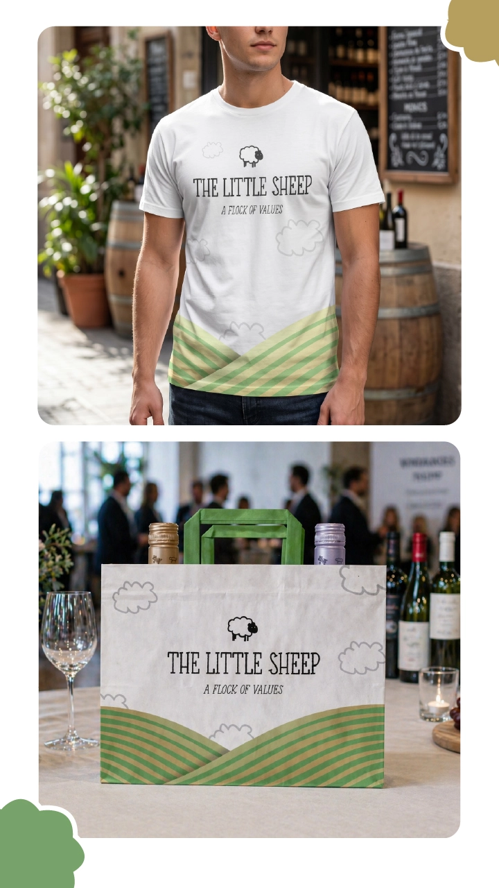
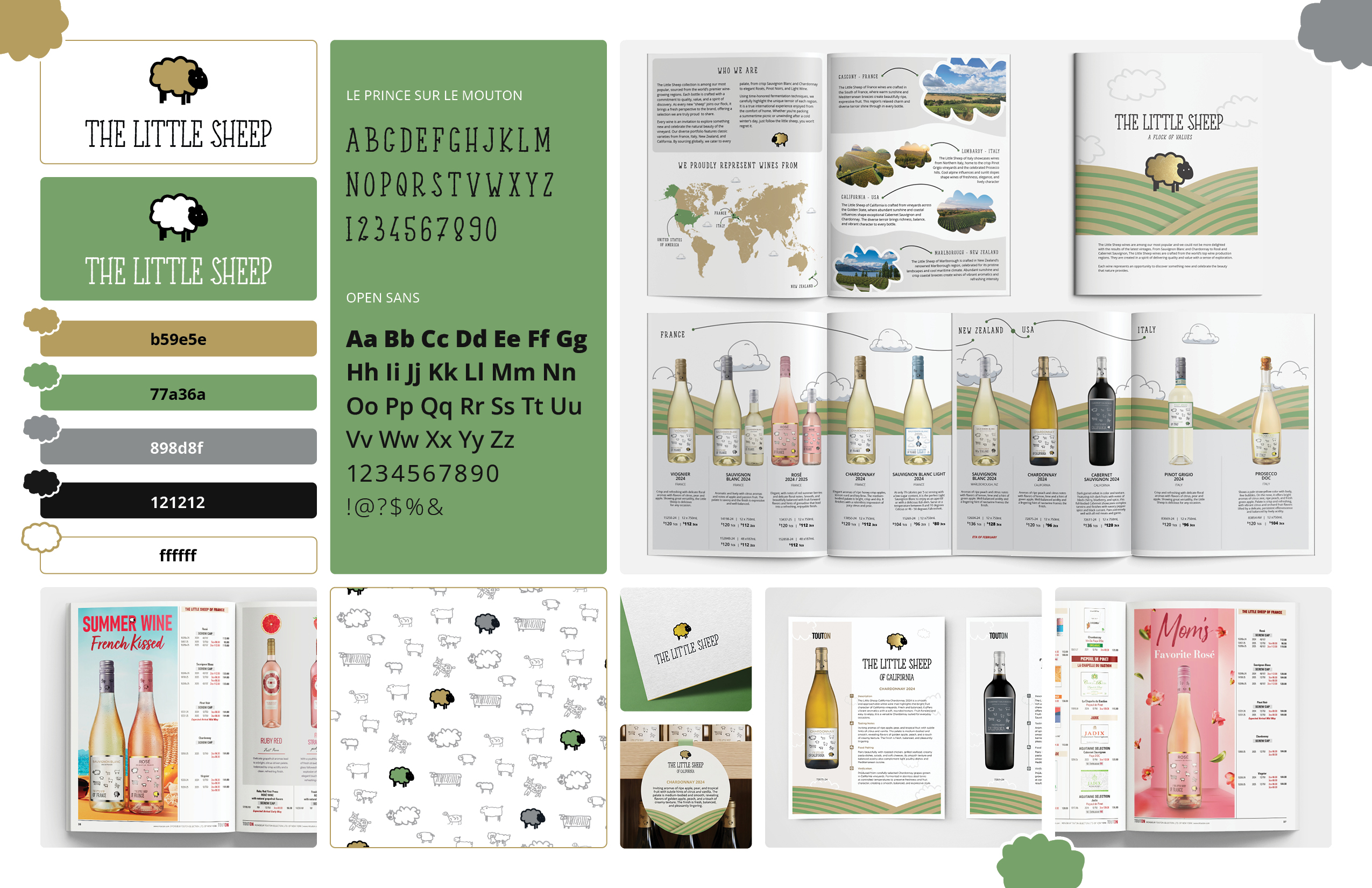
Architected a modular design system using the existing legacy logo as a primary visual anchor. Developed unified typographic frameworks, a curated color palette, and bespoke grid patterns to establish an elevated, cohesive visual language.
Read More
Art direction focused on:
Balancing playful brand character with refined simplicity.
Engineering a modular graphic system adaptable across formats.
Establishing consistent visual hierarchy across print, product, and spatial layouts.
As team lead, I guided concept development, design execution, and cross-application consistency.
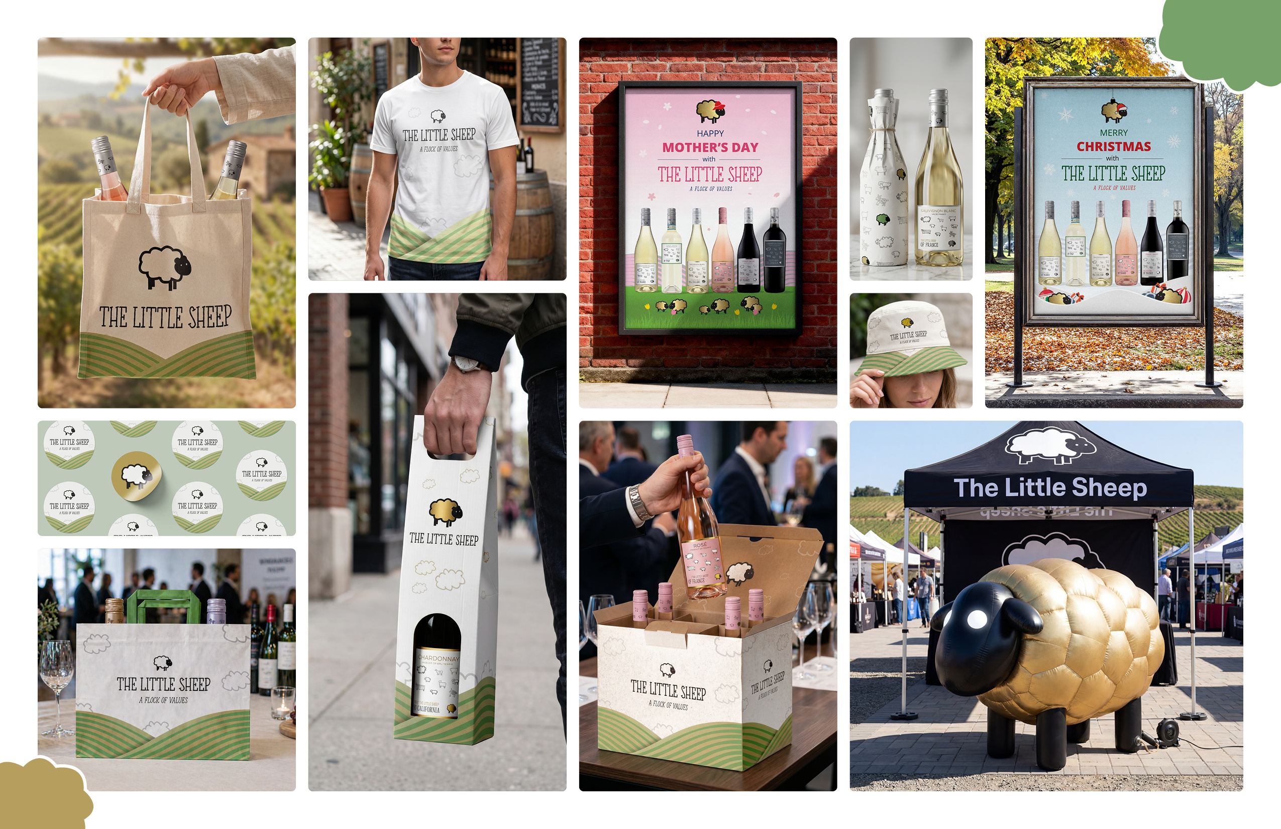
Key outputs included:
Brand identity system (color, typography, graphics).
Packaging and bottle wraps.
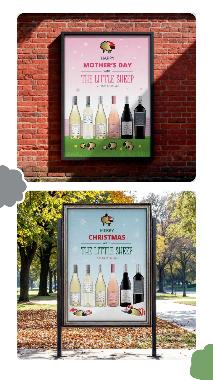
Editorial and catalog advertising.
Merchandise (tote bags, apparel, accessories).
Experiential design, including a large-scale inflatable brand asset.
OUTCOME
Delivered a fully integrated brand ecosystem spanning physical retail and corporate marketing environments. The rebrand strengthened overall visual consistency, significantly accelerated speed-to-market for seasonal collateral, and secured long-term brand equity through scalable application systems.
TOOLS
InDesign · Photoshop · Illustrator
04 · PACKAGING REDESIGN
SCOPE | US MARKET PACKAGING & STRUCTURAL REDESIGN
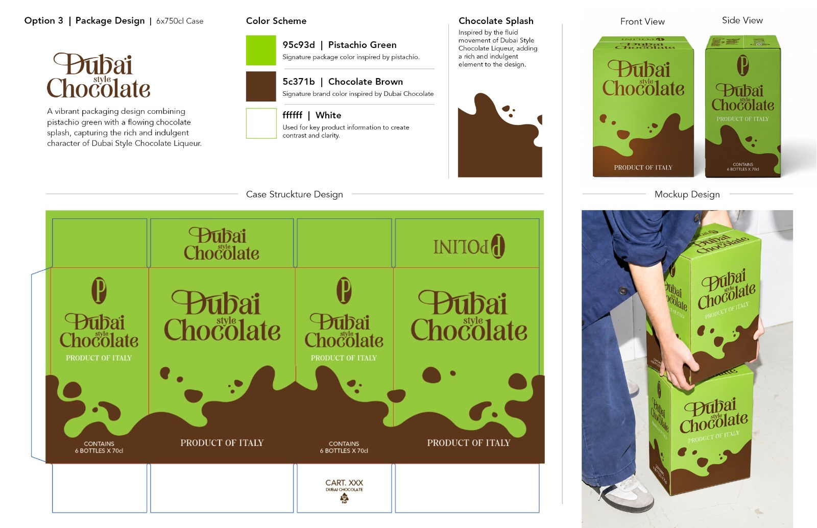
DUBAI STYLE CHOCOLATE
OVERVIEW
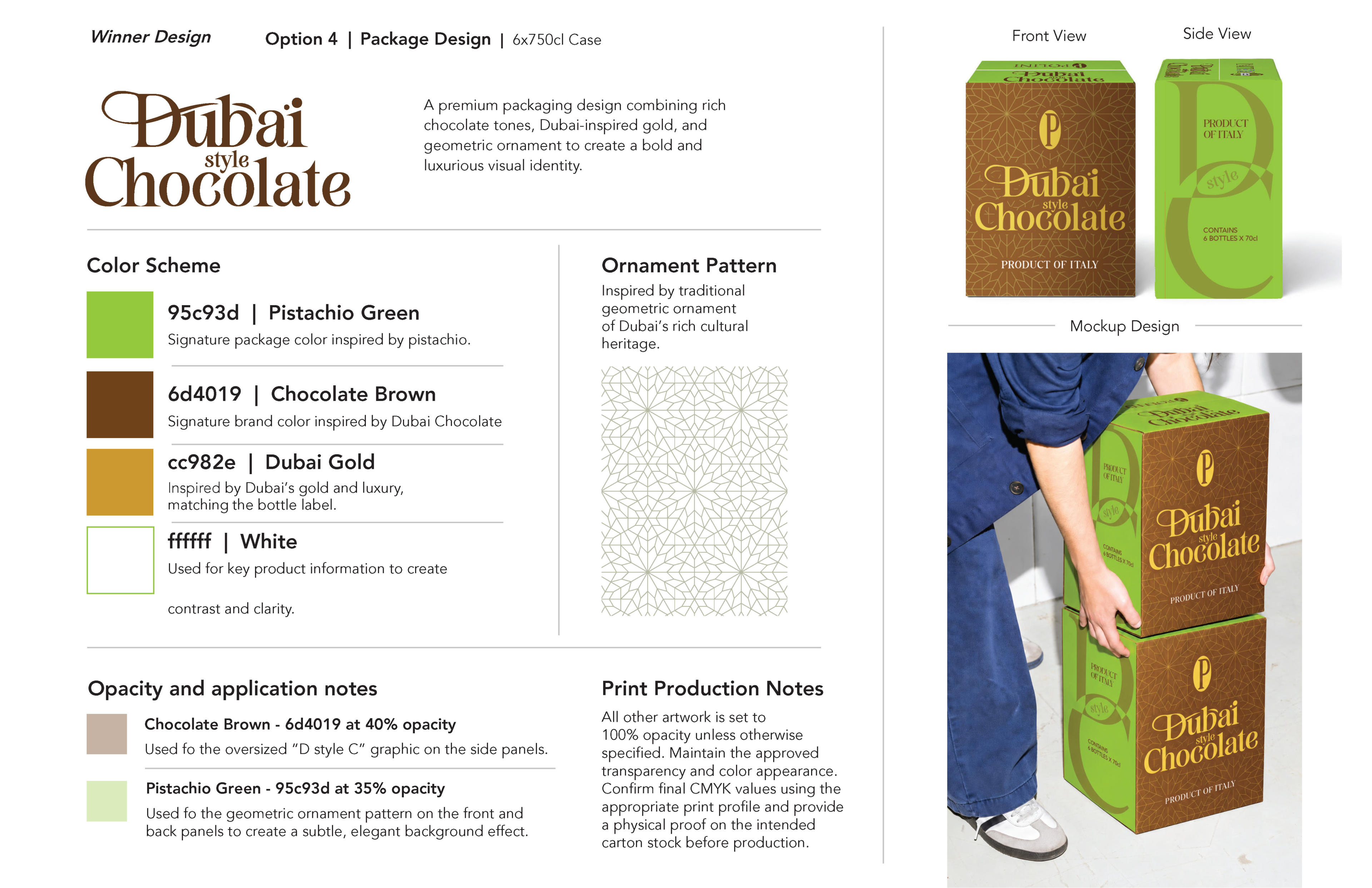
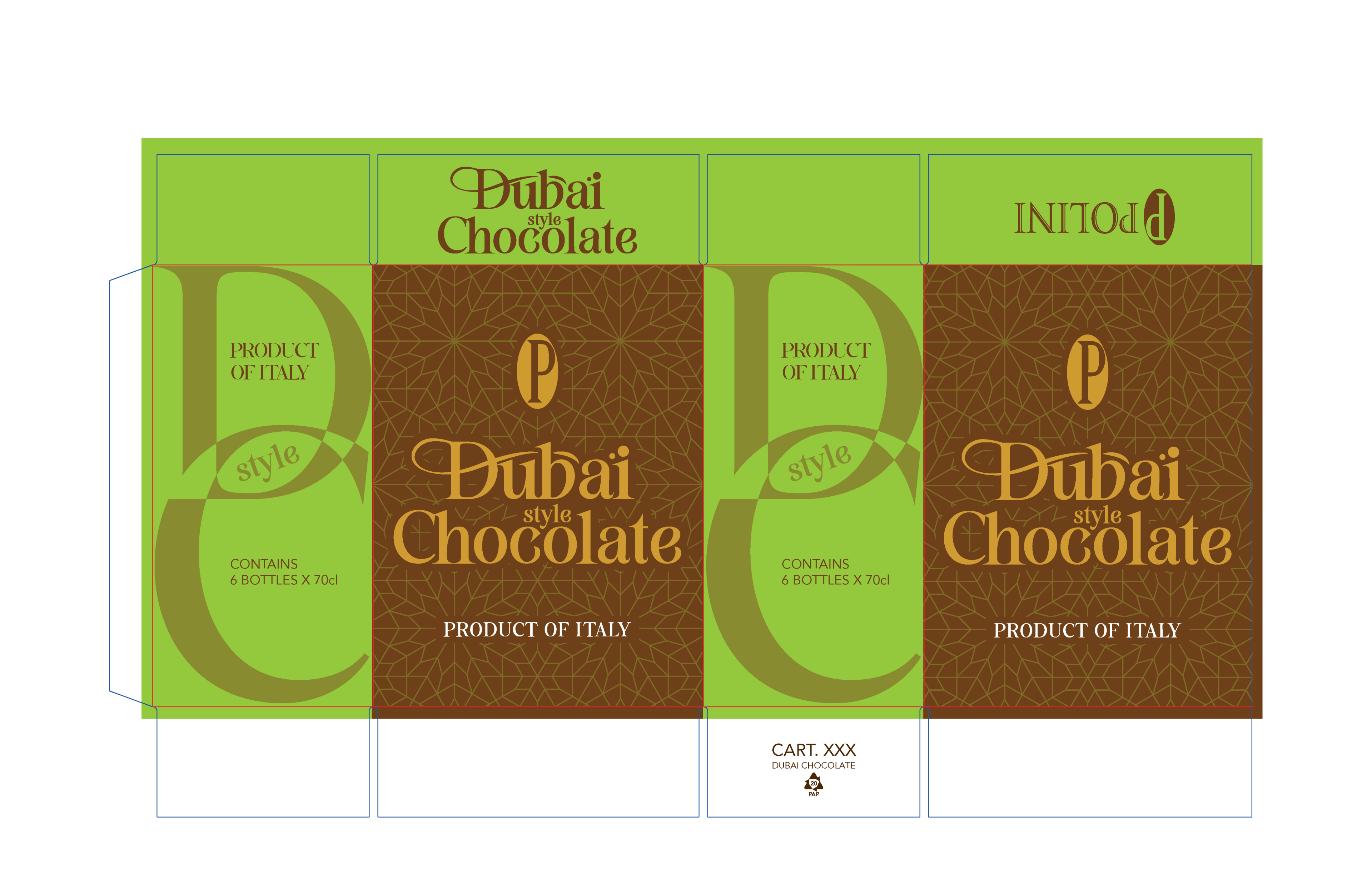
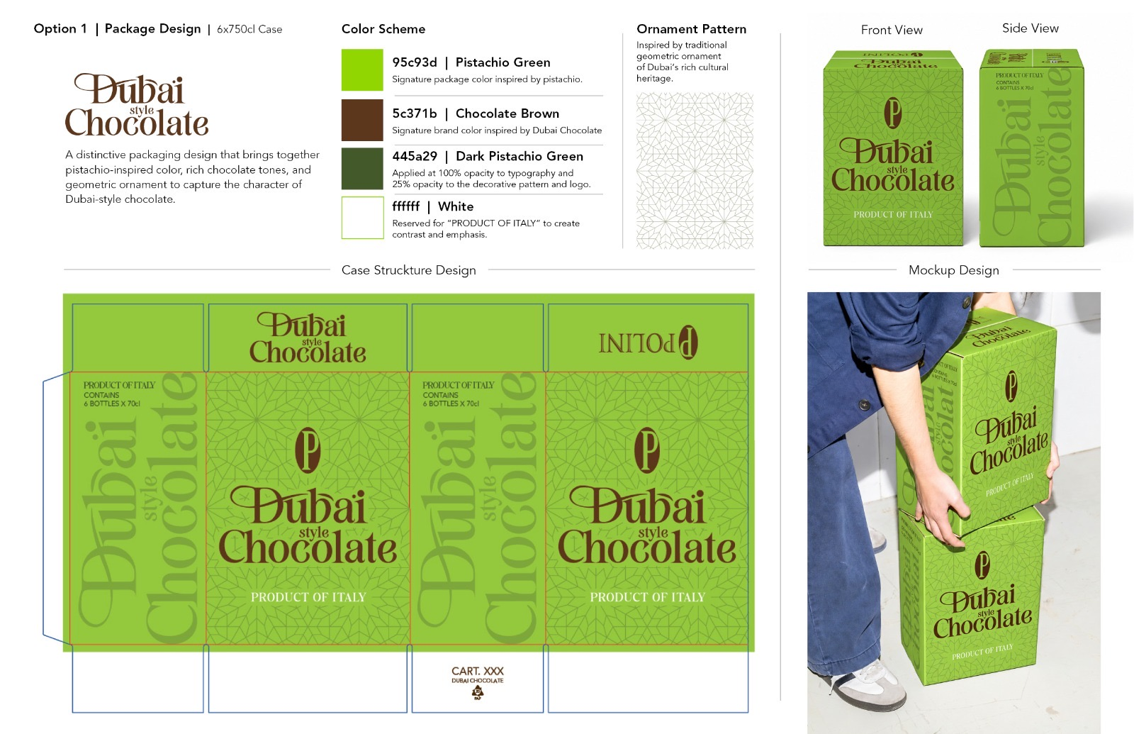
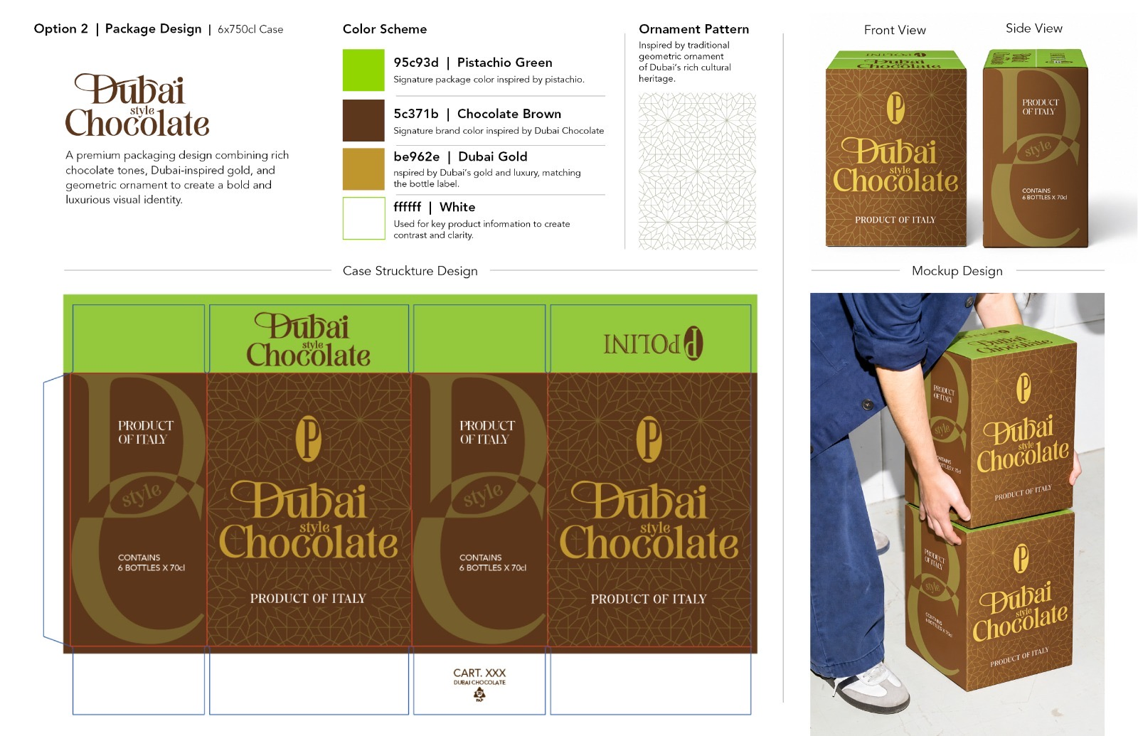
Led the packaging and structural redesign of Dubai Style Chocolate's 6x750cl case structure tailored specifically for the USA market. The project focused on translating the brand's decadent, liqueur-infused identity into a high-impact retail presence through comprehensive iterative exploration and production-ready dielines.
CHALLENGE
To create a distinct and elevated secondary packaging system that resonates with the US consumer market while staying true to the brand's established identity. The packaging needed to perform consistently across omni-channel touchpoints—from bulk transport cartons and wholesale pallets to unboxing moments—balancing rich chocolate tones, signature pistachio green, and luxury gold accents with premium market positioning.
EXECUTION
Architected a multi-option packaging system exploring dynamic chocolate splashes, refined geometric ornament patterns, and luxury gold accents. The final selected direction (Option 4) integrates a sophisticated color palette—signature Pistachio Green, Chocolate Brown, and Dubai Gold—with subtle 35% opacity background patterns and precise production-ready dielines for flawless manufacturing execution.
OUTCOME
Delivered a fully integrated, production-ready packaging ecosystem spanning structural dielines, color specifications, and retail mockups. The finalized box design successfully strengthens visual consistency, maximizes shelf impact for the US market, and elevates long-term brand equity through a luxurious and scalable structural system.
TOOLS
Illustrator · Photoshop
05 · SEASONAL ACTIVATION
SCOPE | MULTI-CHANNEL CAMPAIGN STRATEGY
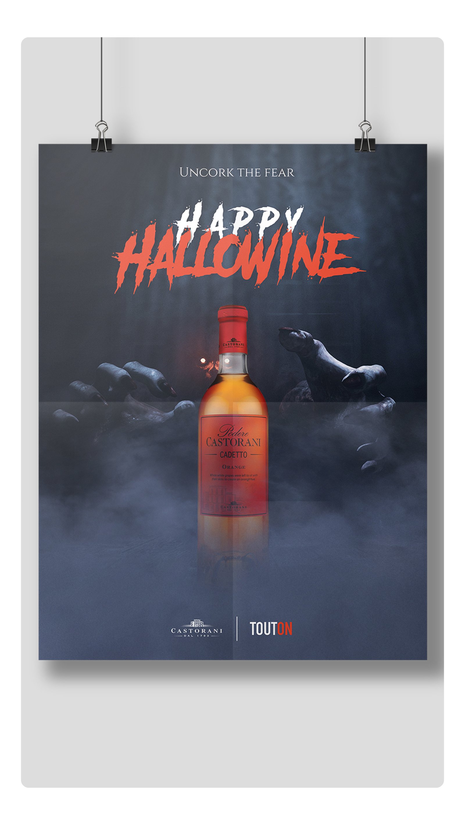
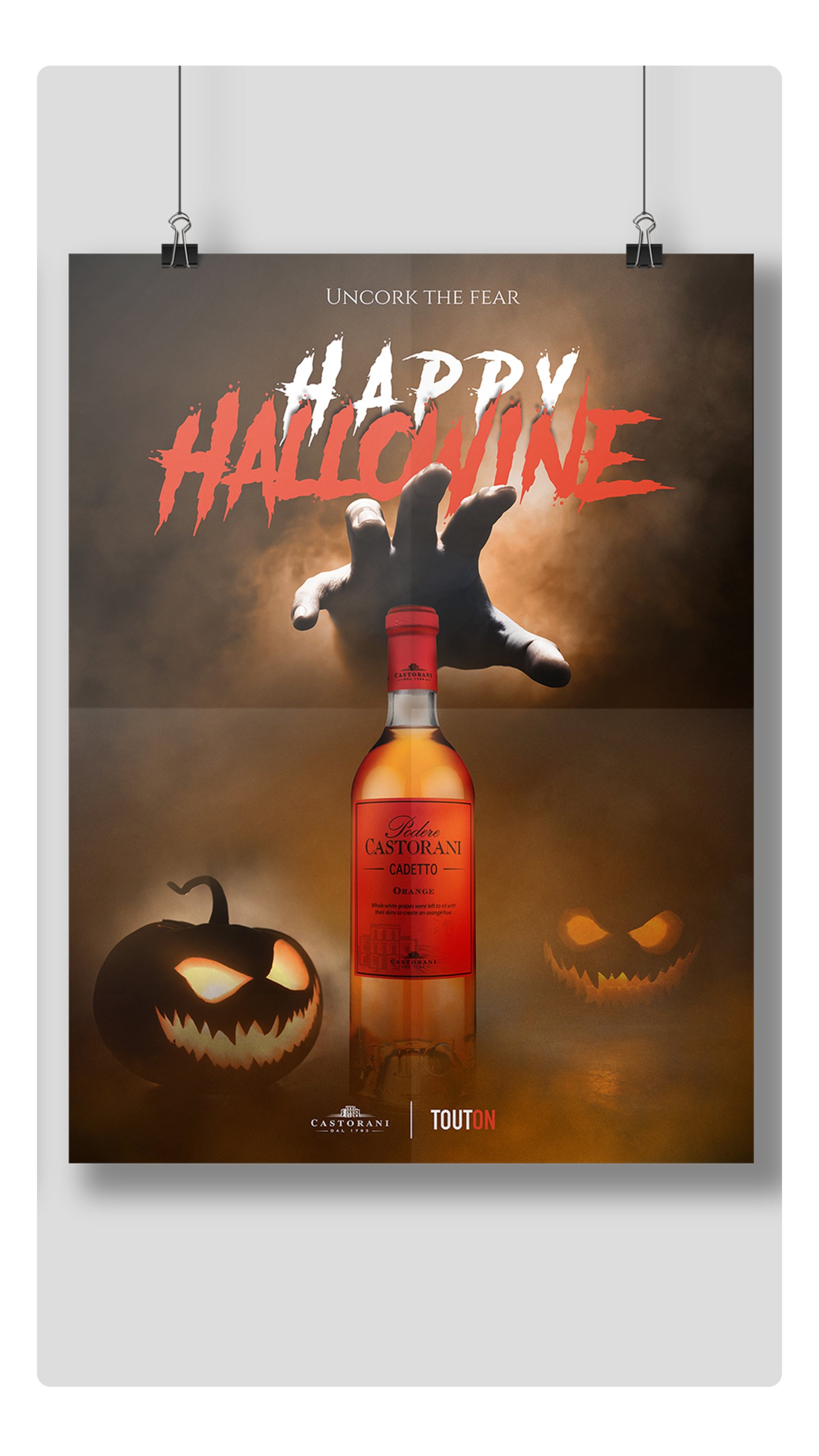
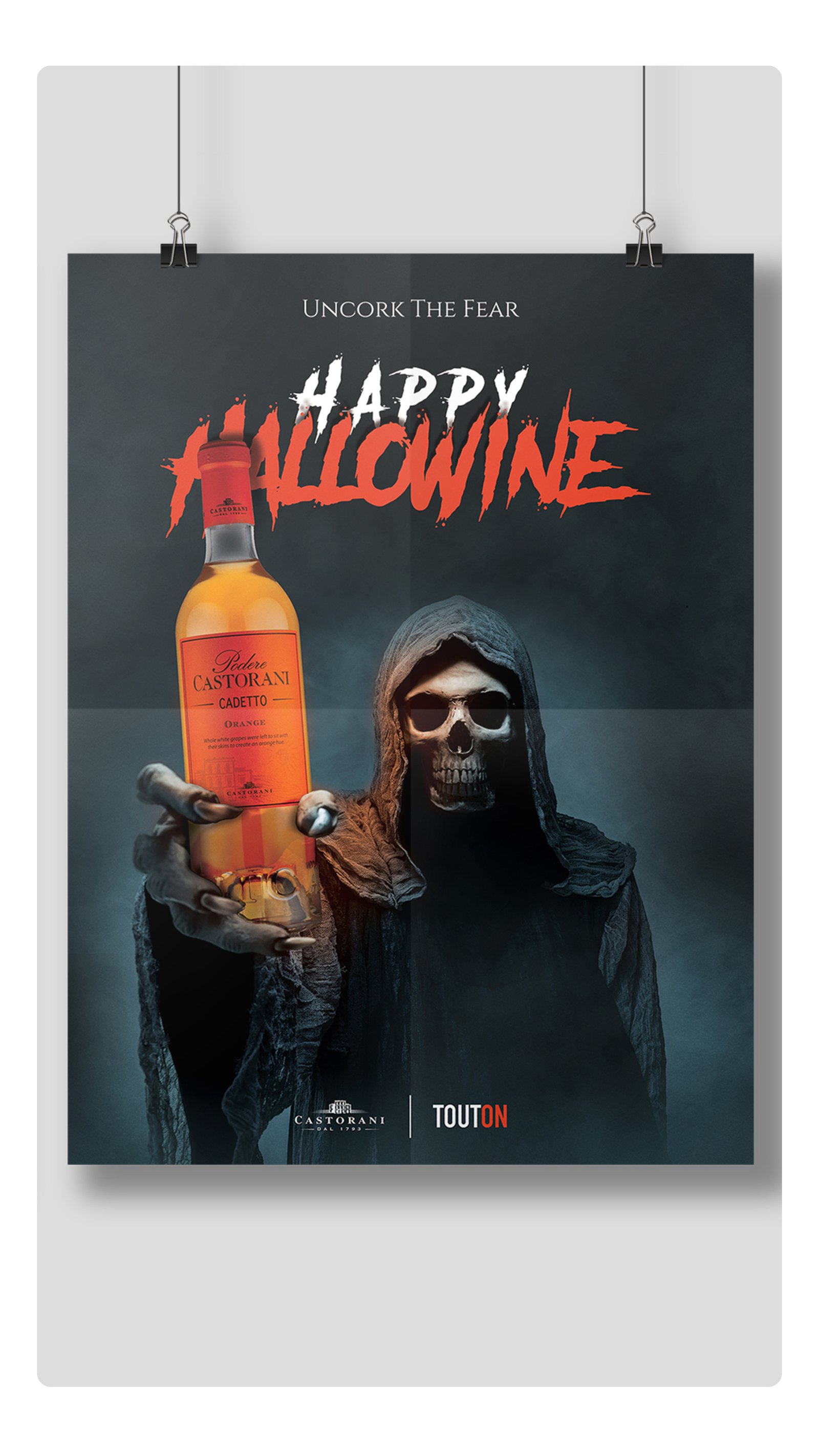
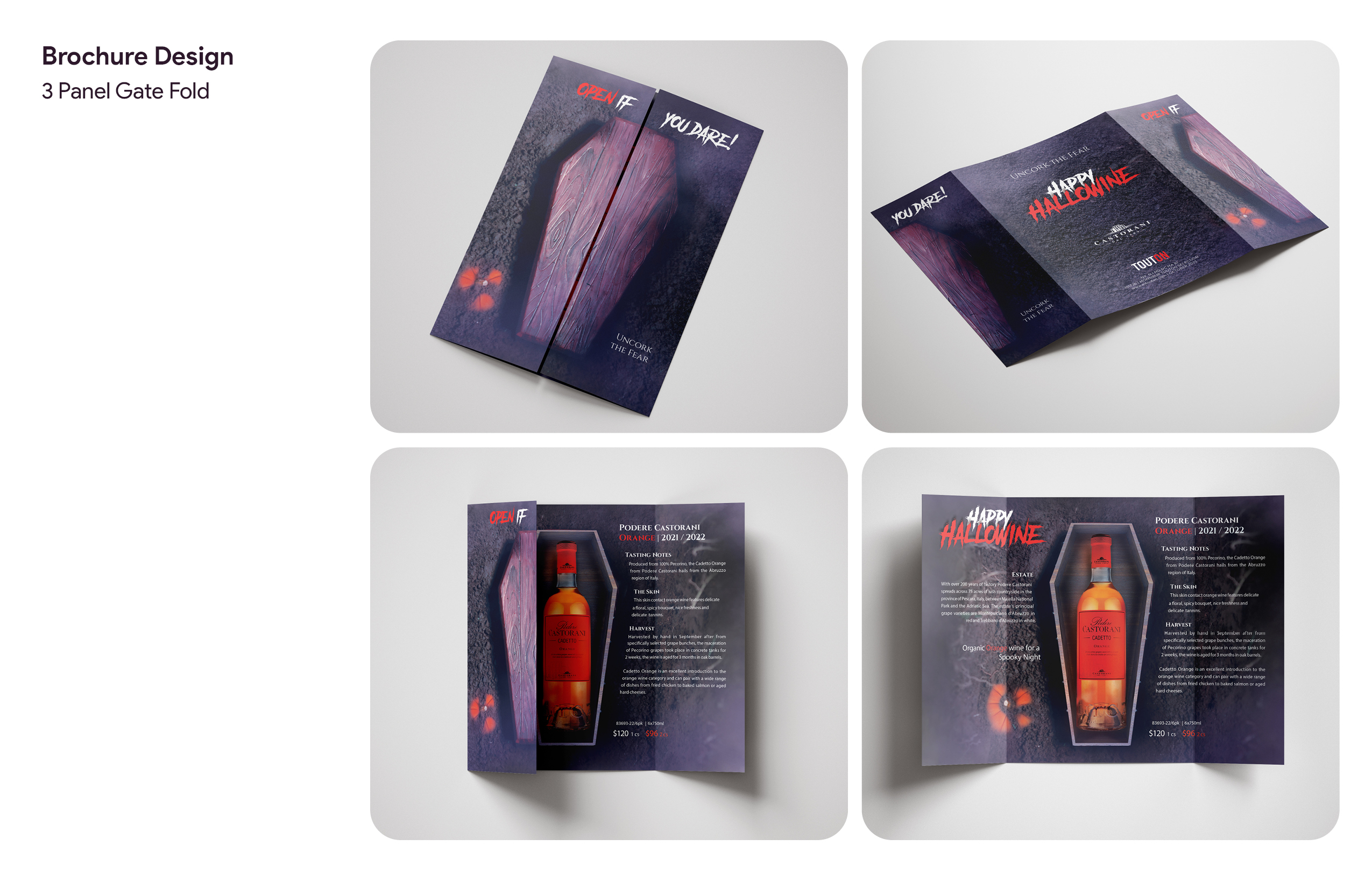
HAPPY HALLOWINE
OVERVIEW
Conceptualized and developed an integrated seasonal campaign for Podere Castorani Orange Wine, translating a traditional product promotion into a narrative-driven, multi-channel marketing experience.
CHALLENGE
The 'Uncork the Fear' creative concept positions the wine bottle as the central character within a Halloween-inspired visual narrative. Rather than functioning as a static product, the bottle becomes the focal point of dramatic tension, with surrounding cinematic elements symbolizing attraction, desire, and suspense.
EXECUTION
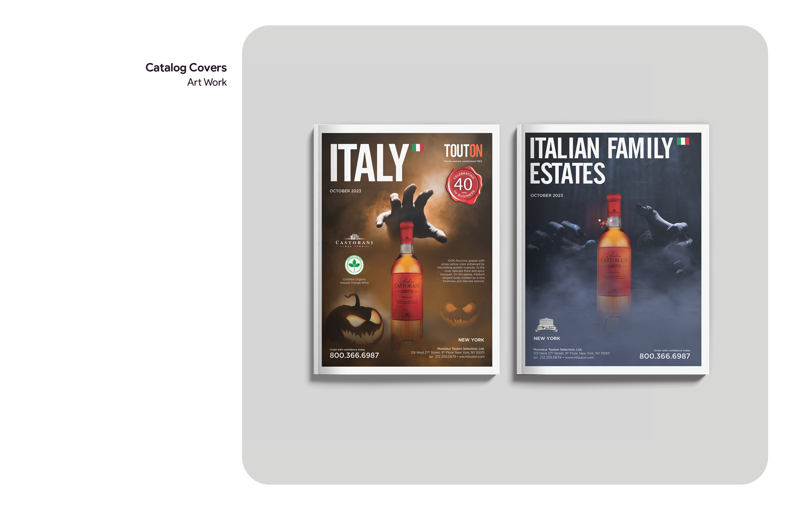
Orchestrated a cohesive visual system across print and digital platforms, including posters, catalog covers, brochures, and social media assets. Compositions were built using a combination of photography and digital compositing, maintaining the product as the primary focal point while introducing cinematic lighting, atmospheric depth, and narrative-driven elements. A consistent typographic treatment and visual language ensured absolute continuity across all touchpoints.
Read More
Interactive Print Collateral
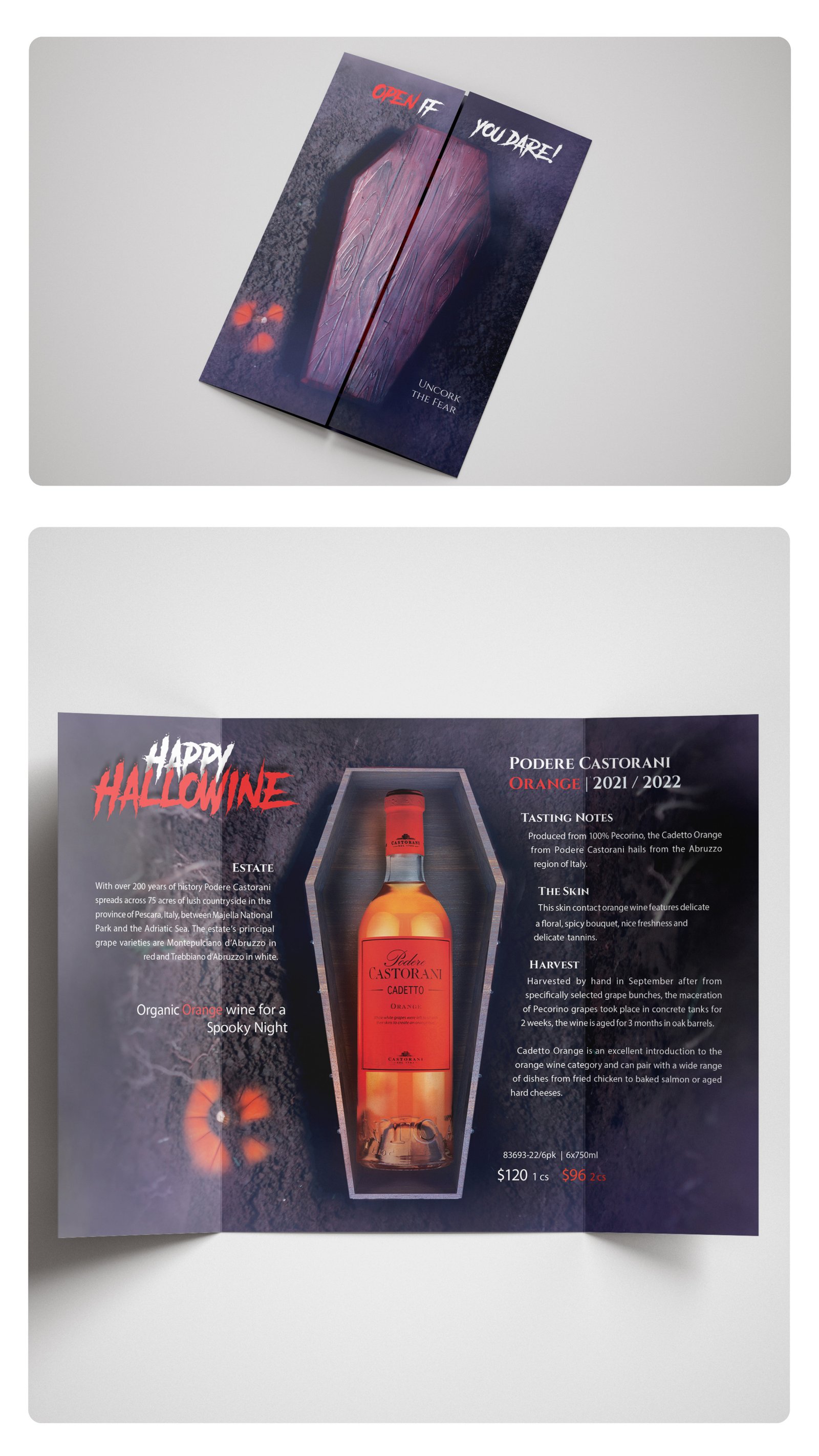
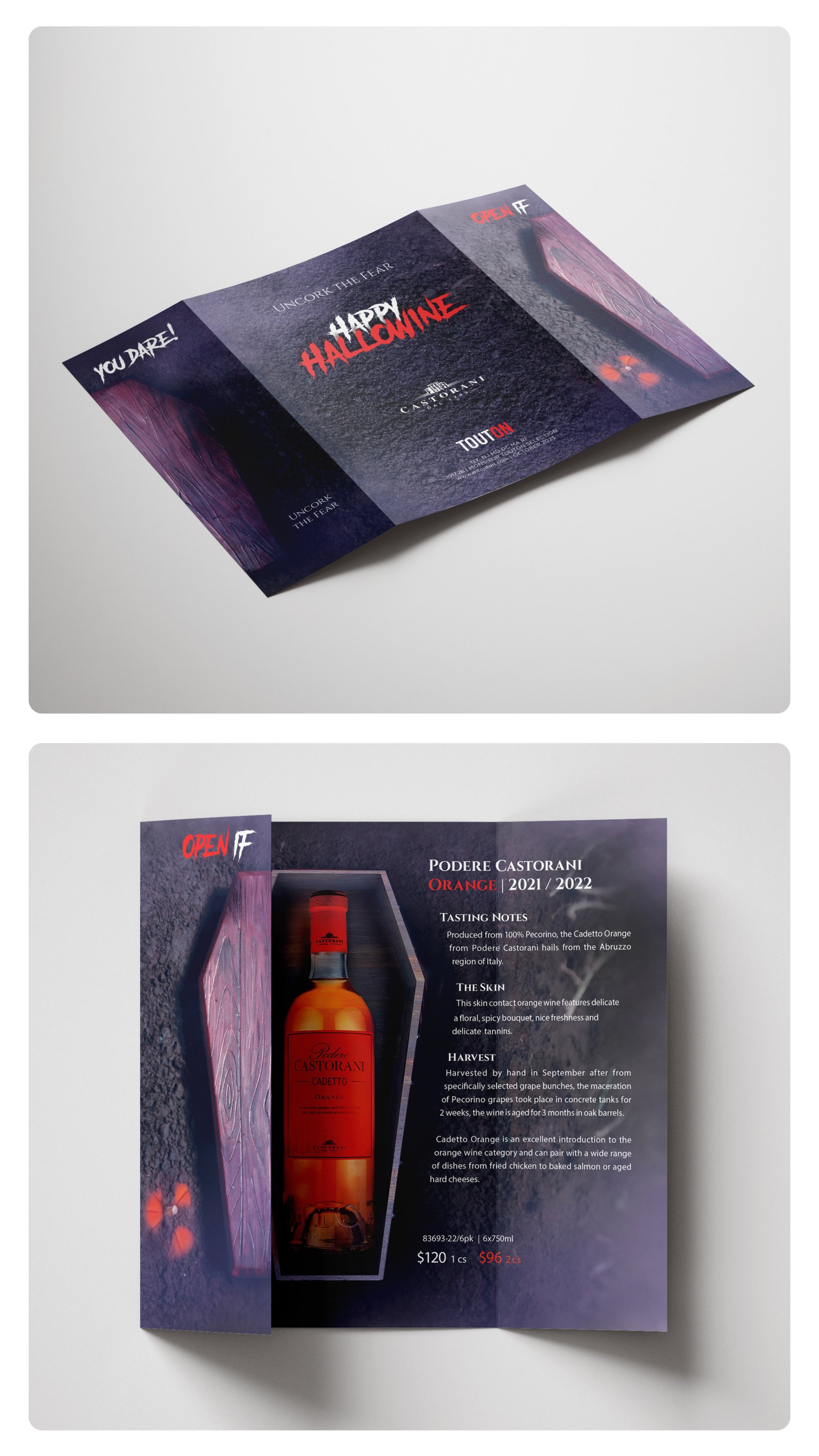
The campaign’s central tactical piece is a bespoke 3-panel gatefold brochure engineered with a structural coffin die-cut. When closed, the exterior layout features a tactile, thematic aesthetic paired with the high-impact teaser typography: “Open if you dare.” Upon opening, the interior reveals the wine asset nested inside the structural silhouette, successfully transforming a standard product reveal into an immersive, theatrical unboxing moment.
Campaign Promotional Posters
A cohesive series of illustrative and composited marketing posters designed to scale dramatic, narrative tension. In selected variations, atmospheric, ethereal figures and skeletal characters interact directly with the bottle asset to establish a stark, high-contrast focal point that seamlessly reinforces seasonal brand recall.
Editorial Publication Covers
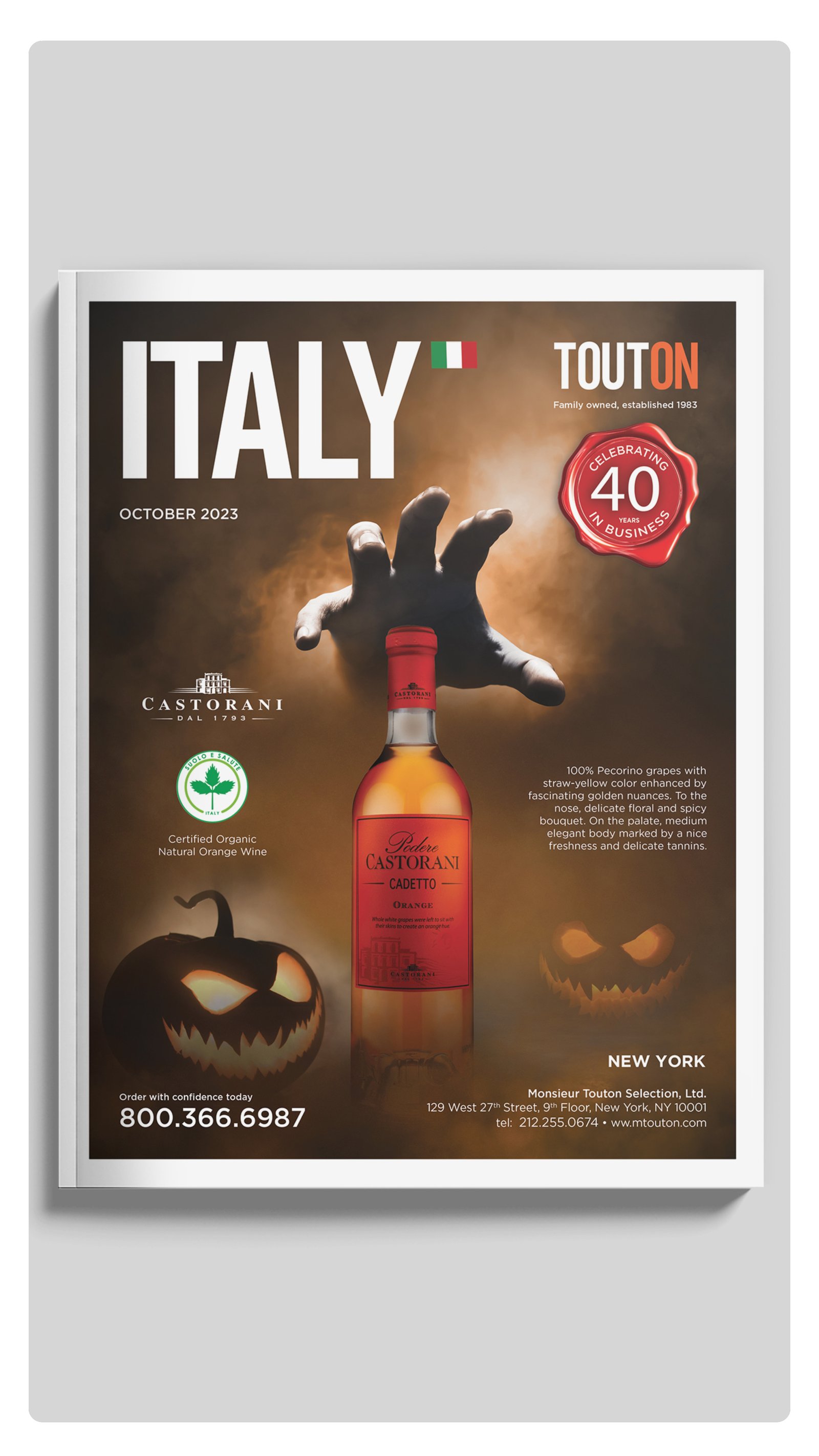
Seasonal catalog covers systematically structured to extend the campaign’s visual narrative into the company’s core B2B trade publications, eliminating design debt and securing absolute visual consistency across multi-page layout environments.
Integrated Digital & Social Strategy
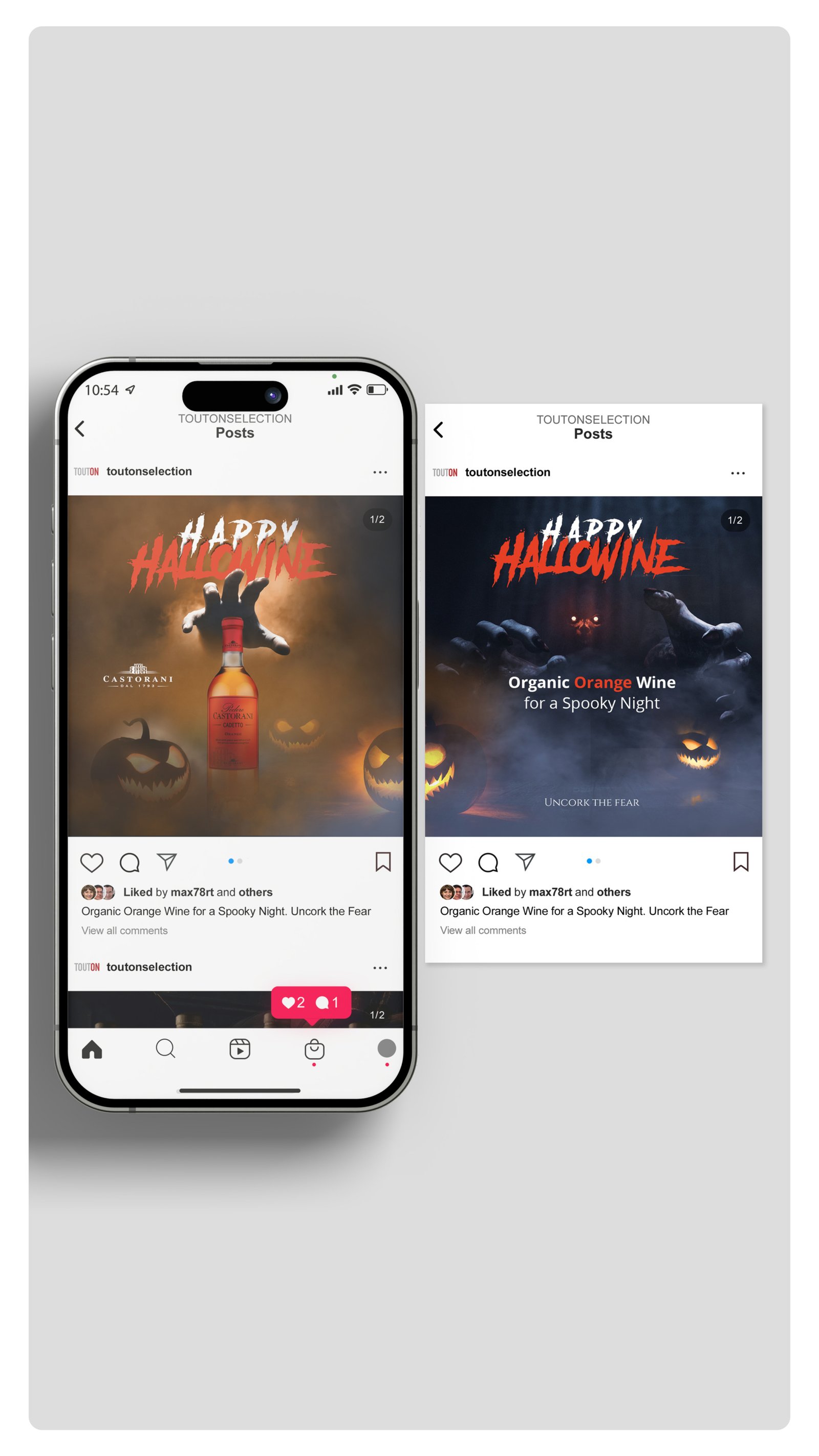
High-engagement Instagram carousel systems and immersive Story ads optimized for mobile-first consumption. These digital assets scale the identical cinematic atmosphere and atmospheric lighting across screen layouts to capture user attention and maximize digital conversion rates.
OUTCOME
Delivered a scalable campaign system that elevates product storytelling, strengthens brand presence across marketing channels, and successfully transforms a seasonal promotion into a distinctive, immersive brand experience.
TOOLS
InDesign · Photoshop · Premiere Pro
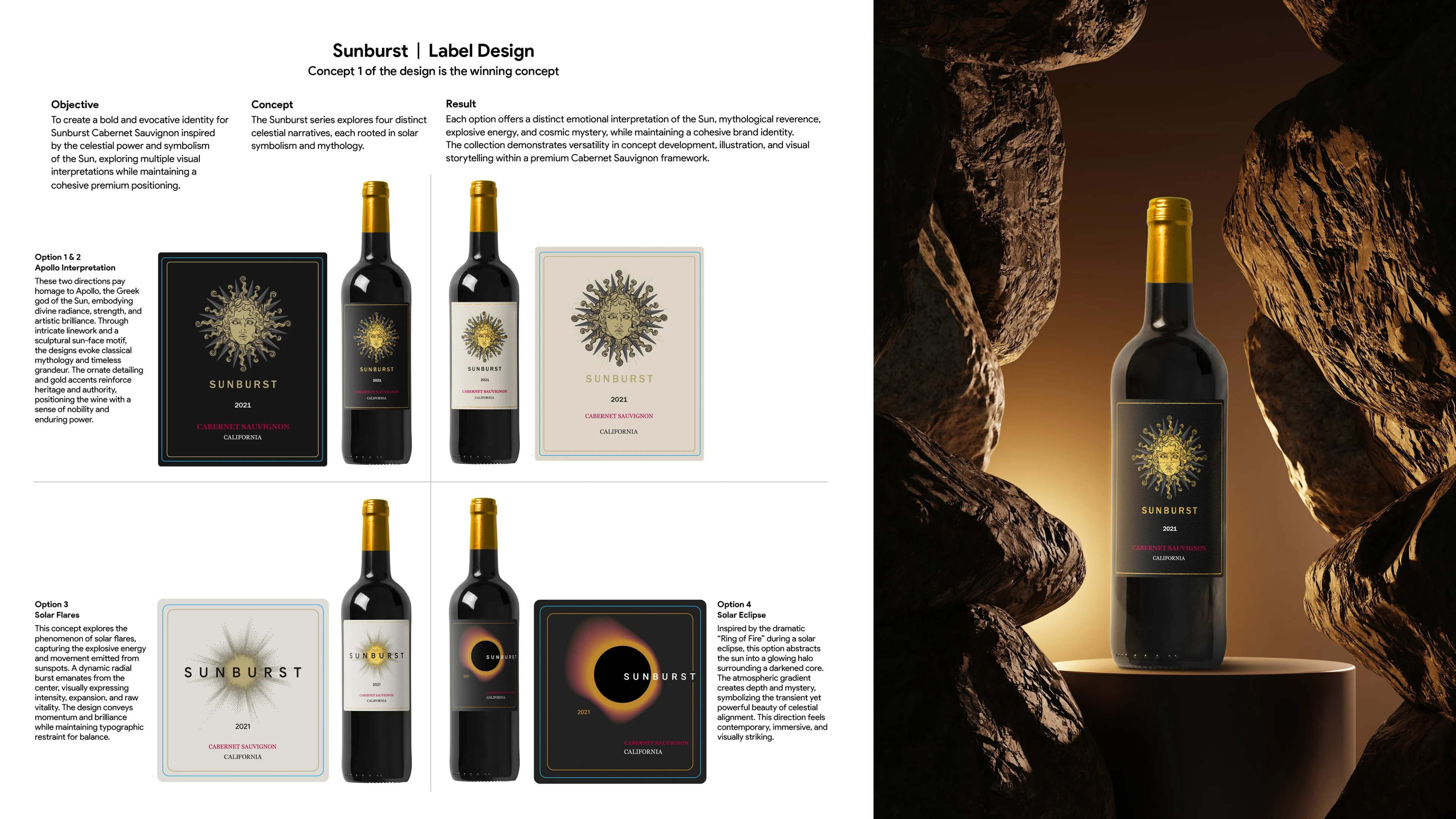
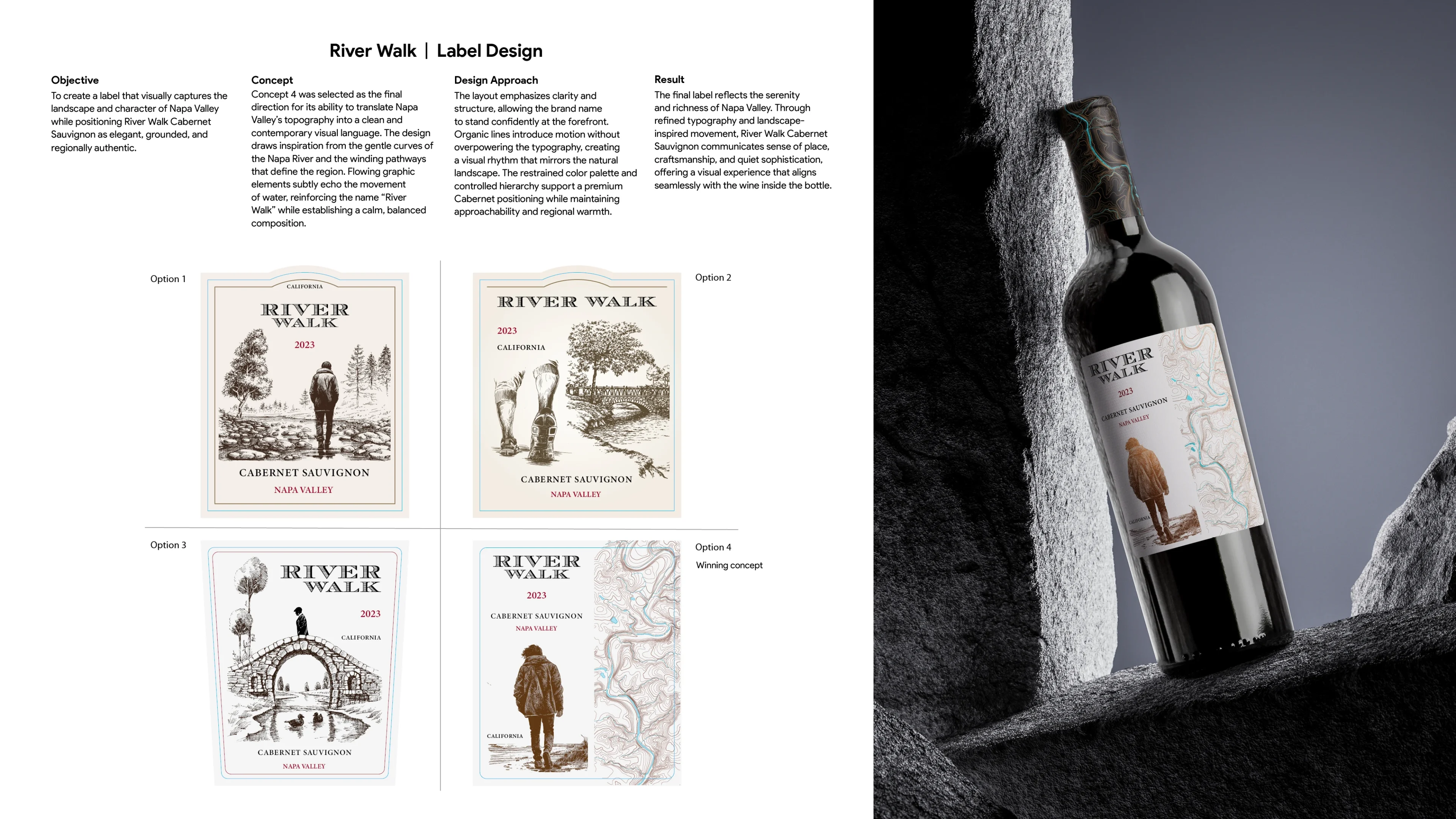
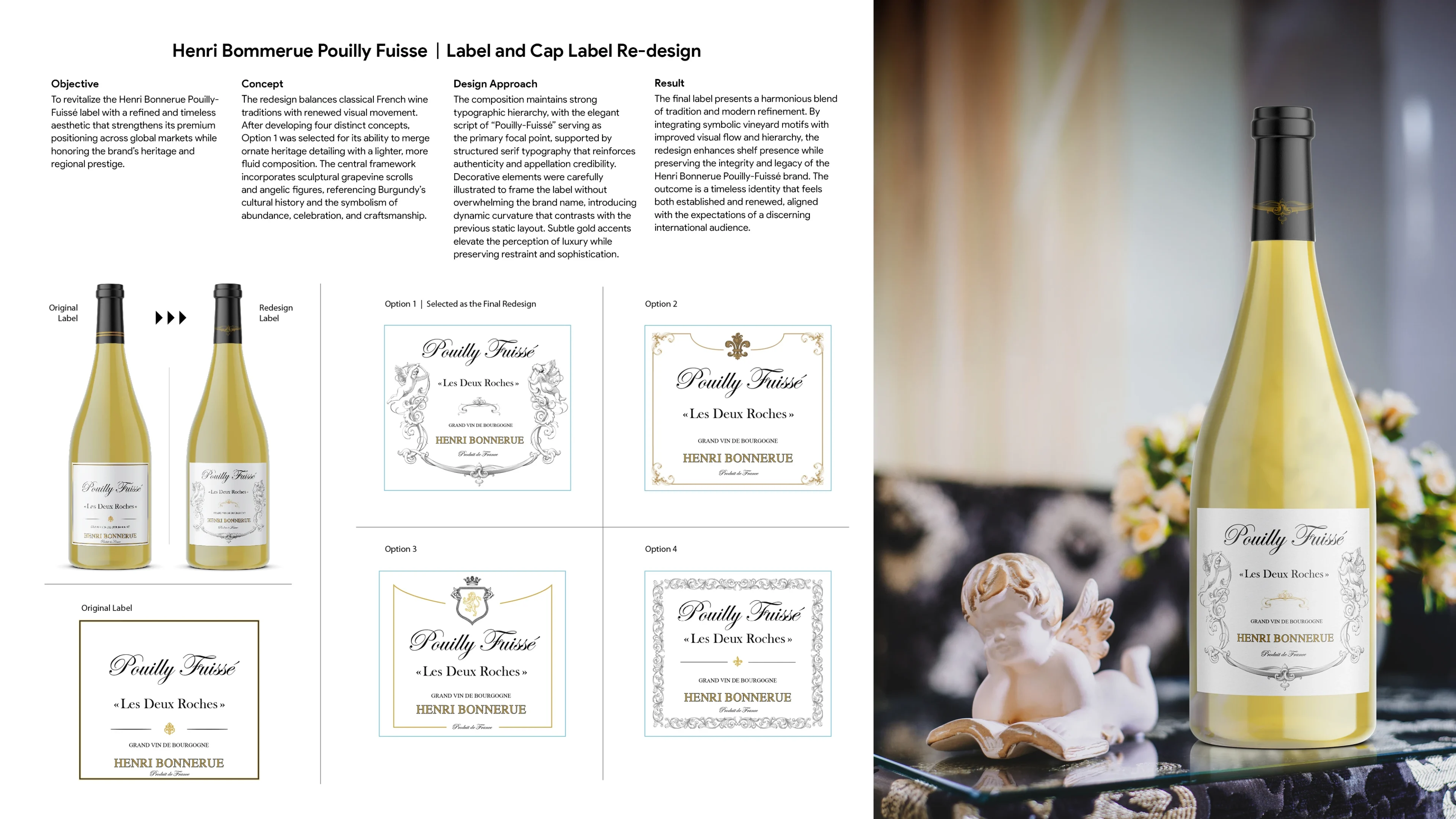
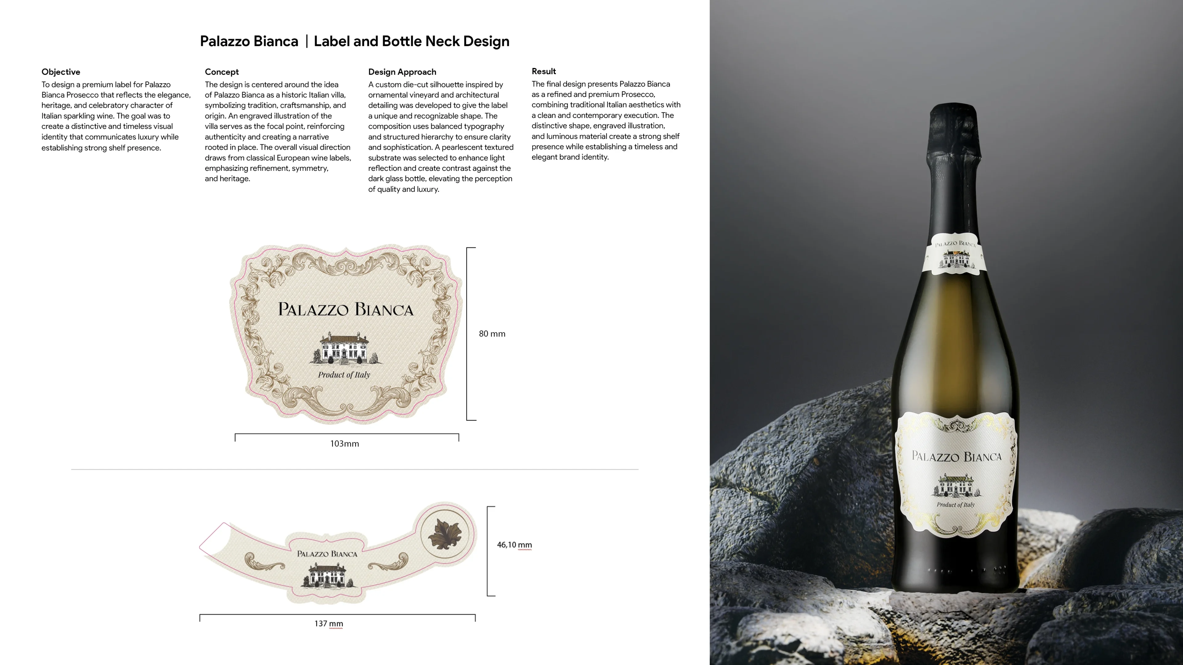
06 · SELECTED WORKS
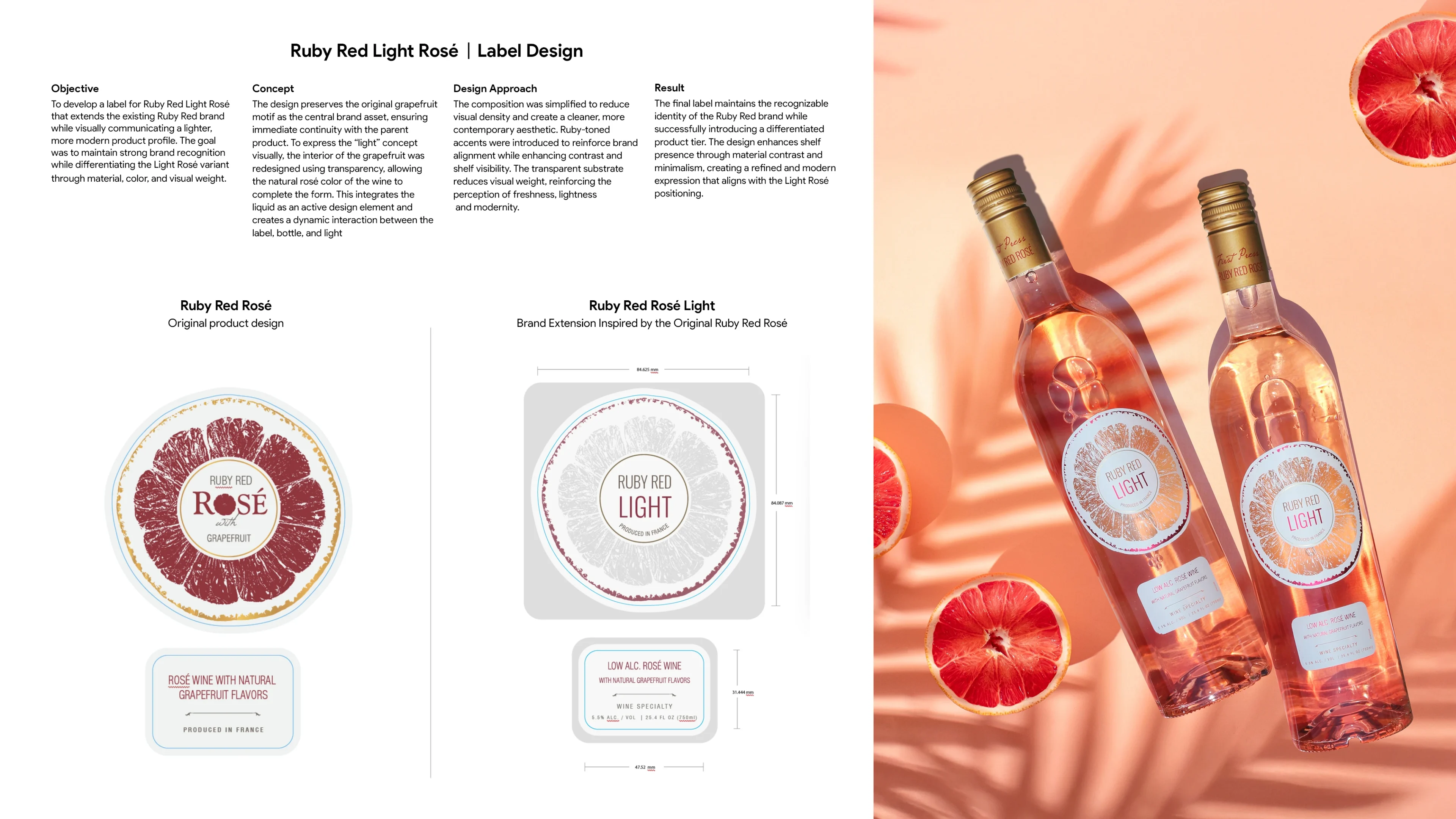
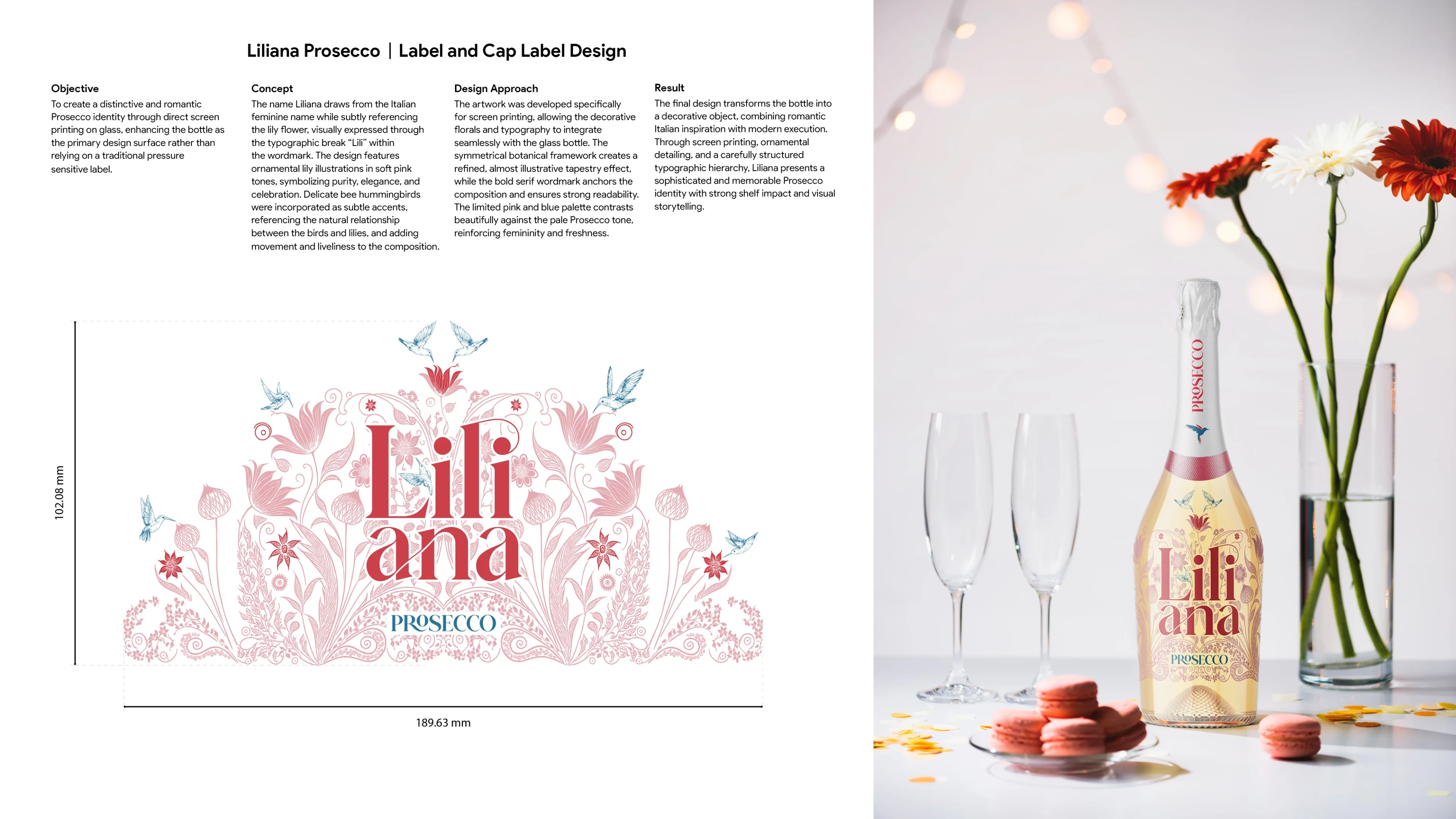
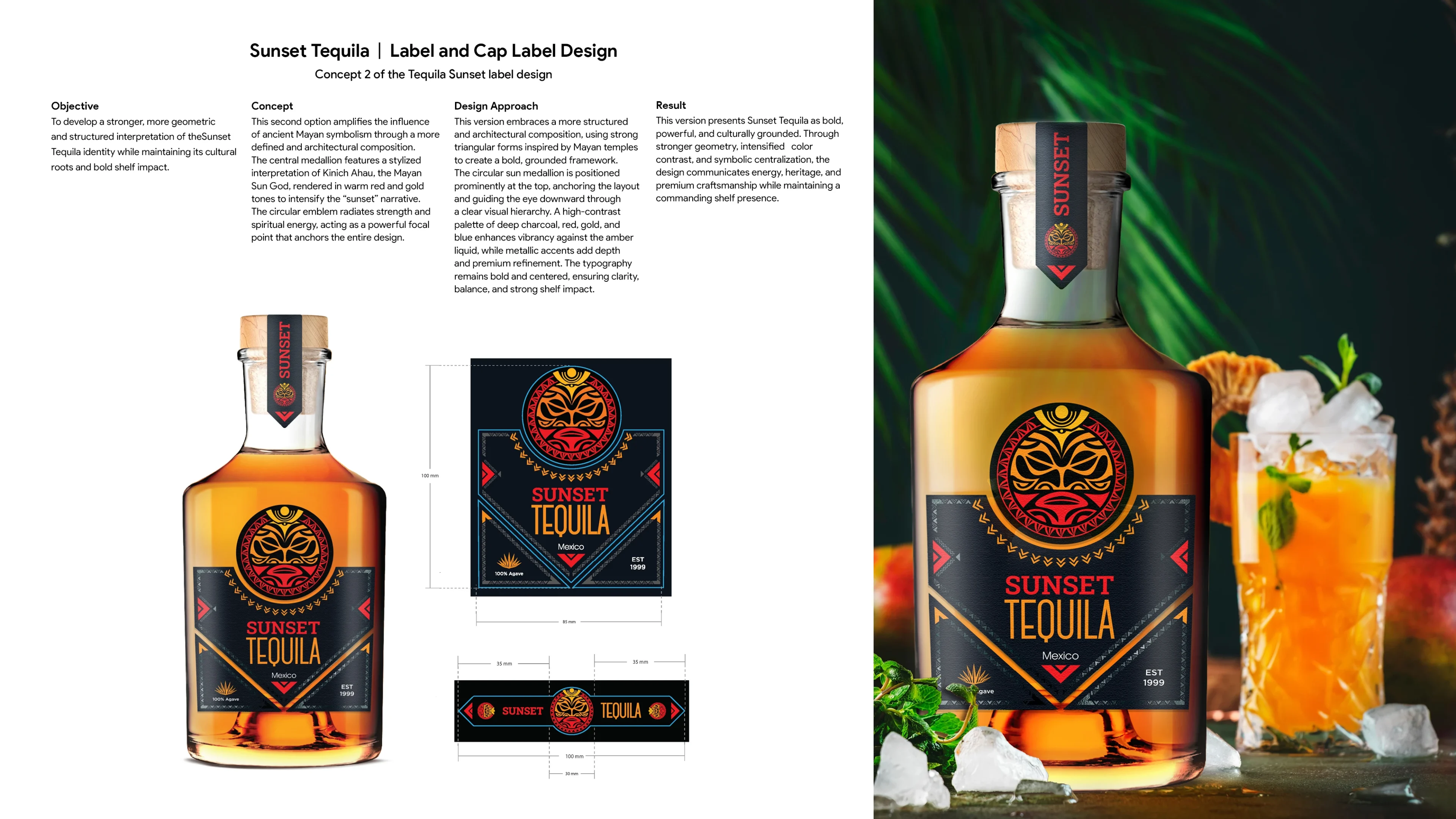
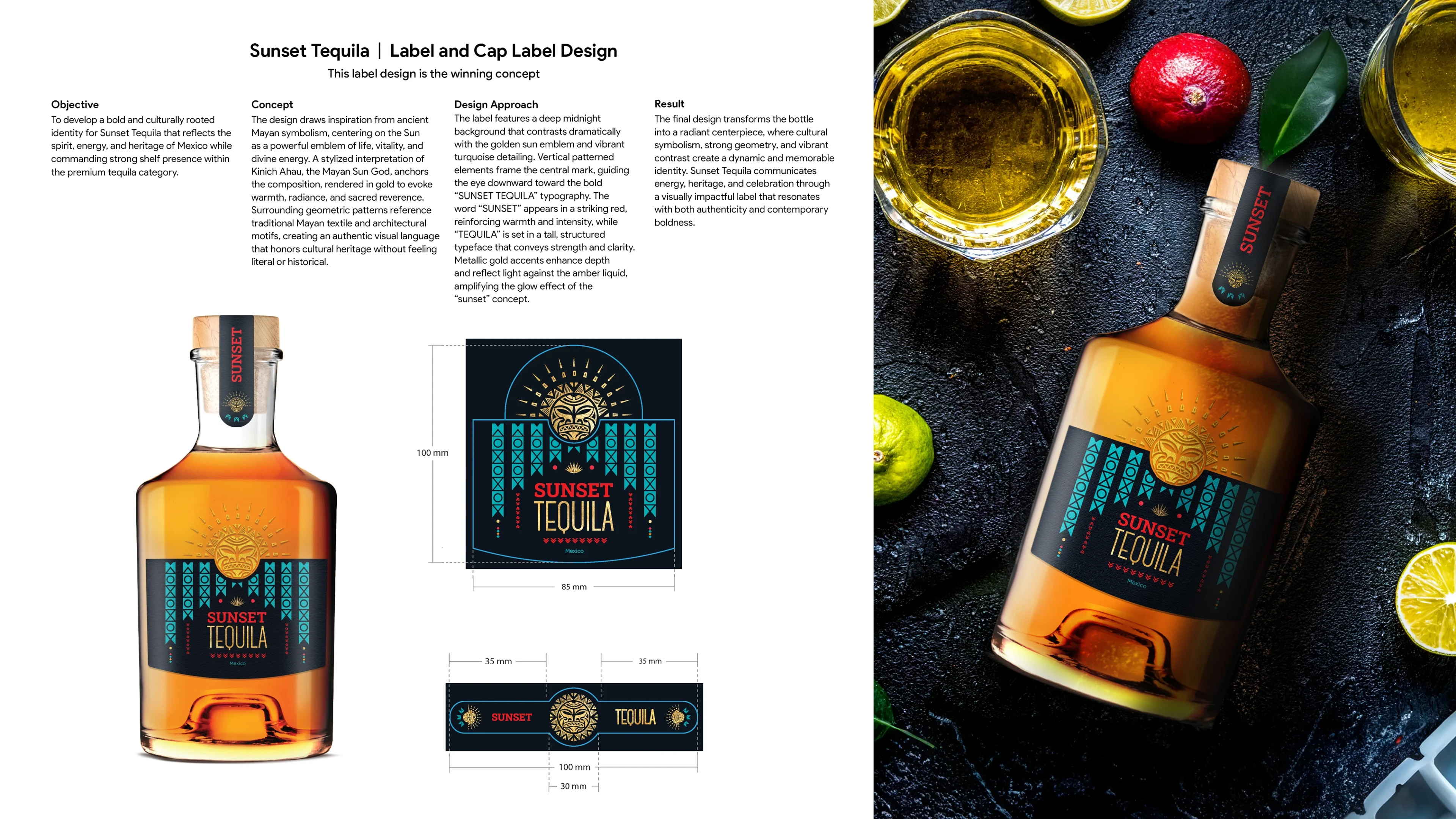
SCOPE | BESPOKE LABEL SYSTEMS
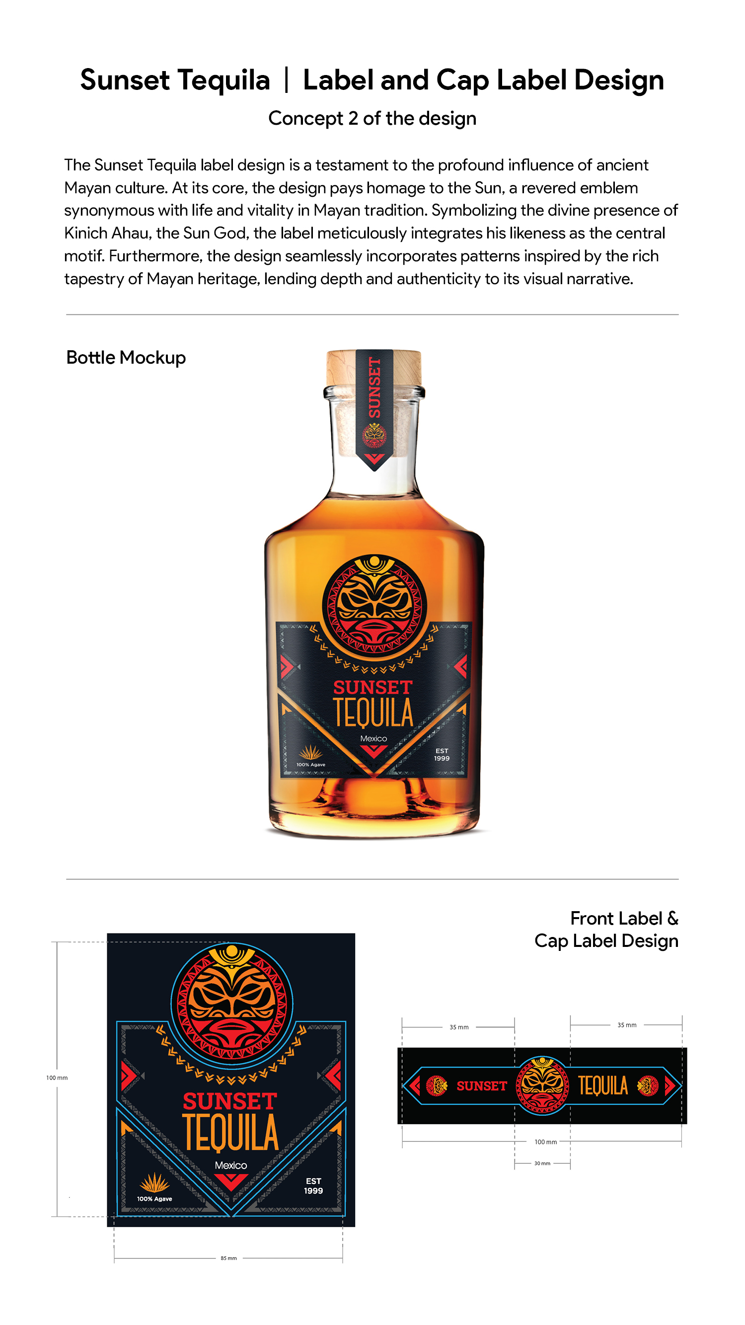
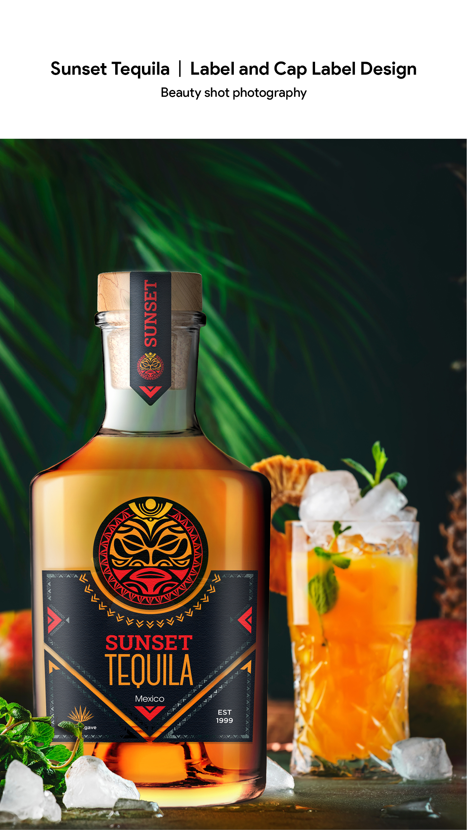
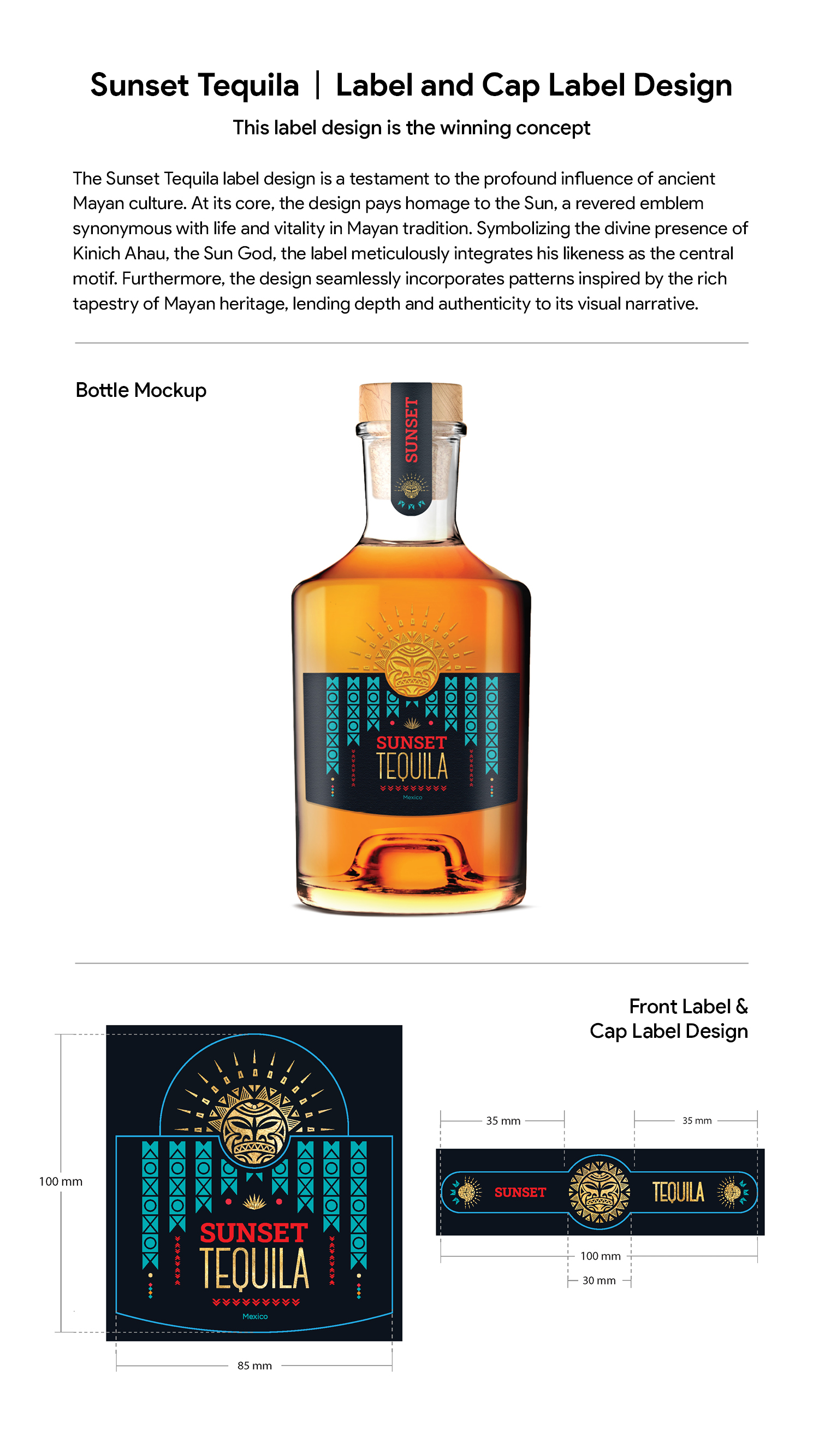
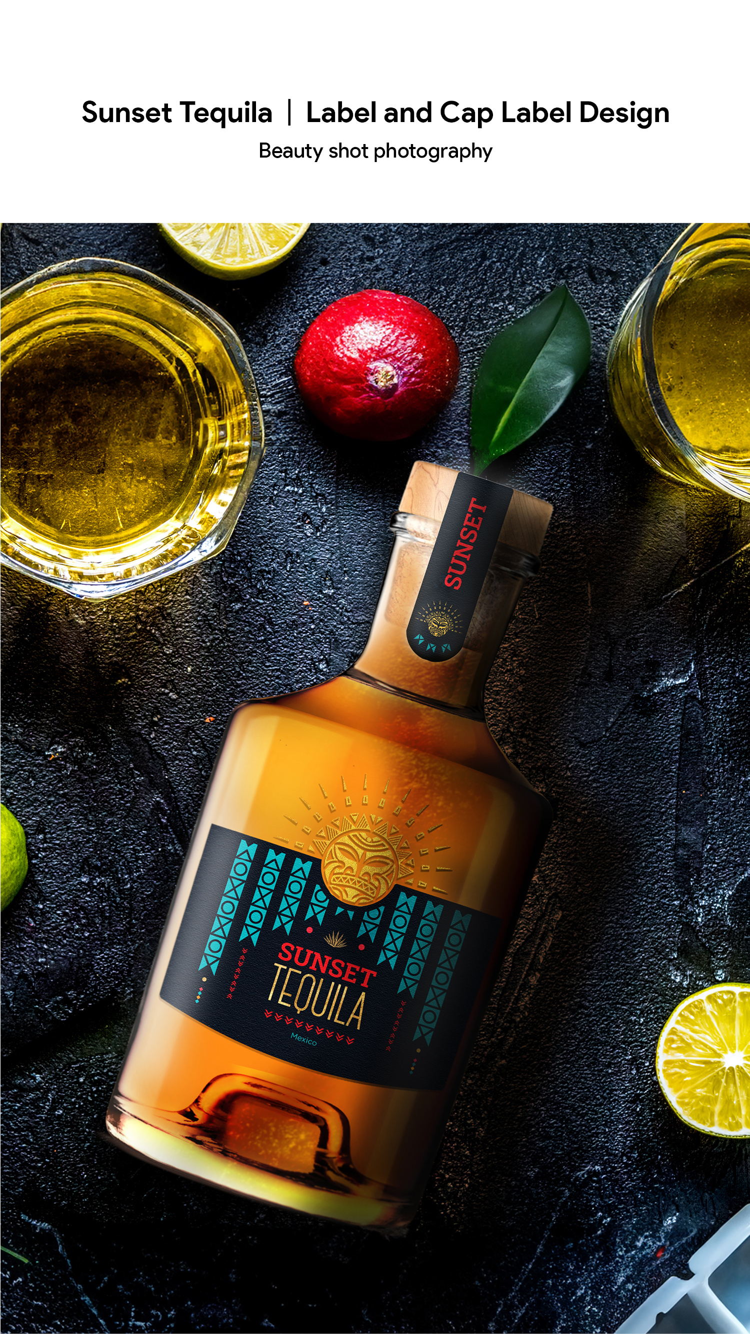
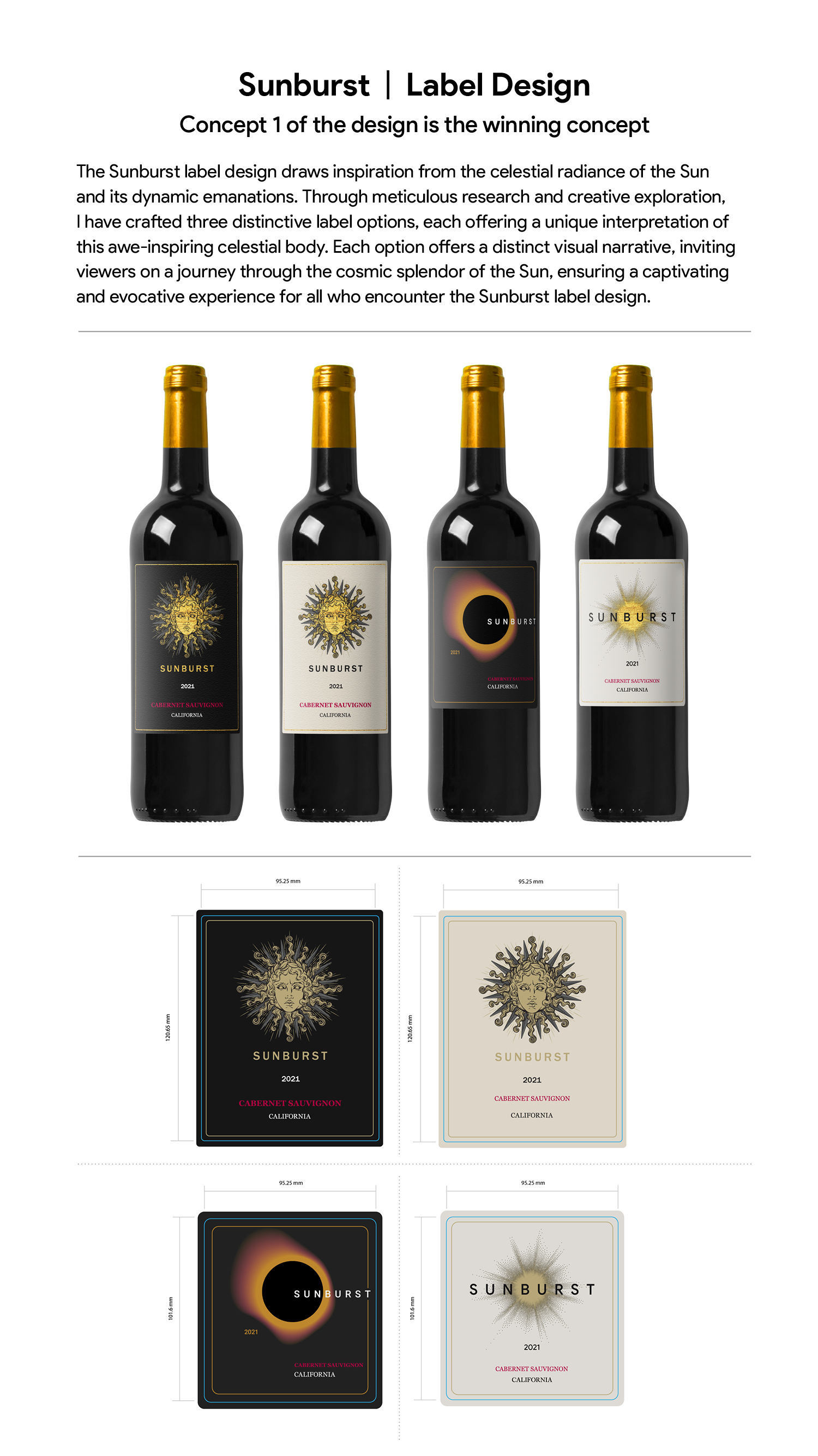
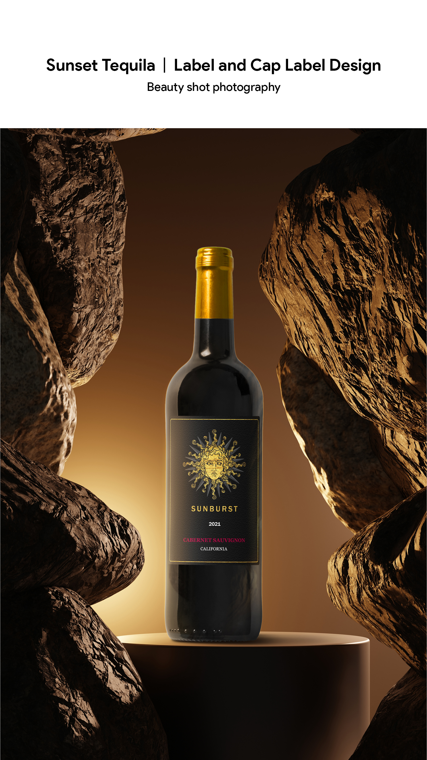
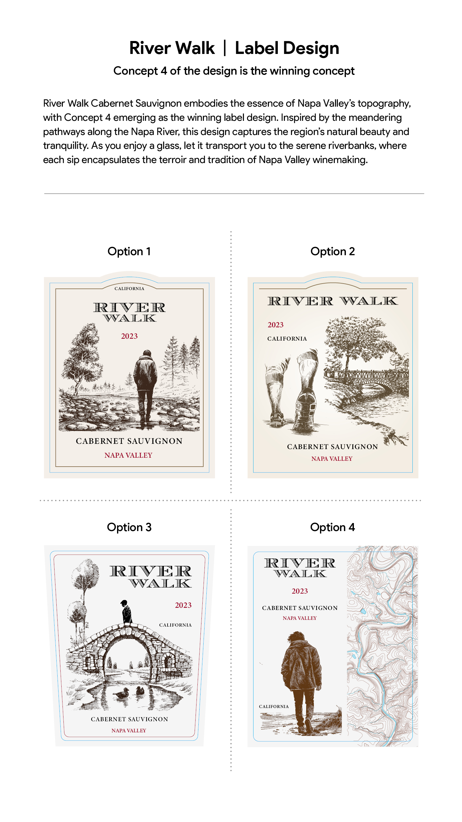
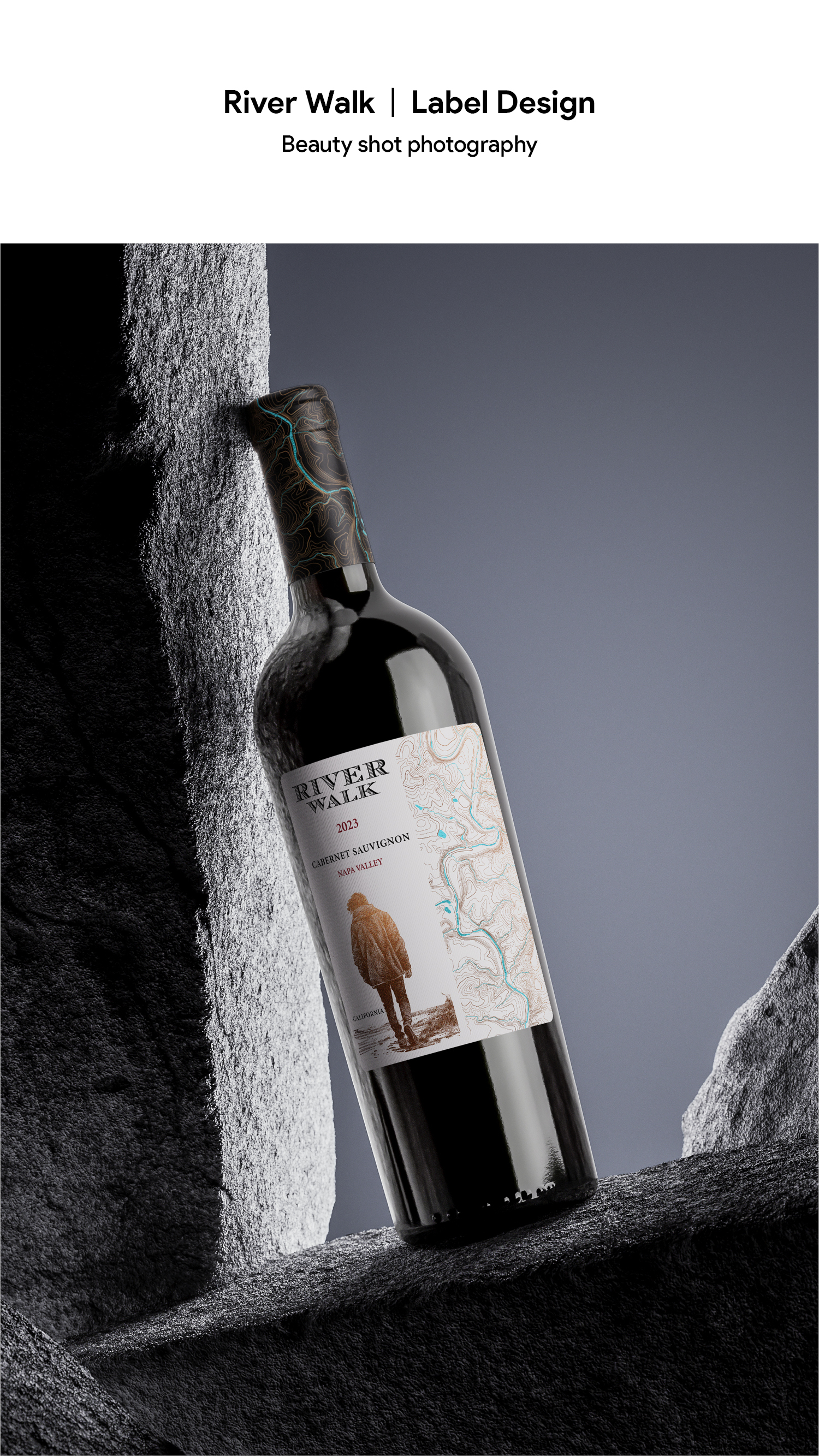
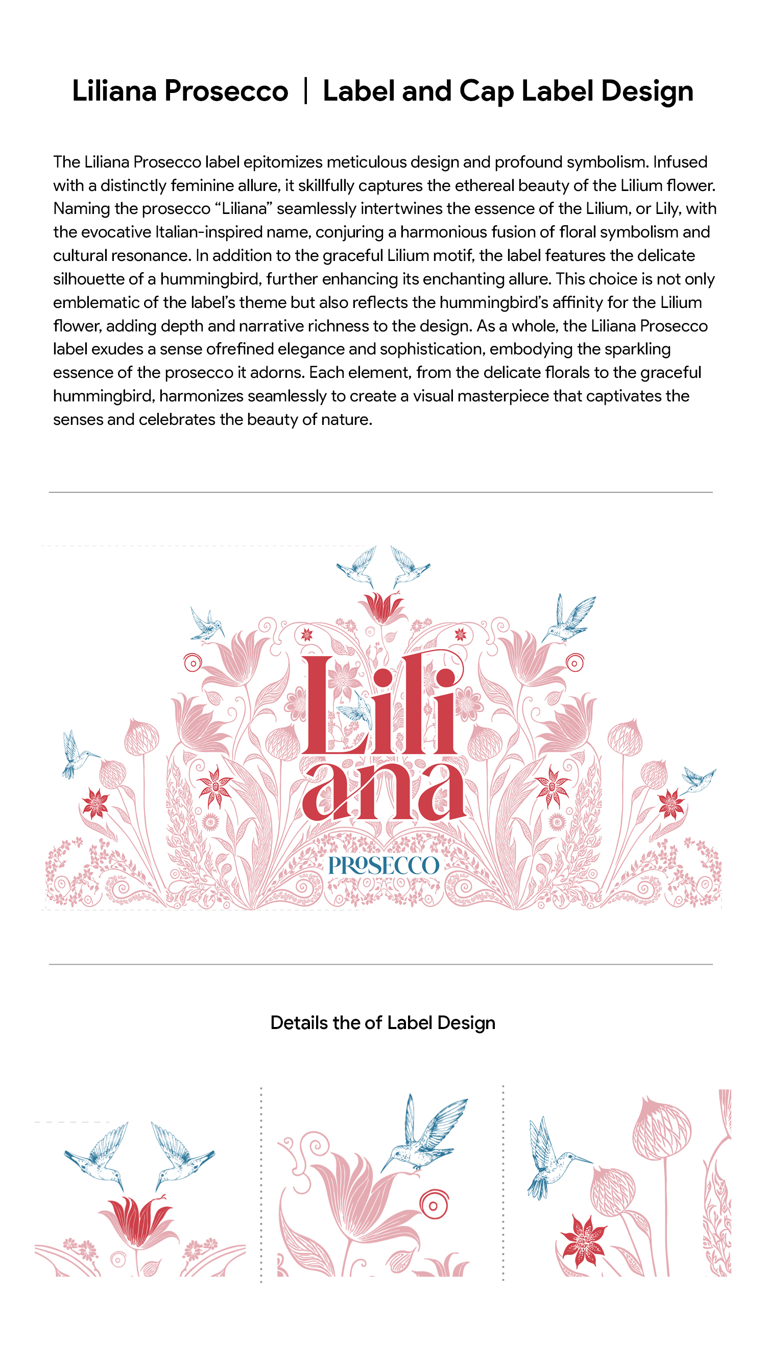
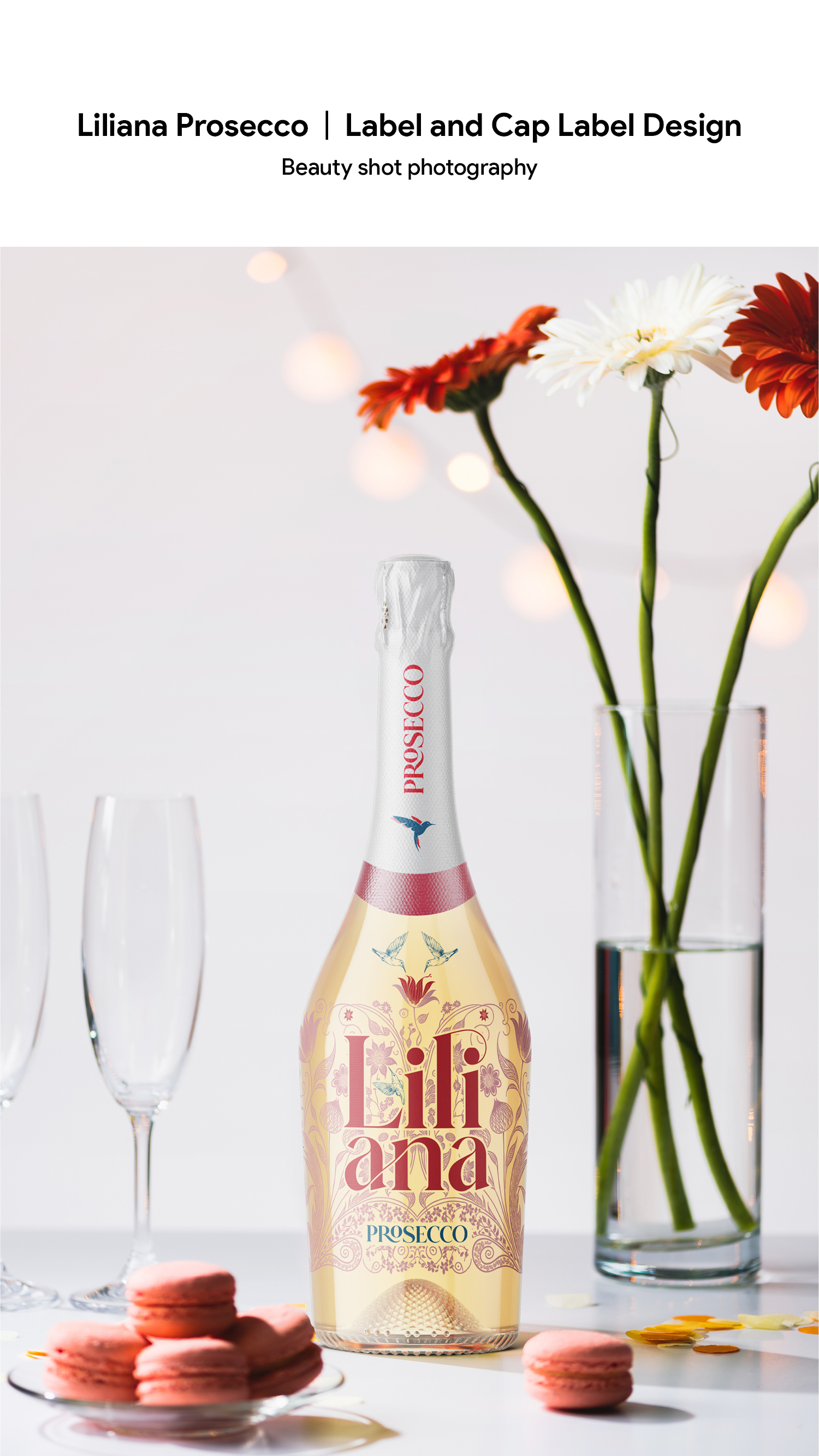
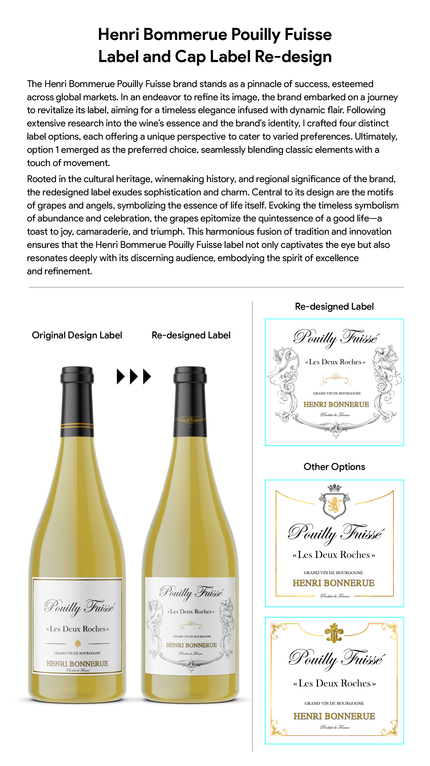
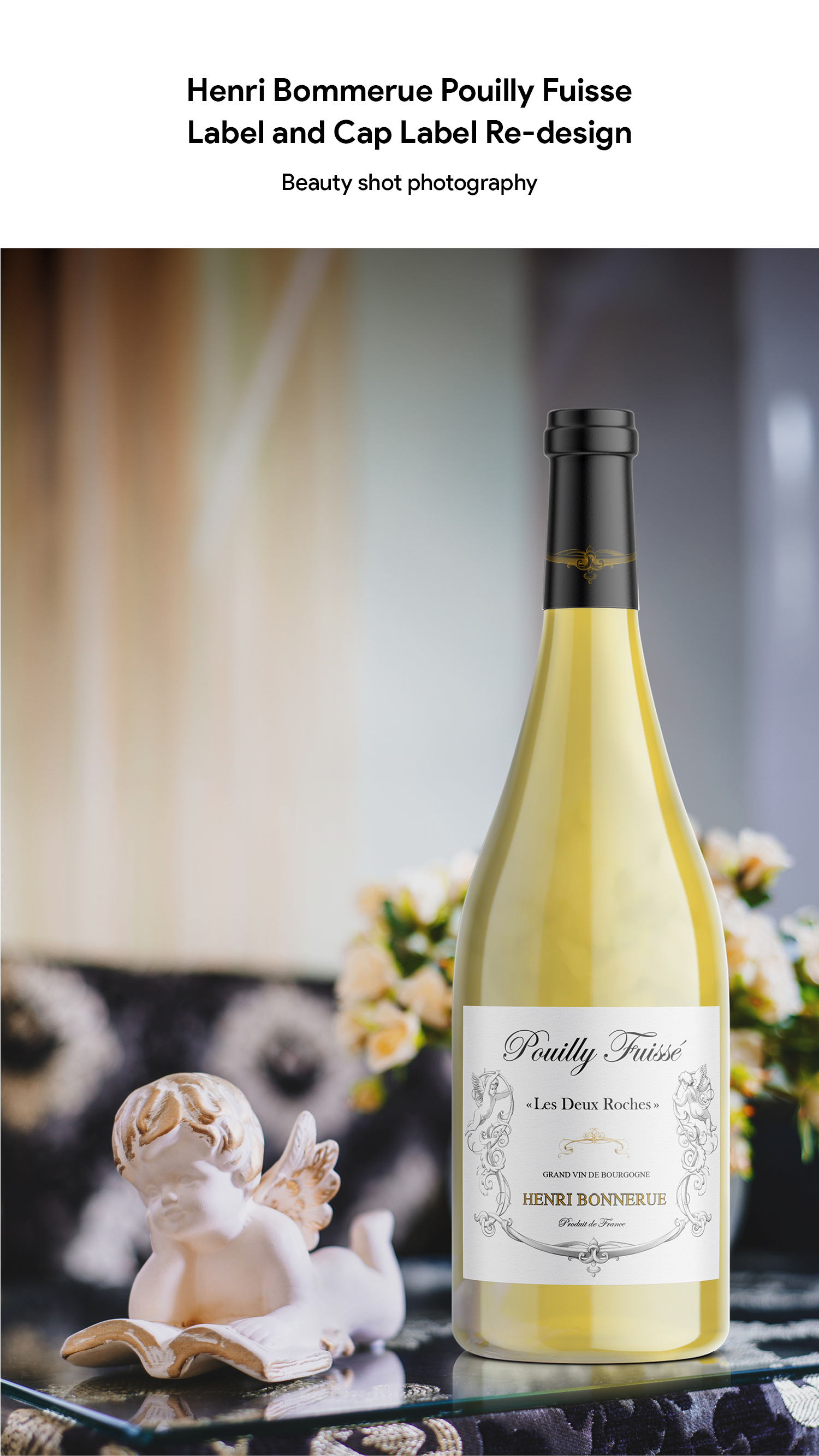
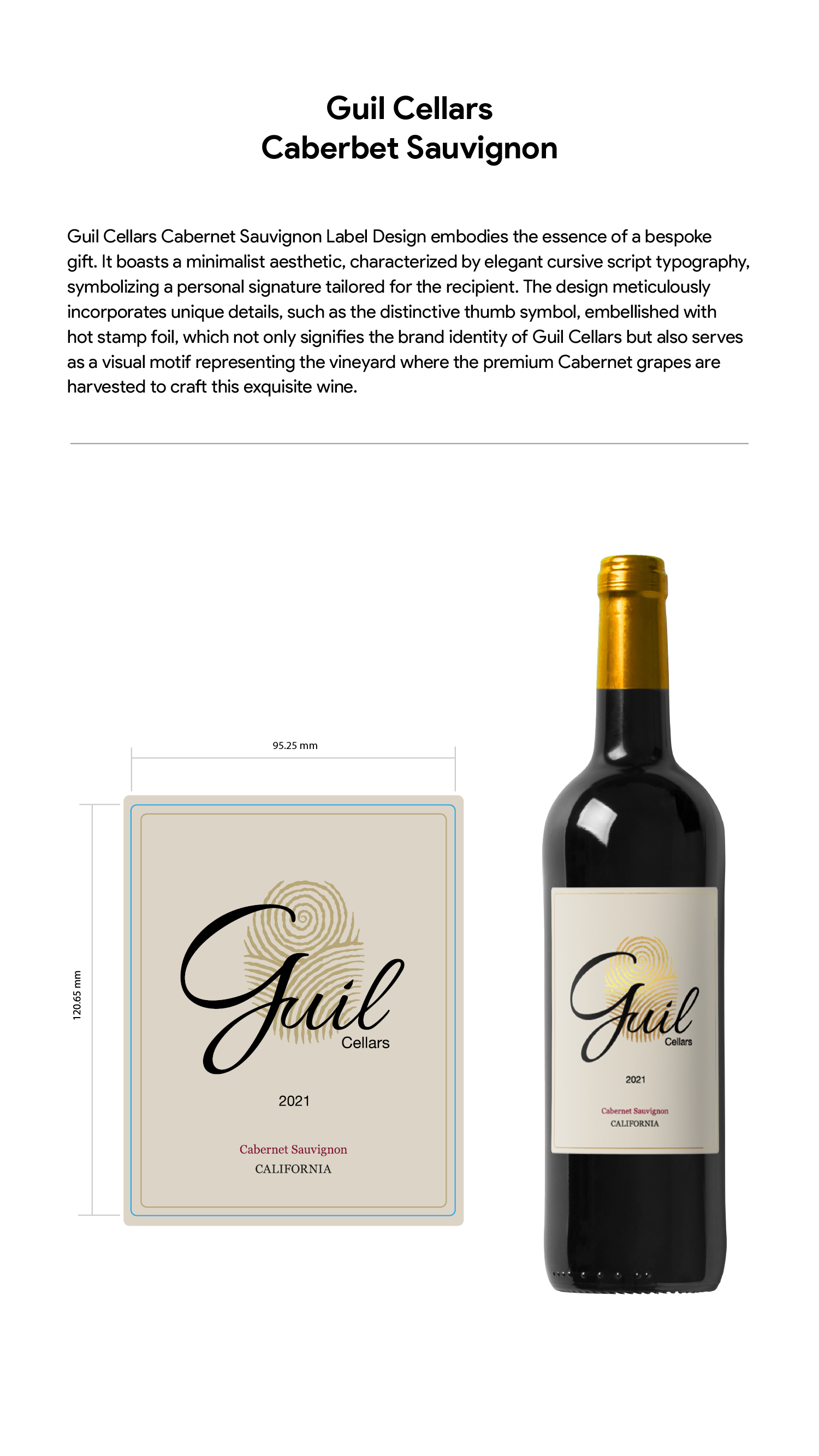
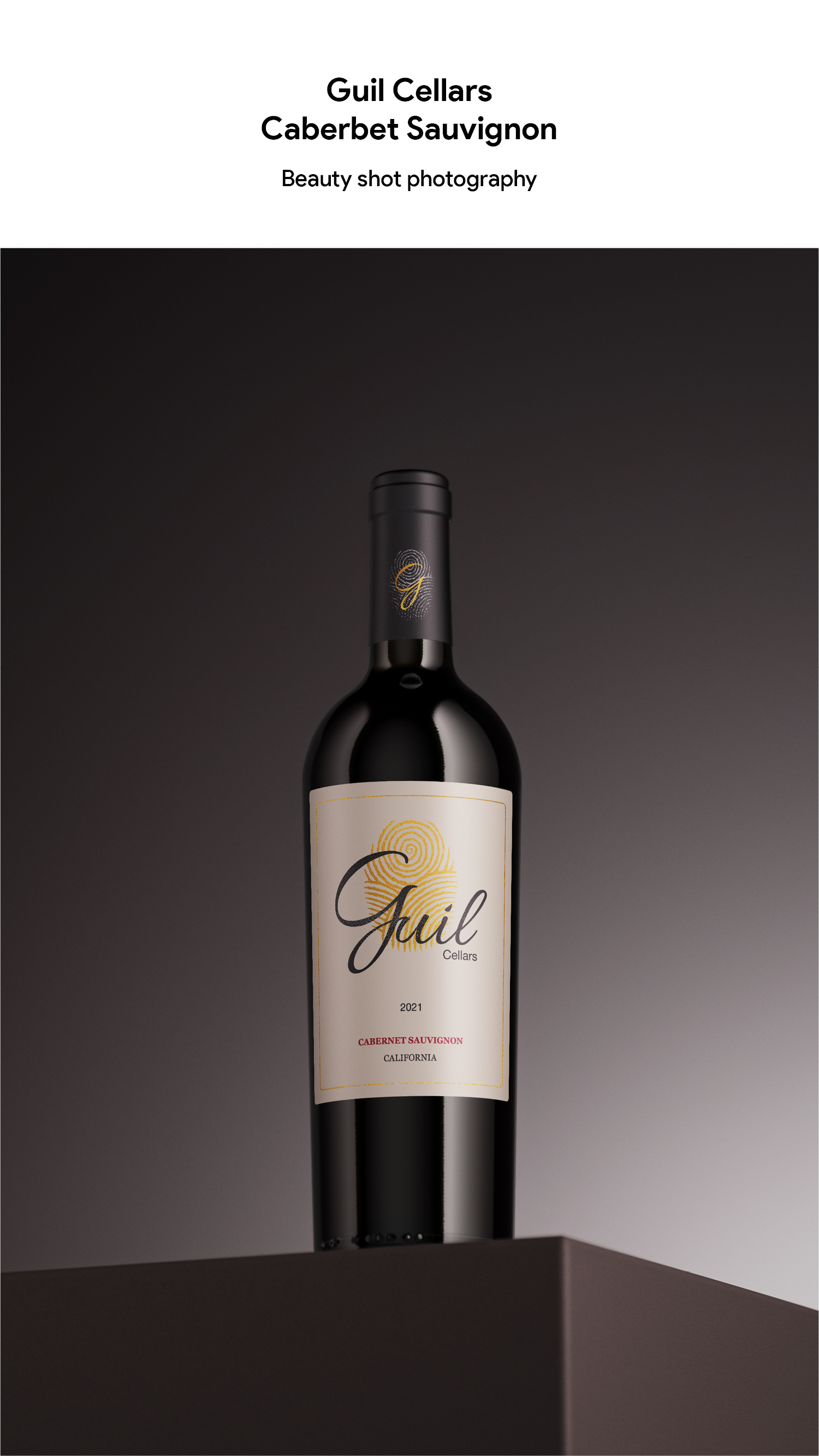
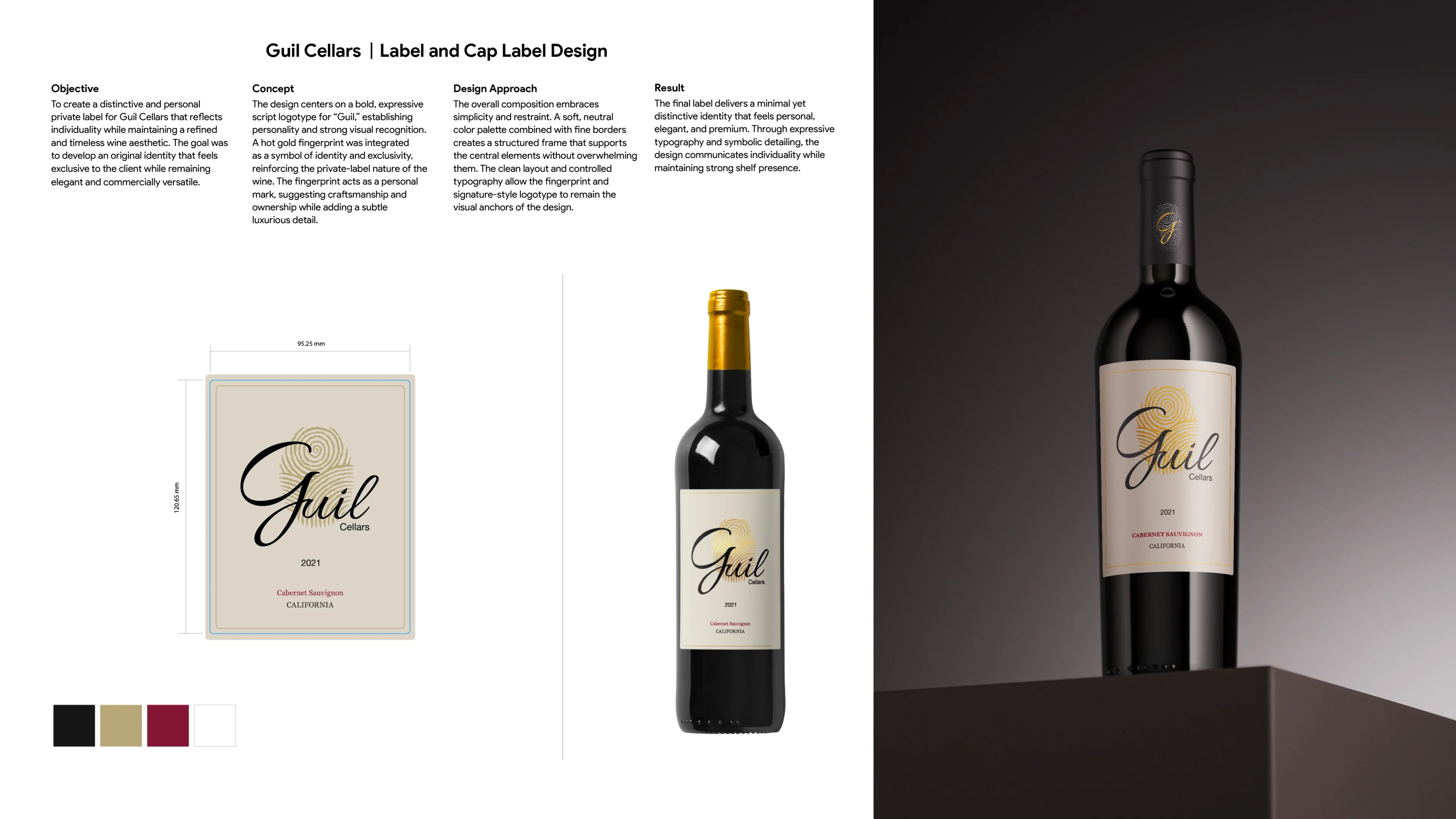
WINE & SPIRITS PACKAGING
TOOLS
Illustrator
07 · SELECTED WORKS
SCOPE | RETAIL MARKETING & COLLATERAL
EDITORIAL & PRINT SYSTEMS
OVERVIEW
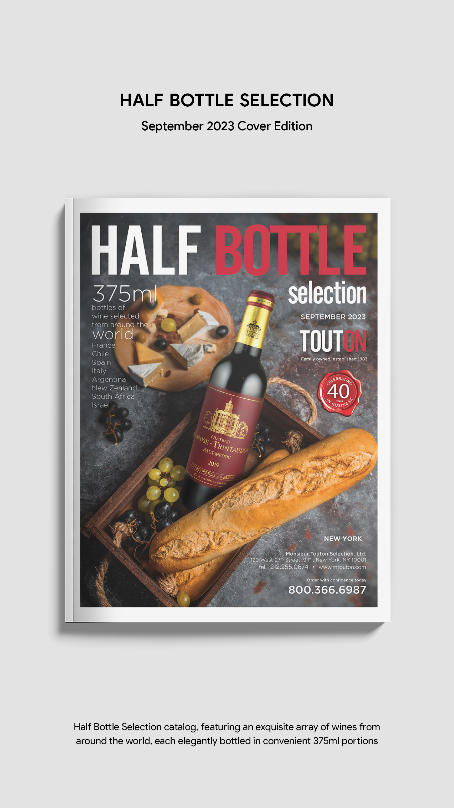
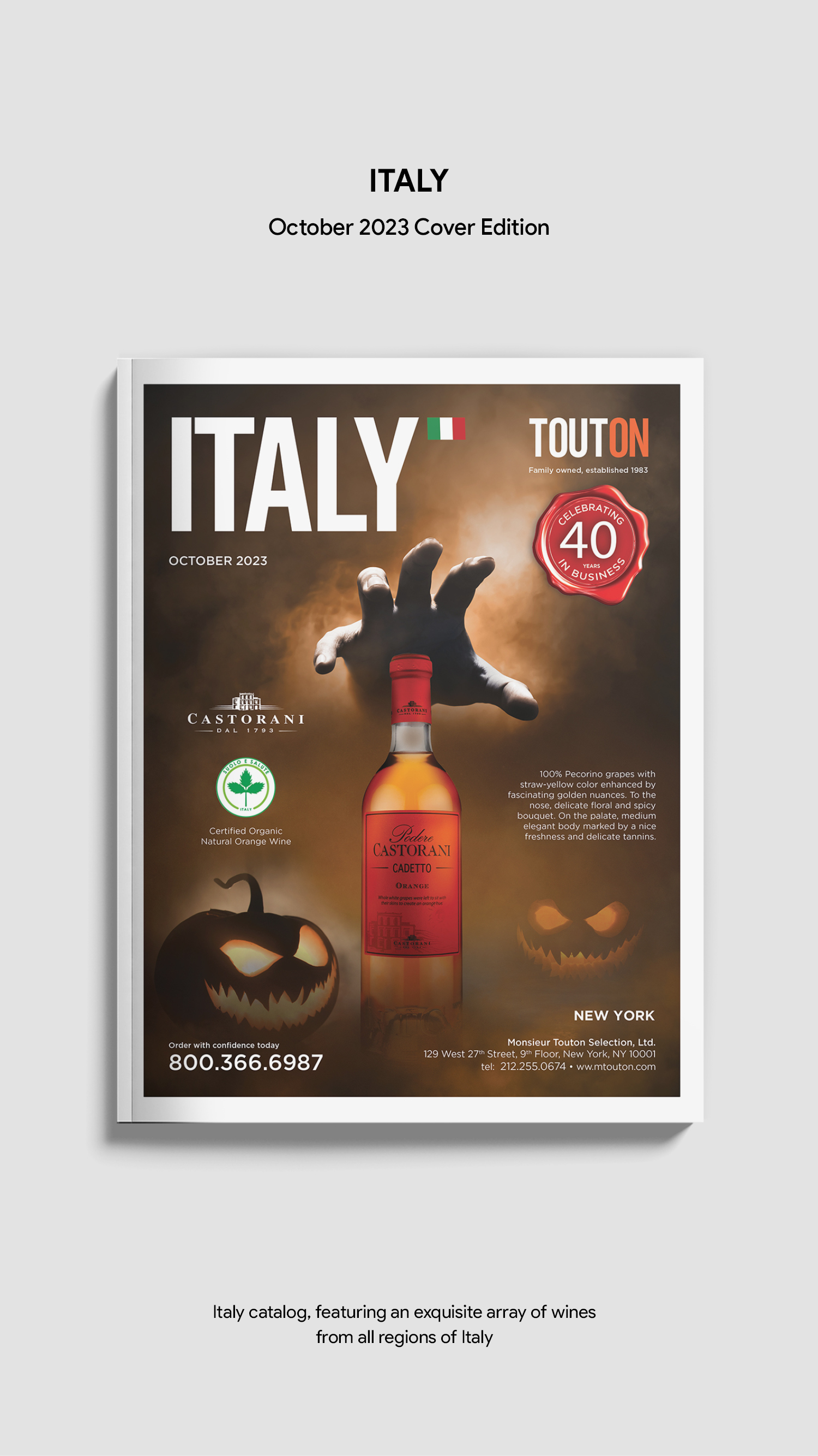
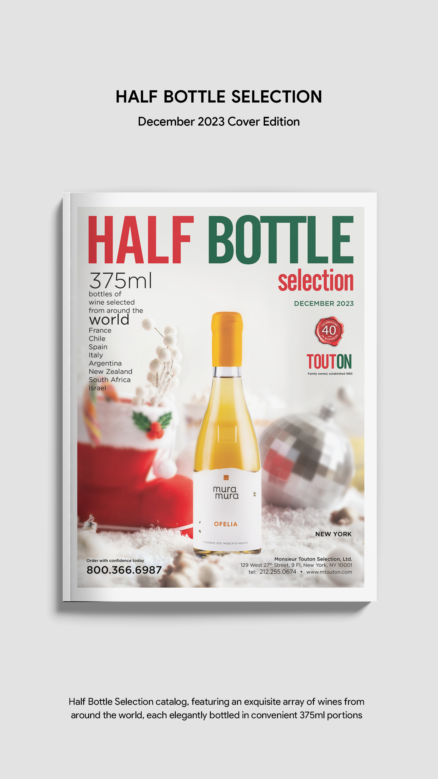
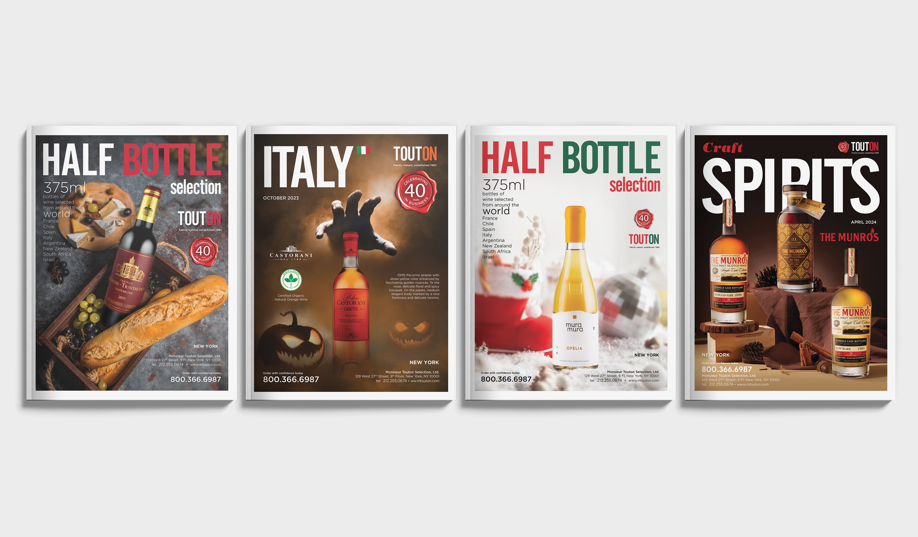
Conceptualized and developed a seasonal catalog cover system for a comprehensive wine and spirits portfolio, balancing absolute brand consistency with distinct campaign-driven visuals.
CHALLENGE
Each cover explores a narrative environment tailored to the unique product selection, translating seasonal themes into visually engaging, product-focused composition systems.
EXECUTION
Orchestrated and composed scenes using a hybrid approach of digital compositing and lifestyle photography. Established rigid typographic hierarchies and grid structures to ensure seamless continuity across editions, leveraging curated color palettes and atmospheric lighting to differentiate each release.
Read More
Half Bottle Selection A lifestyle-focused layout highlighting 375ml product variants alongside balanced food pairings, emphasizing versatility and curated everyday consumption
Italy Edition A thematic layout system created as a core component of a seasonal marketing activation, seamlessly blending traditional heritage with narrative-driven visual storytelling.
Holiday Half Bottle Edition A festive, atmospheric composition designed to evoke celebration and premium gifting moments, reinforcing market interest in smaller packaging formats.
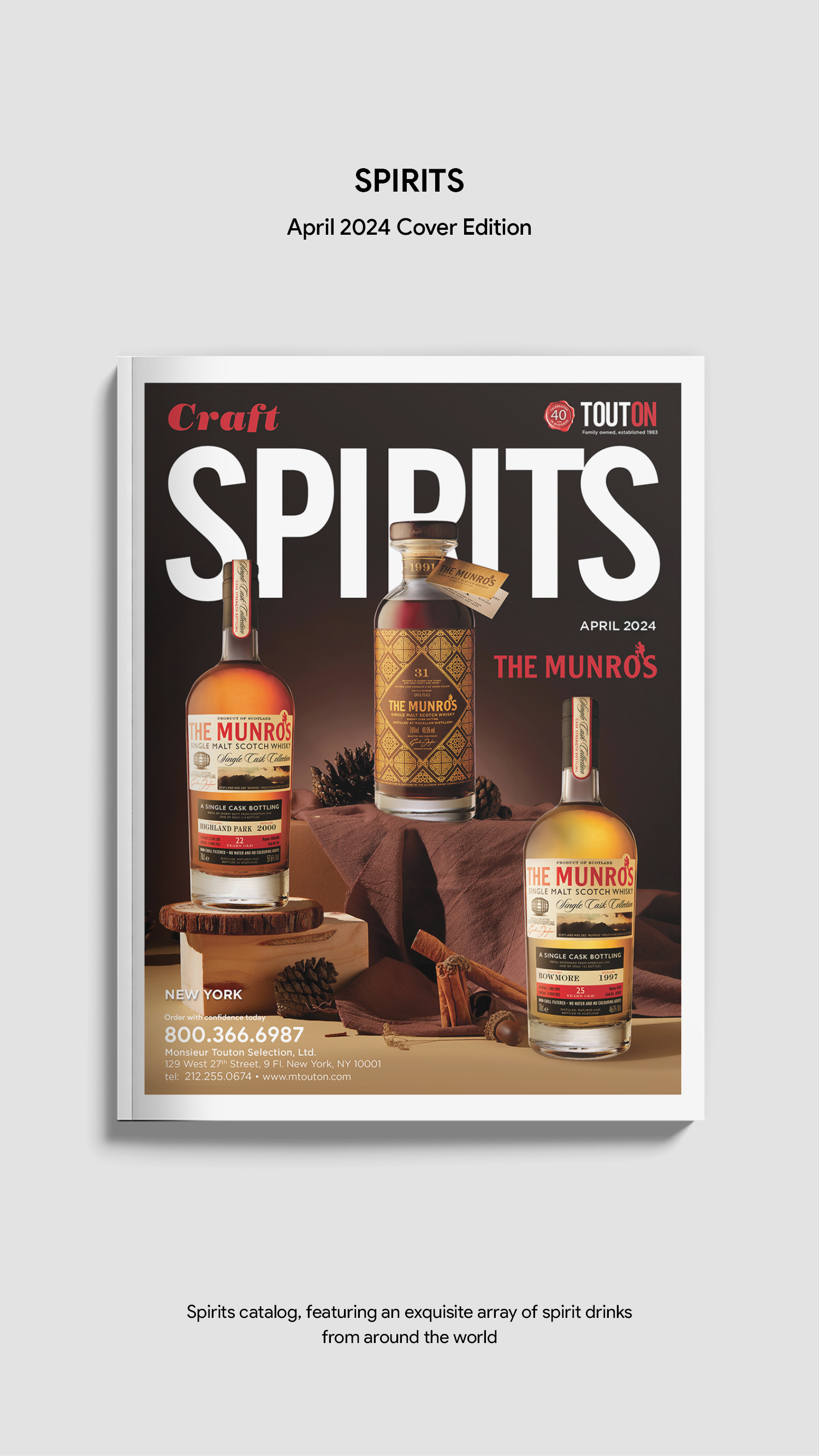
Craft Spirits Edition A refined, warm studio composition utilizing highly textured surfaces and moody, directional lighting to showcase product craftsmanship and ultra-premium brand character.
OUTCOME
Delivered a scalable visual system that enhances product shelf visibility, strengthens brand equity, and systematically supports multi-channel marketing initiatives.
TOOLS
InDesign · Photoshop
08 · SELECTED WORKS
SCOPE | RETAIL MARKETING & COLLATERAL
B2B PUBLICATION SYSTEMS
OVERVIEW
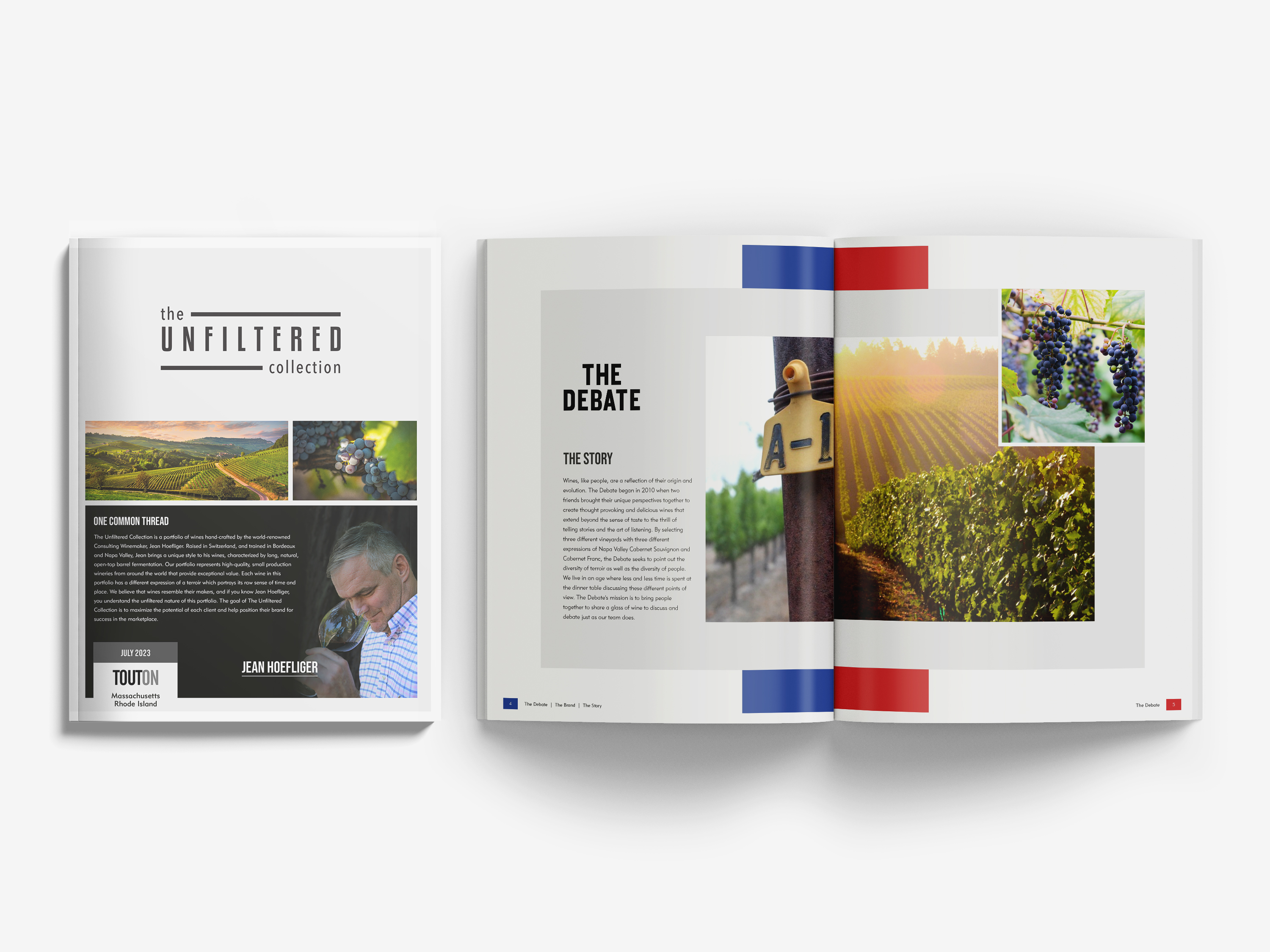
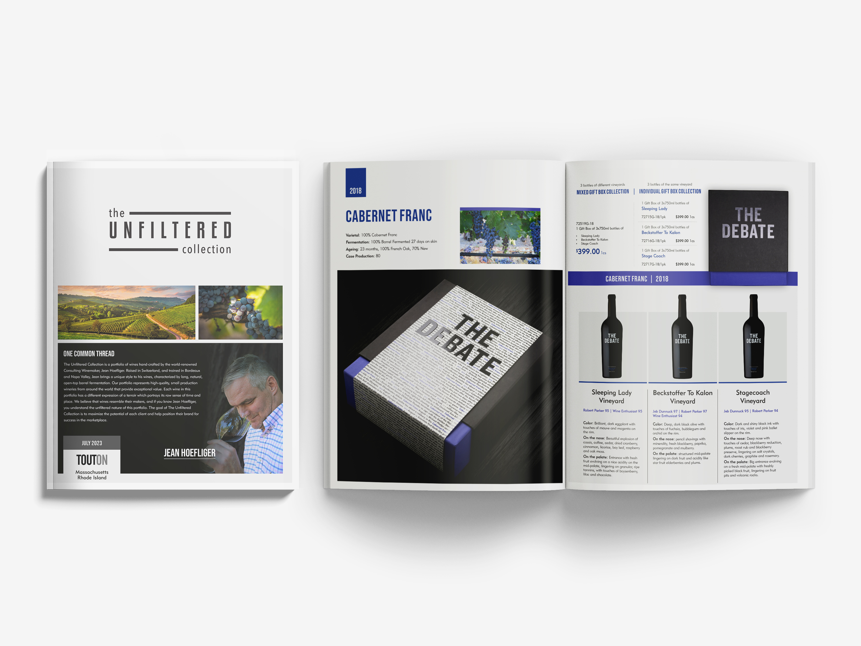
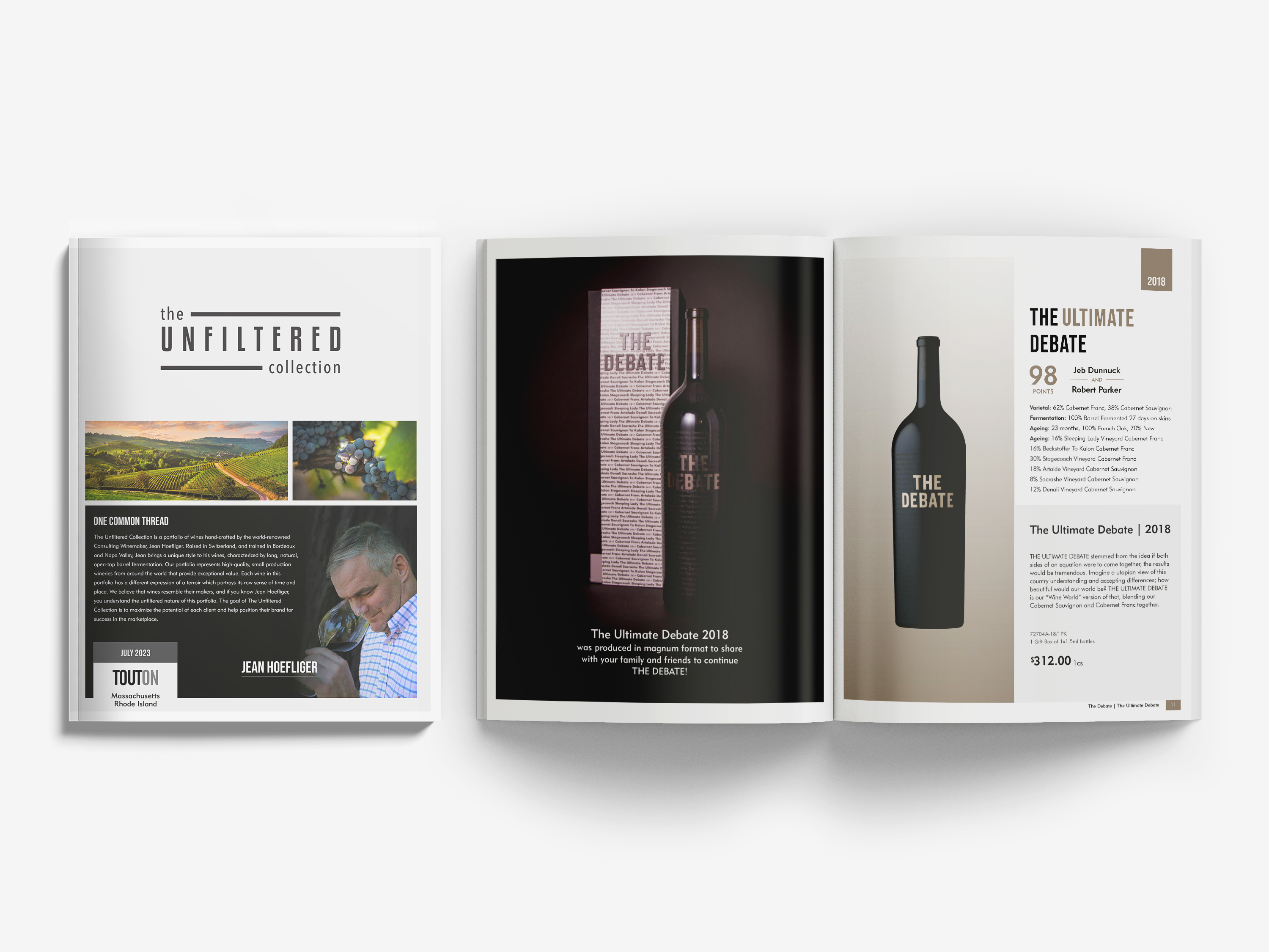
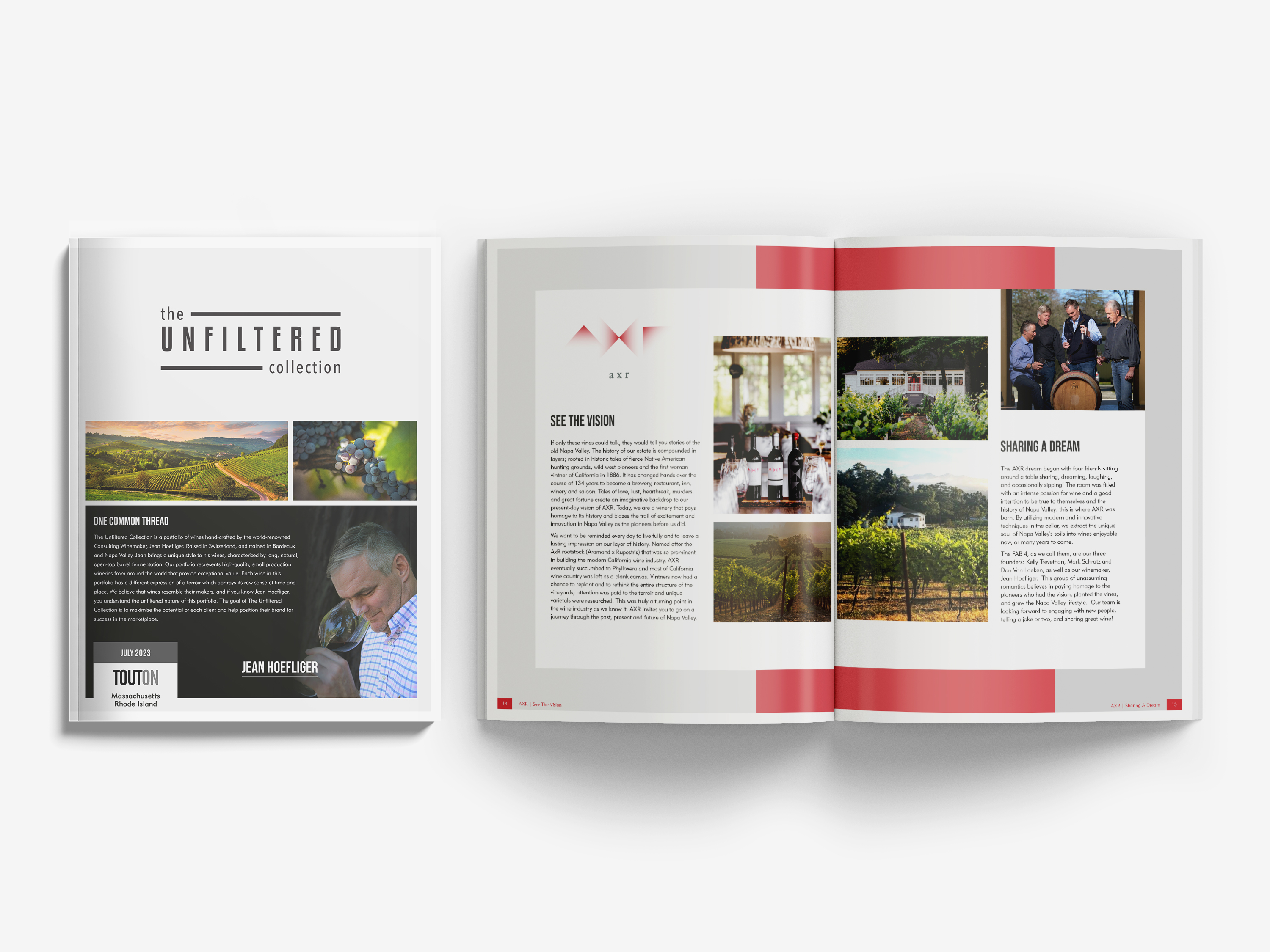
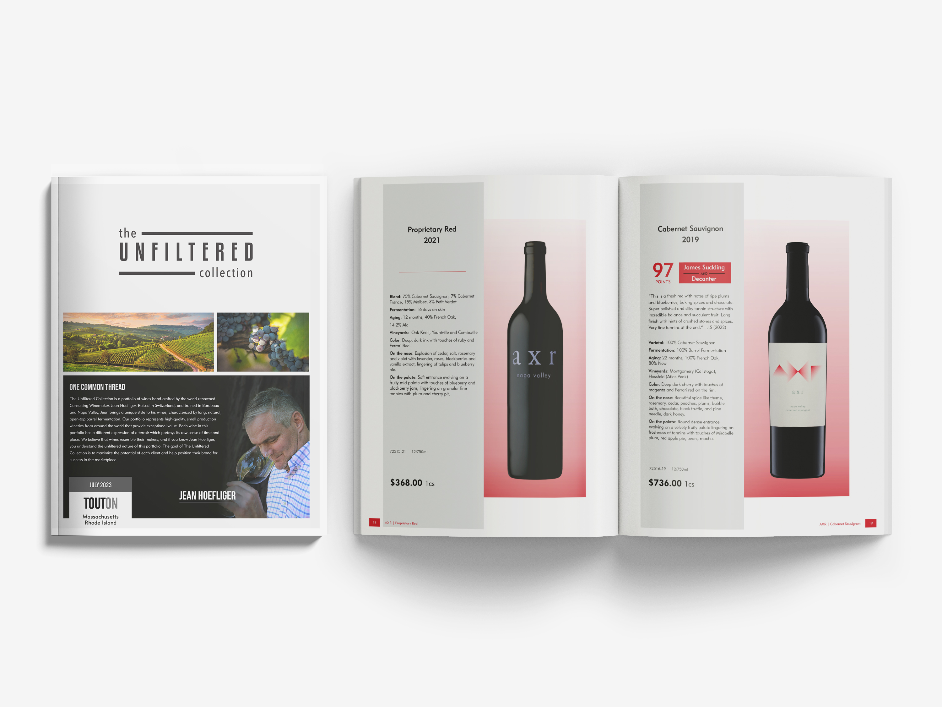
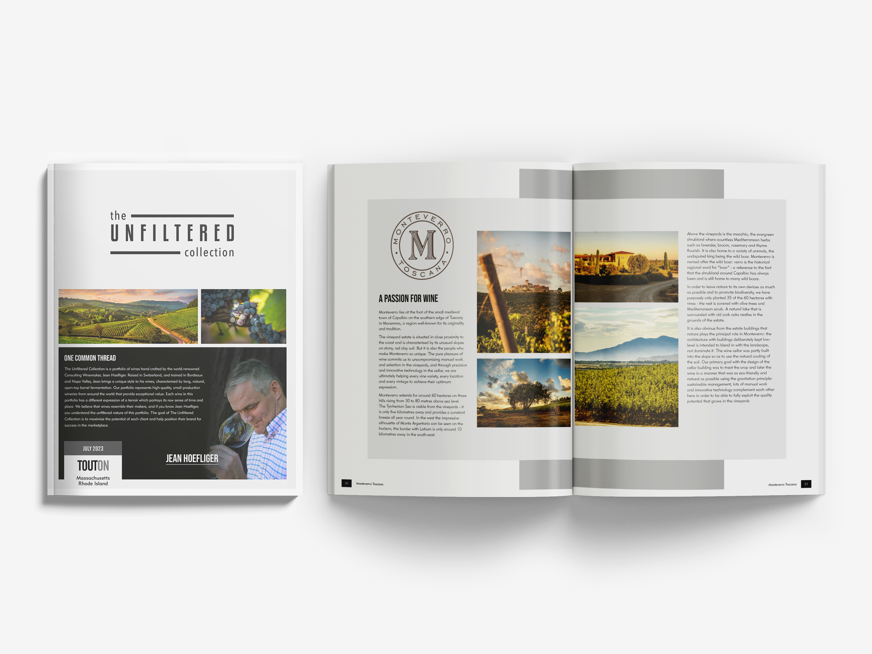
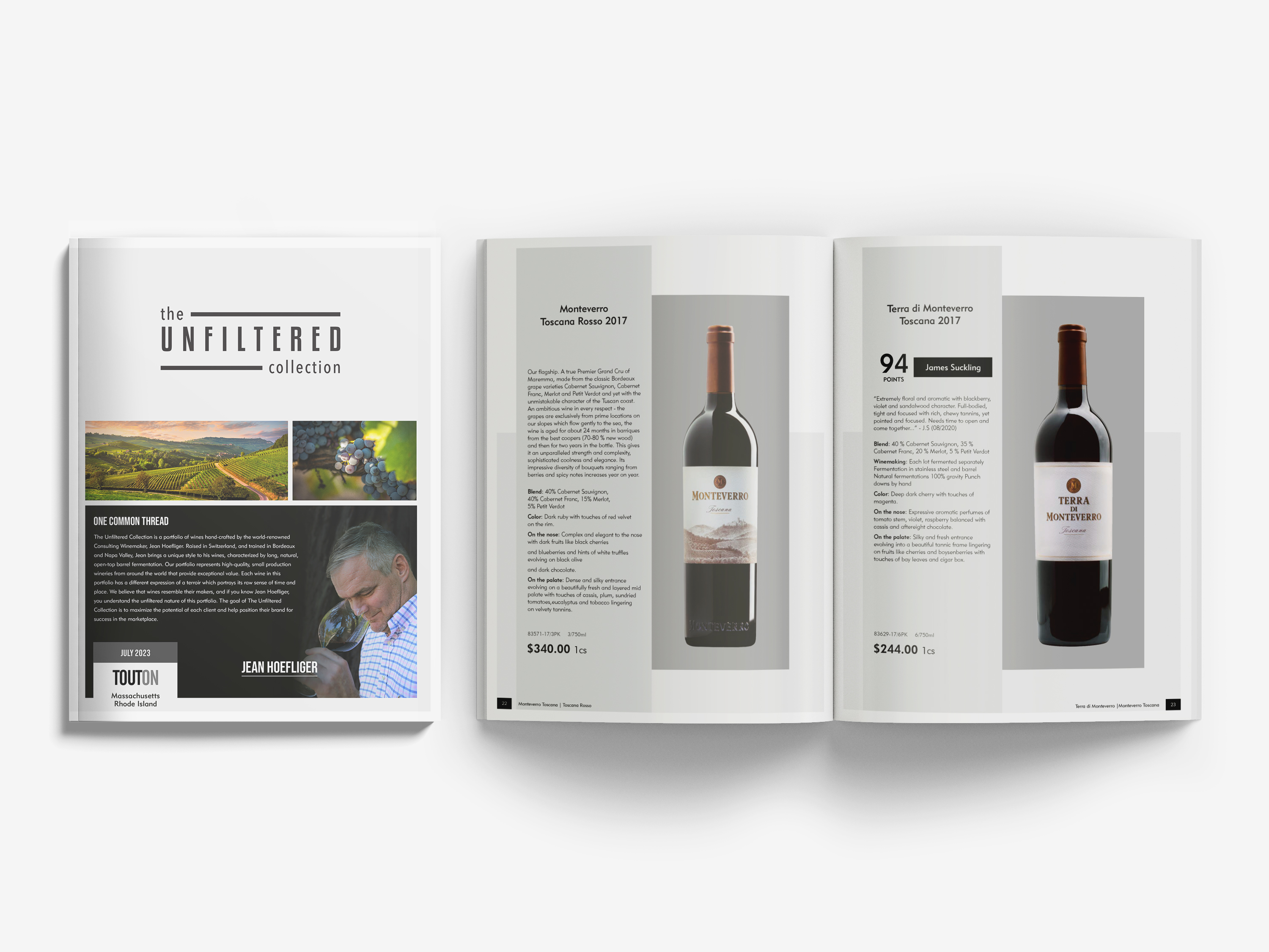
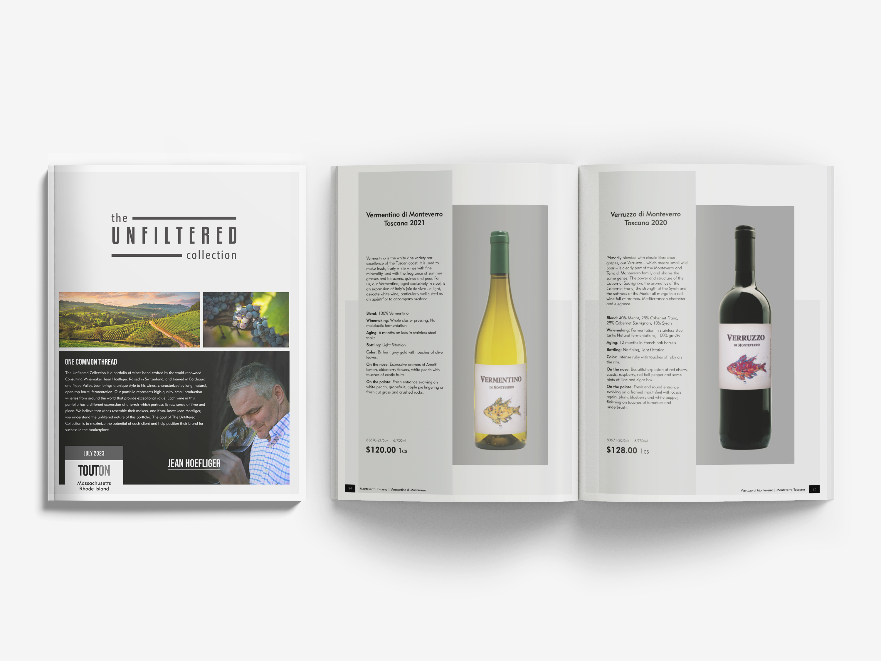
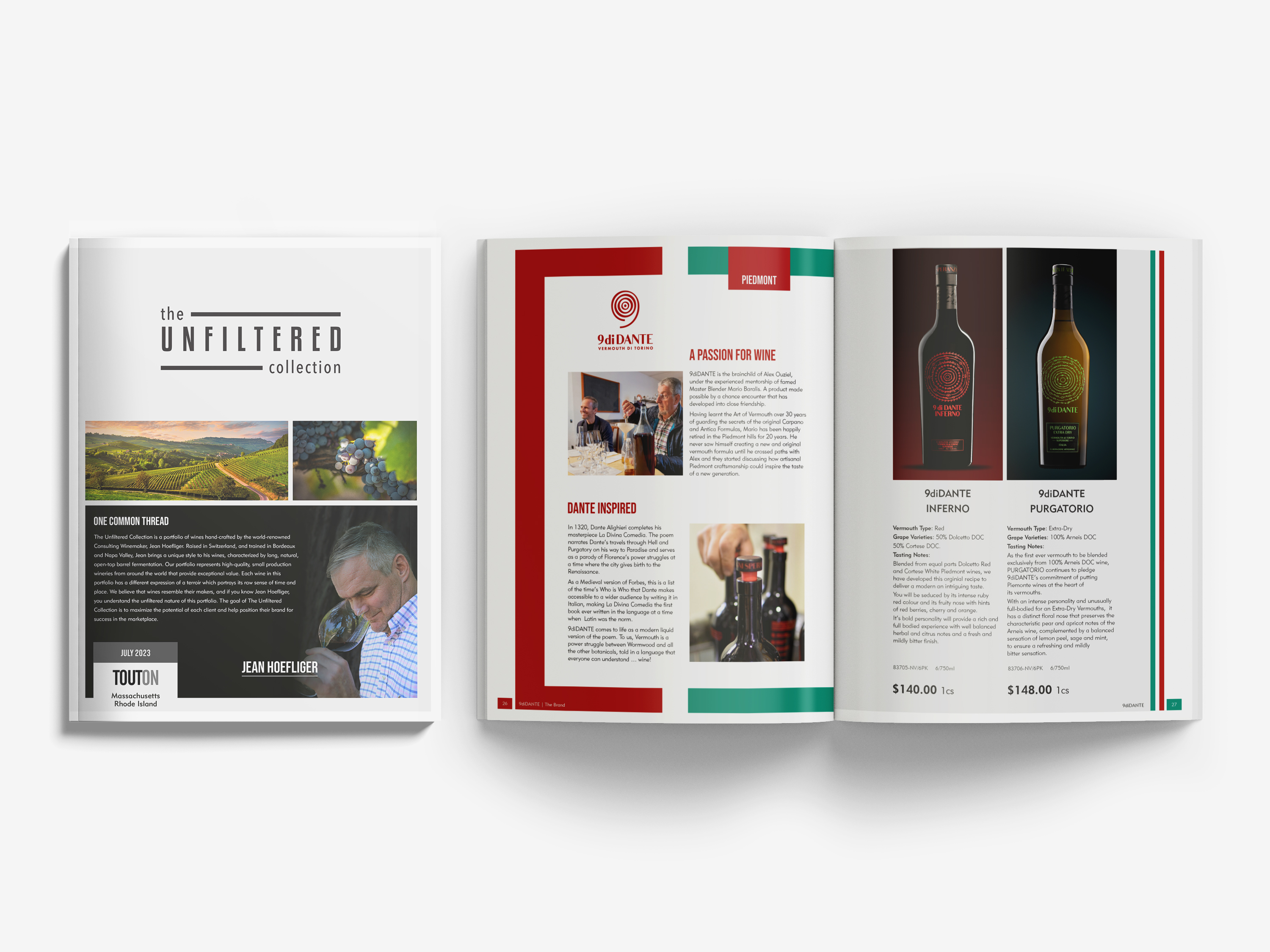
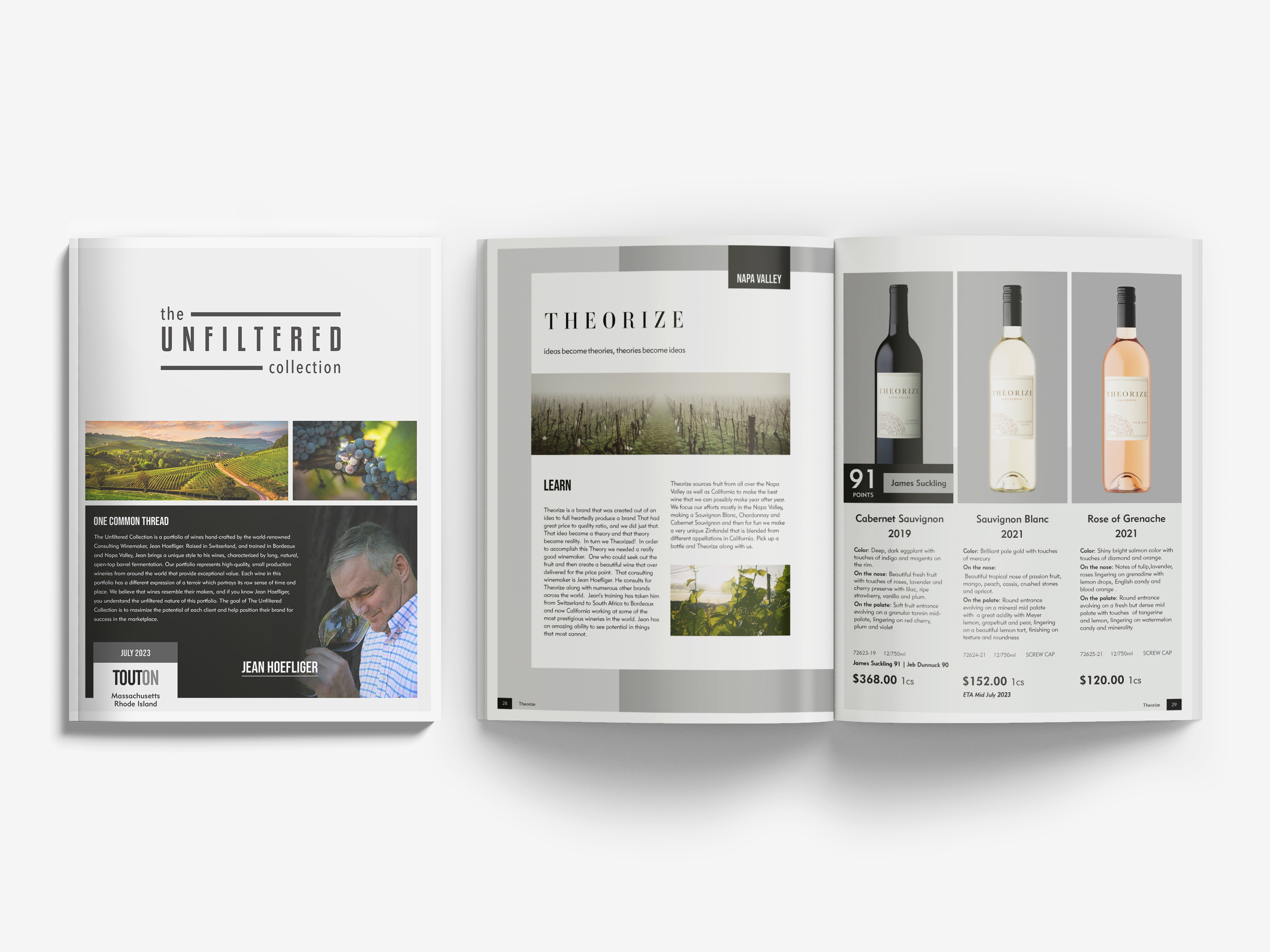
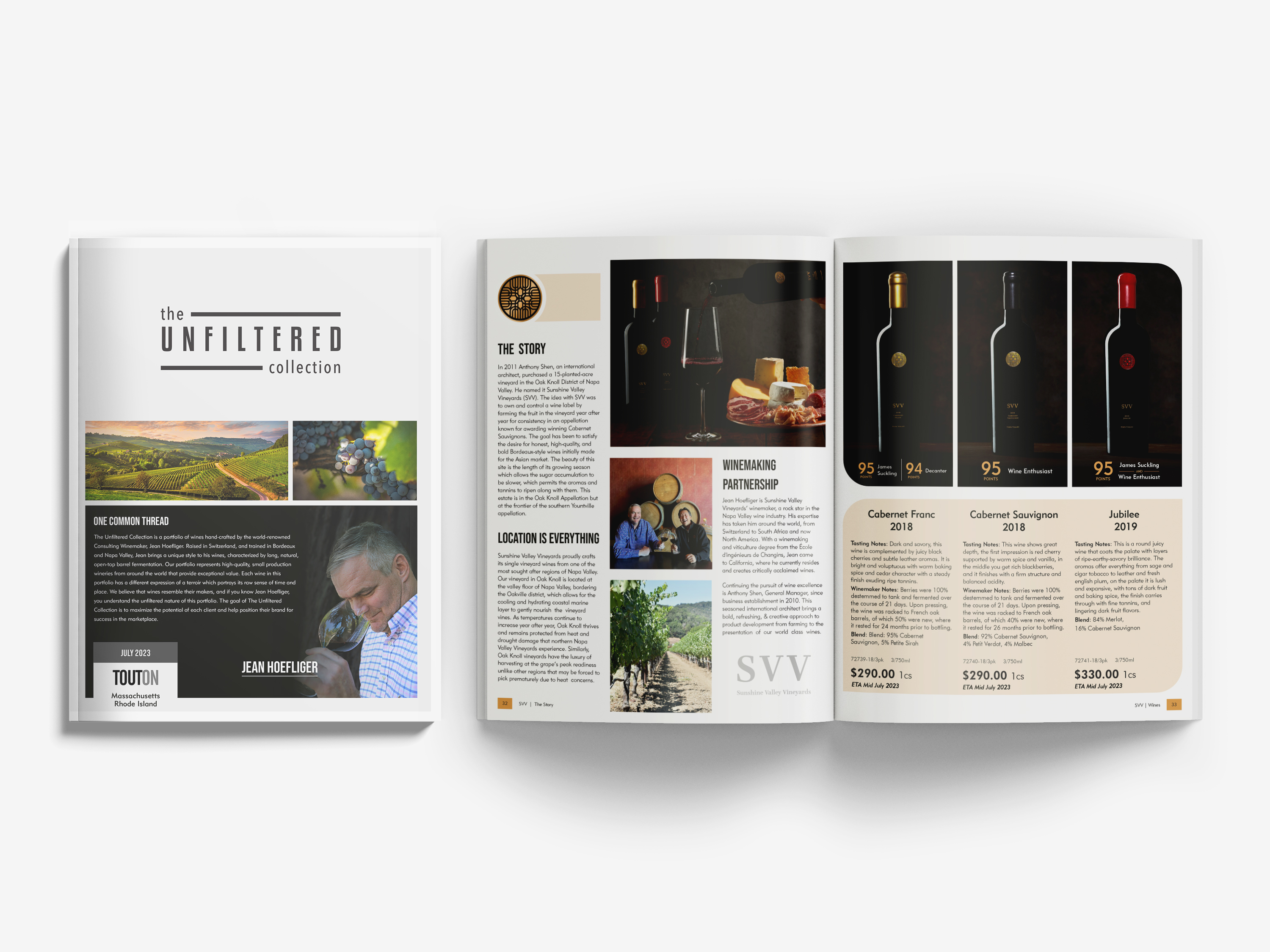
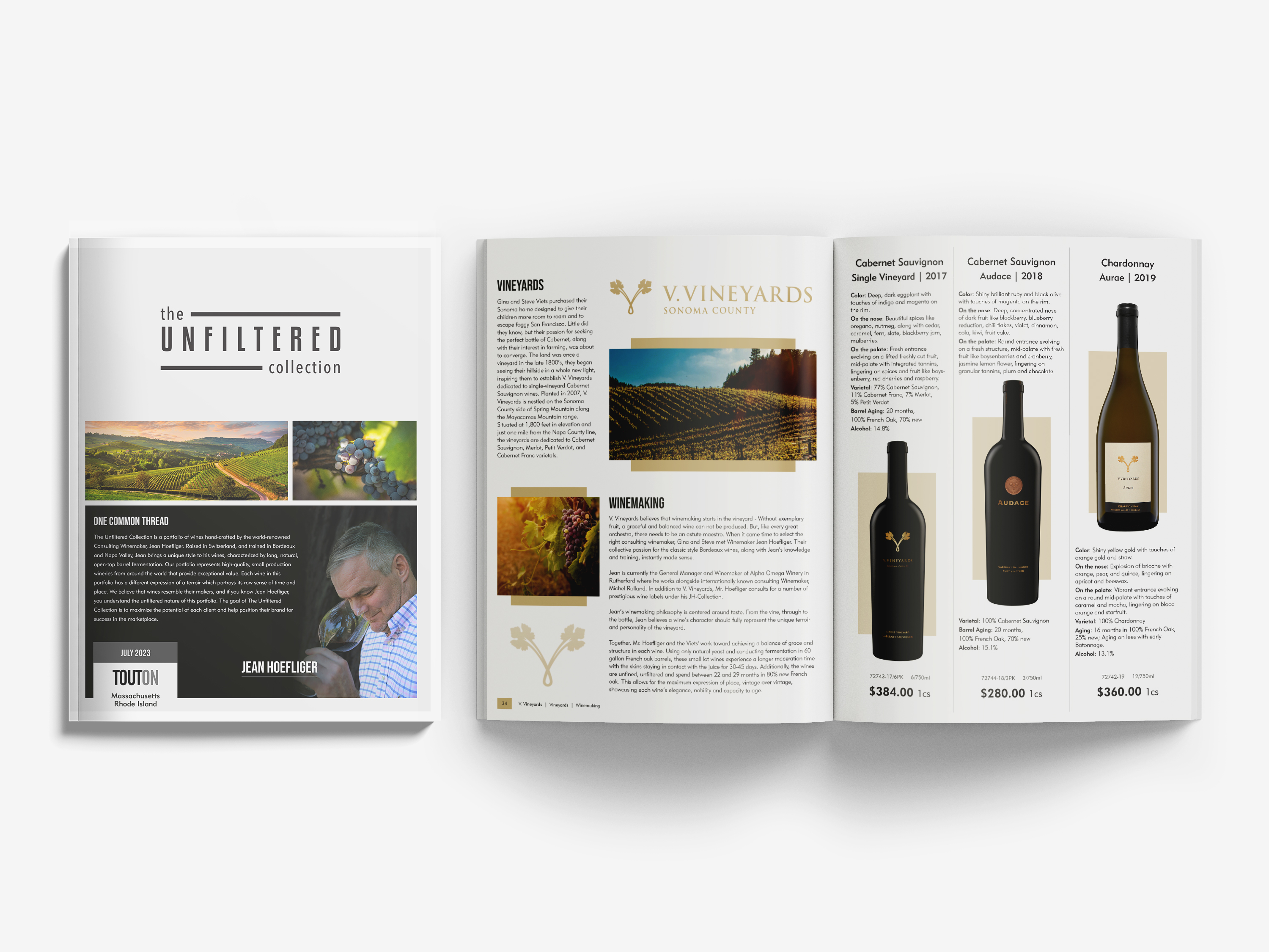
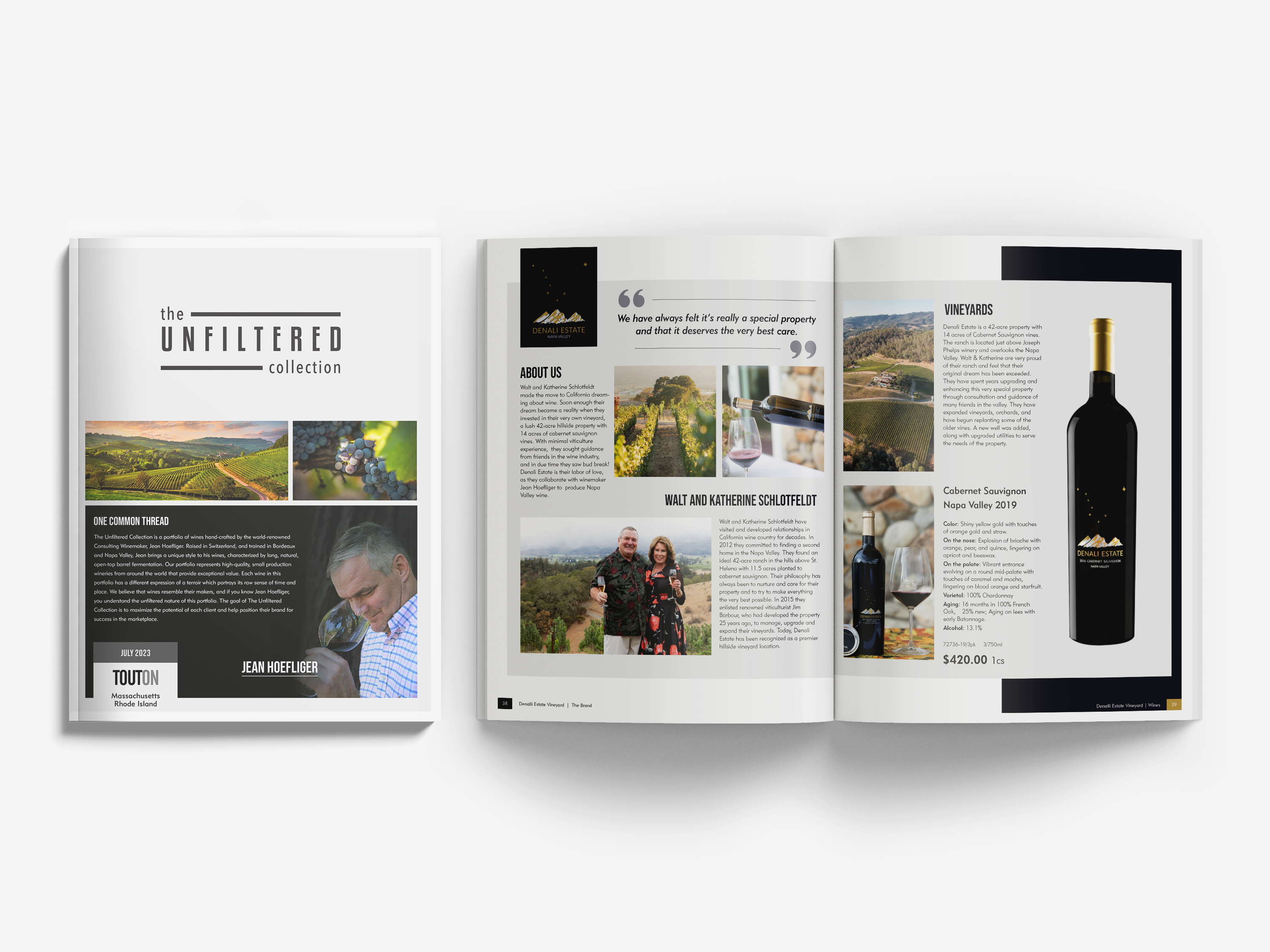
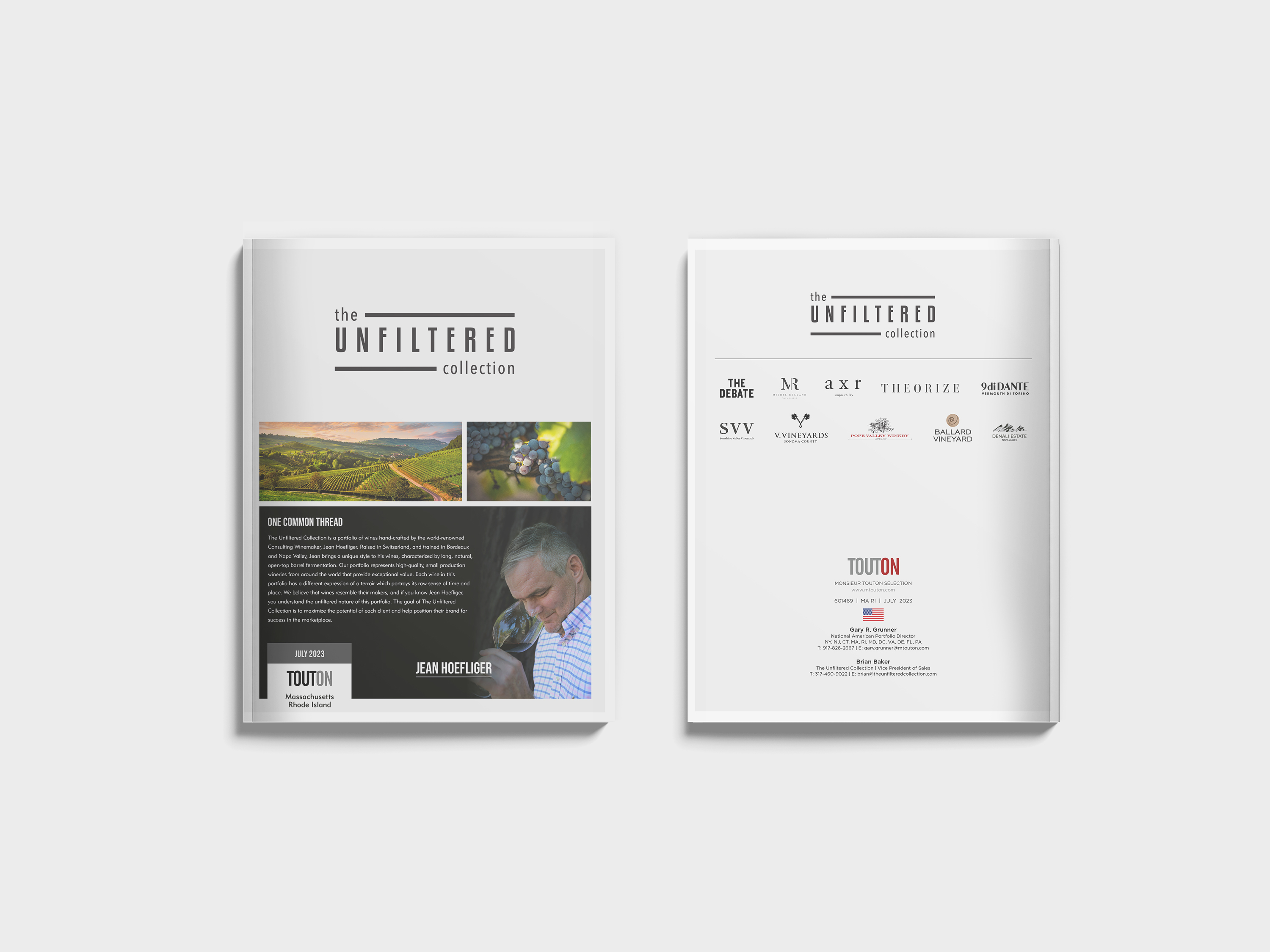
Conceptualized and architected a unified portfolio of premium editorial publications and multi-page marketing brochures. The collection fuses high-end brand storytelling, structured product data, and editorial presentation into a cohesive catalog experience designed to support global B2B sales and marketing communication.
CHALLENGE
To establish a clear, contemporary editorial language that honors individual brand authenticity, craftsmanship, and vineyard heritage. The system required a highly flexible framework capable of balancing diverse imagery and content types while maintaining a rigorous visual rhythm across the entire print series.
EXECUTION
Delivered a scalable publication framework that successfully balances commercial clarity with luxury editorial storytelling. The resulting print ecosystem elevates wholesale trade usability, strengthens brand presentation, and accelerates speed-to-market execution across multiple formats.
Read More
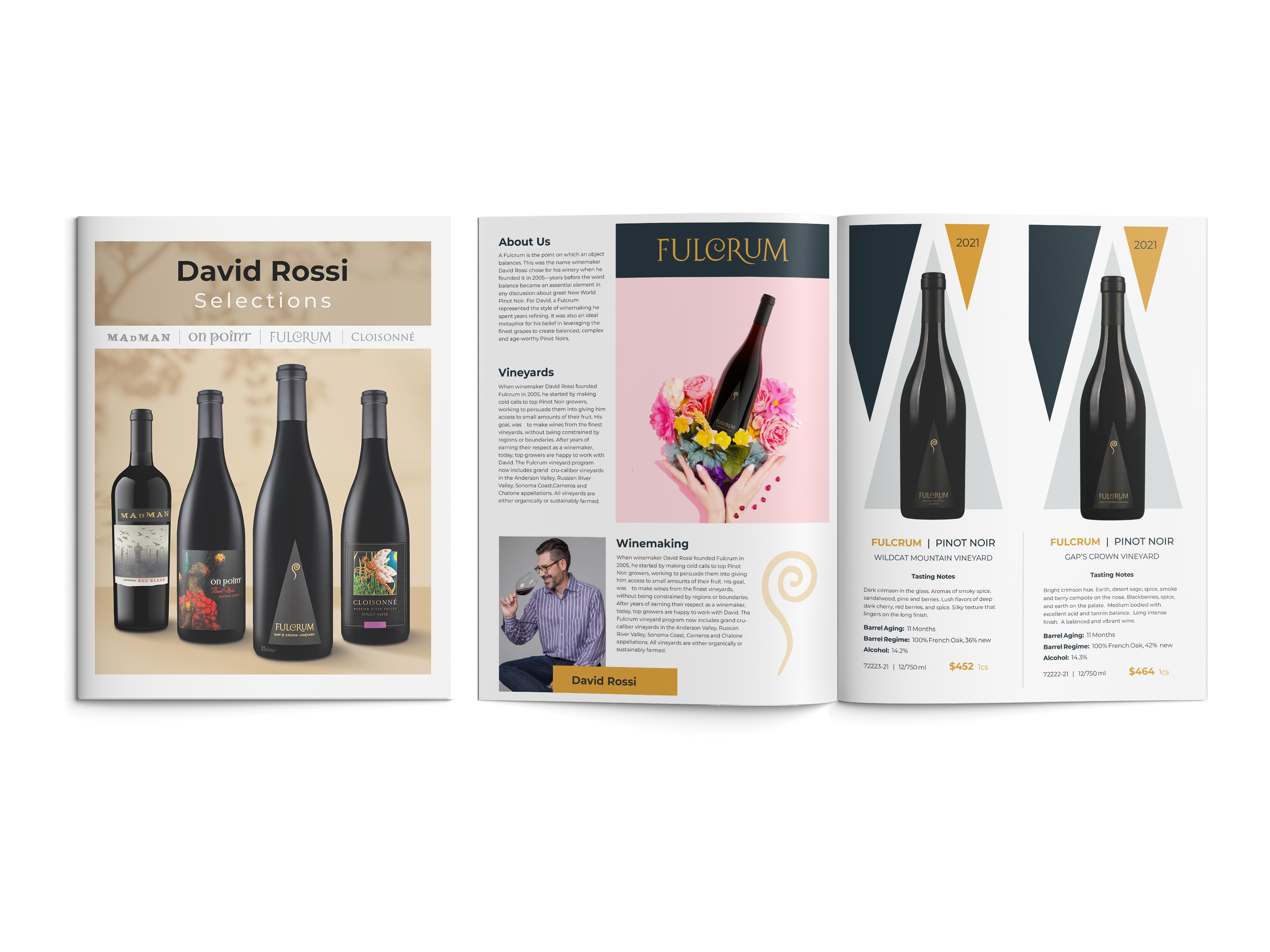
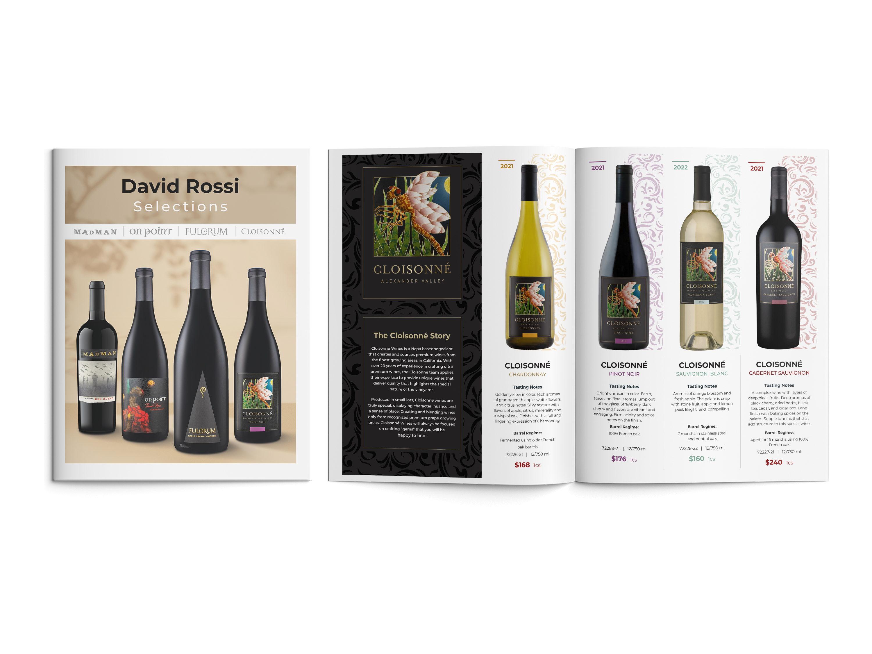
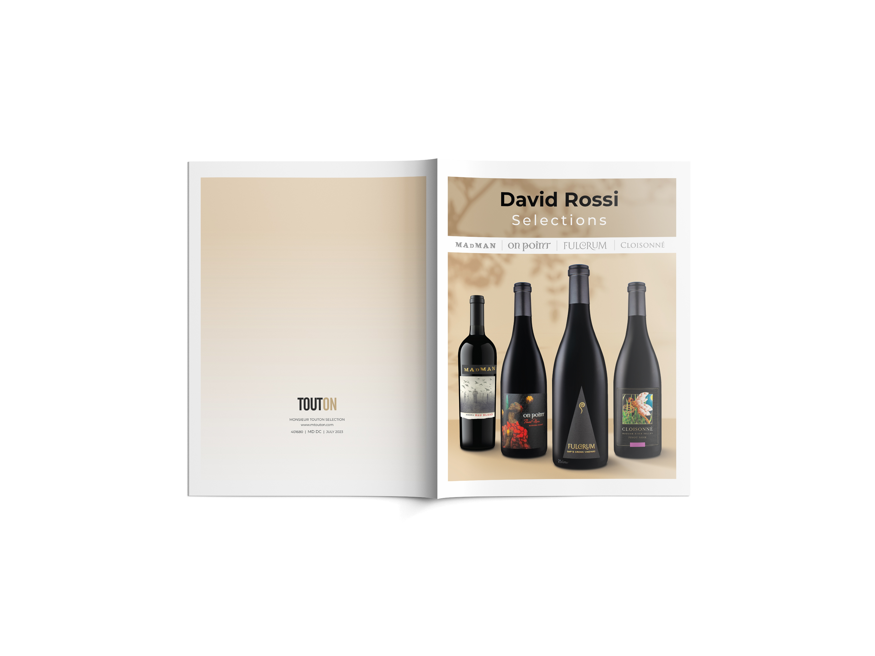
David Rossi Selections (8-Page Editorial Brochure) A structured portfolio system designed to guide trade buyers seamlessly through select product tiers. Layouts integrate product imagery, vintage tasting notes, and vineyard narratives within a balanced typographic hierarchy that maximizes legibility.
The Munro’s Whisky (4-Page Luxury Product Brochure) An ultra-premium visual layout focusing on high-contrast compositions, deep warm color theory, and advanced digital compositing techniques to showcase rare assets and emphasize an exclusive, high-value brand character.
HOOPES / HOOPLA Wine (4-Page Brand Presentation) A narrative-driven marketing asset that blends landscape-inspired lifestyle imagery with modern grid layouts, establishing a direct emotional link to winemaking tradition while keeping commercial copy clean and accessible.
OUTCOME
Delivered a scalable visual system that enhances product shelf visibility, strengthens brand equity, and systematically supports multi-channel marketing initiatives.
TOOLS
InDesign · Photoshop · CorelDRAW
09 · SELECTED WORKS
SCOPE | POINT-OF-SALE & RETAIL ACTIVATIONS
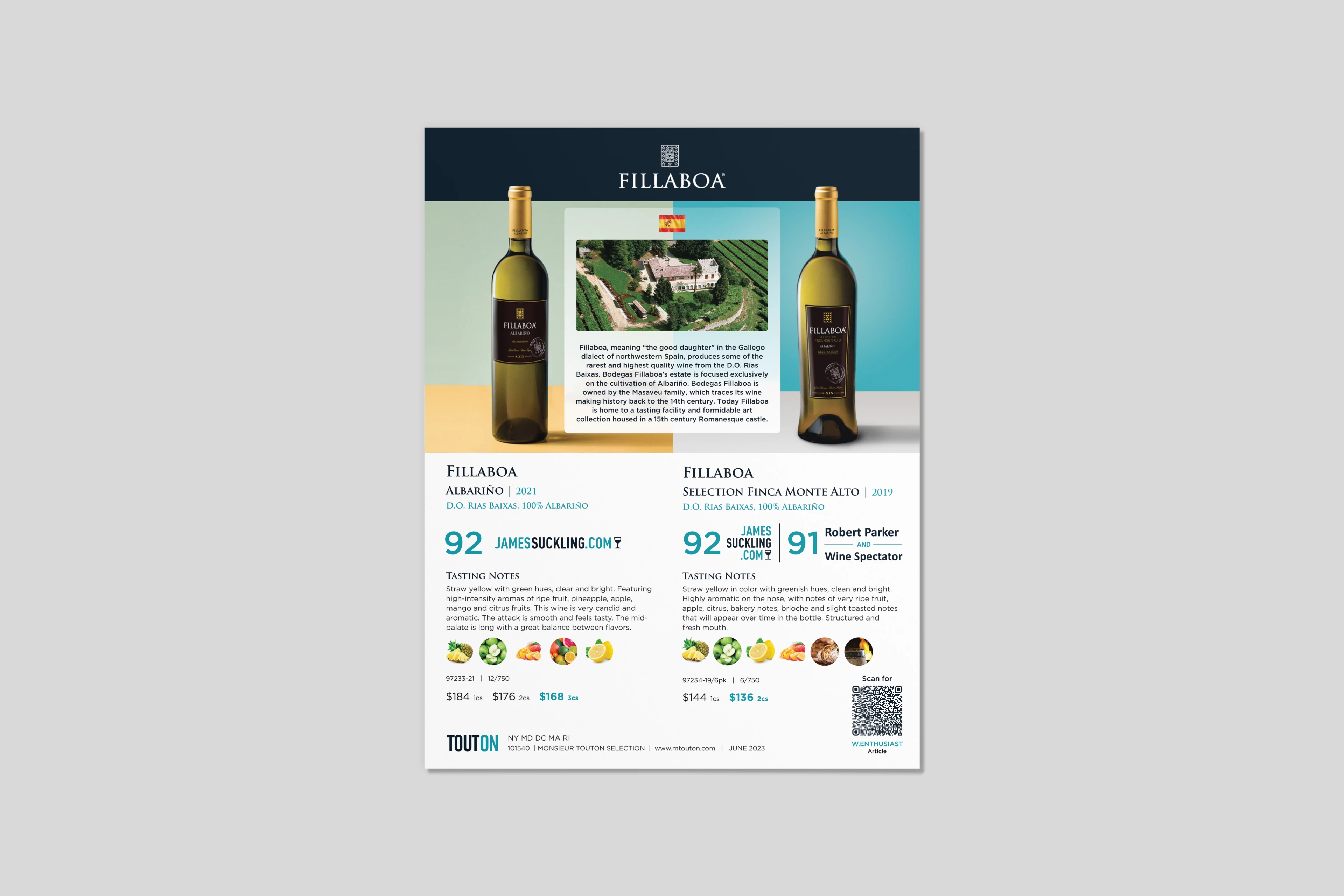
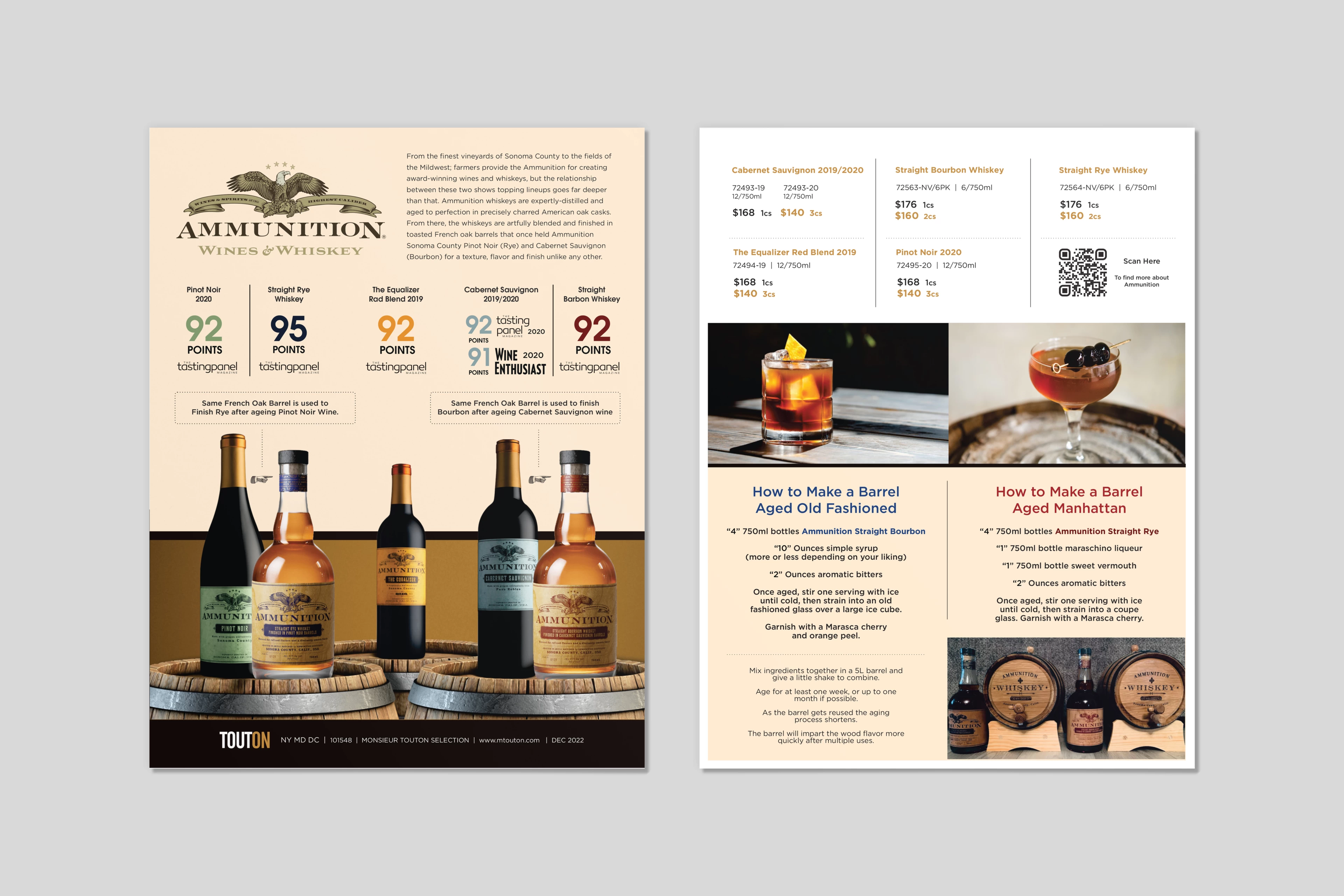
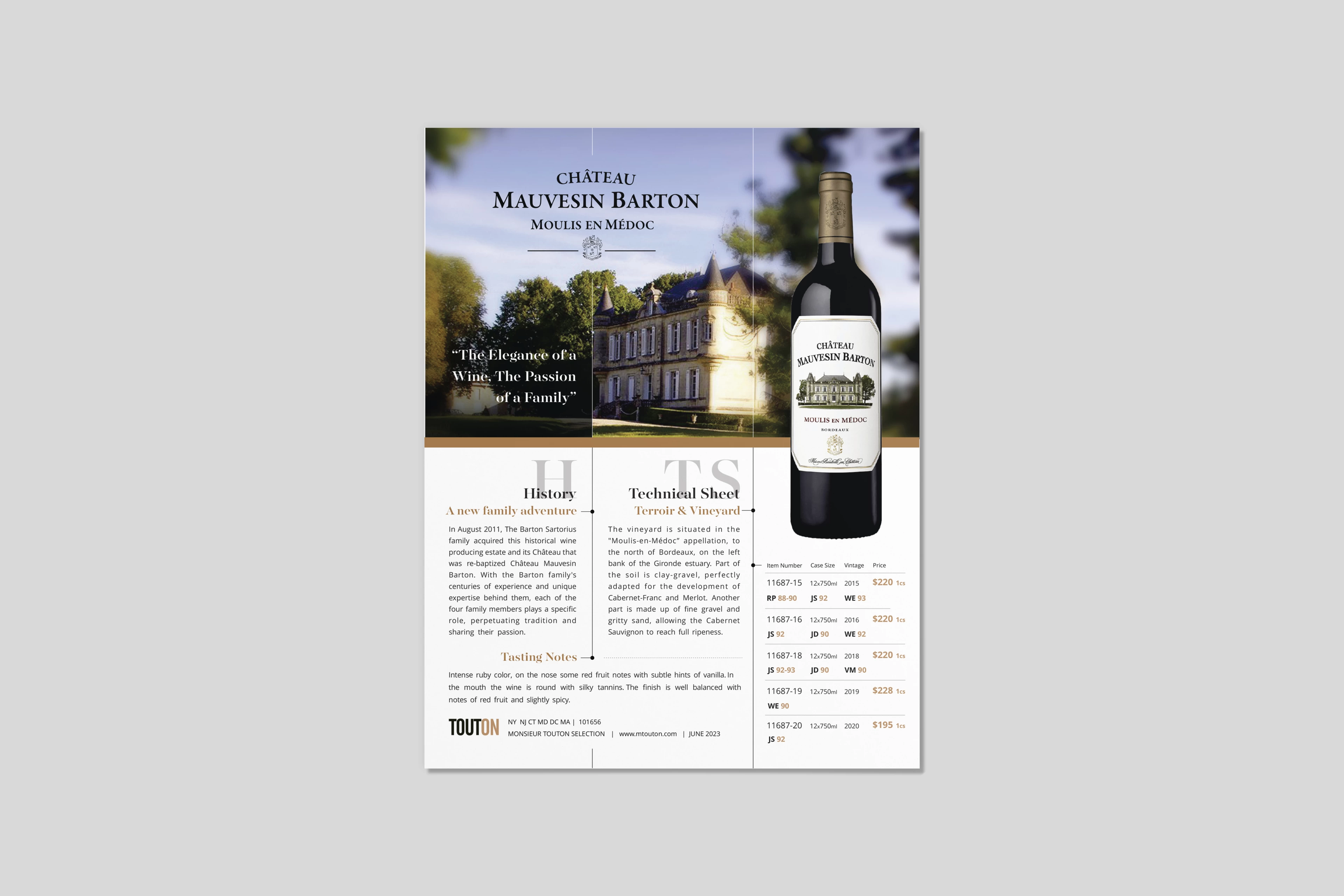
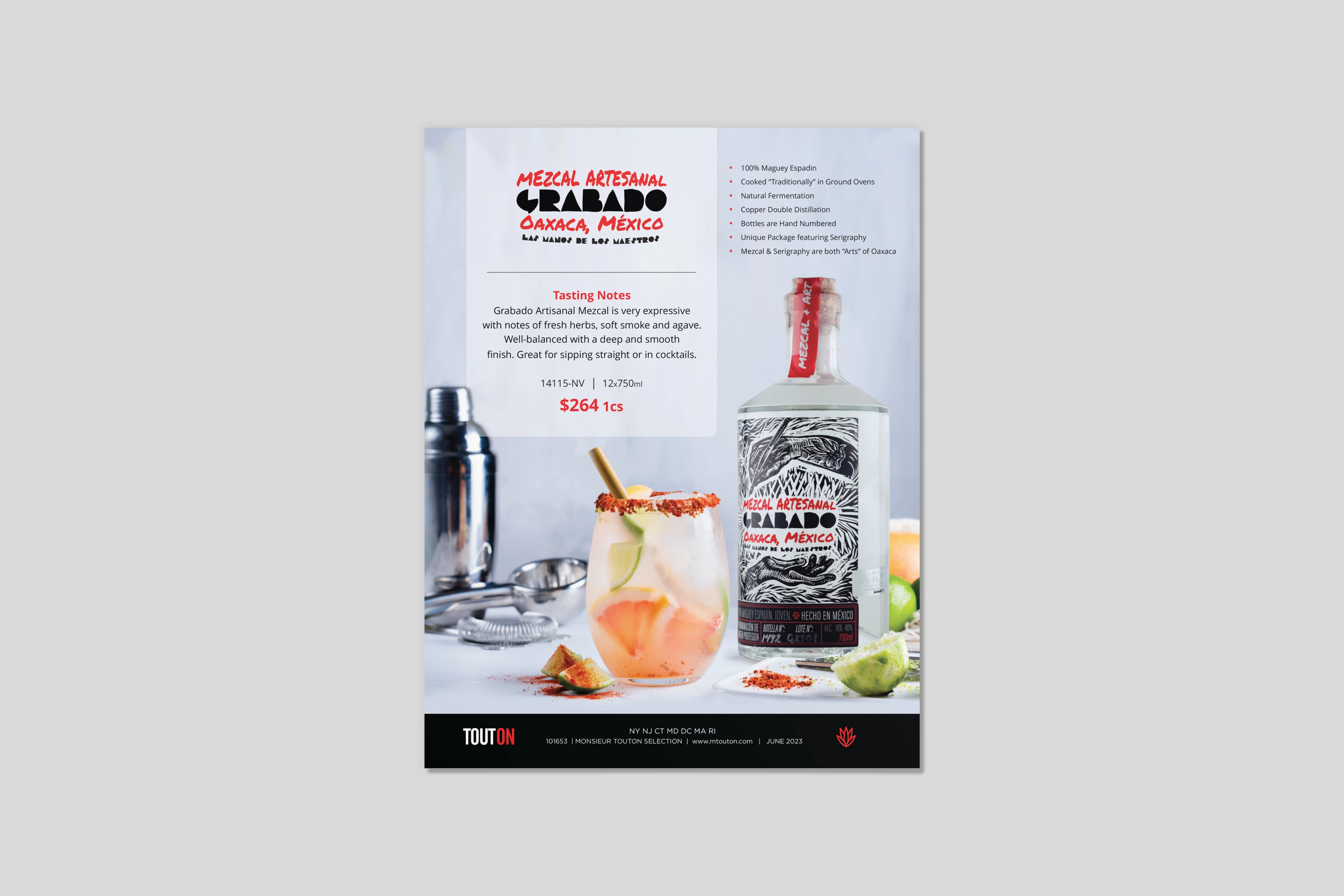
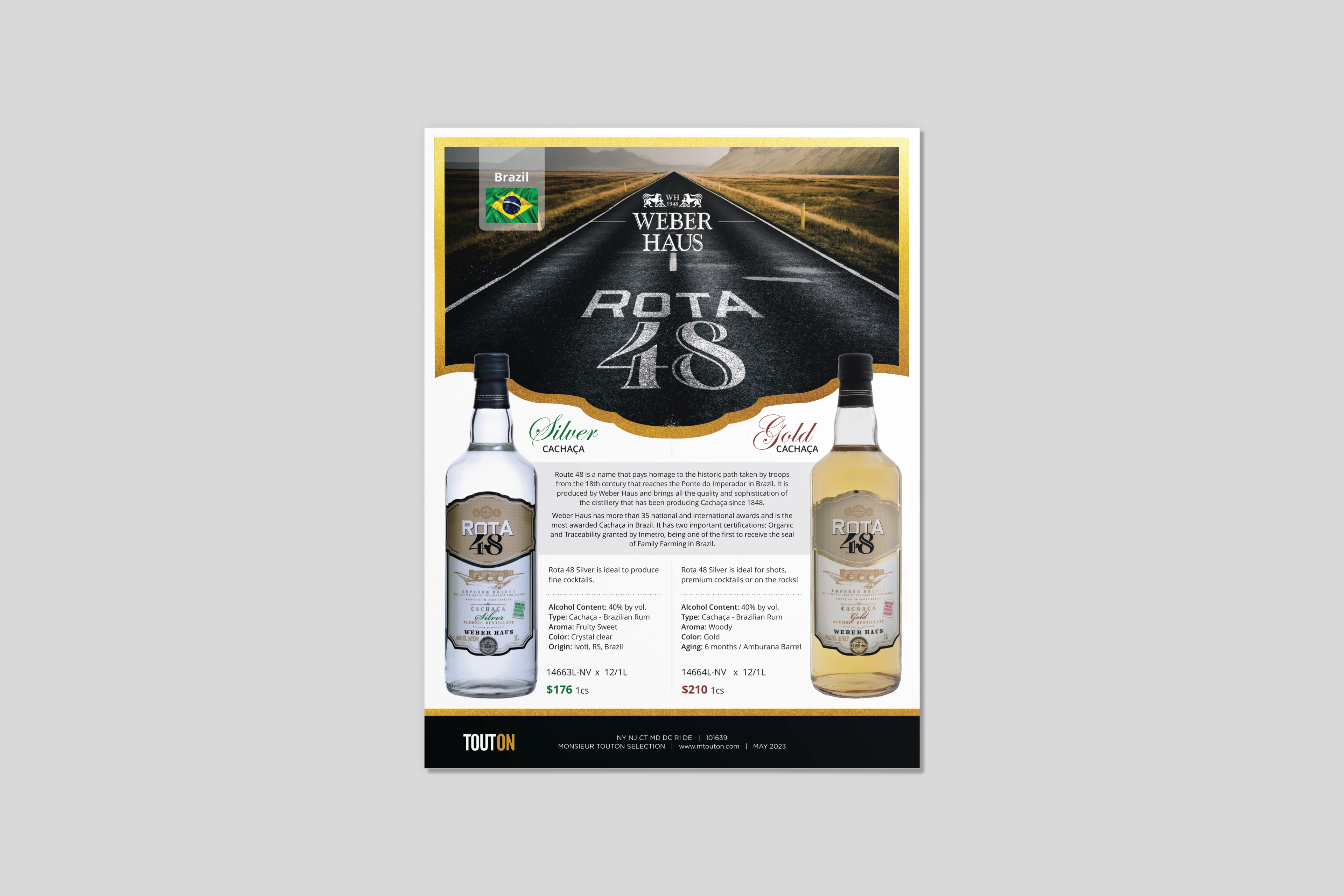
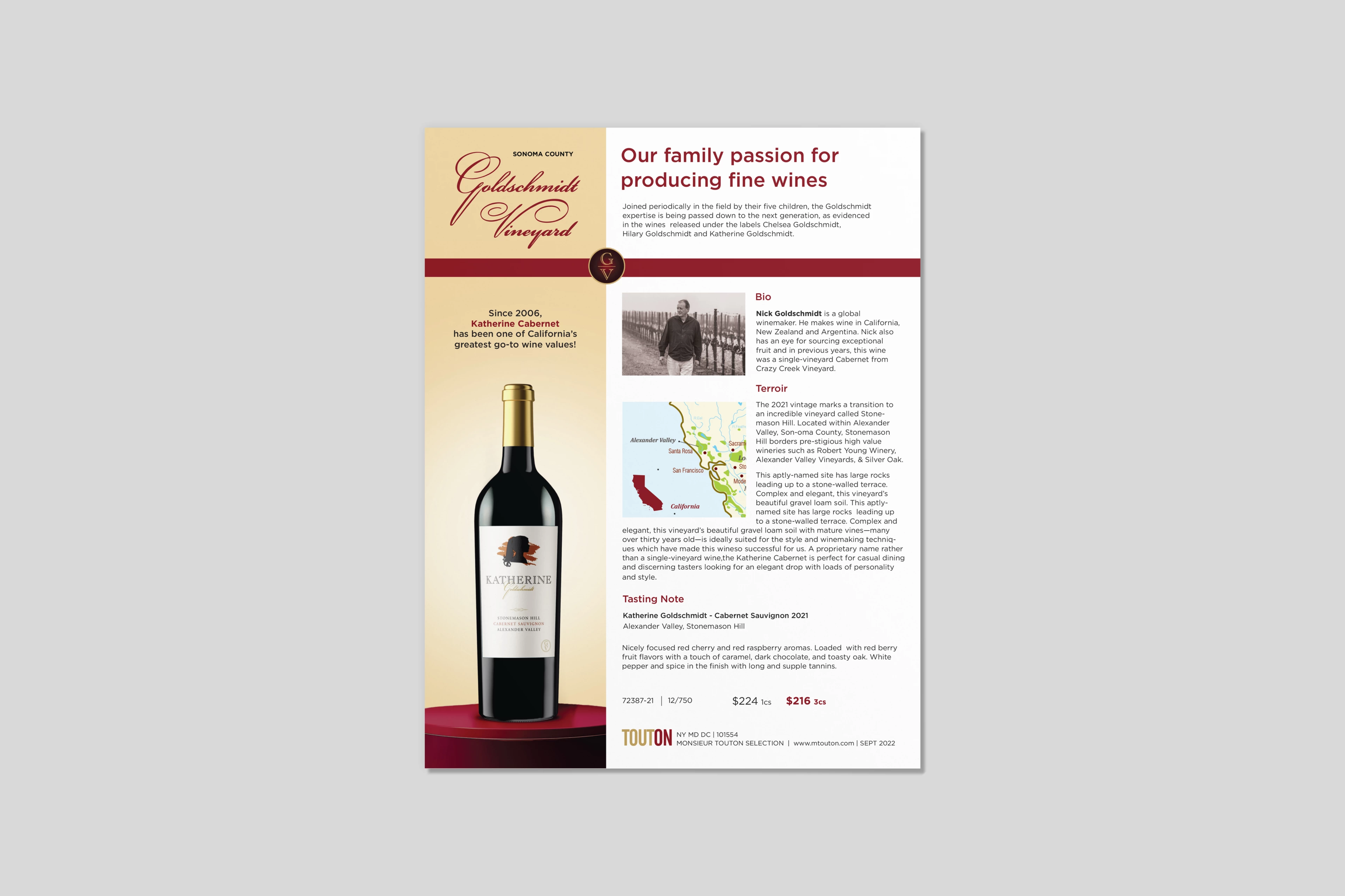
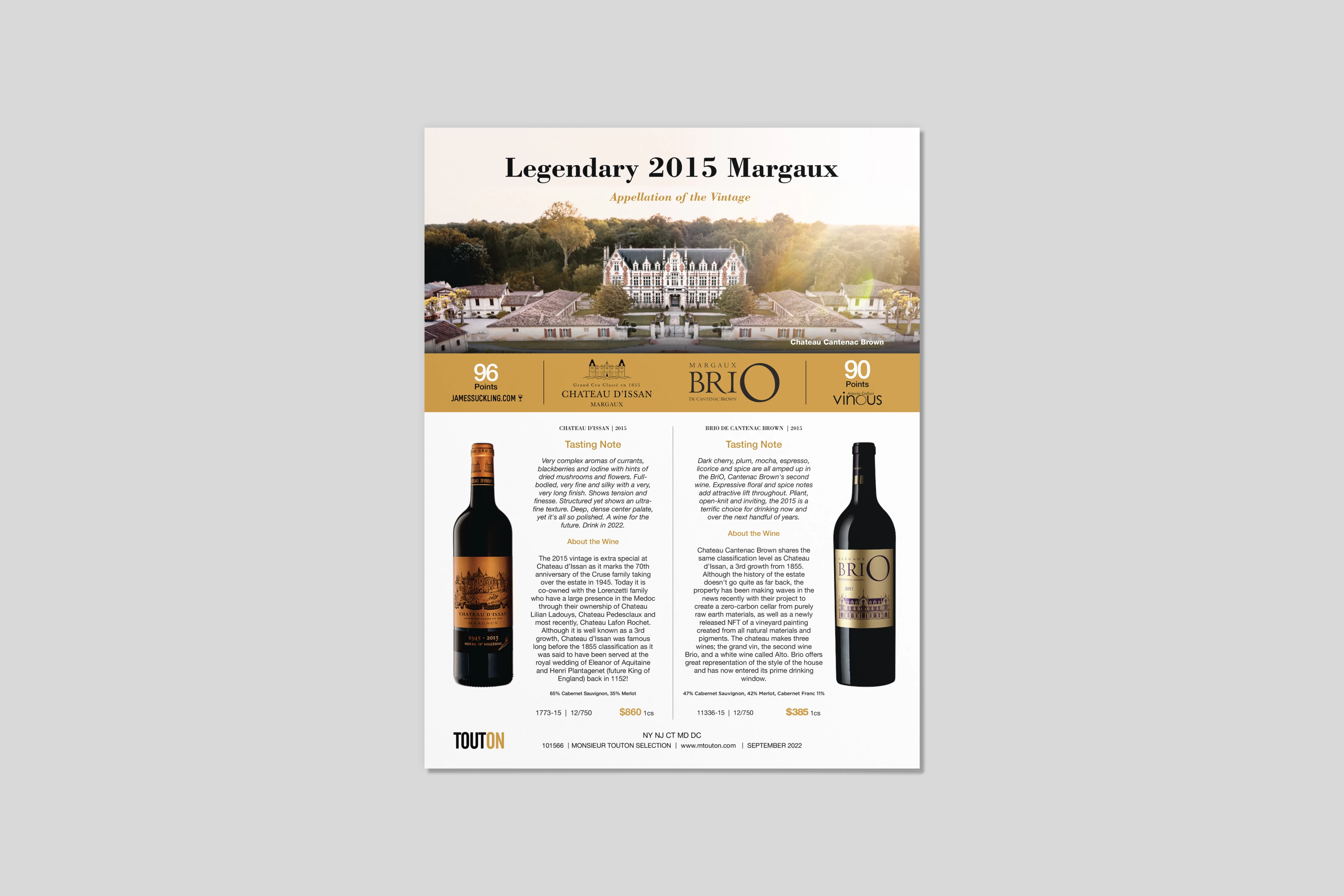
TACTICAL PRINT MARKETING
OVERVIEW
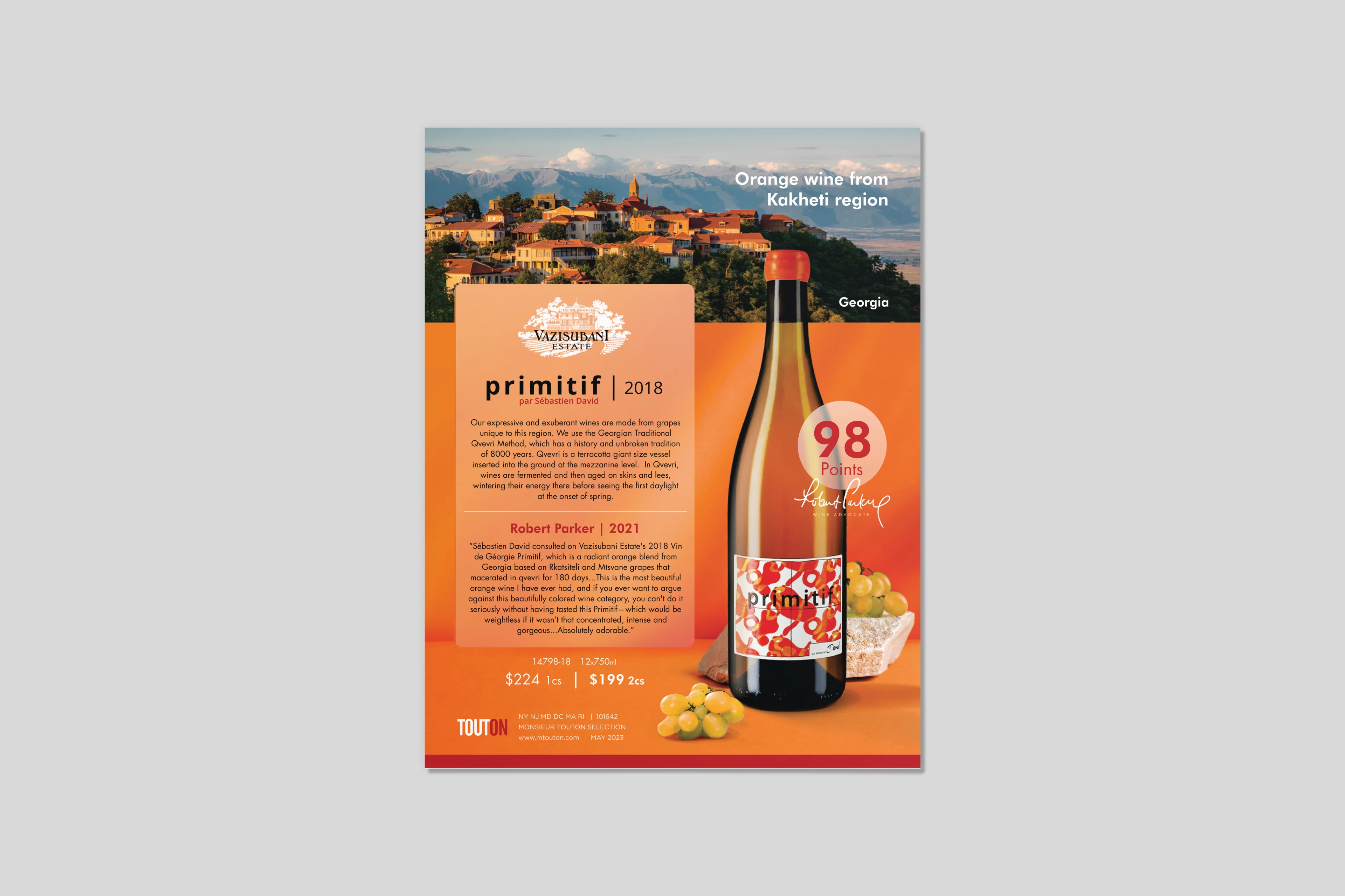
Managed the end-to-end creative execution of high-impact promotional flyers, sell sheets, and trade marketing assets for an expansive portfolio of 150–200 global wine and spirits brands. The objective was to translate complex corporate product data, tasting notes, and critical critical industry acclaim into tactical B2B and B2C sales collateral that drives immediate commercial distribution.
CHALLENGE
The core challenge lay in maintaining absolute brand governance and visual fidelity across hundreds of distinct international brand identities simultaneously. Each brand required strict adherence to its unique typography, color spaces, asset libraries, and legal compliance mandates, all while operating under tight, high-volume production deadlines that demanded maximum operational velocity.
EXECUTION
Architected a modular production workflow and developed highly flexible layout grids to streamline information design. Systematized the visual presentation of complex data—including bottle silhouettes, critical rating badges, pricing models, and QR codes. Leveraged advanced digital compositing, color grading, and lifestyle typography to ensure each individual brand asset stood out dramatically while preserving a premium, cohesive trade aesthetic.
OUTCOME
Delivered a highly agile, production-ready collateral ecosystem that successfully eradicated design debt across the global portfolio. By standardizing high-frequency layout formats, significantly minimized production friction, accelerated speed-to-market for regional distributor activations, and directly empowered sales teams to capture market share.
TOOLS
InDesign · Photoshop · CorelDRAW
10 · SELECTED WORKS
SCOPE | HOSPITALITY BRAND SYSTEMS
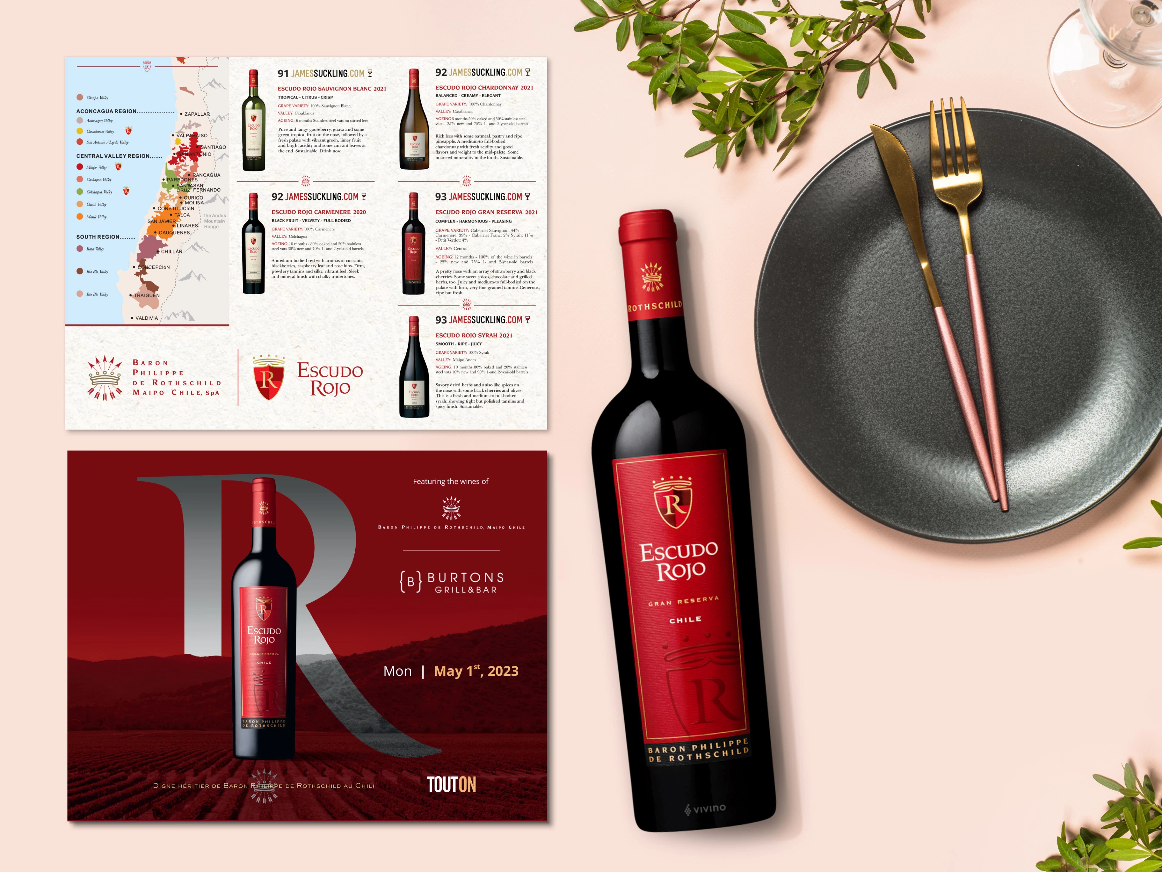
HOSPITALITY BRAND TOUCHPOINTS & MENU SYSTEMS
OVERVIEW
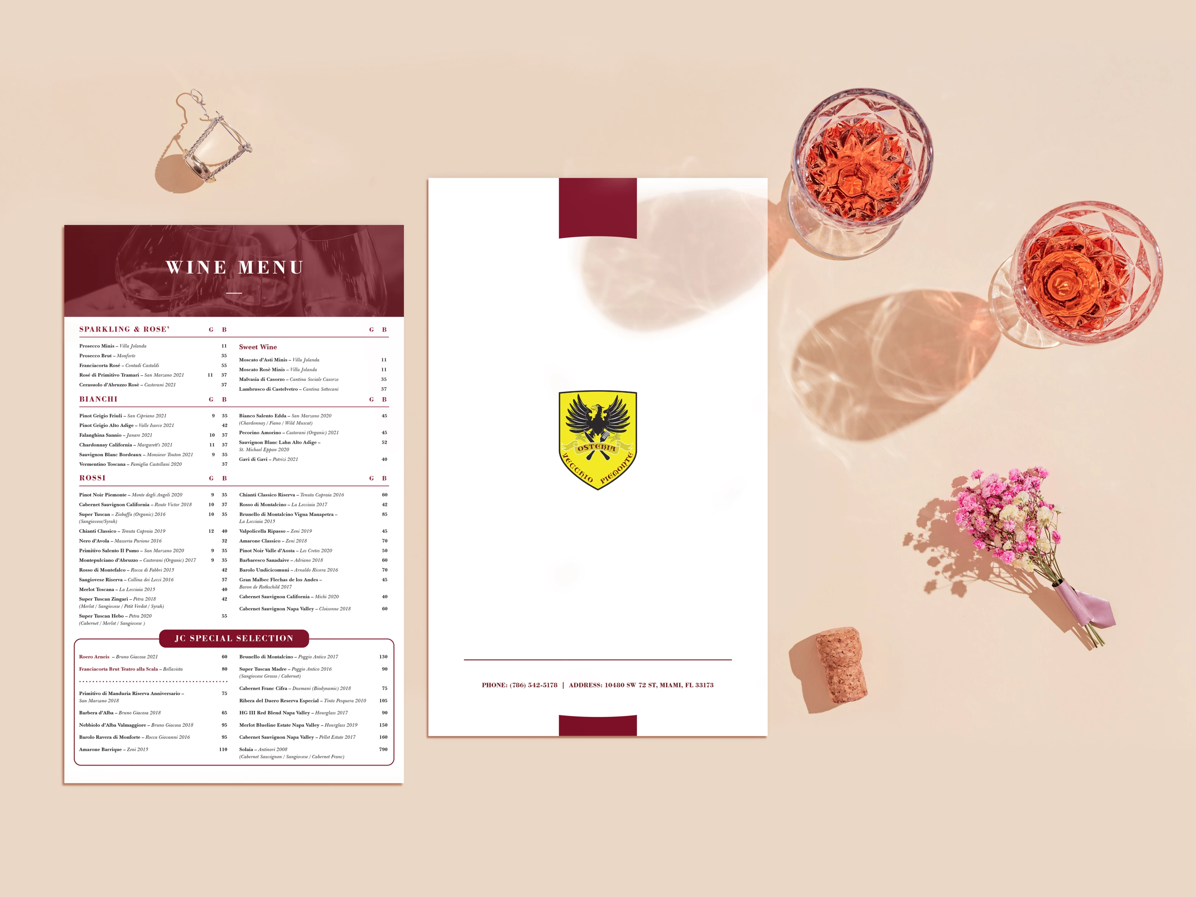
Conceptualized and architected robust menu systems for premium hospitality environments where clarity, speed, and usability are business-critical. Each layout is structurally engineered to support real-world dining behavior, translating complex culinary offerings into intuitive, easy-to-navigate visual formats.
CHALLENGE
Approached menus explicitly as information design systems rather than static layouts. The core challenge was to drastically reduce cognitive load while maintaining an assertive brand presence, ensuring guests can quickly scan options, compare items, and make purchasing decisions completely free of friction.
EXECUTION
Systematized structured typographic hierarchies to define clear navigation pathways across diverse categories, items, and pricing matrices. Calibrated negative space, macro-alignments, and logical item grouping to maximize visual scannability in high-density content environments. Integrated tactical supporting elements—such as regional map visualizations and distinct section markers—to guide user flow while reinforcing core brand equity.
OUTCOME
Delivered high-performance menu frameworks that elevate operational usability, streamline consumer decision-making, and heighten the overall guest experience through a precise, structured, and entirely brand-driven interface design.
TOOLS
InDesign · Photoshop · CorelDRAW
11 · SELECTED WORKS
SCOPE | OOH & RETAIL ACTIVATIONS
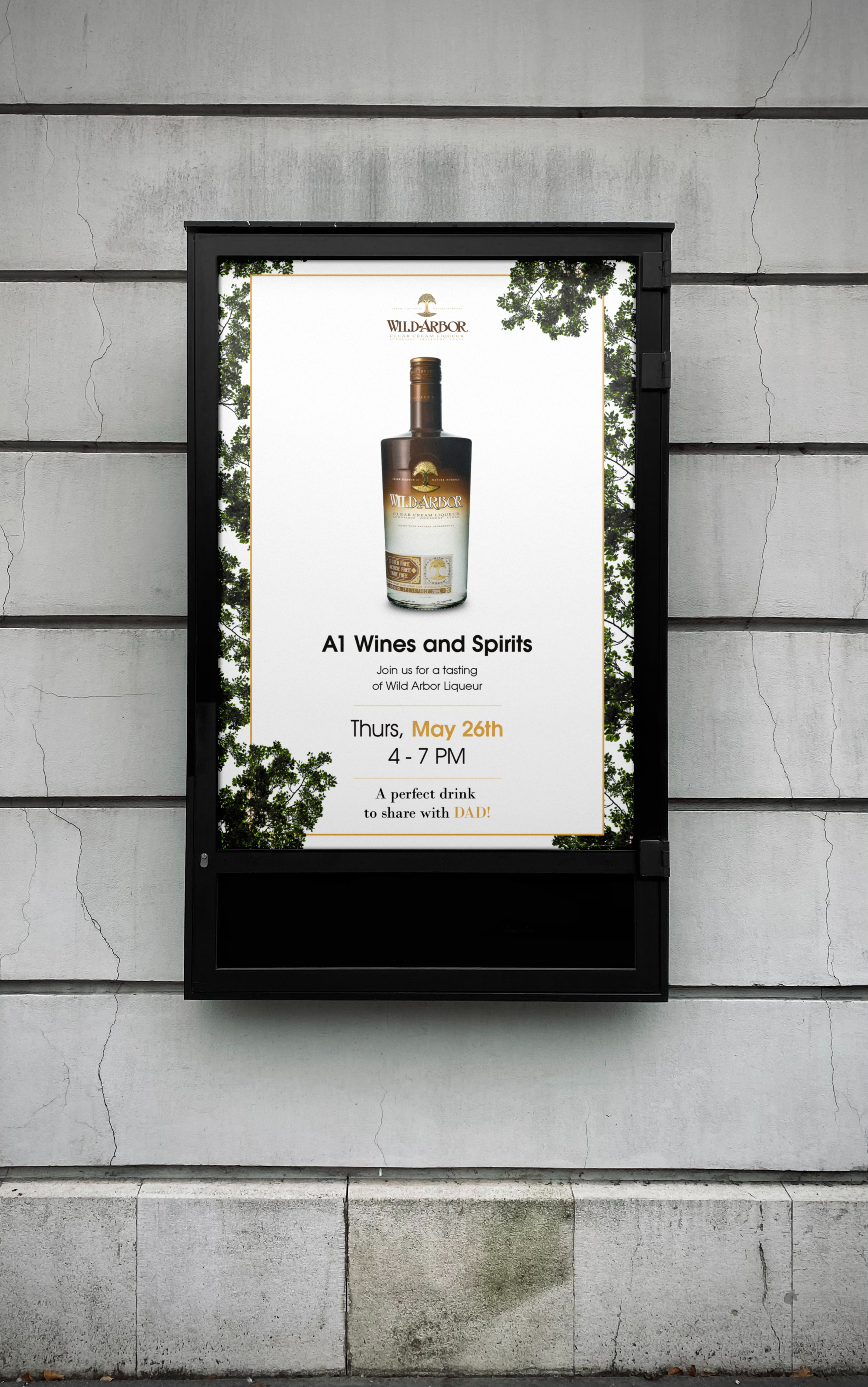
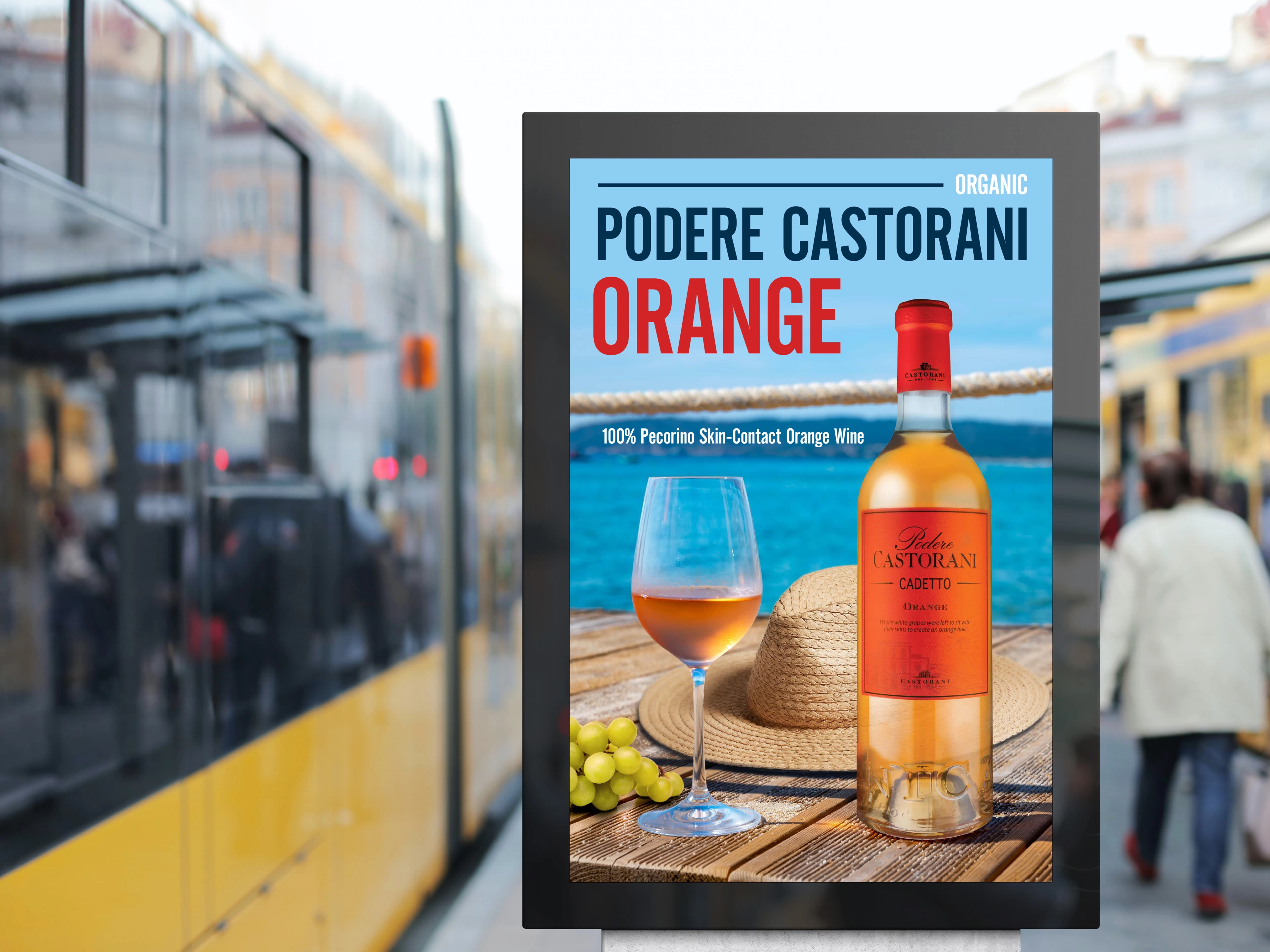
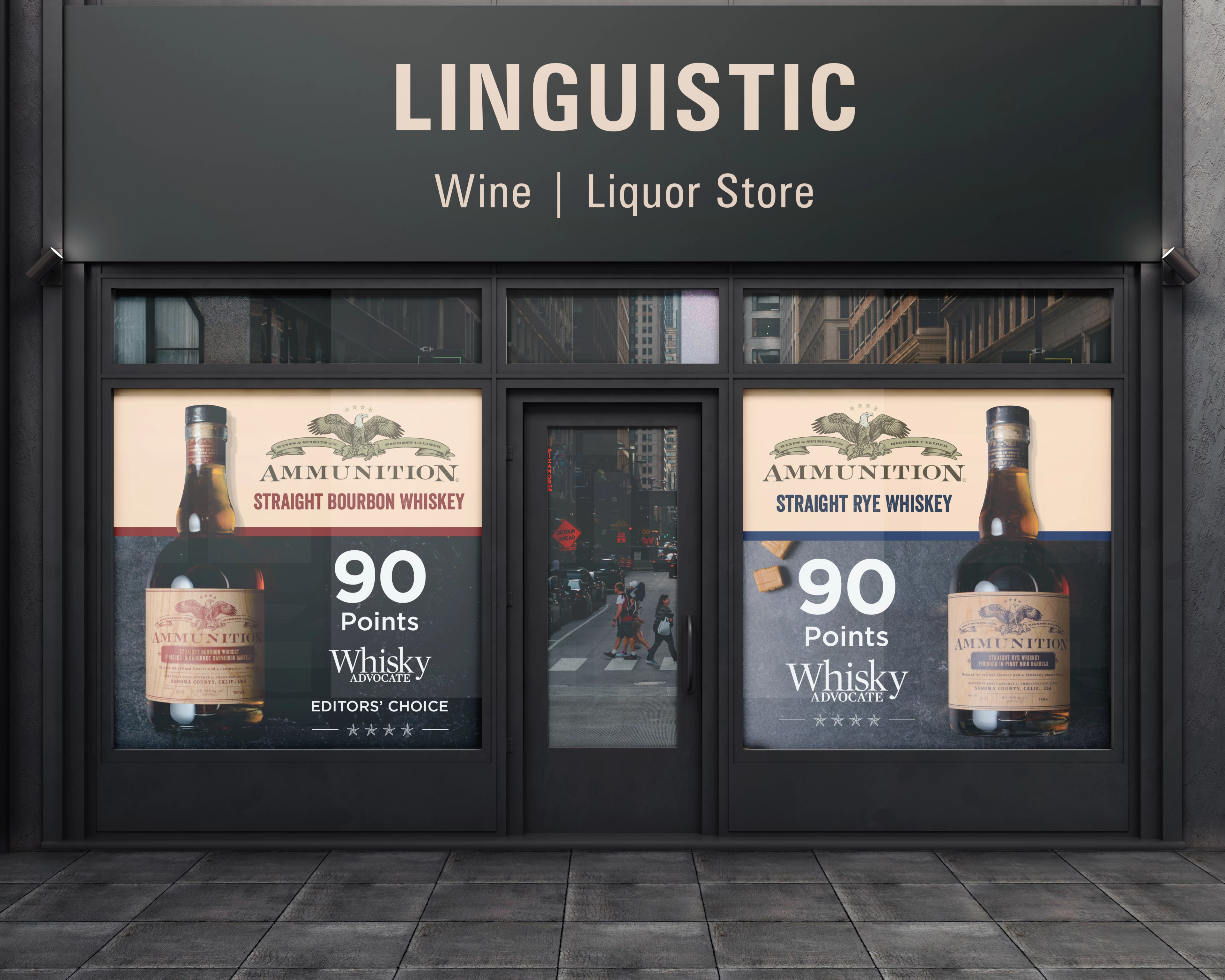
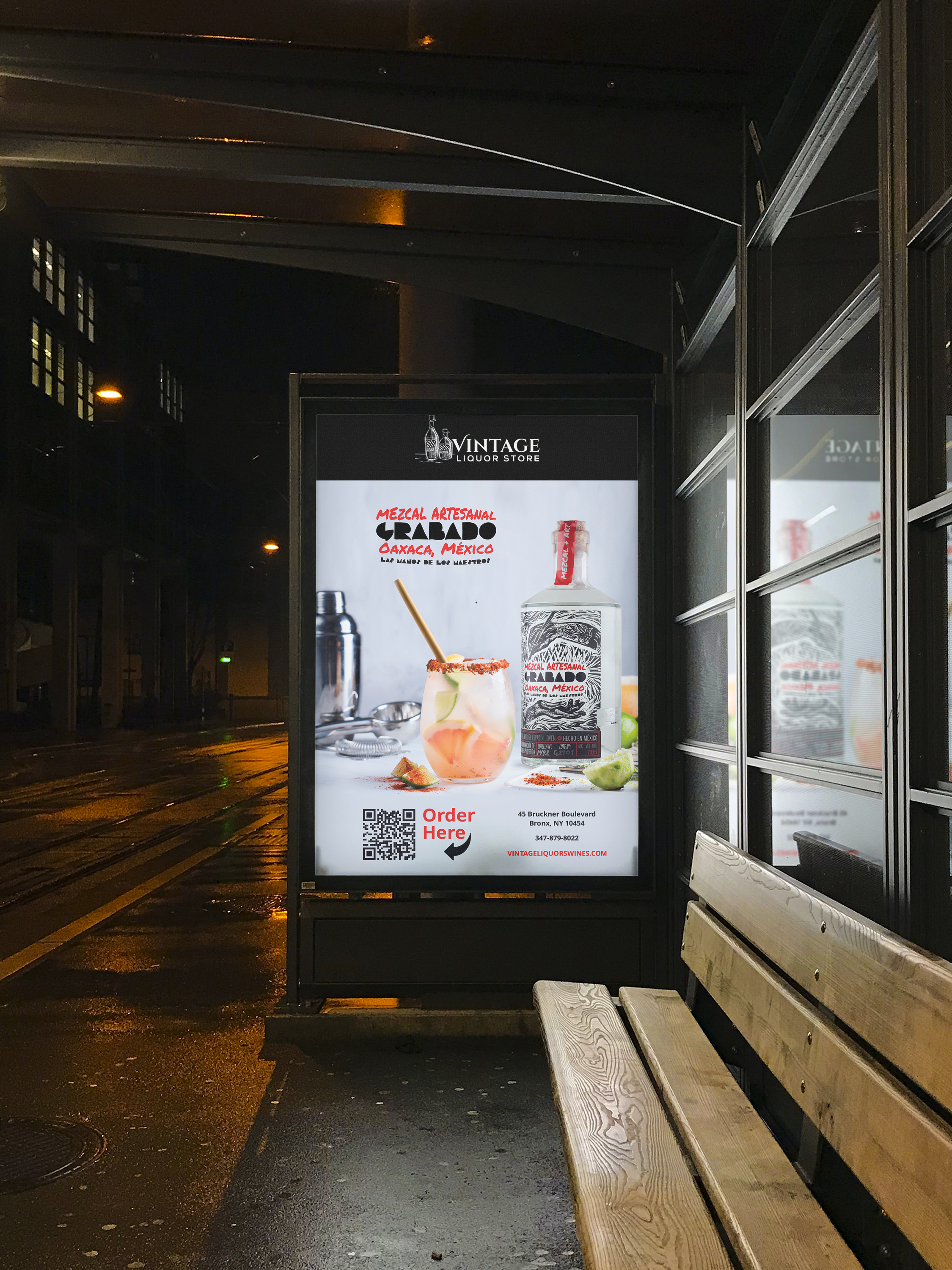
CAMPAIGN COLLATERAL & POSTER DESIGN
OVERVIEW
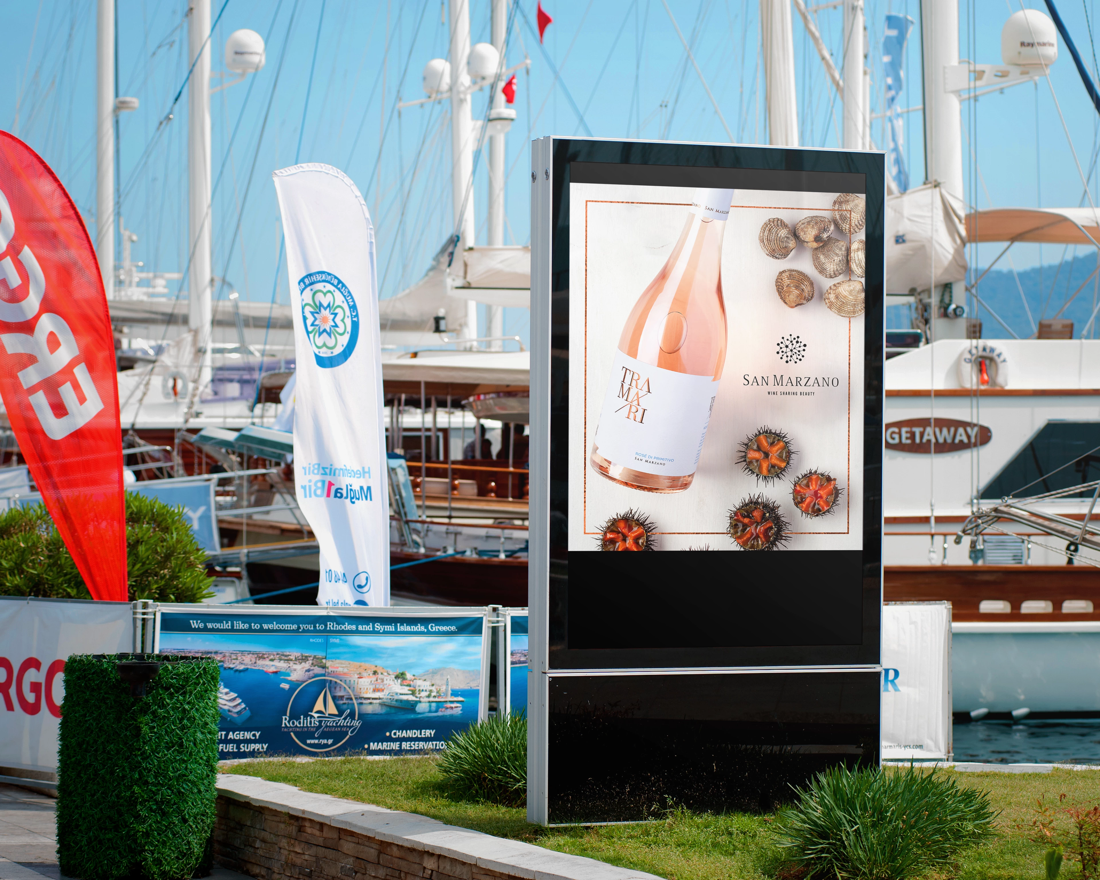
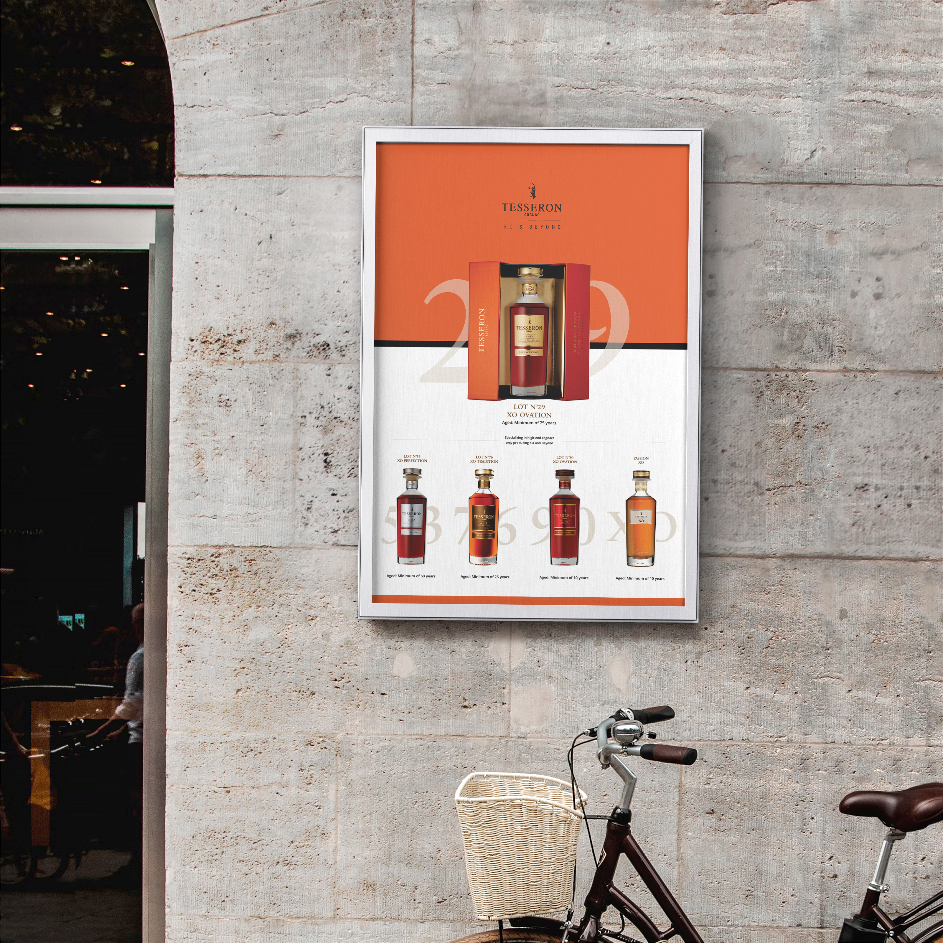
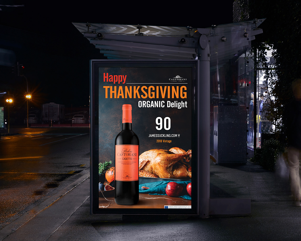
Conceptualized and developed an impactful collection of large-format poster designs created to elevate premium wine and spirits brands across retail and outdoor advertising environments. Compositions systematically fuse product-focused layouts with high-impact visual storytelling to capture attention and fortify brand recall in high-visibility public spaces.
CHALLENGE
To generate immediate visual impact while communicating complex product value and core brand identity instantly. Each layout required meticulous spatial planning to position the bottle as the indisputable hero asset, utilizing advanced digital compositing, dramatic atmospheric backgrounds, and targeted color grading to ensure maximum legibility and visibility under diverse real-world lighting conditions.
KEY DESIGN ELEMENTS
• Product-Centered Visual Composition: Positioned the physical asset as the primary visual anchor across all variants.
• Advanced Digital Compositing: Combined high-fidelity product photography with meticulously engineered environments.
• Rigid Information Hierarchies: Formulated clean, scannable pathways between headlines, product assets, and supporting copy.
• Multi-Format Adaptability: Designed responsive grid structures scalable across storefront displays, retail endcaps, and outdoor media.
OUTCOME
Delivered a high-performance marketing collateral system that functions dynamically across competitive commercial environments. By prioritizing strong typographic hierarchy and clean visual architecture, the designs successfully maximize retail product visibility, strengthen overarching brand equity, and turn high-traffic touchpoints into distinctive consumer experiences.
TOOLS
InDesign · Photoshop
12 · SELECTED WORKS
SCOPE | EVENT BRANDING & TACTILE PRINT
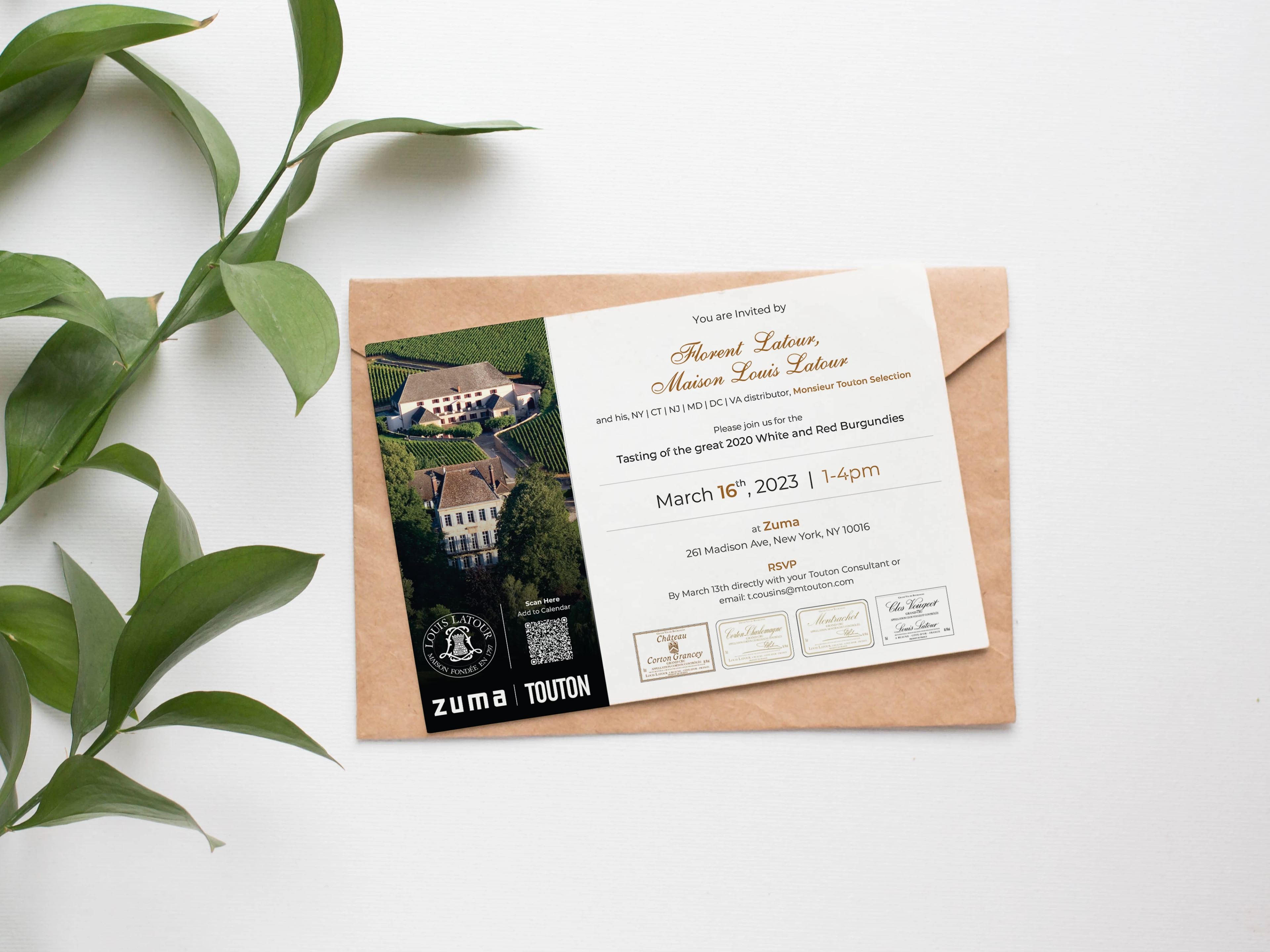
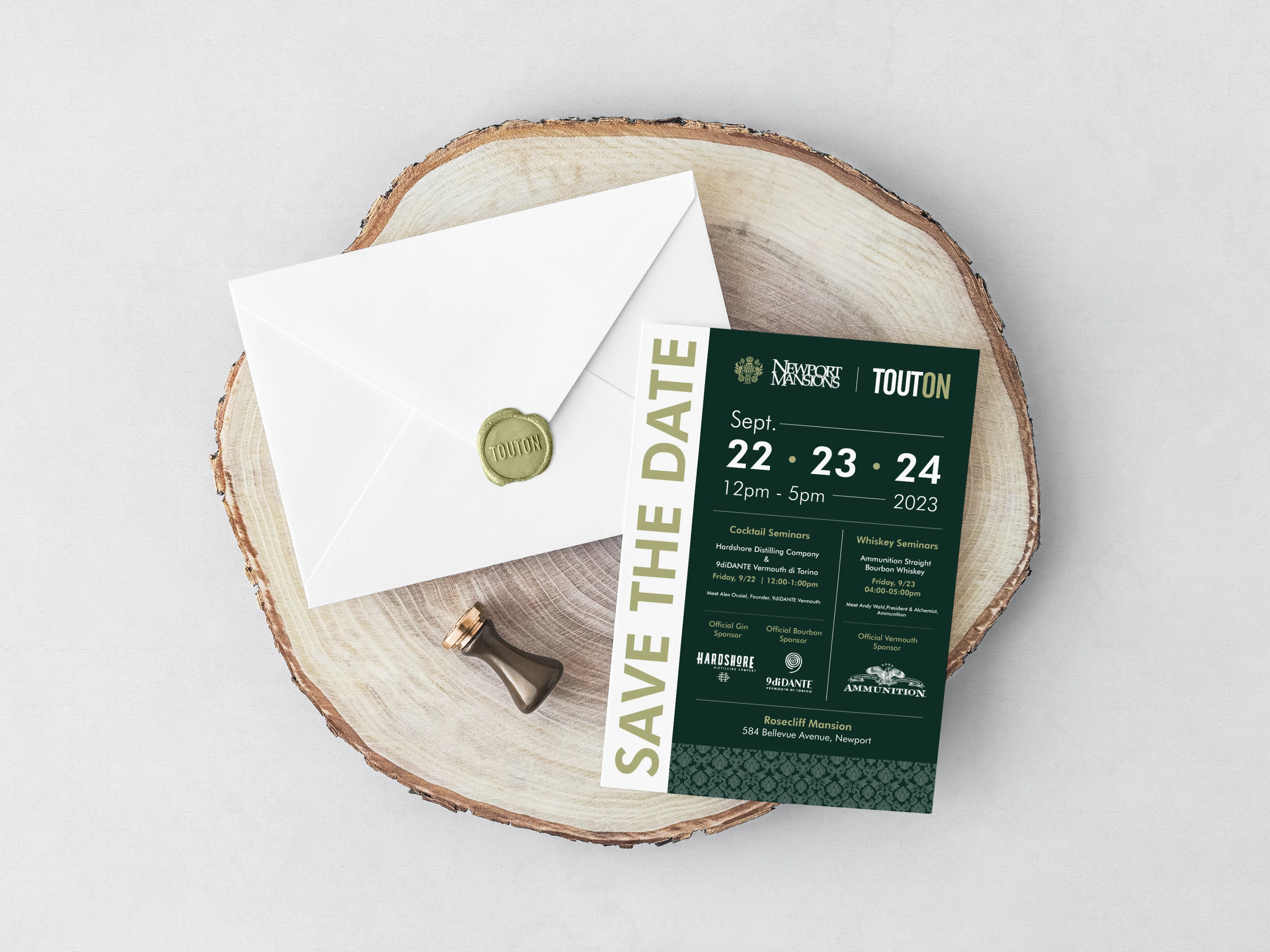
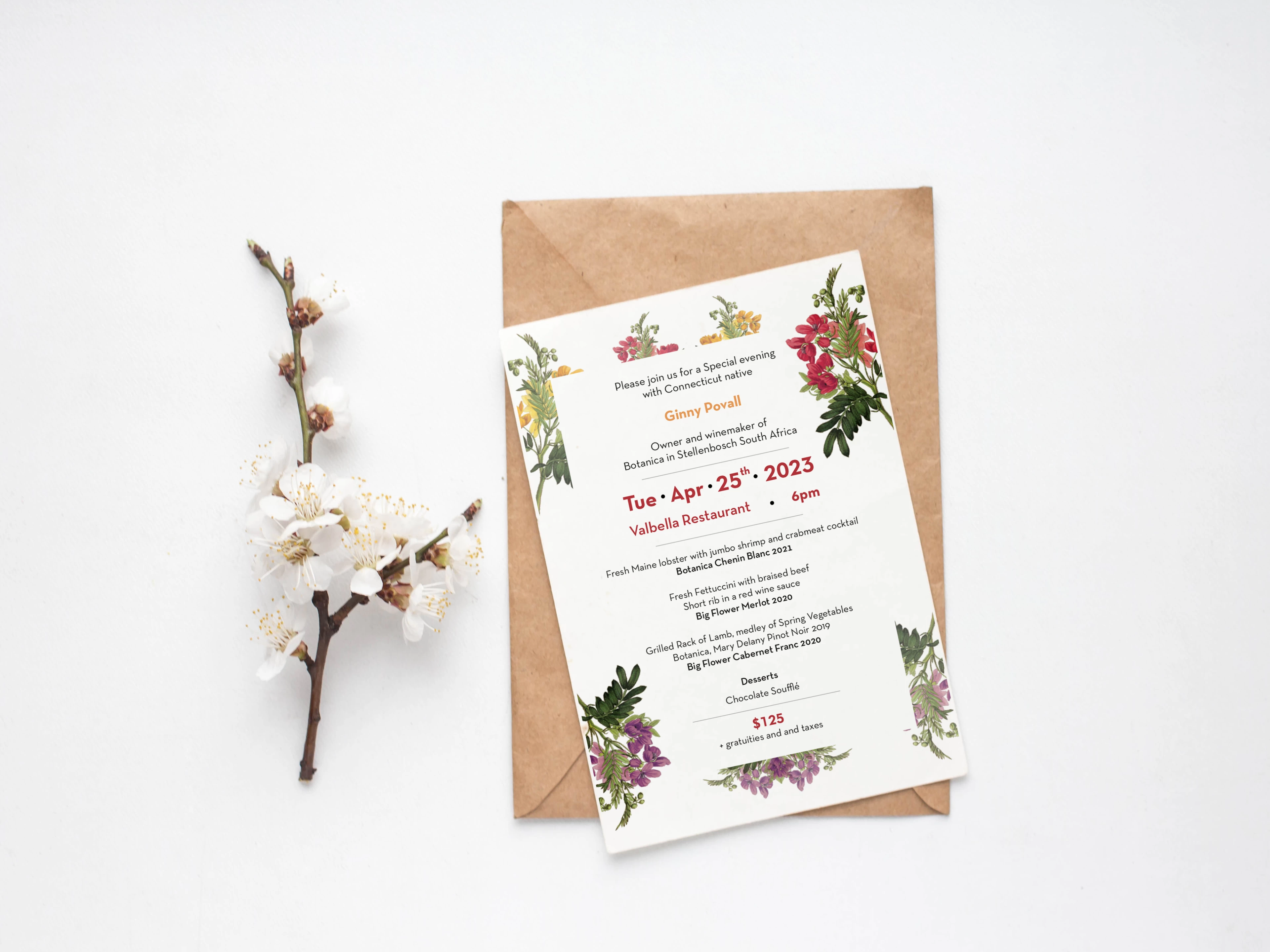
EVENT COLLATERAL & INVITATION DESIGN
OVERVIEW
Conceptualized and developed an exclusive ecosystem of high-end invitations, menus, and visual collateral for corporate wine tastings, portfolio launches, and high-profile brand events. Compositions seamlessly blend refined typography with elegant structural layouts to establish an immersive visual introduction that sets the tone for premium guest experiences.
CHALLENGE
To translate luxury brand heritage into a tactile, intimate format while managing dense informational hierarchies such as seating timelines, tasting flights, and venue coordinates. The collateral needed to balance sophisticated aesthetic restraints with technical execution, requiring meticulous pre-press planning to accommodate complex physical production techniques on premium paper stocks.
KEY DESIGN ELEMENTS
• Editorial Typographic Systems: Formulated elegant hierarchy systems prioritizing clarity and high-end brand alignment.
• Tactile Spatial Planning: Engineered layouts designed explicitly for premium textured materials and specialized custom cuts.
• Rigid Information Management: Curated structured grid matrices to display tasting menus, event timelines, and maps cleanly.
• Production-Ready Precision: Developed flawless pre-press files optimized for specialized finishing specs and spot colors.
OUTCOME
Delivered a highly polished suite of event collateral that elevates corporate hospitality touchpoints and strengthens brand equity. By pairing strict visual governance with premium layout architectures, the final print assets turn traditional invitations into memorable, tangible touchpoints that drive high guest engagement.