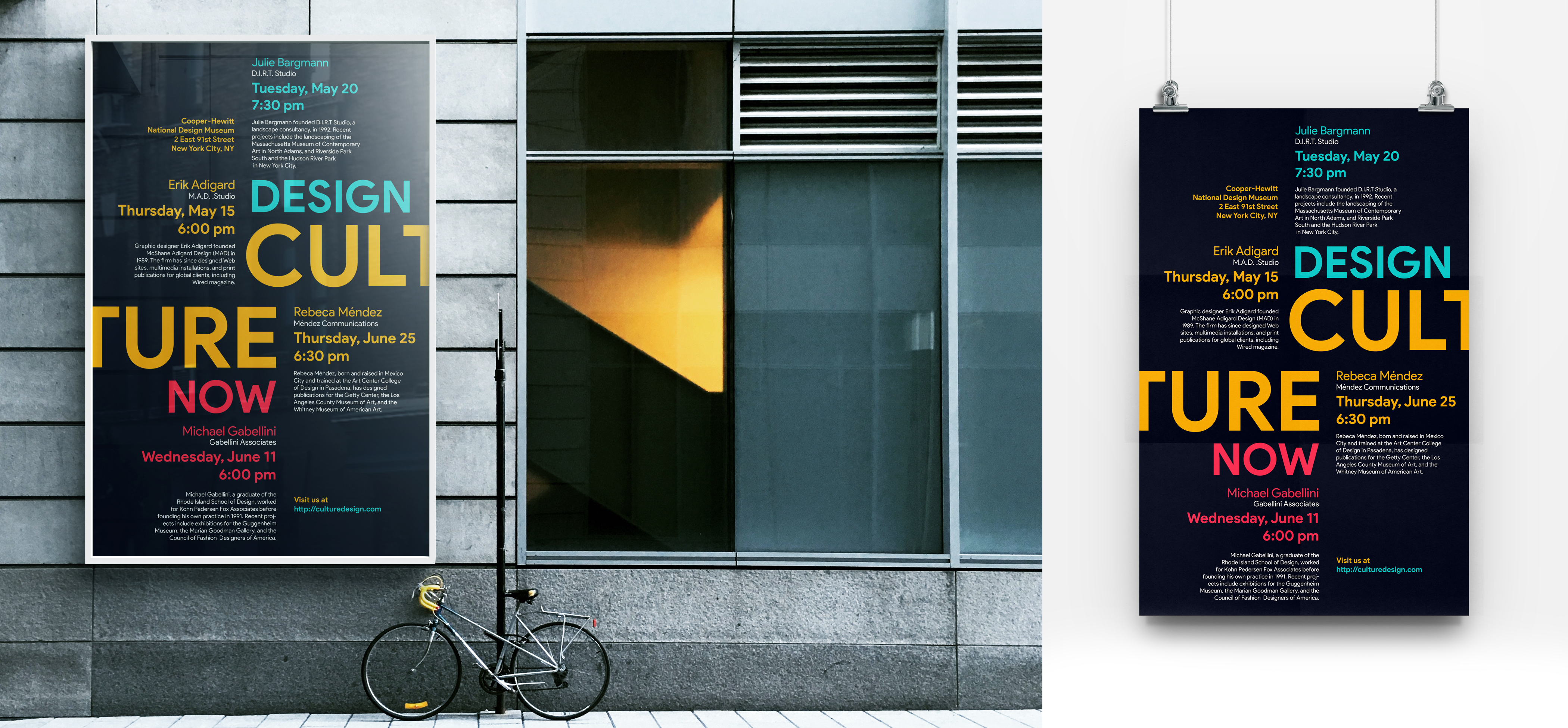
Design Culture Now - Poster Design
Design Culture Now
Design Culture Now is a project for the Typography 1 class that I took at Queens College during my first semester.
This project is a poster design based on typography and how important typography design is. Sometimes we do not need images to transmit the message to the public, with fonts and typography it is possible too. For example, on my poster design, I tried to make everything clear to the public. What is the poster about, what event the poster talks about, making the title huge and visible? Playing with the size of typography makes the design more acceptable and cleaner, not too much noise for the viewer. Playing with the size on typography design makes everything easier to understand and follow what is the message of the design.
Design Culture Now
Design Culture Now
Design Culture Now is a project for the Typography 1 class that I took at Queens College during my first semester.
This project is a poster design based on the typography and how important is the typography design. Sometimes we do not need images to transmit the message to public, with fonts and the typography it is possible too. For example on my poster design I tried to make everything clear for the public. What is the poster about, what event the poster talk about making the title huge and visible. Playing with the size of typography make the design more acceptable and clean, not too much noise for the viewer. Playing with the size on typography design make everything easier to understand and follow what is the message of the design
Claustrophobia - Poster Design
Claustrophobia
Claustrophobia is a project that I designed in Design 1 class during the first semester at Queens College. This project is a concept of claustrophobia as a mental disorder represented only with shapes. Designing only shapes with a message behind sometimes is very difficult. You need to understand very well the message that you want to give to clients and viewers. In this case, I have worked with circles and squares. The square represents the elevator and the circles represent people inside the elevator. The red circle is an individual that suffers from the mental disorder claustrophobia, and in this case, the individual is suffering because the elevator is full and there is not much space for him to feel comfortable. About the typography, I like to play with it. In this case, I have combined the word claustrophobia and the individual that suffers from the mental disorder. The letter O represents the individual that does not have too much space between the other letters.
Claustrophobia is a project that I designed in Design 1 class during the first semester at Queens College. This project is a concept of claustrophobia as a mental disorder represented only with shapes. Designing only shapes with a message behind sometimes is very difficult. You need to understand very well the message that you want to give to clients and viewers. In this case, I have worked with circles and squares. The square represents the elevator and the circles represent people inside the elevator. The red circle is an individual that suffers from the mental disorder claustrophobia, and in this case, the individual is suffering because the elevator is full and there is not much space for him to feel comfortable. About the typography, I like to play with it. In this case, I have combined the word claustrophobia and the individual that suffers from the mental disorder. The letter O represents the individual that does not have too much space between the other letters.
Claustrophobia
Claustrophobia
Claustrophobia is a project that I designed at Design 1 class during the first semester at Queens College.
This project is a concept of the claustrophobia as a mental disorder represented only with shapes. Designing only shapes with a message behind sometimes is very difficult. You need to understand very good the message that you want to give to clients and viewers. In this case, I have worked with circles and squares. The square represents the elevator and the circles represent people inside the elevator. The red circle is an individual that suffers from the mental disorder claustrophobia, and in this case, the individual is suffering because the elevator is full and there is not much space for him to feel comfortable. About the typography, I like to play with it. In this case, I have combined the word claustrophobia and the individual that suffers from a mental disorder. The letter O represents the individual that does not have too much space between the other letters.
of the design.


