Arnaldo Rivera Undicicomuni Barolo × The Devil Wears Prada 2
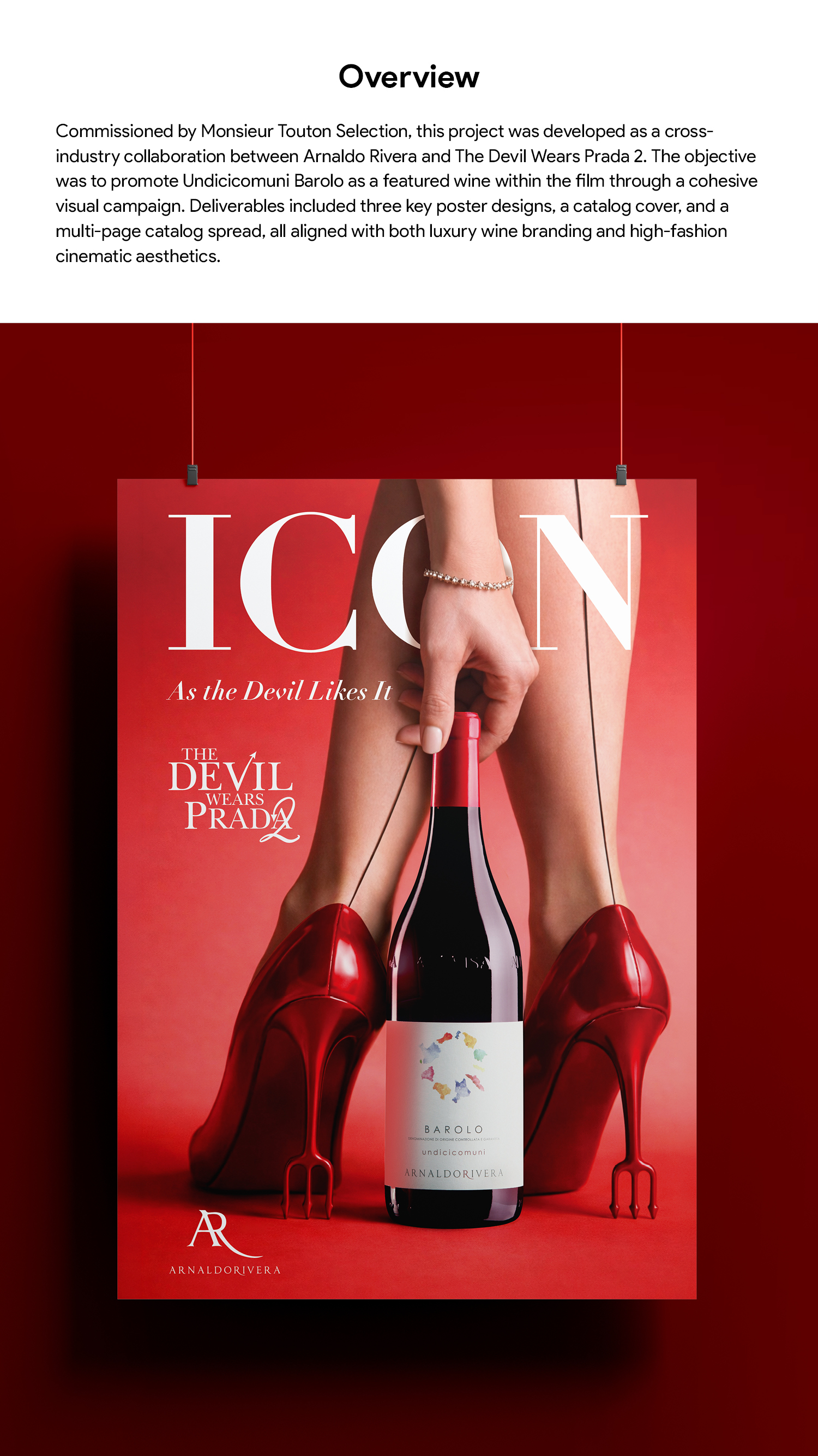
Overview
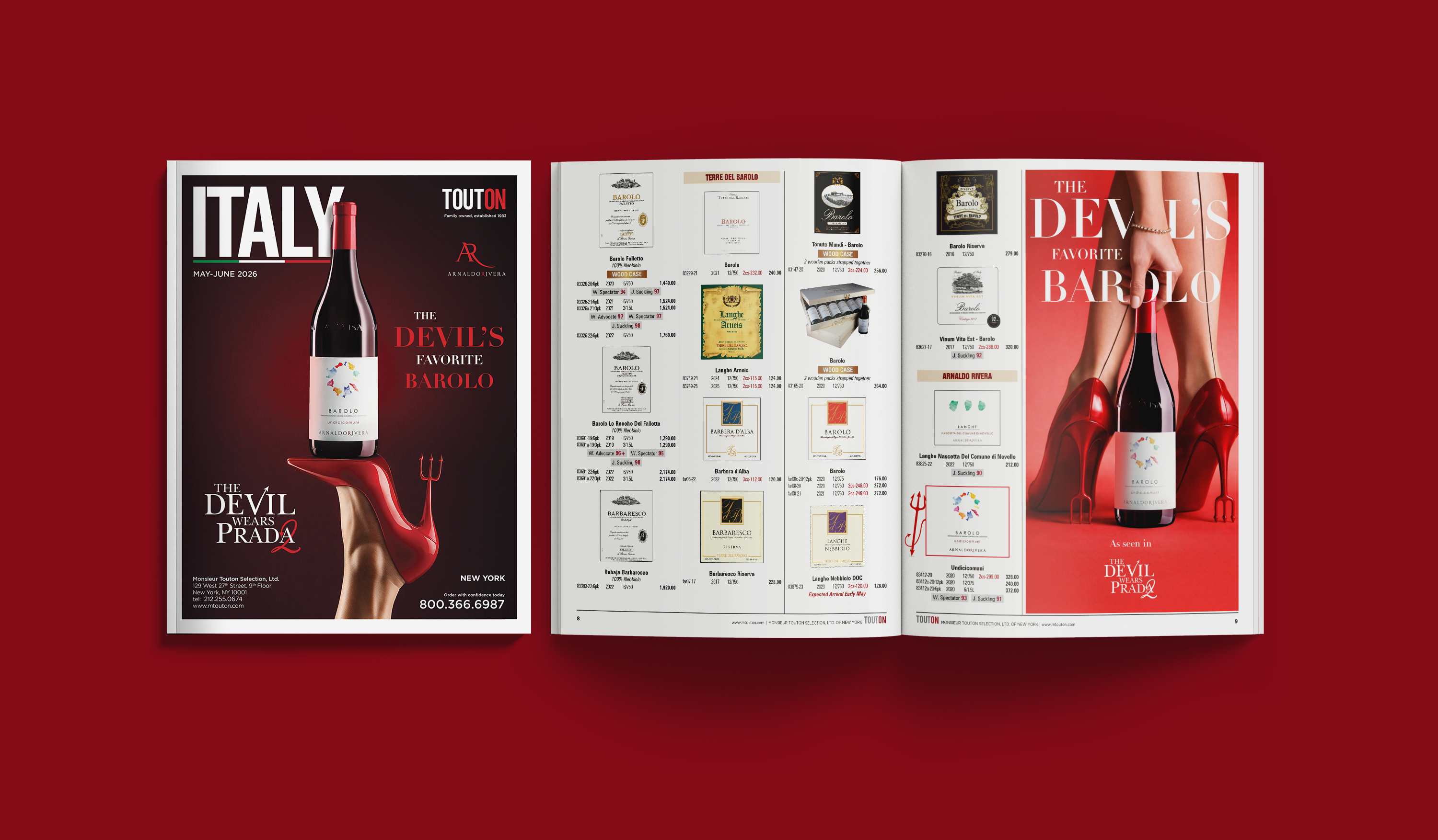
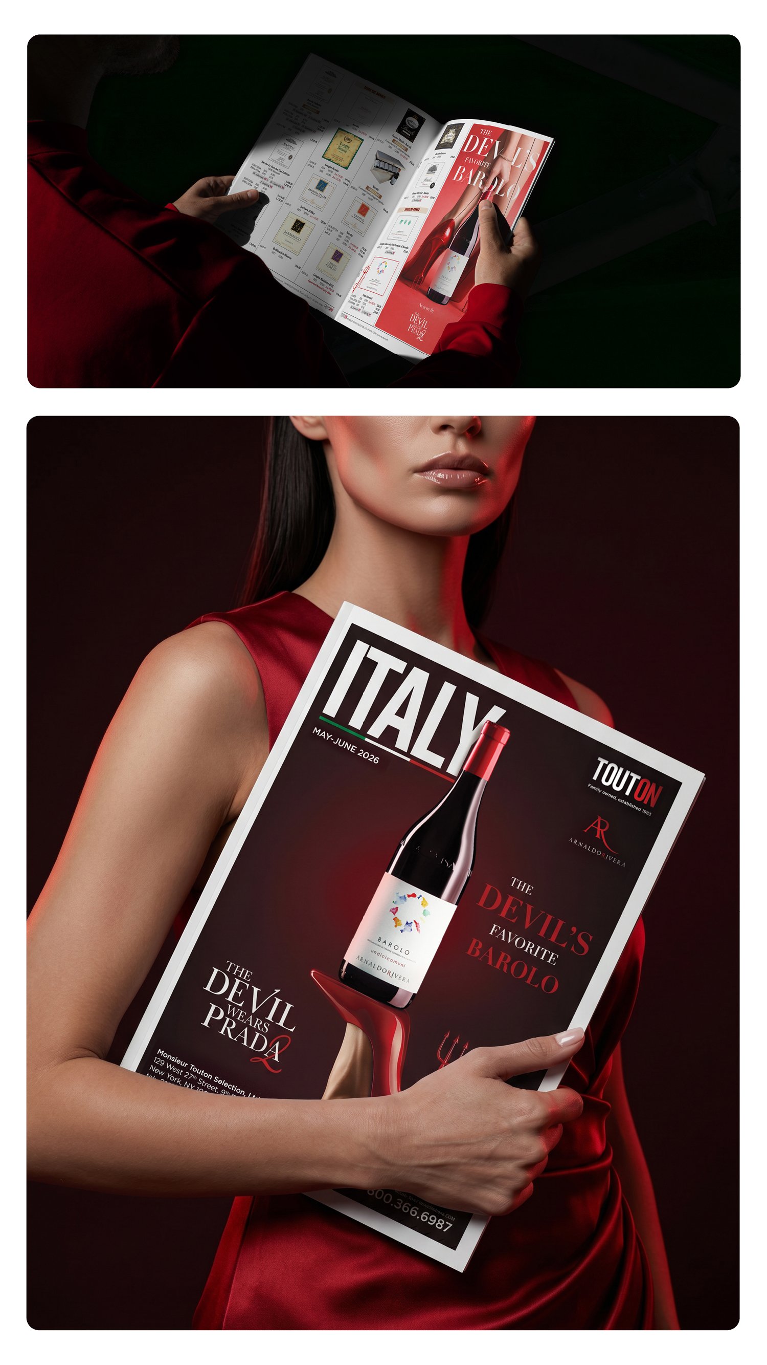
Commissioned by Monsieur Touton Selection, this project was developed as a cross-industry collaboration between Arnaldo Rivera and The Devil Wears Prada 2. The objective was to promote Undicicomuni Barolo as a featured wine within the film through a cohesive visual campaign. Deliverables included three key poster designs, a catalog cover, and a multi-page catalog spread, all aligned with both luxury wine branding and high-fashion cinematic aesthetics.
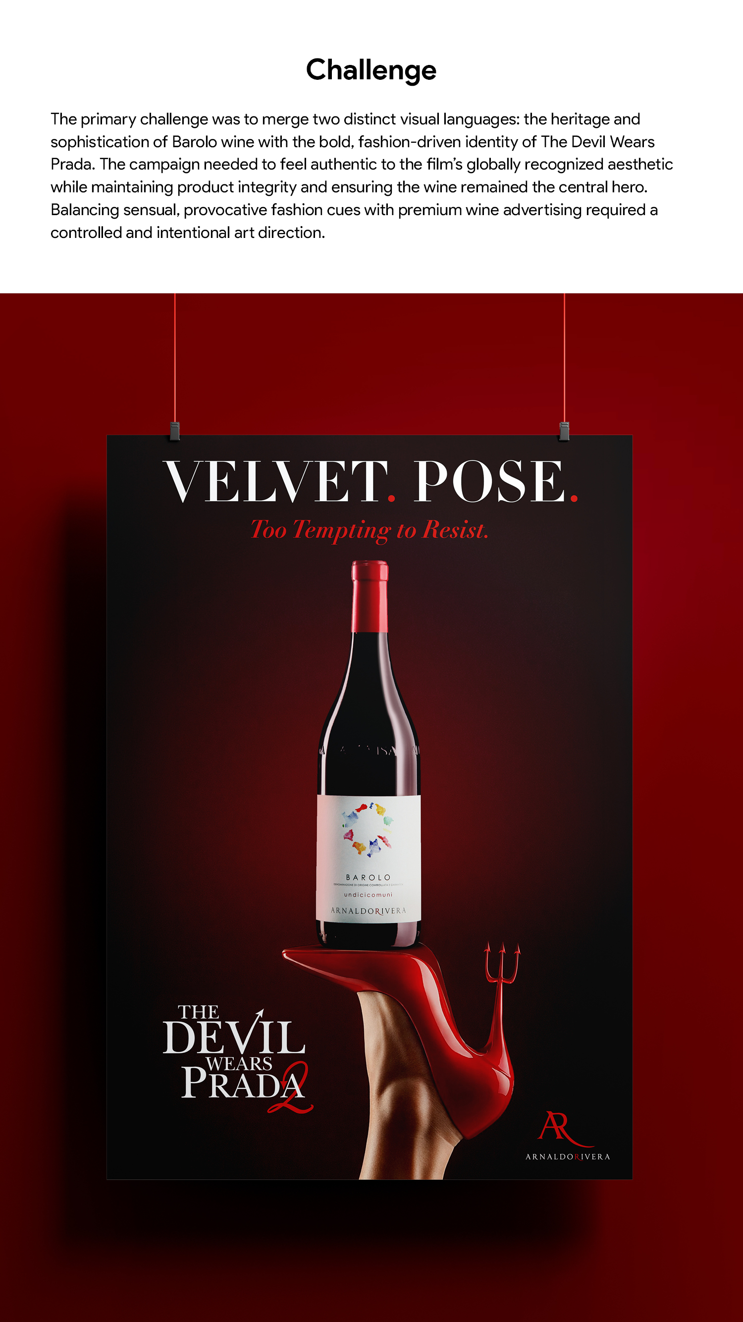
Challenge
The primary challenge was to merge two distinct visual languages: the heritage and sophistication of Barolo wine with the bold, fashion-driven identity of The Devil Wears Prada. The campaign needed to feel authentic to the film’s globally recognized aesthetic while maintaining product integrity and ensuring the wine remained the central hero. Balancing sensual, provocative fashion cues with premium wine advertising required a controlled and intentional art direction.
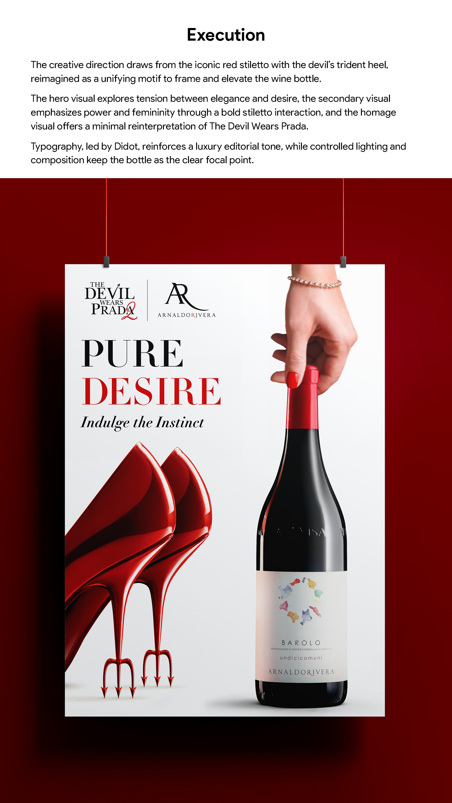
Execution
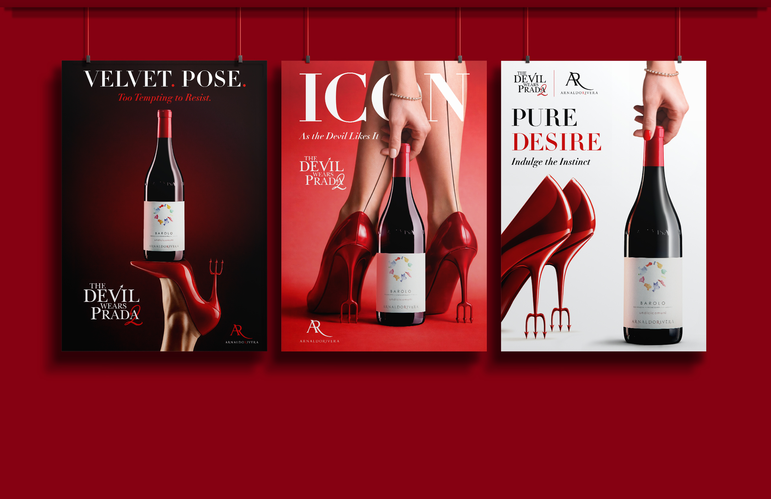
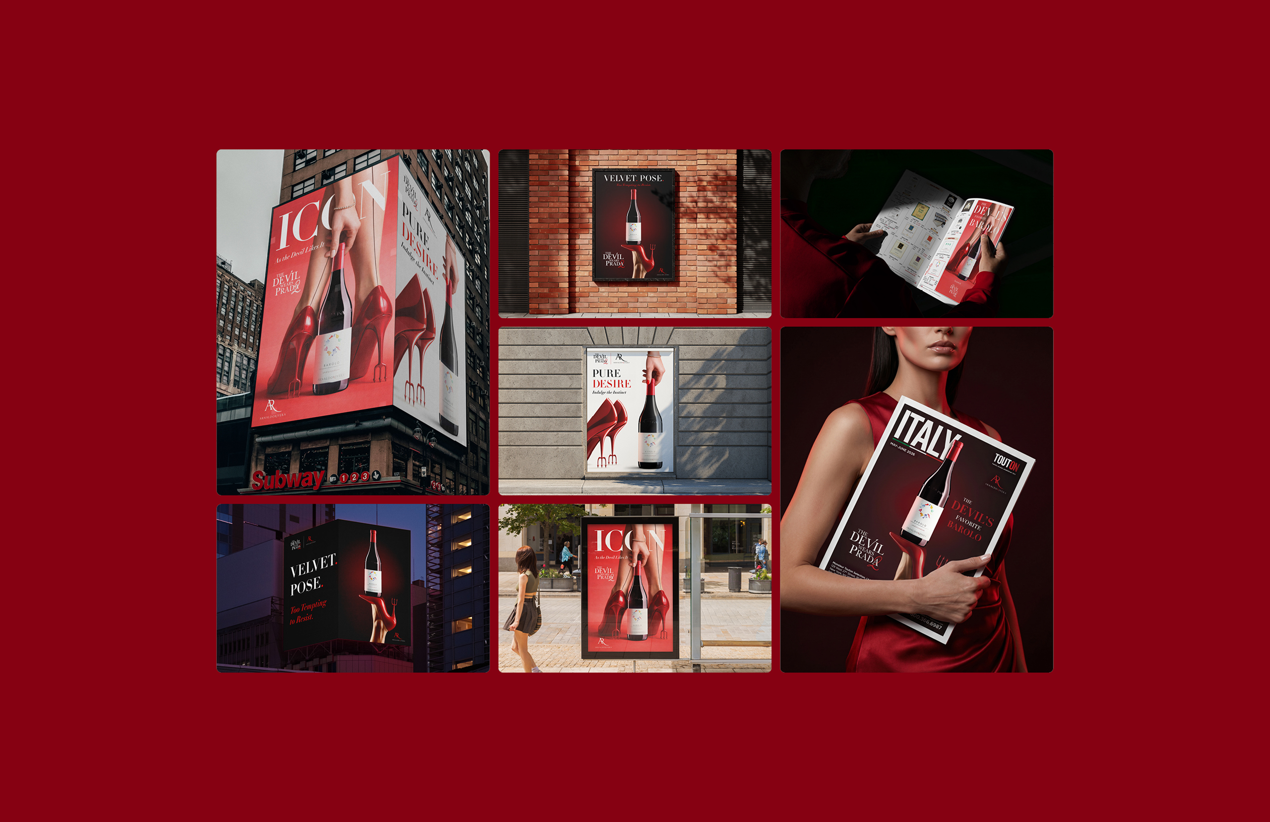
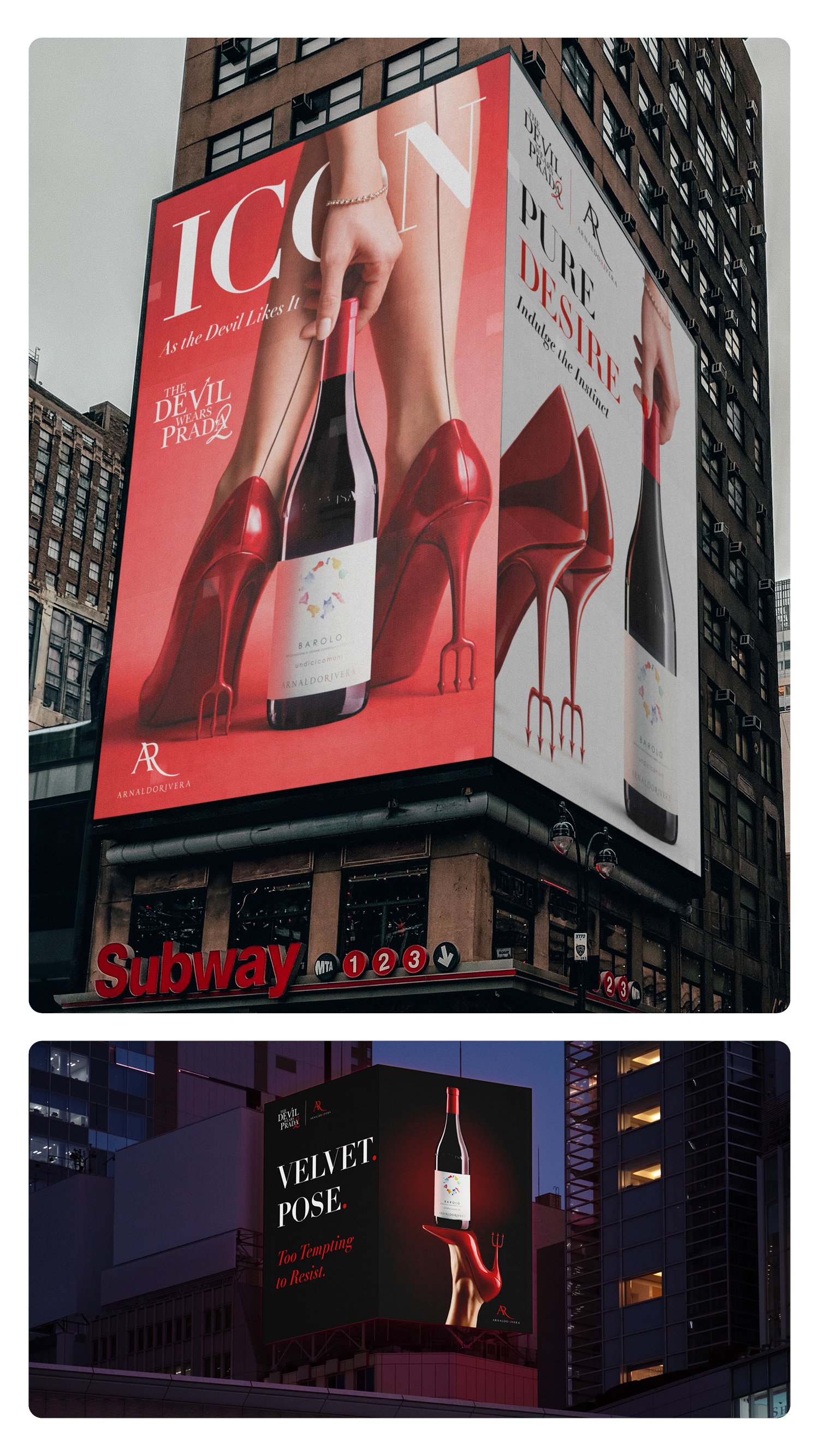
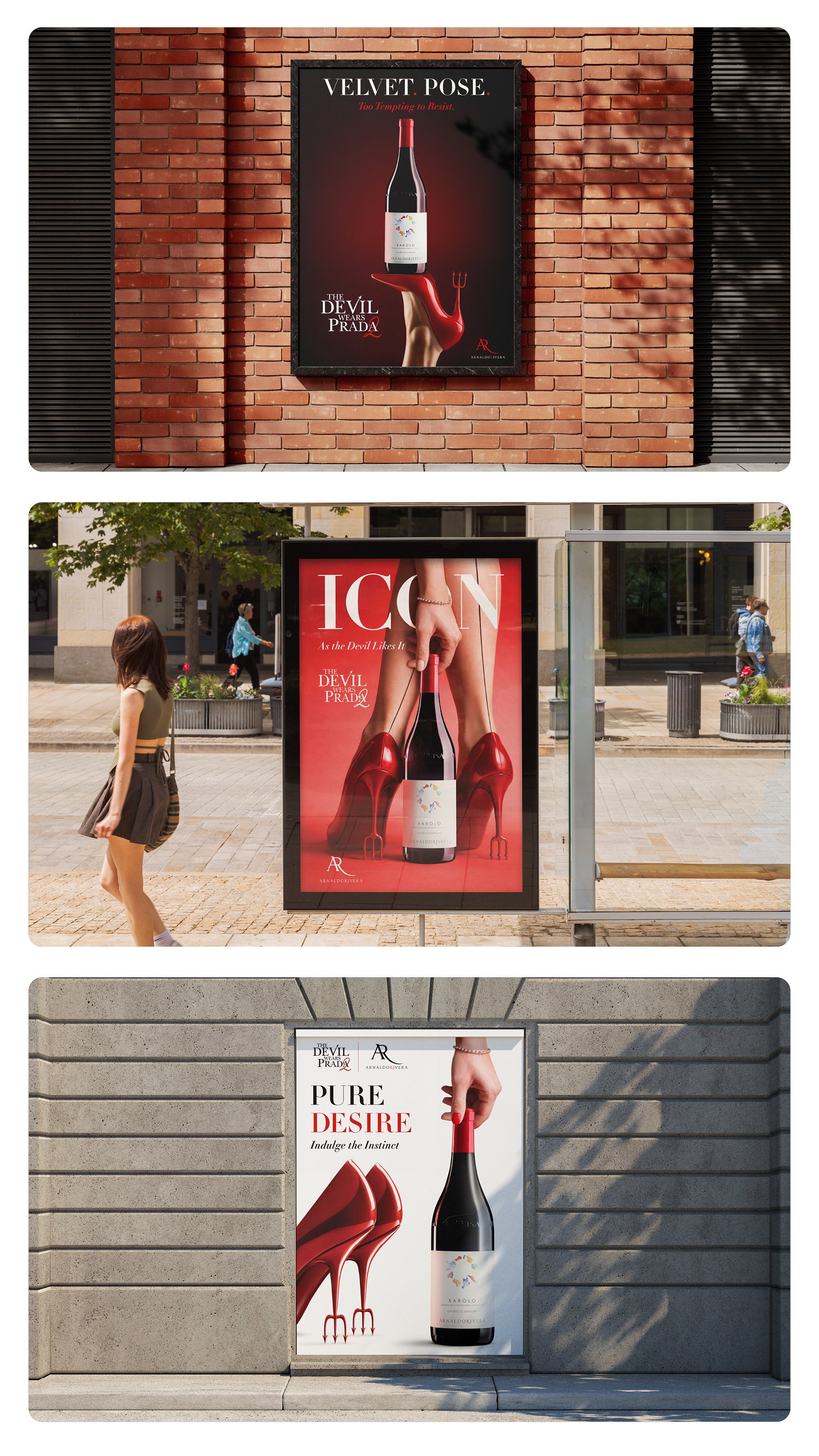
The creative direction was anchored in the film’s most iconic visual element: the red stiletto with the devil’s trident heel. This motif became the unifying symbol across all designs, reinterpreted to frame and elevate the wine bottle as the focal point.
Read More
Hero Visual A female model delicately yet provocatively engages with the bottle, creating a tension between elegance and desire. The monochromatic red environment amplifies drama, seduction, and brand recall.
Secondary Visual A bold, fashion-forward visual where the stiletto physically interacts with the bottle, emphasizing power, femininity, and visual impact.
Homage Visual A minimalist reinterpretation of the original Devil Wears Prada artwork, maintaining global recognizability while integrating the wine product through subtle yet intentional modifications.
Typography
Typography played a critical role in reinforcing the fashion narrative. The use of Didot—a typeface synonymous with luxury editorial design and reminiscent of RUNWAY magazine—established an immediate connection to the fashion world while maintaining refinement and clarity.
Across all executions, strict attention was given to product fidelity, lighting realism, and composition hierarchy, ensuring the wine bottle remained the undisputed focal point.
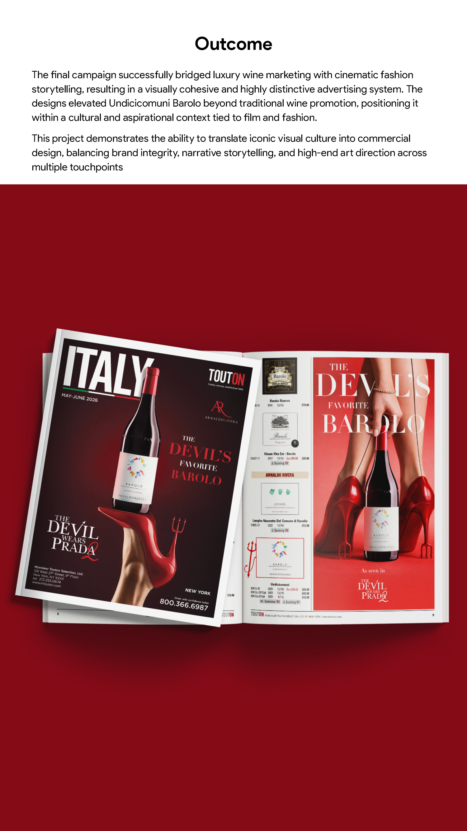
Outcome
The final campaign successfully bridged luxury wine marketing with cinematic fashion storytelling, resulting in a visually cohesive and highly distinctive advertising system. The designs elevated Undicicomuni Barolo beyond traditional wine promotion, positioning it within a cultural and aspirational context tied to film and fashion.
Tools
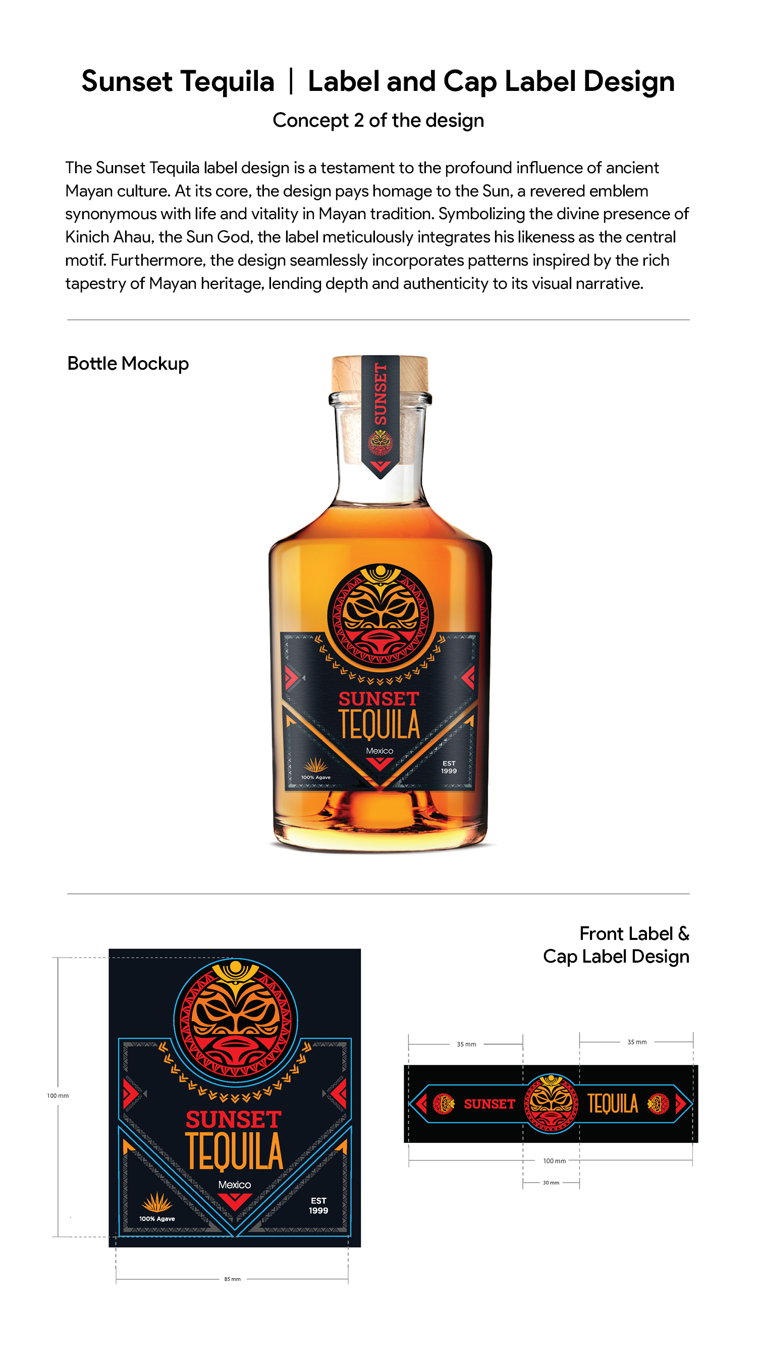
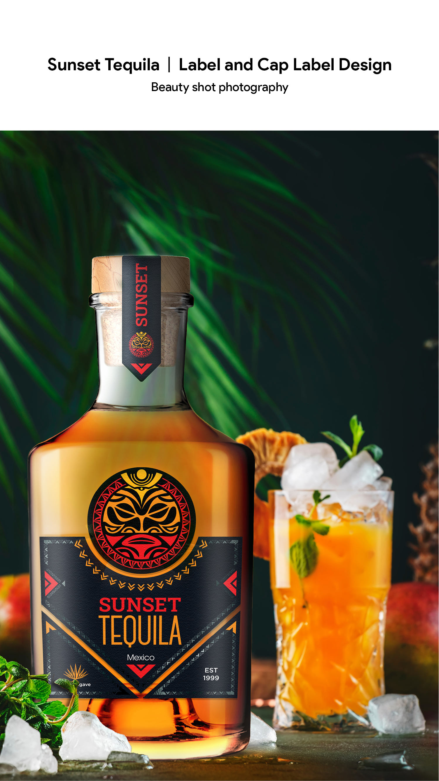
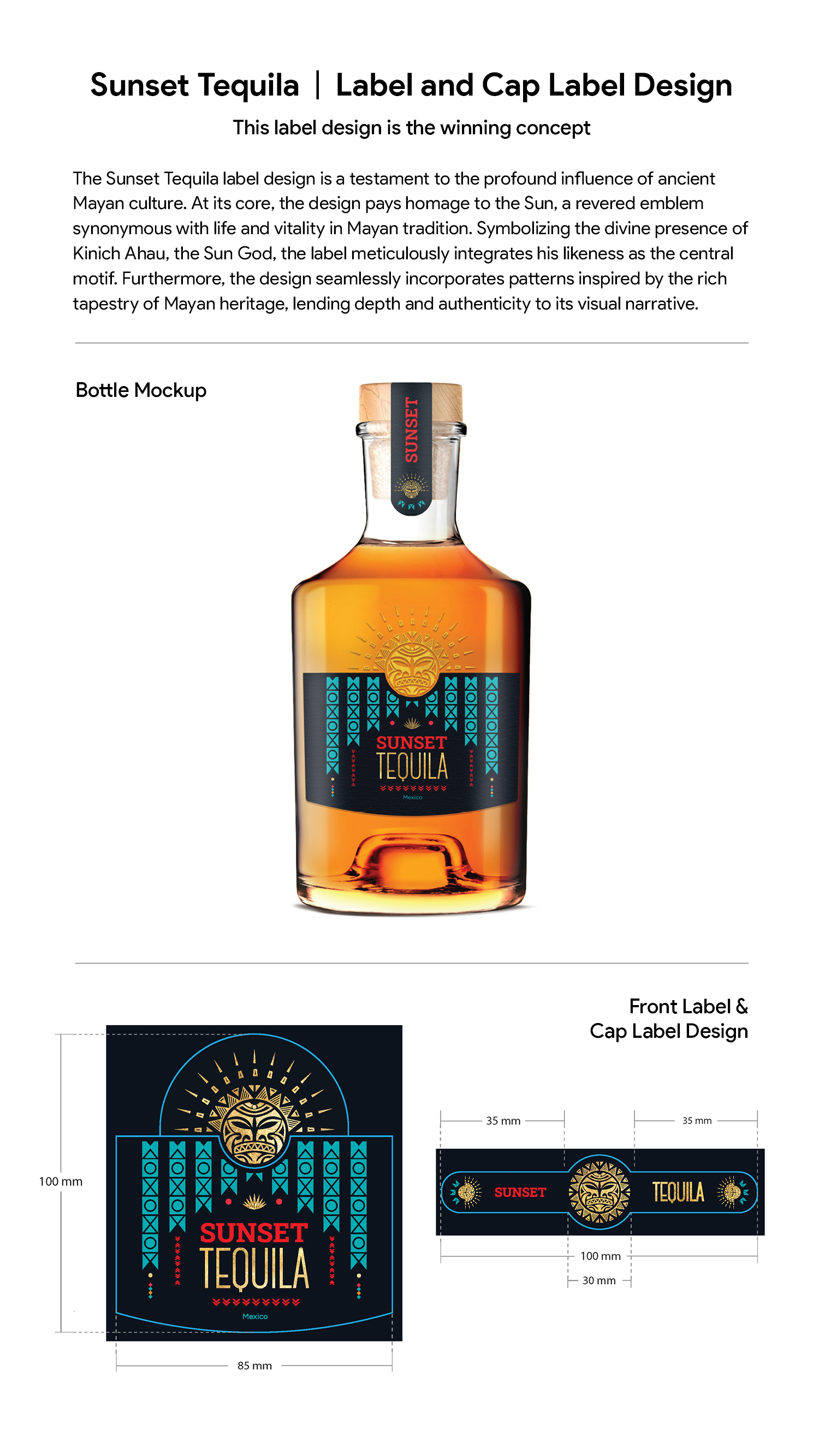
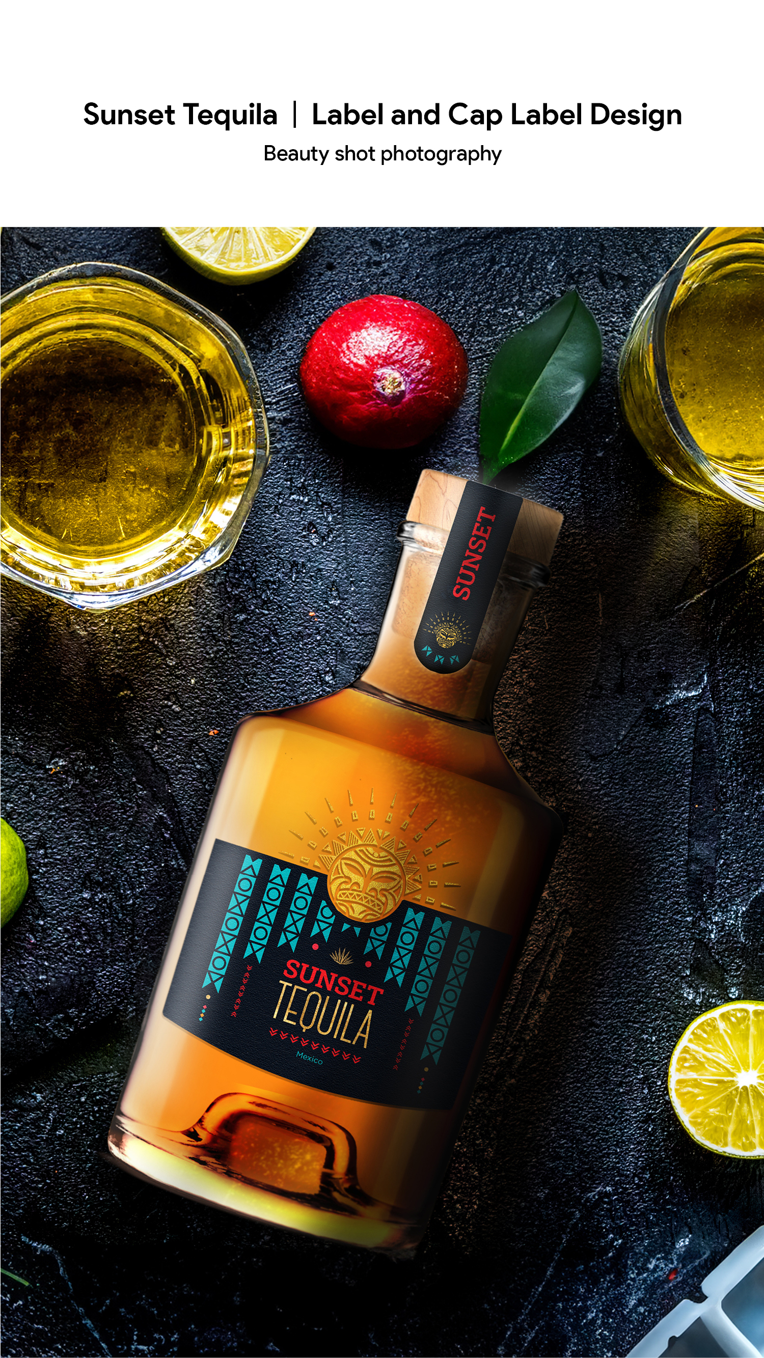
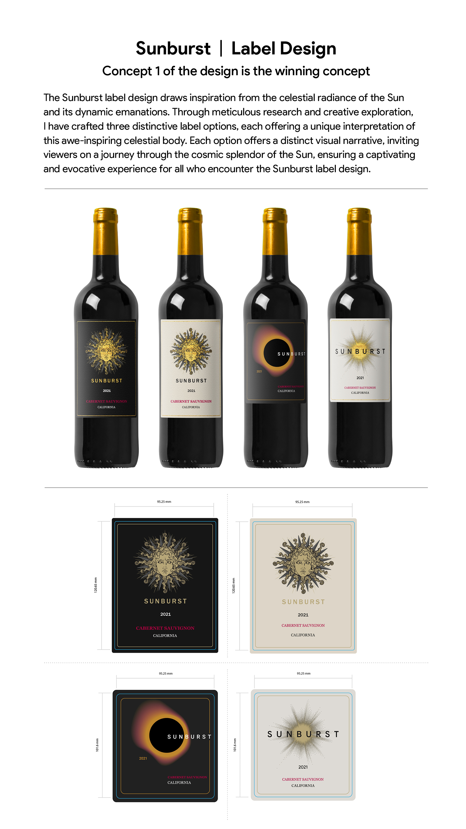
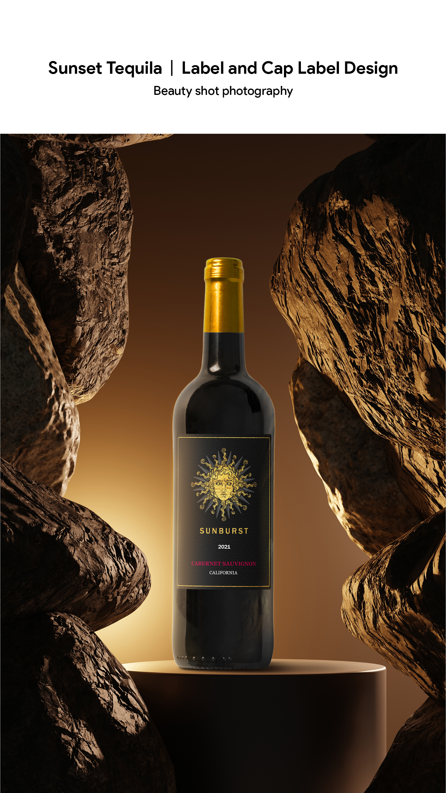
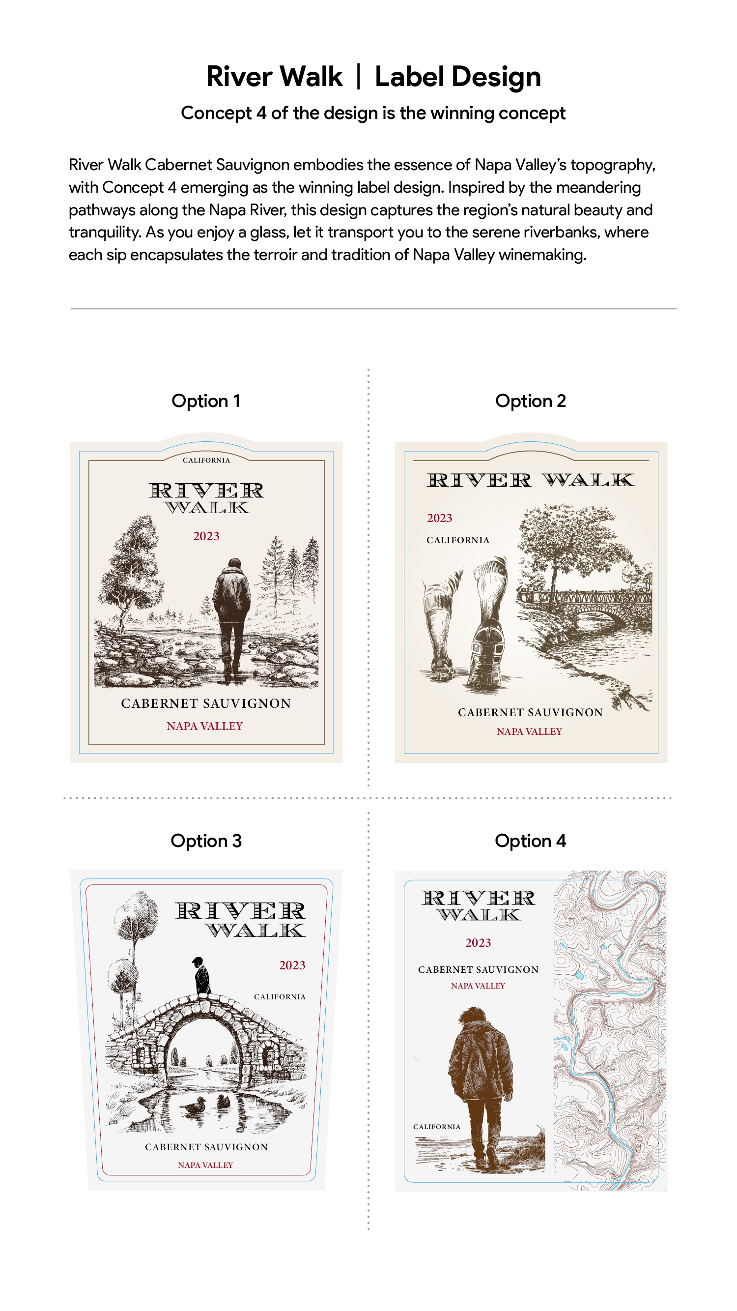
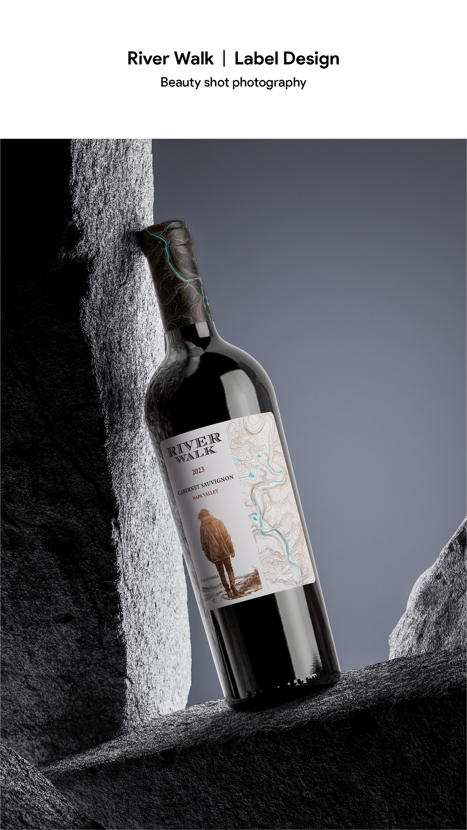
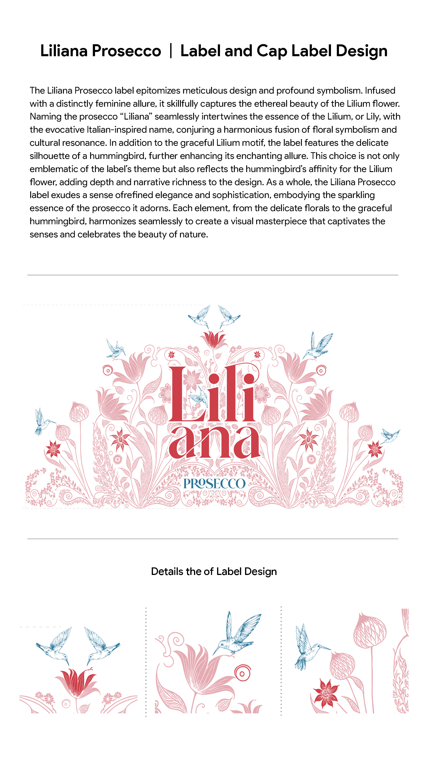
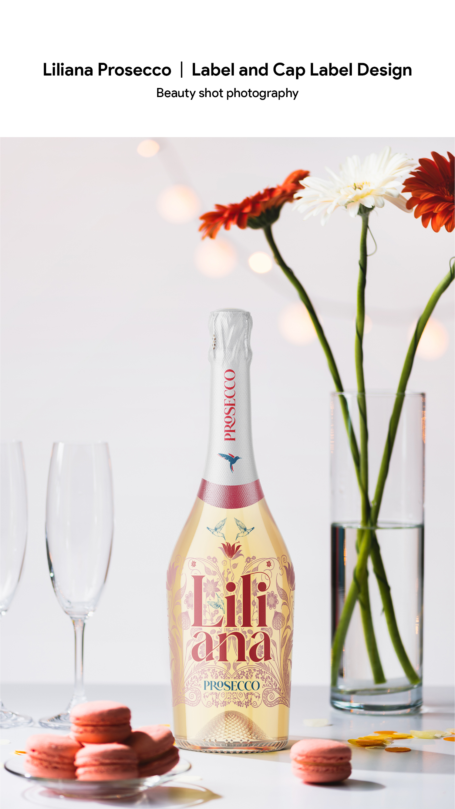
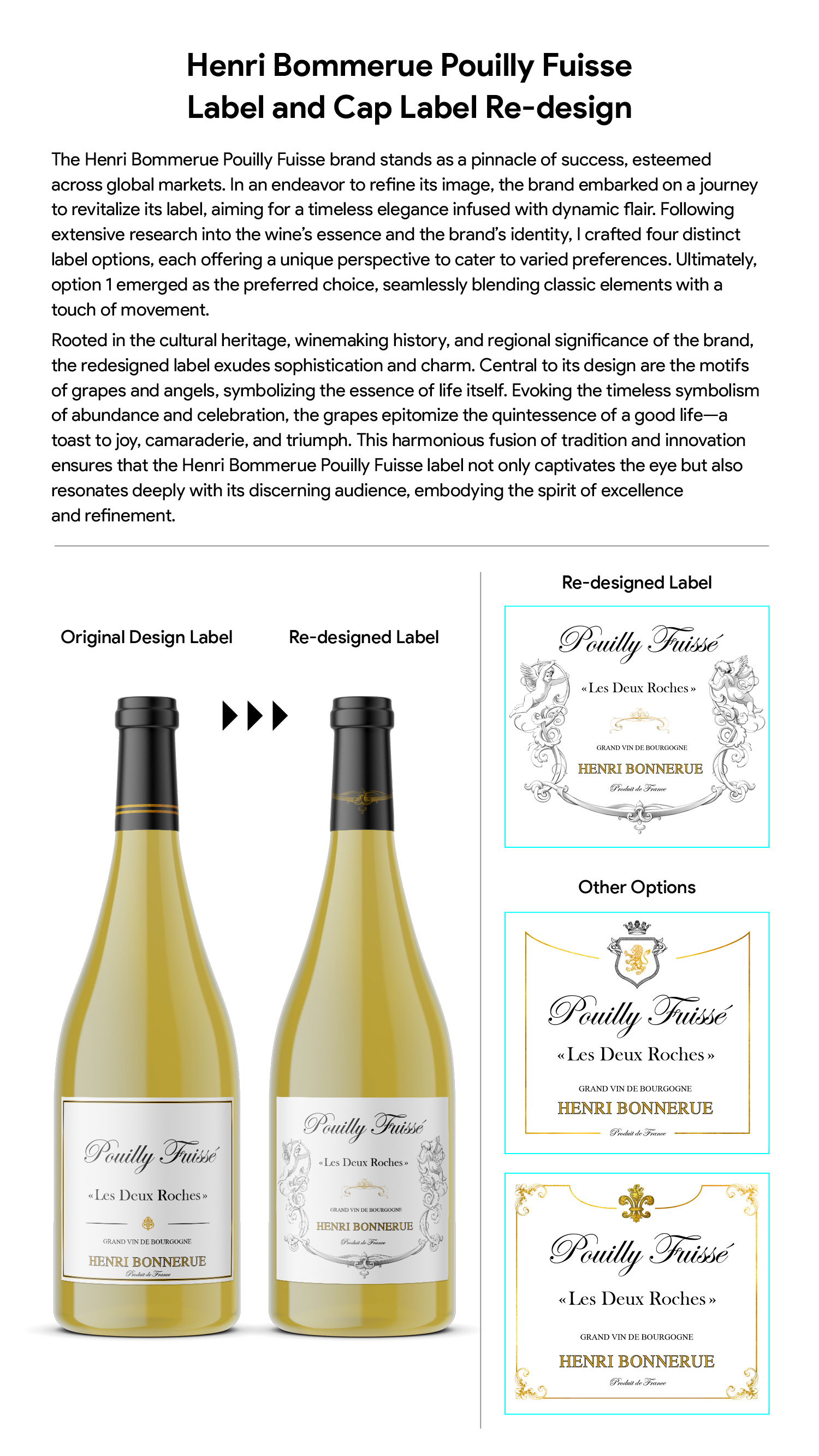
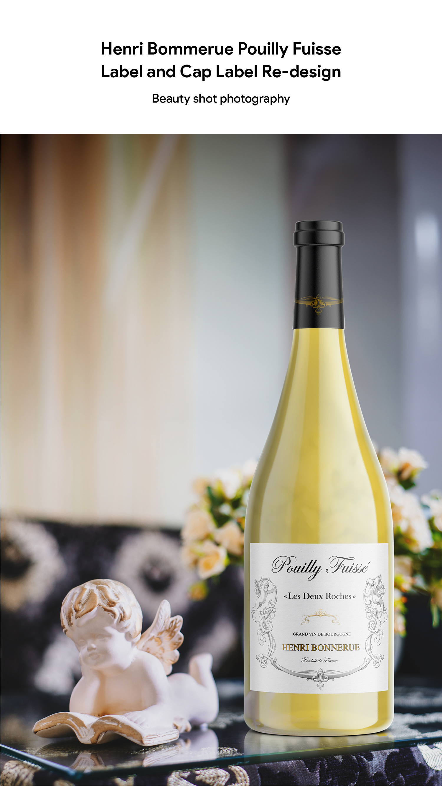
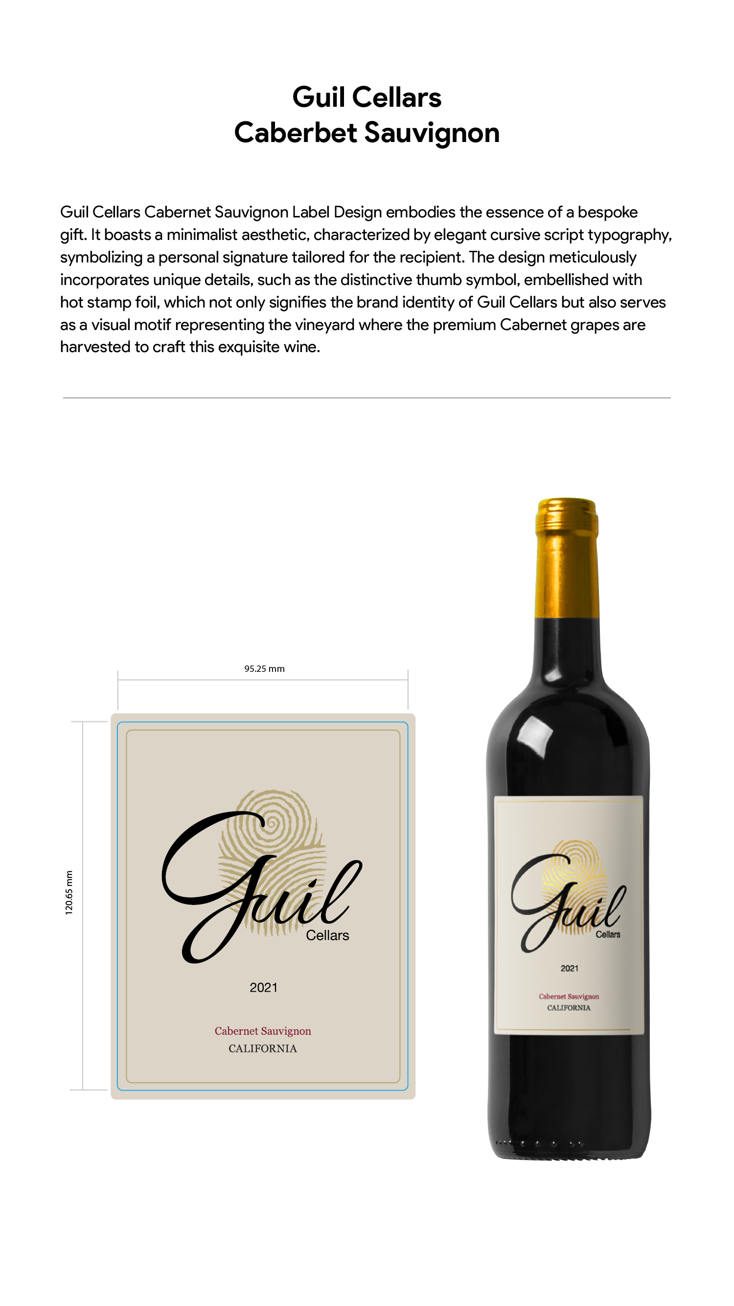
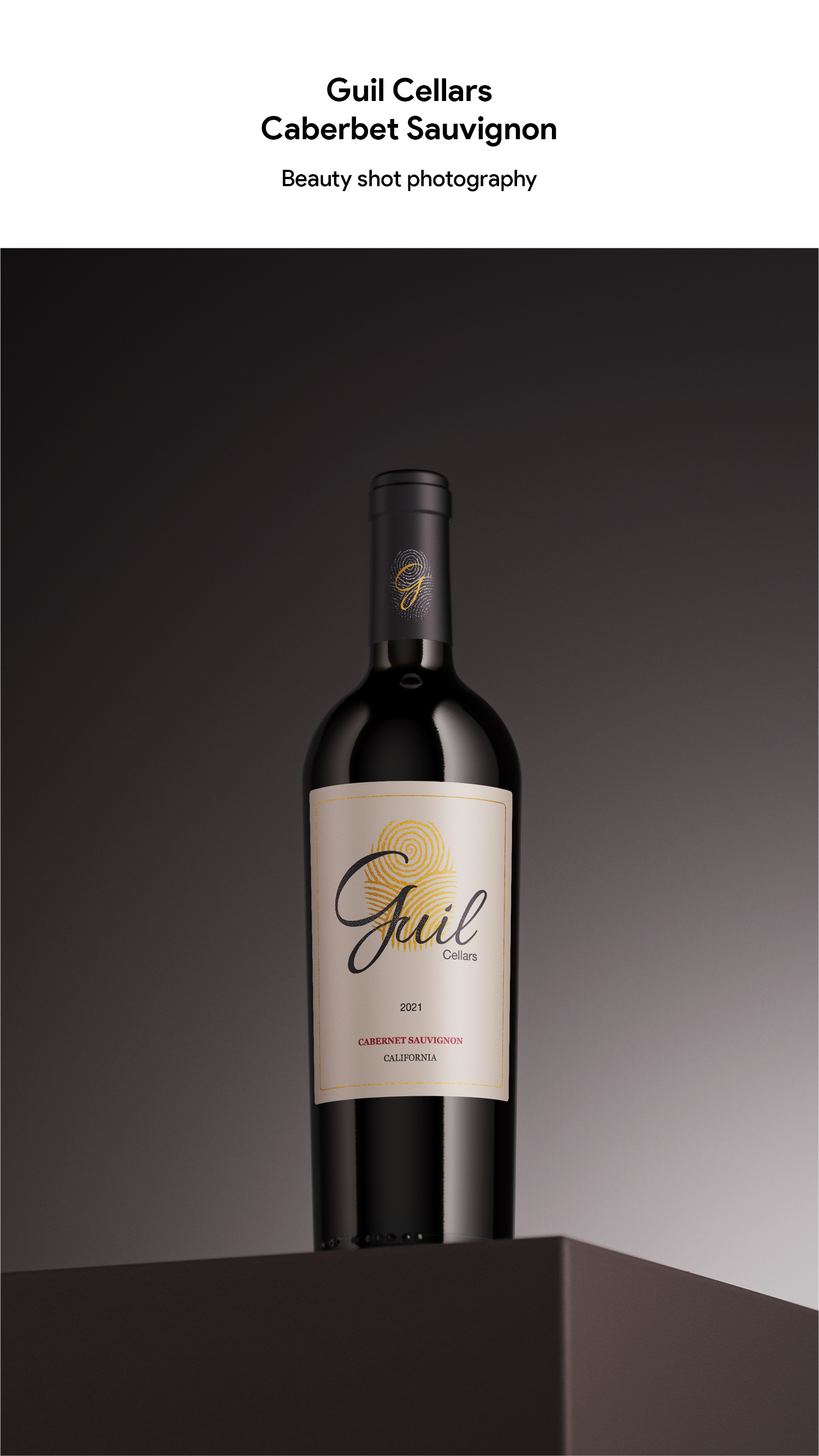
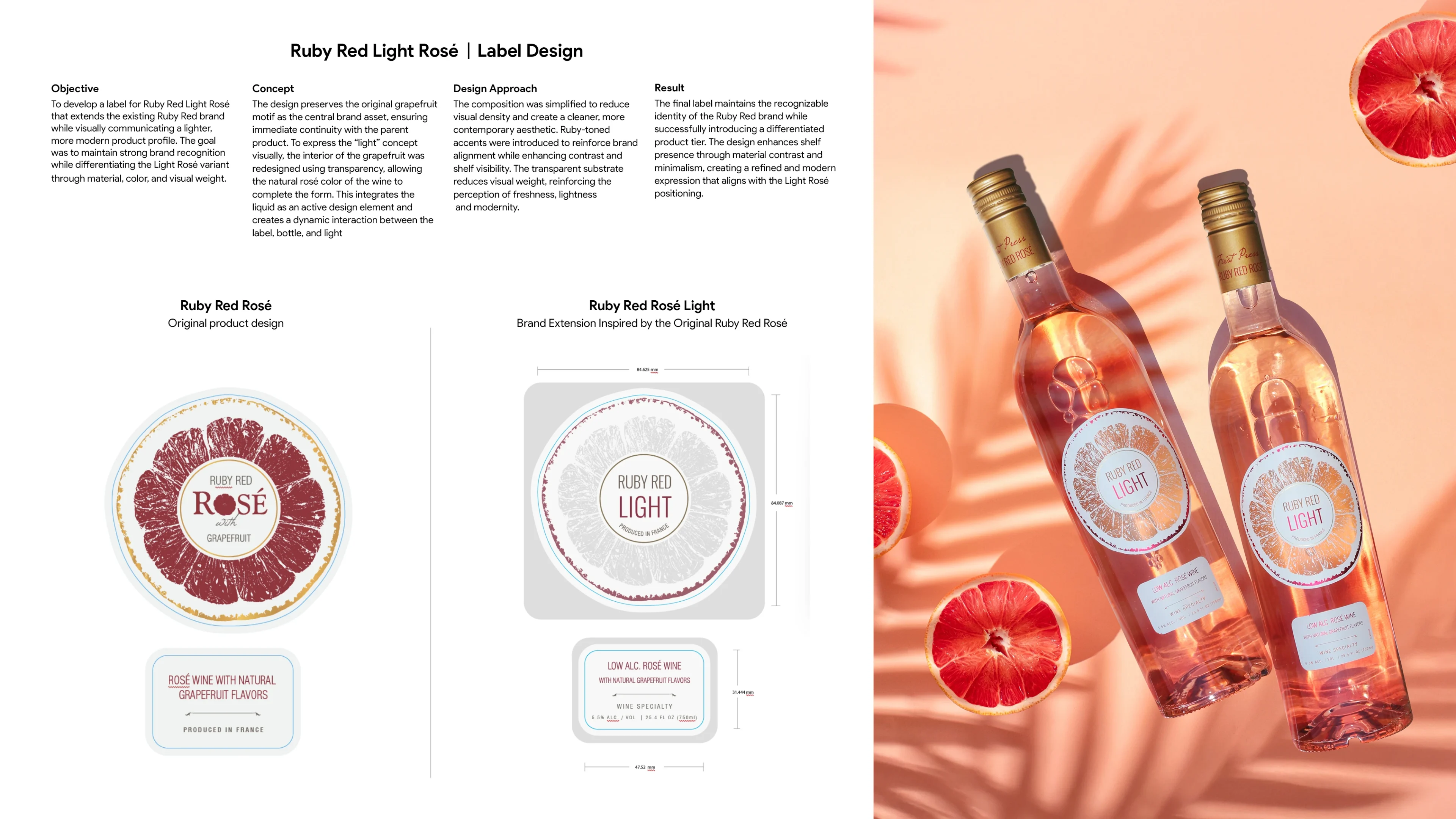
Wine and Spirits Label Designs
Unique Label Designs for Wine and Spirits
Brand Identity & Rebranding
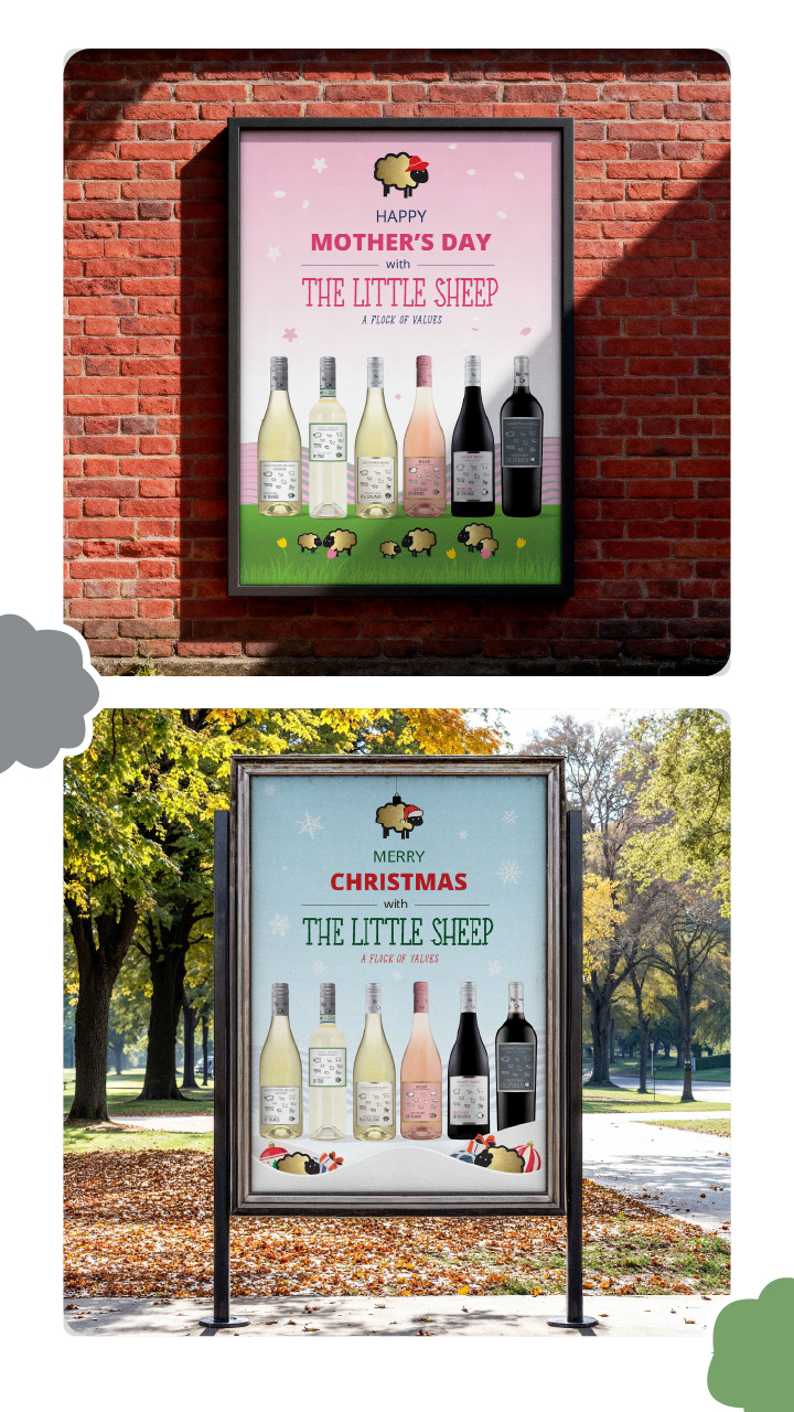
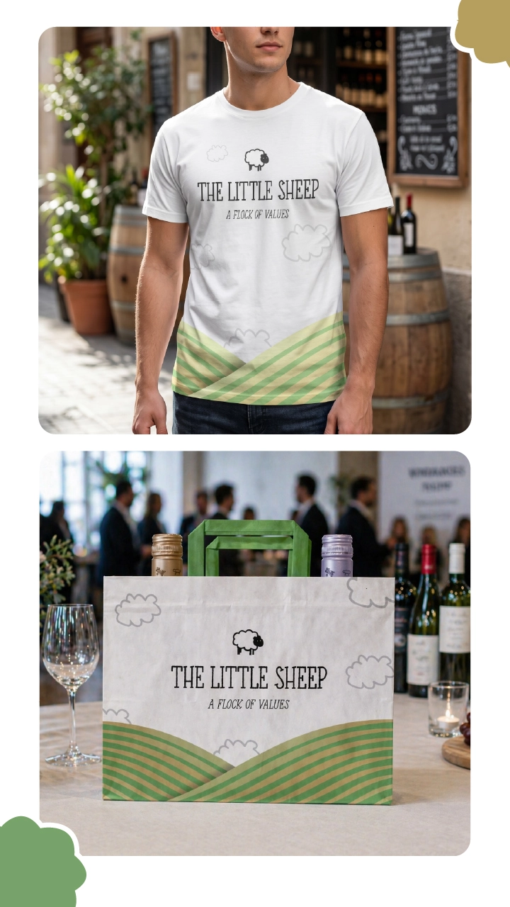
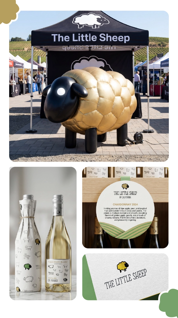
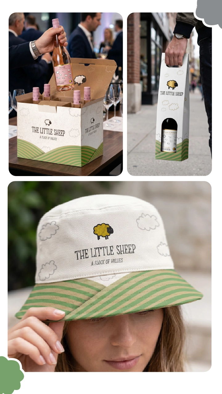
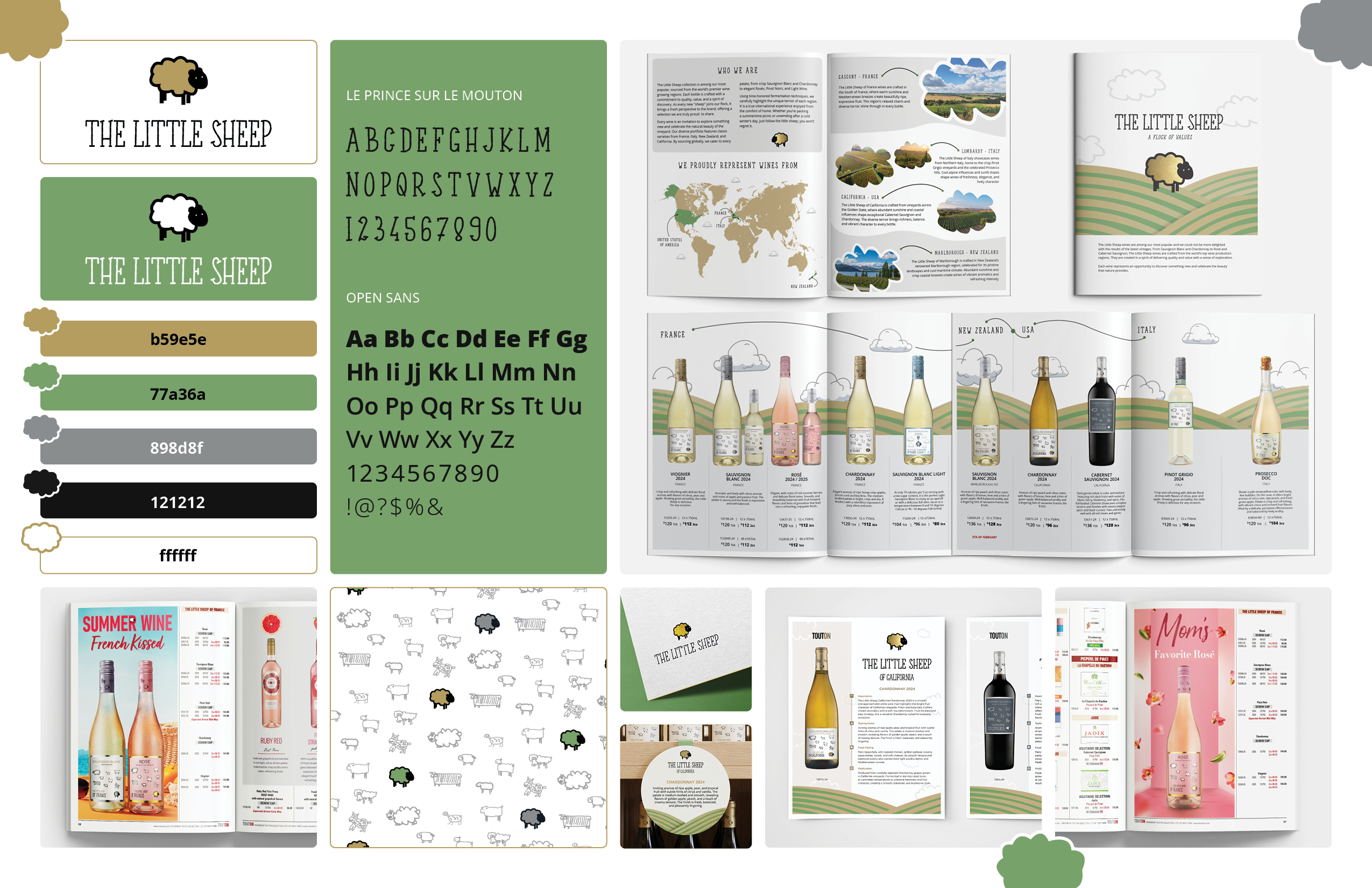
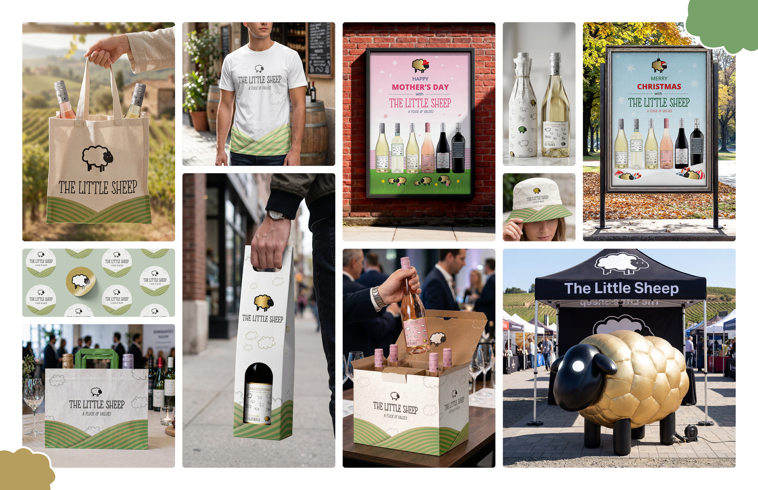
The Little Sheep — Art Direction, Brand System & Integrated Design
Overview
Led the rebranding of The Little Sheep, a French wine brand, at Monsieur Touton Selection. The project focused on building a cohesive identity system across all touchpoints while preserving the existing logo. Working with a team of designers, I directed the development of a scalable visual language grounded in the brand’s name, heritage, and market positioning.
Challenge
To create a distinct and elevated brand identity without modifying the logo, requiring the development of a strong supporting system that could carry the brand across diverse applications. The identity needed to perform consistently across packaging, editorial, merchandise, and experiential environments, while balancing approachability with premium perception.
Execution
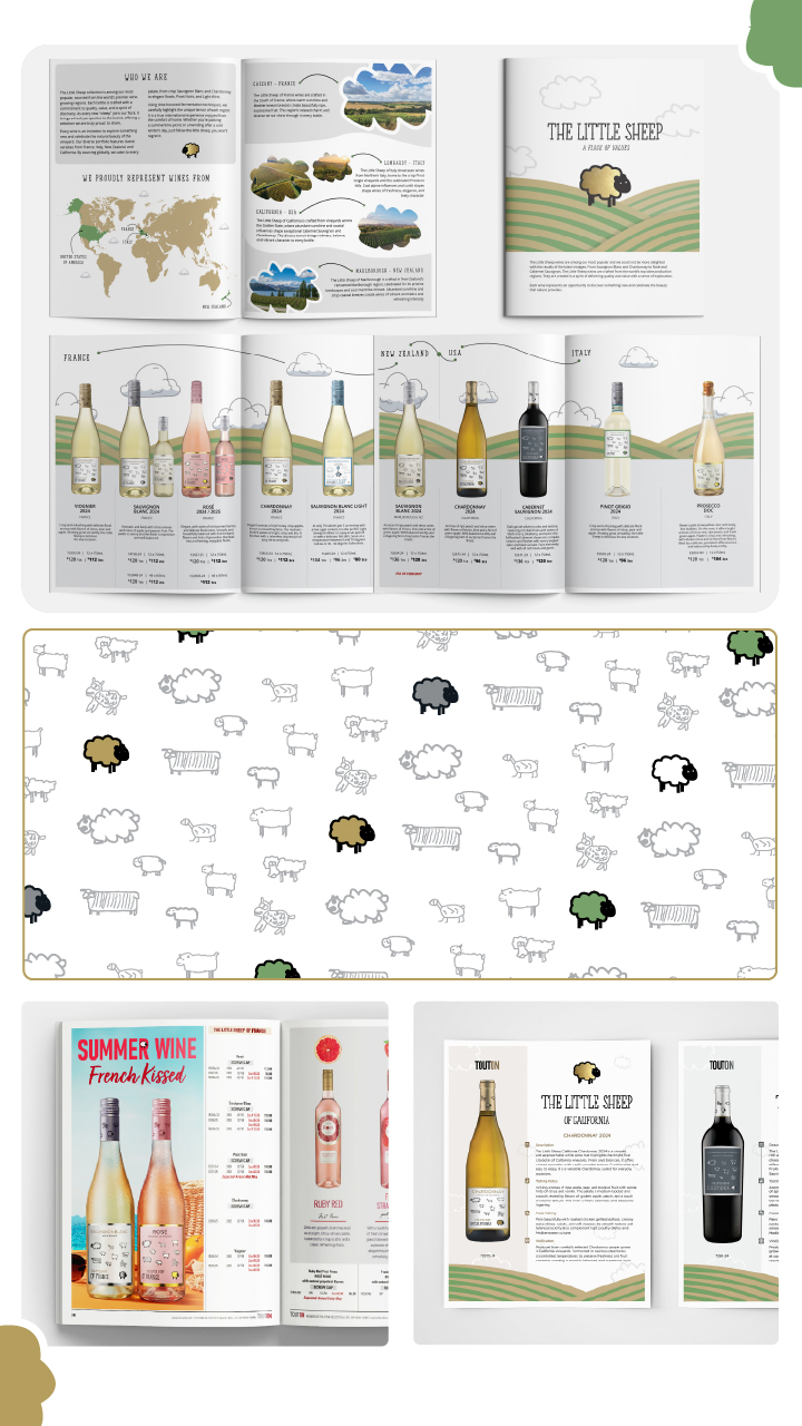
Defined and led the development of a flexible brand system, using the existing logo as an anchor while building a cohesive visual language.
Read More
Art direction focused on:
A balance between playful character and refined simplicity.
A modular graphic system adaptable across formats.
Consistent hierarchy across print, product, and spatial applications.
As team lead, I guided concept development, design execution, and cross-application consistency.
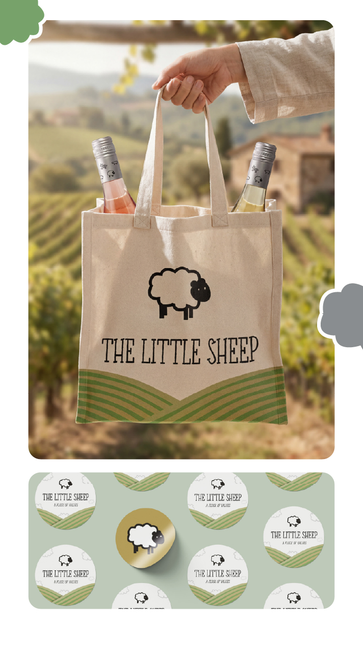
Key outputs included:
Brand identity system (color, typography, graphics).
Packaging and bottle wraps.
Editorial and catalog advertising.
Merchandise (tote bags, apparel, accessories).
Experiential design, including a large-scale inflatable brand asset.
Outcome
Delivered a fully integrated brand ecosystem that extends across physical, retail, and marketing environments. The rebrand strengthened visual consistency, improved brand recognition, and enabled scalable application across campaigns and activations.
Tools
Marketing Campaign Designs
Halloween Campaign - Art Direction & Integrated Marketing
Overview
Developed an integrated seasonal campaign for Podere Castorani Orange Wine, translating a traditional product promotion into a narrative-driven, multi-channel marketing experience.
Concept & Art Direction
“Uncork the Fear” positions the wine bottle as the central character within a Halloween-inspired visual narrative. Rather than functioning as a static product, the bottle becomes the focal point of tension, with surrounding elements symbolizing attraction, desire, and suspense.
Read More
Design System
A consistent visual language was developed to support the campaign across all platforms.
Key visual elements include:
Atmospheric fog and dark textured environments Warm orange highlights that echo the wine label Dramatic lighting to create a cinematic Halloween mood Ghostly hands, skeleton figures, and carved pumpkins The wine bottle is positioned as the visual focal point
These elements allow the wine to remain the hero while surrounding characters create movement and narrative tension.
Execution
Directed a cohesive visual system across print and digital platforms, including posters, catalog covers, brochures, and social media assets. Compositions were built using a combination of photography and digital compositing, maintaining the product as the primary focal point while introducing cinematic lighting, atmospheric depth, and narrative-driven elements. A consistent typographic treatment and visual language ensured continuity across all touchpoints.
Read More
Brochure Design
The campaign’s central piece is a 3-panel gatefold brochure designed as a coffin.
When closed, the brochure visually resembles a coffin with the message “Open if you dare.”
When opened, the inside reveals the wine bottle placed inside the coffin instead of a human figure, turning the product reveal into a theatrical moment.
Poster Design
A set of Halloween promotional posters where ghostly figures reach toward the bottle or interact with it in dramatic scenes. In one variation, a skeletal character presents the wine directly to the viewer, reinforcing the idea of the wine being showcased during the Halloween celebration.
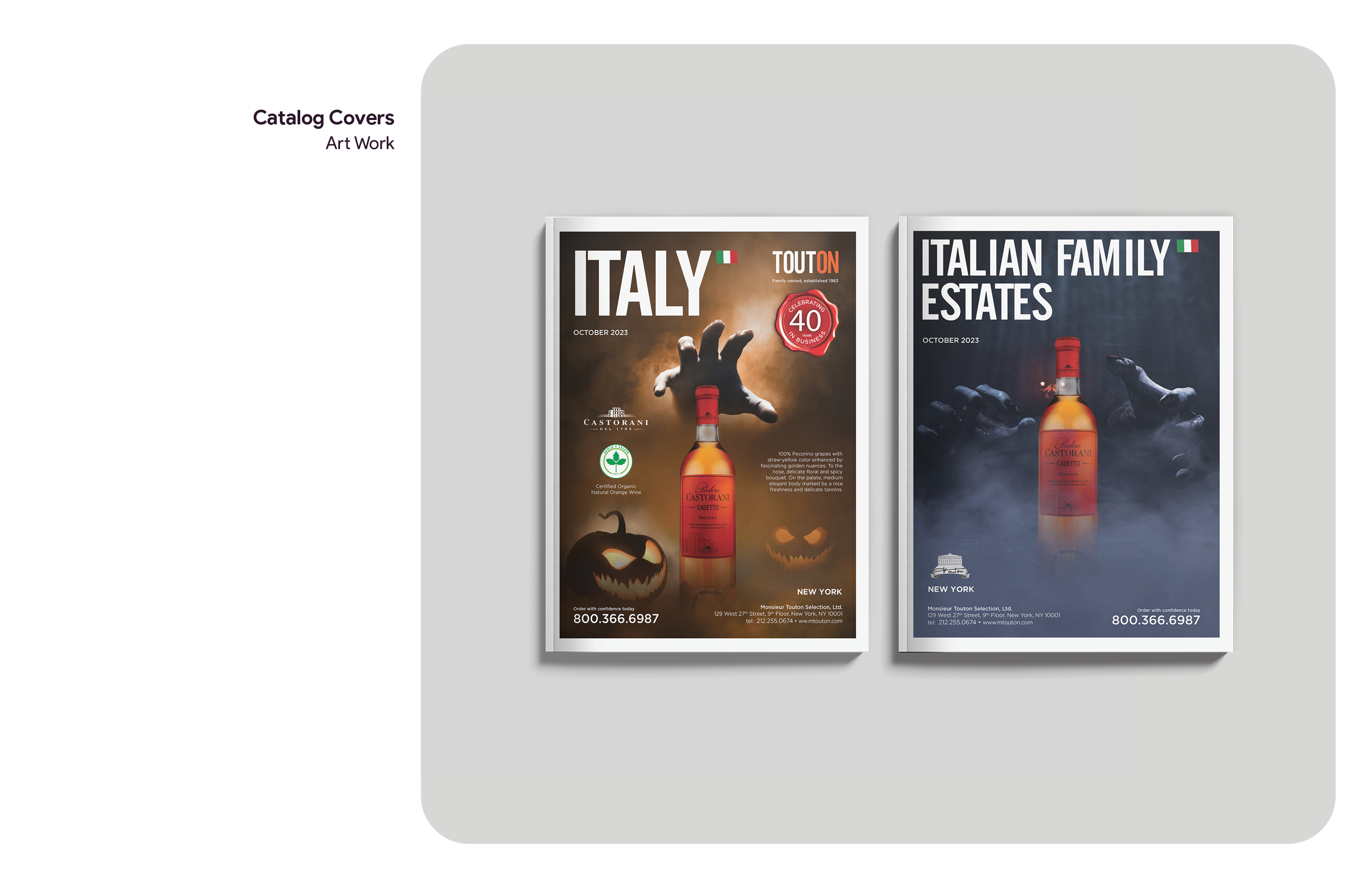
Catalog Covers
Seasonal catalog covers designed to extend the campaign into the company’s trade publications, ensuring visual consistency across marketing materials.
Social Media Camaign
Instagram carousel posts and Story ads adapted the campaign for mobile viewing, using the same cinematic atmosphere and narrative elements to capture attention in digital spaces.
Outcome
A scalable campaign system that elevates product storytelling, strengthens brand presence across channels, and transforms a seasonal promotion into a distinctive, immersive brand experience.
Tools
Seasonal Catalog Cover Design
Seasonal Catalog Covers - Art Direction & Editorial Design
Overview
Developed a seasonal catalog cover system for a wine and spirits portfolio, balancing brand consistency with distinct campaign-driven visuals.
Challenge
Each cover explores a narrative environment tailored to the product selection, translating seasonal themes into visually engaging, product-focused compositions.
Execution
Directed and composed scenes using a hybrid approach of photography and digital compositing. Established clear typographic hierarchy and grid structure to ensure consistency across editions, while leveraging color, lighting, and texture to differentiate each release.
Read More
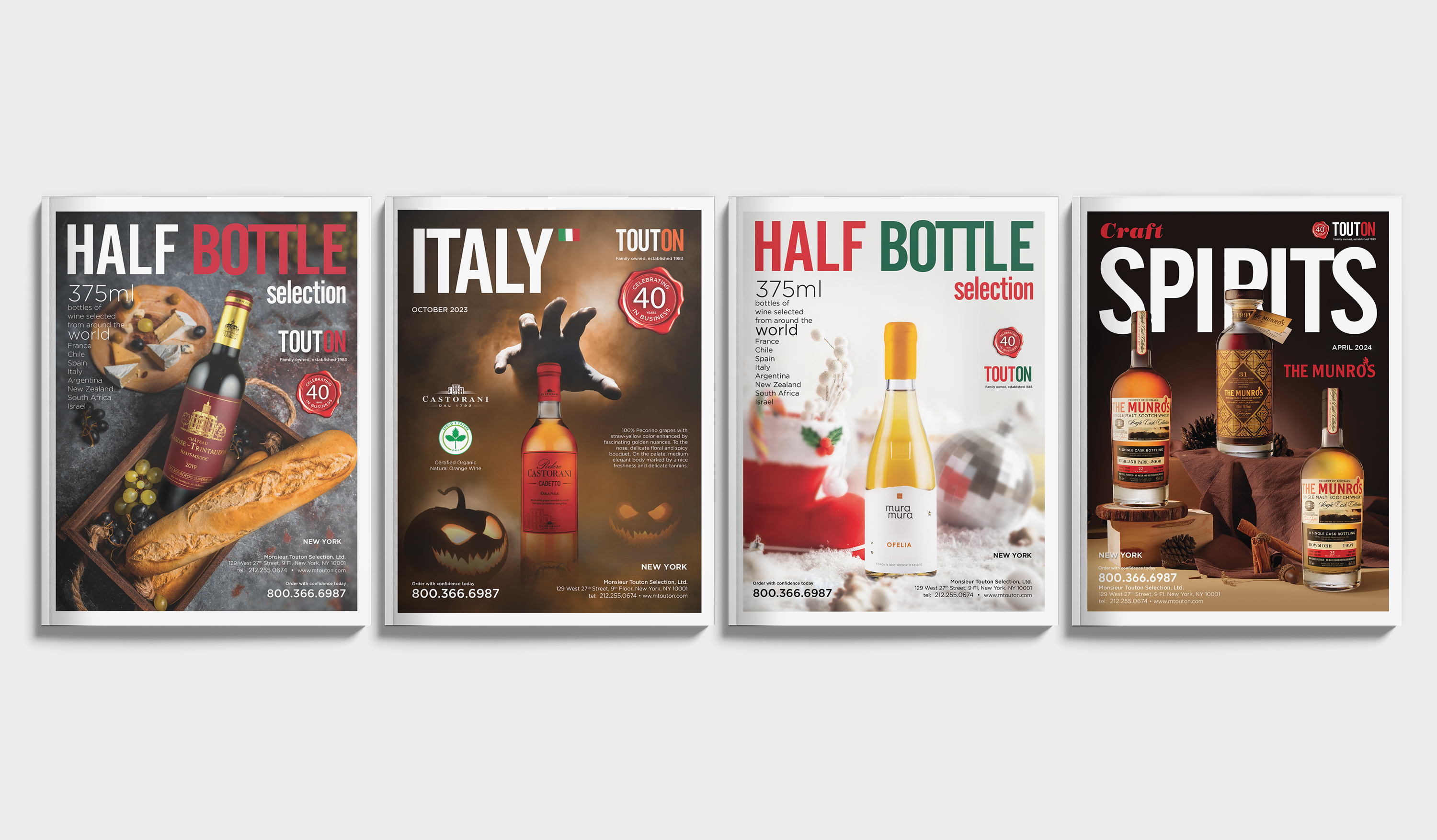
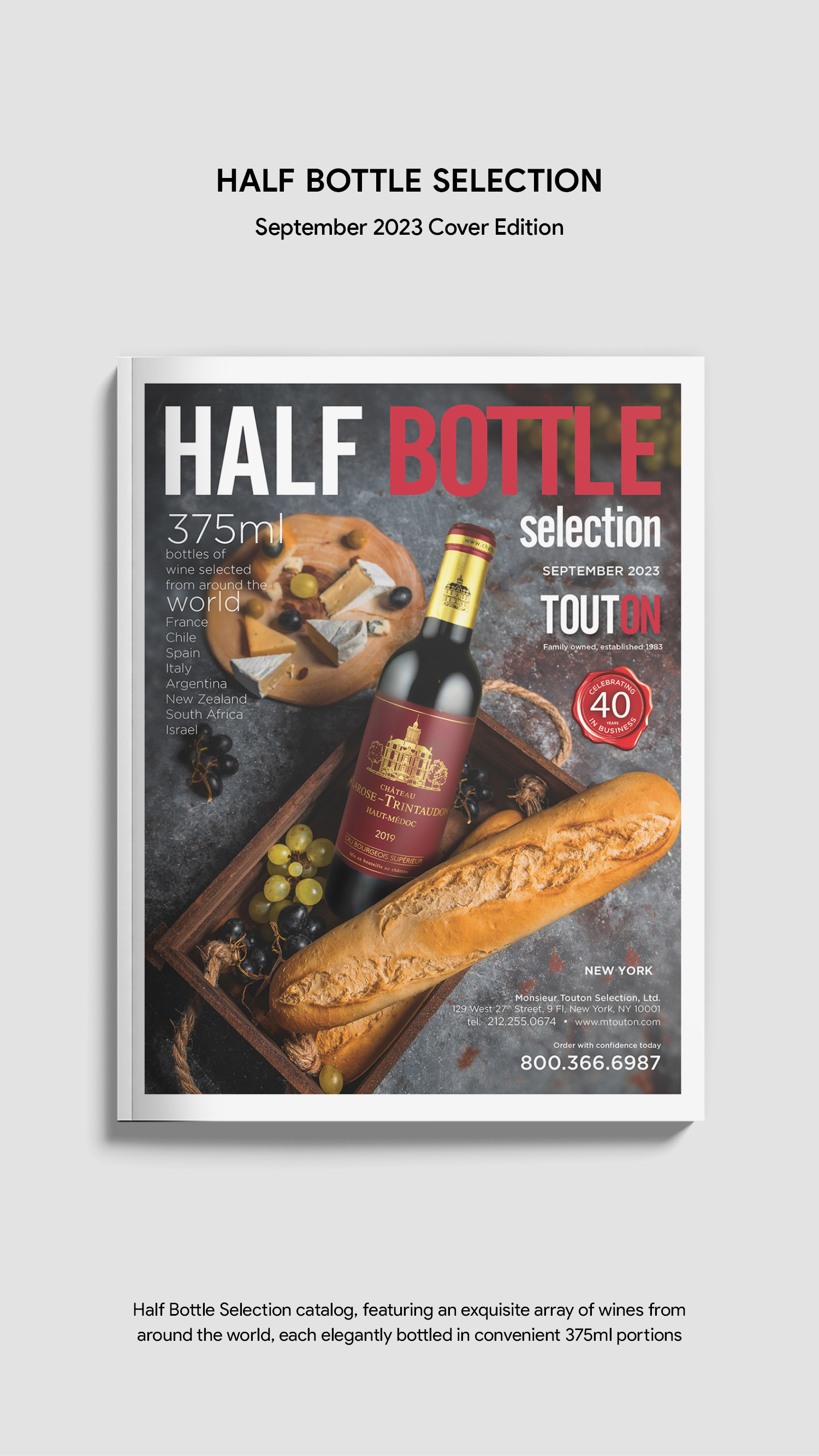
Half Bottle Selection A lifestyle-inspired composition highlighting 375ml wines alongside food pairings, emphasizing versatility and everyday enjoyment.
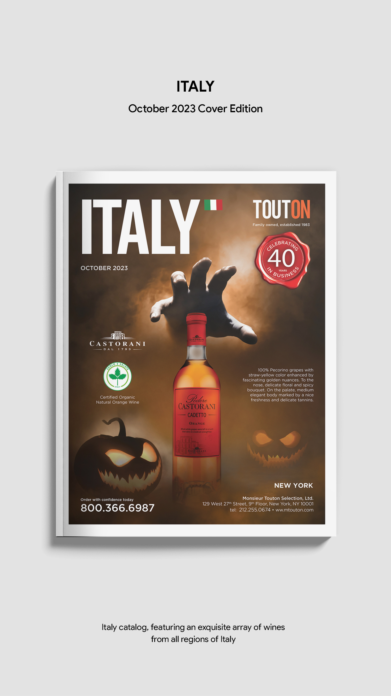
Italy Edition This catalog cover design was created as part of a Halloween Marketing Campaign series, blending Italian wine heritage with seasonal visual storytelling to create a bold and engaging promotional cover.
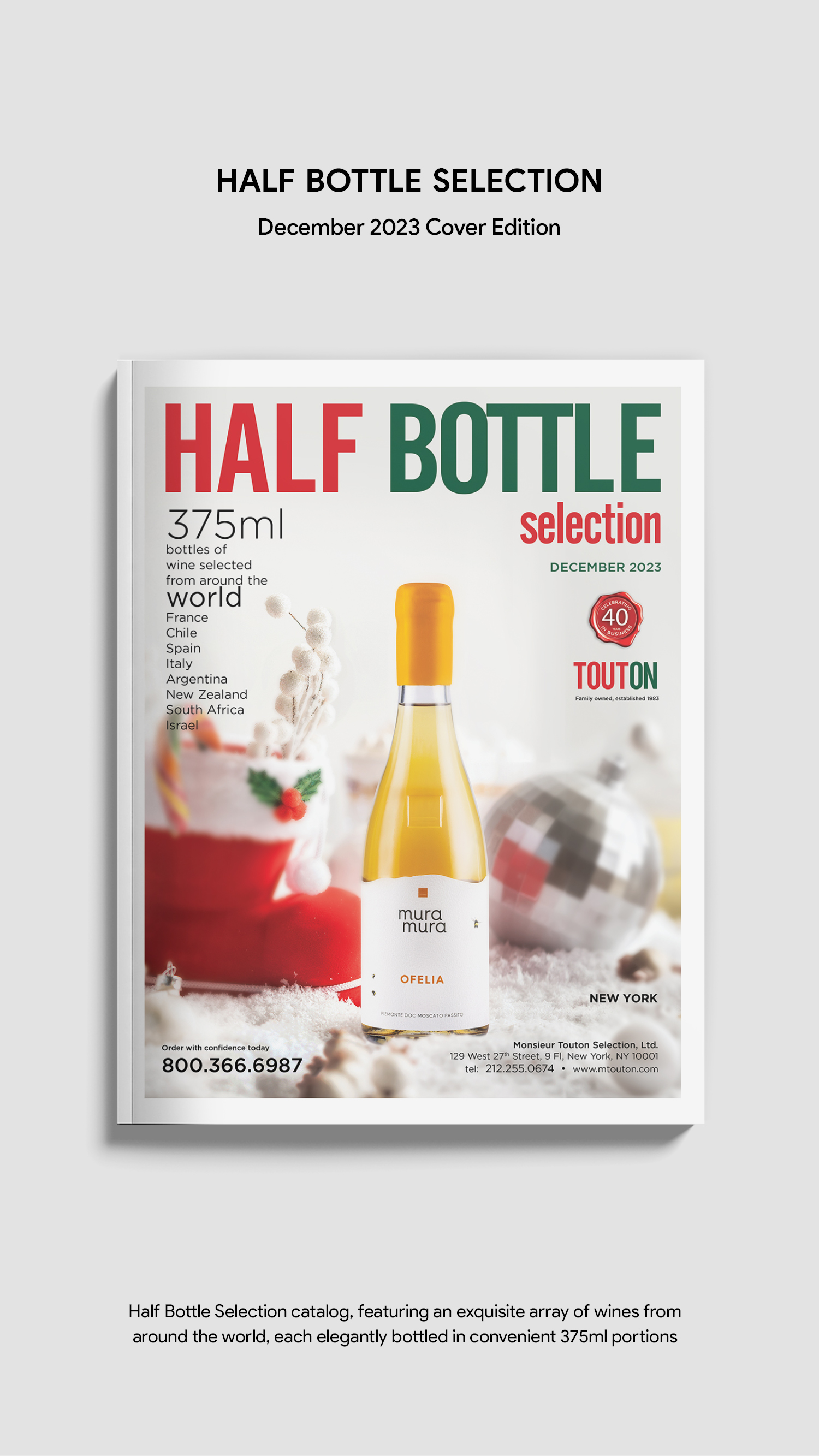
Holiday Half Bottle Edition A festive winter setting designed to evoke celebration and gifting moments, reinforcing the appeal of smaller bottle formats for gatherings.
Craft Spirits Edition A warm, refined studio composition using textured surfaces and moody lighting to emphasize the craftsmanship and premium character of the spirits.
Outcome
A scalable visual system that enhances product visibility, strengthens brand recognition, and supports multi-channel marketing initiatives.
Tools
Catalog Cover Designs
Monthly Catalog Cover Design Showcase:
Sept, Oct, Dec 2023, and Apr 2024 Editions
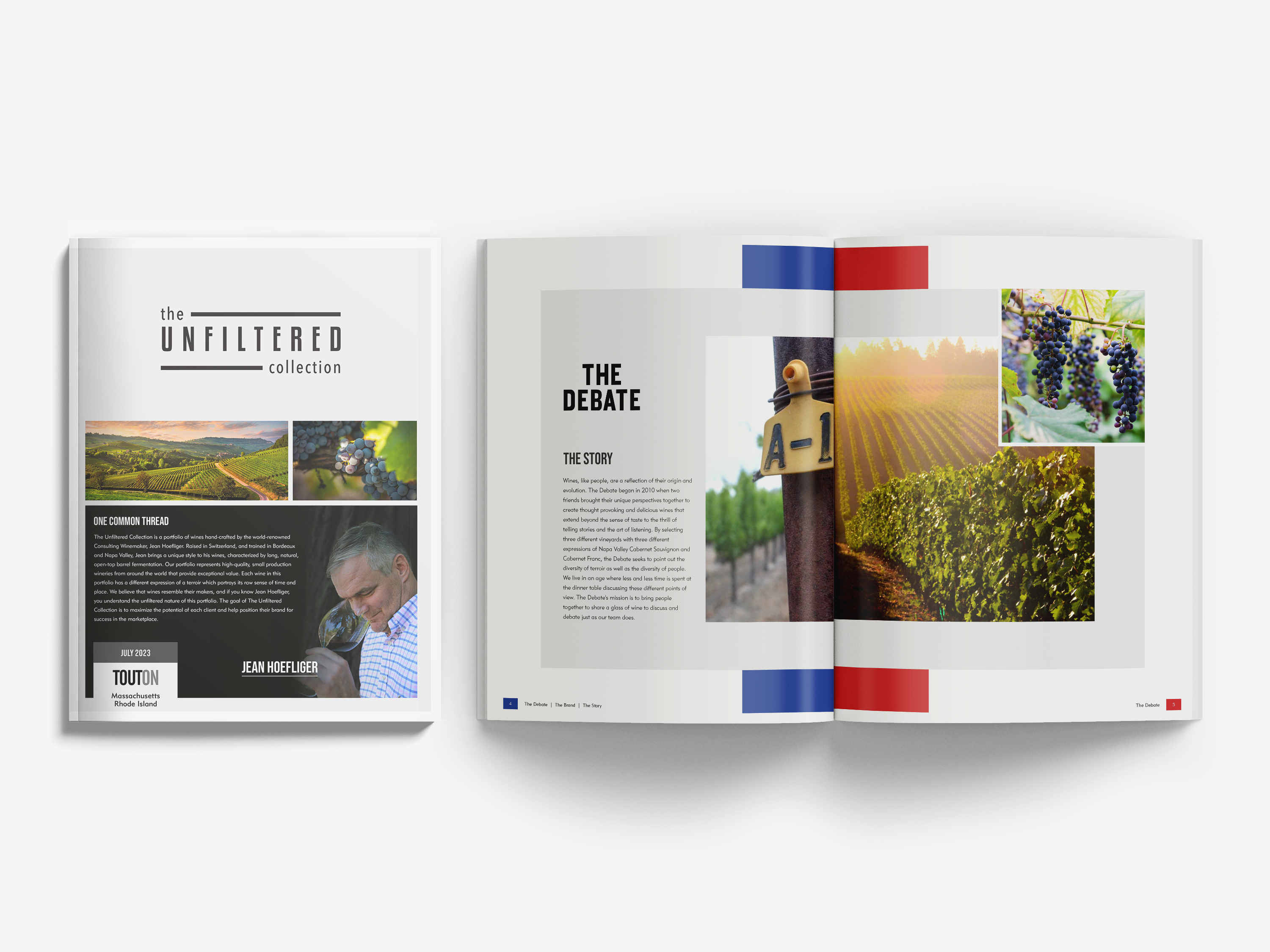
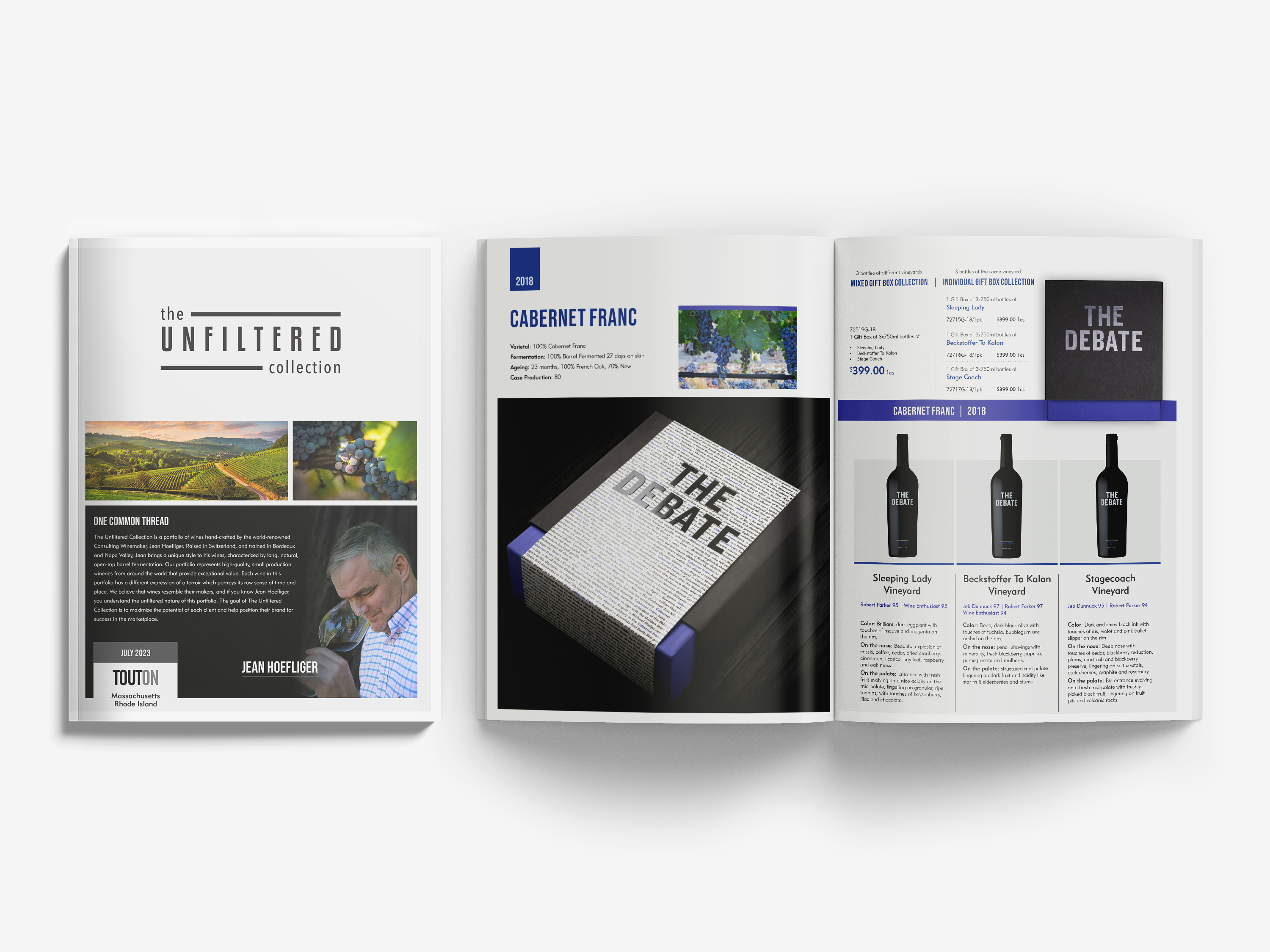
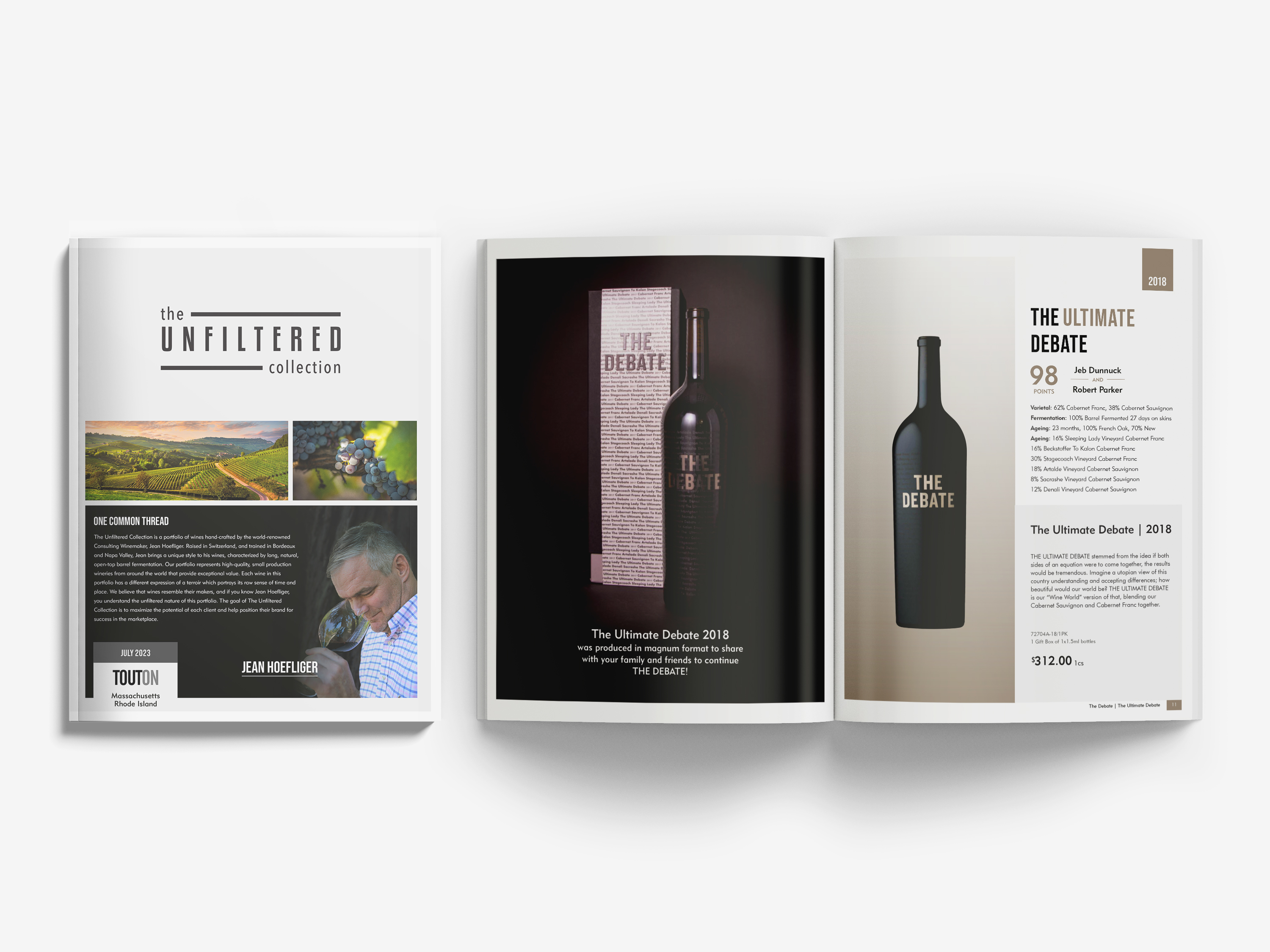
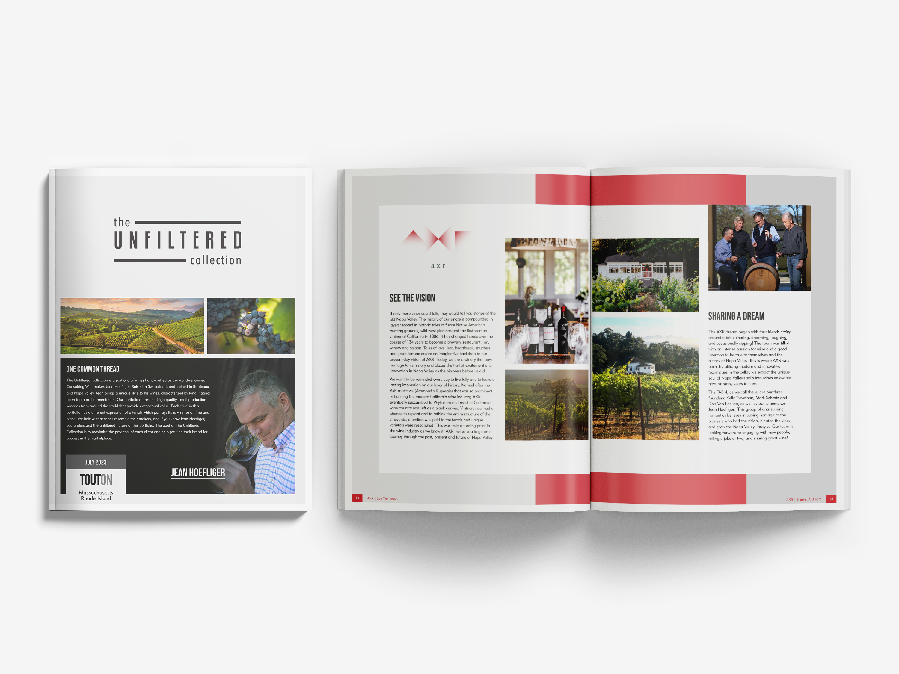
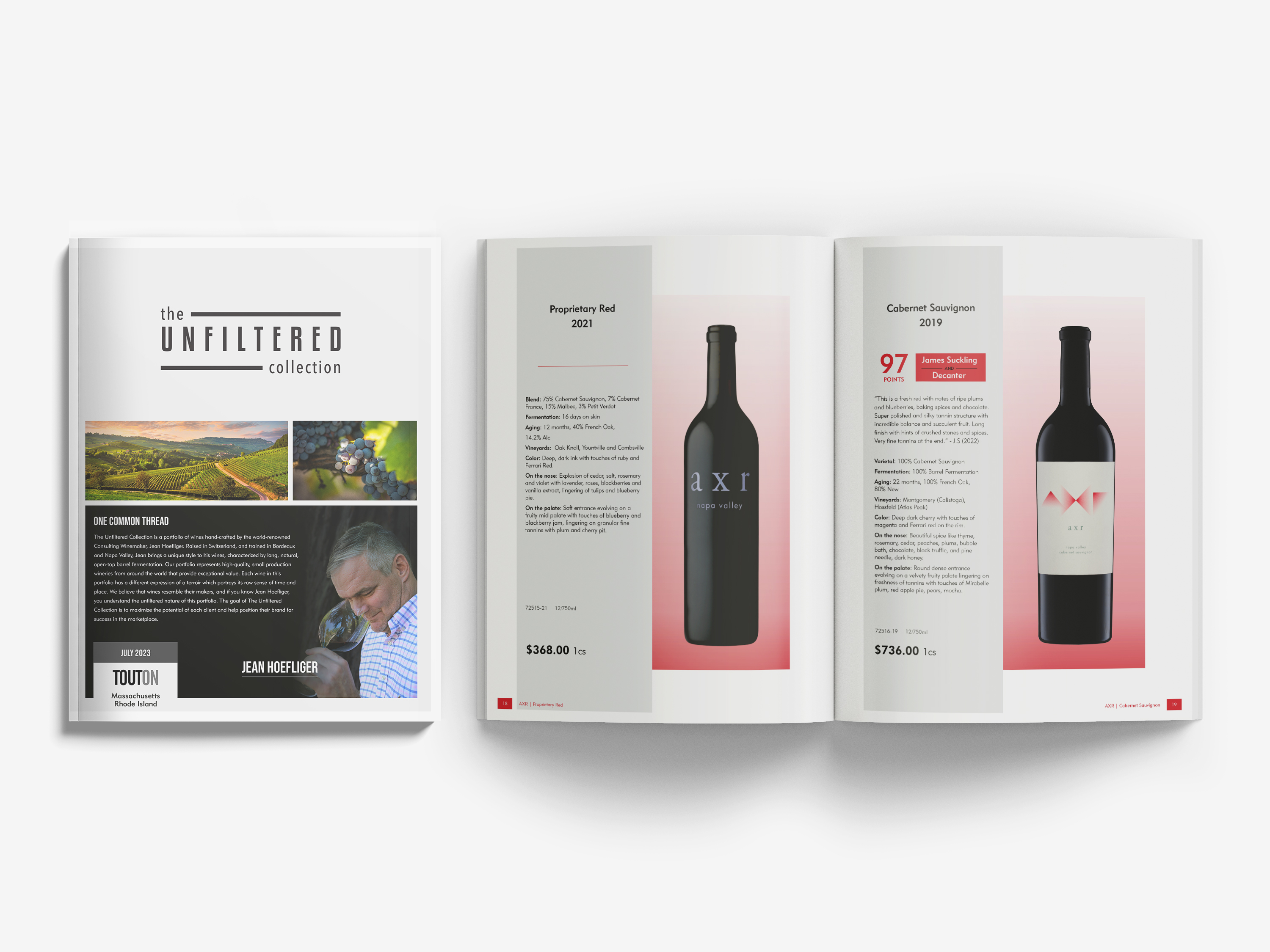
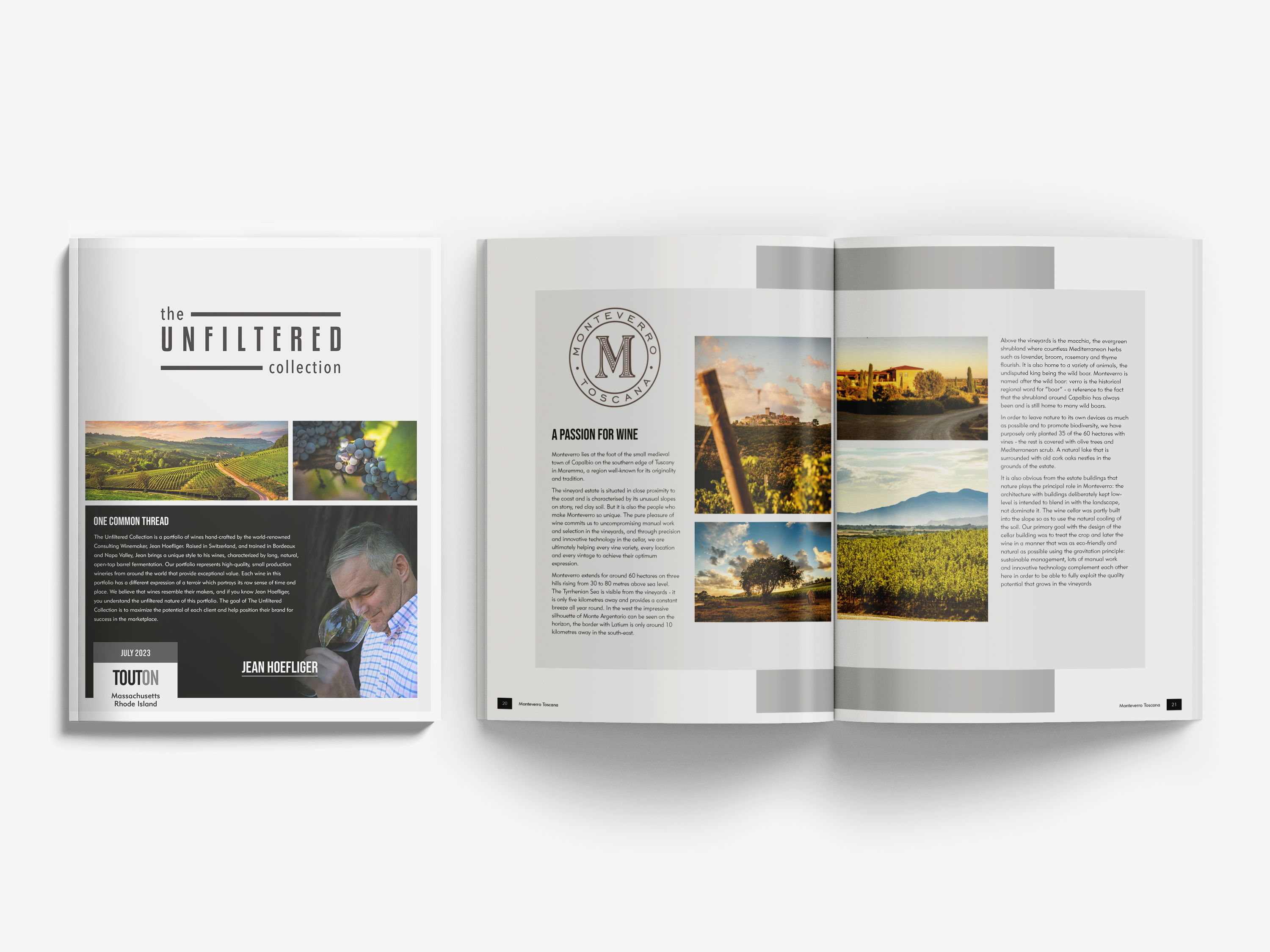
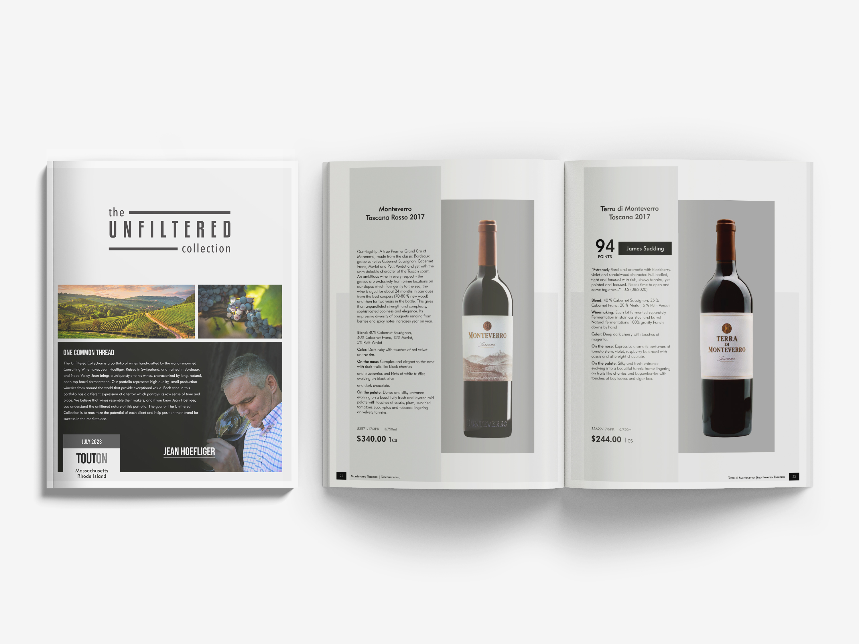
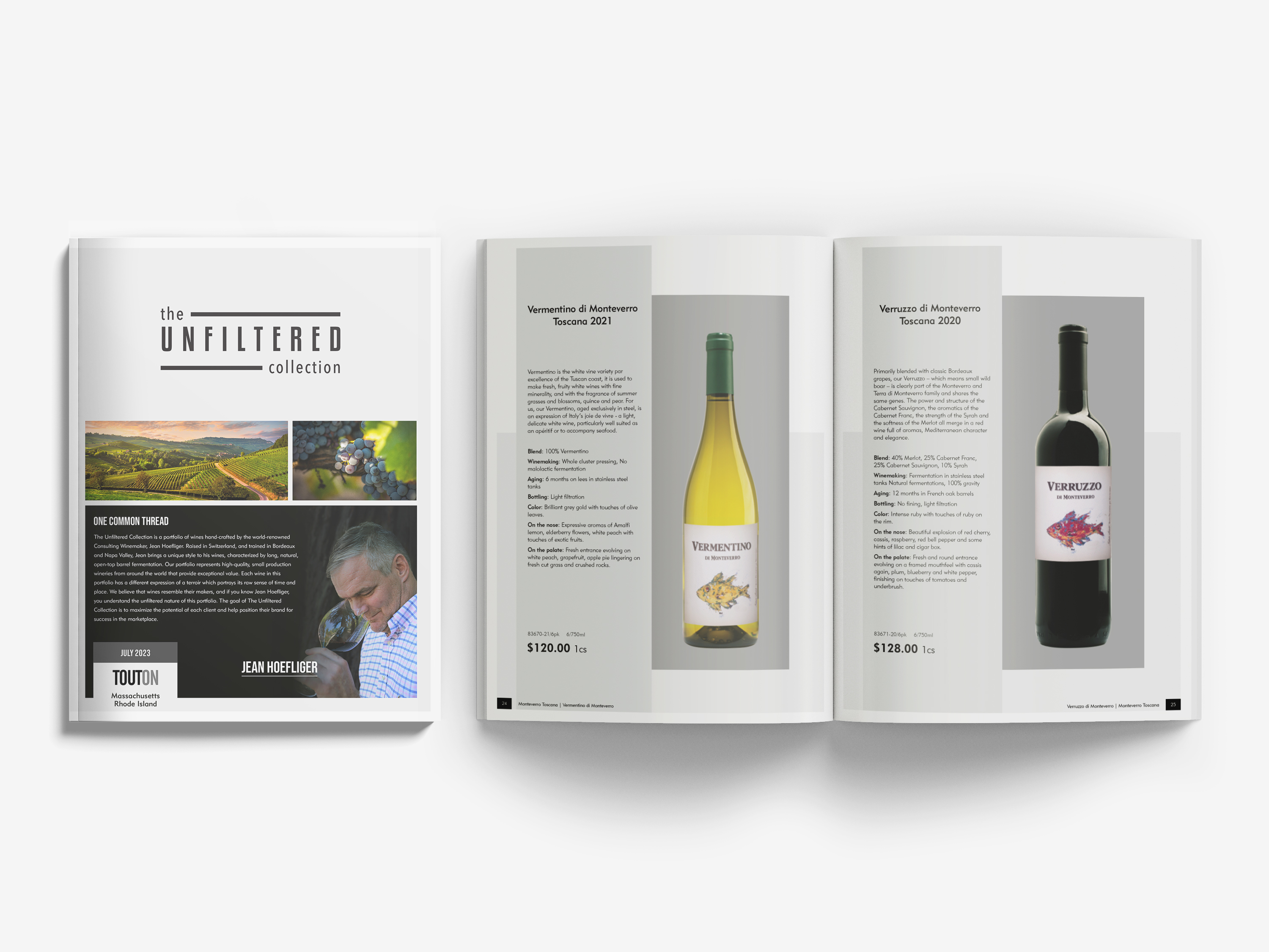
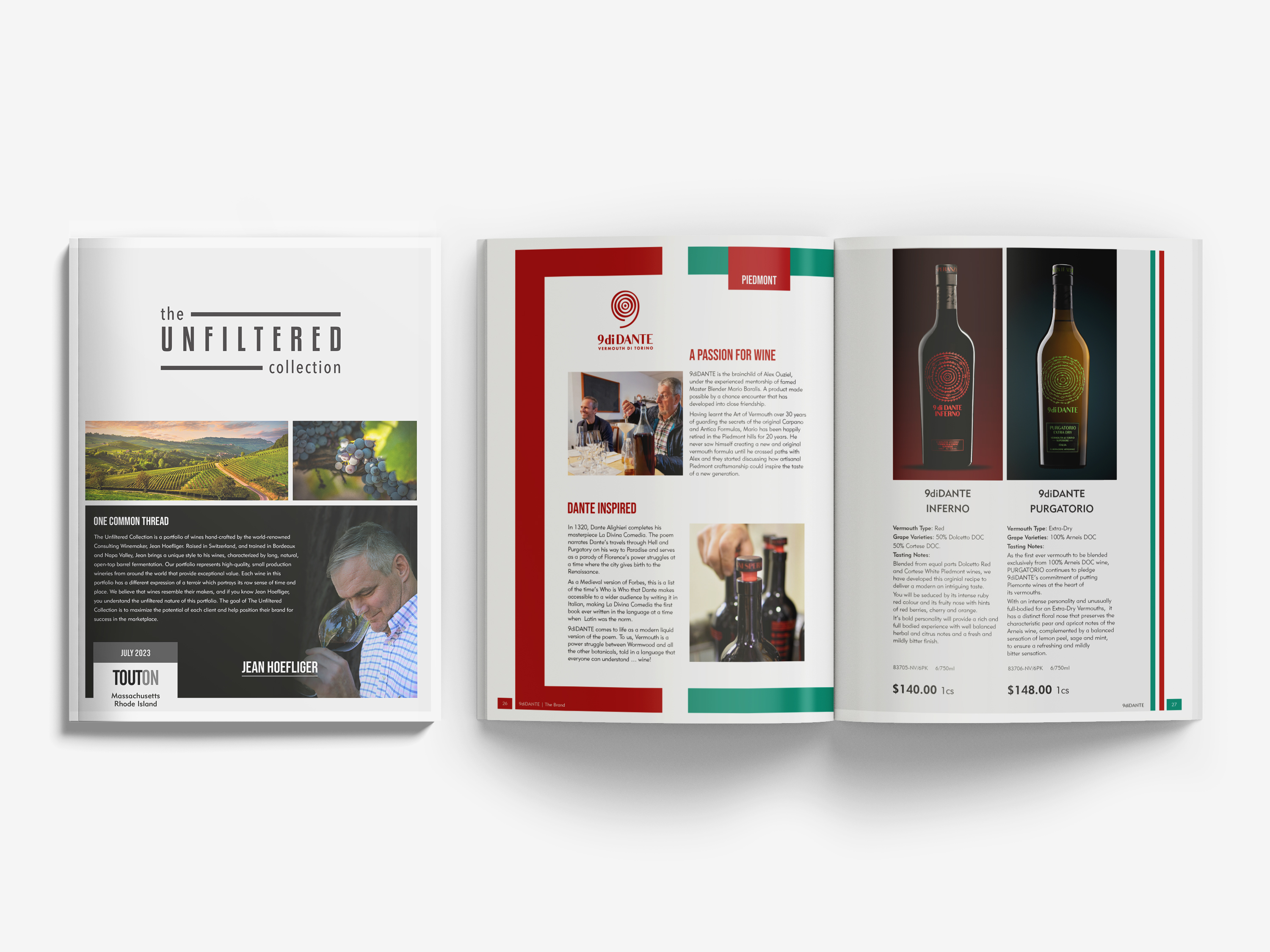
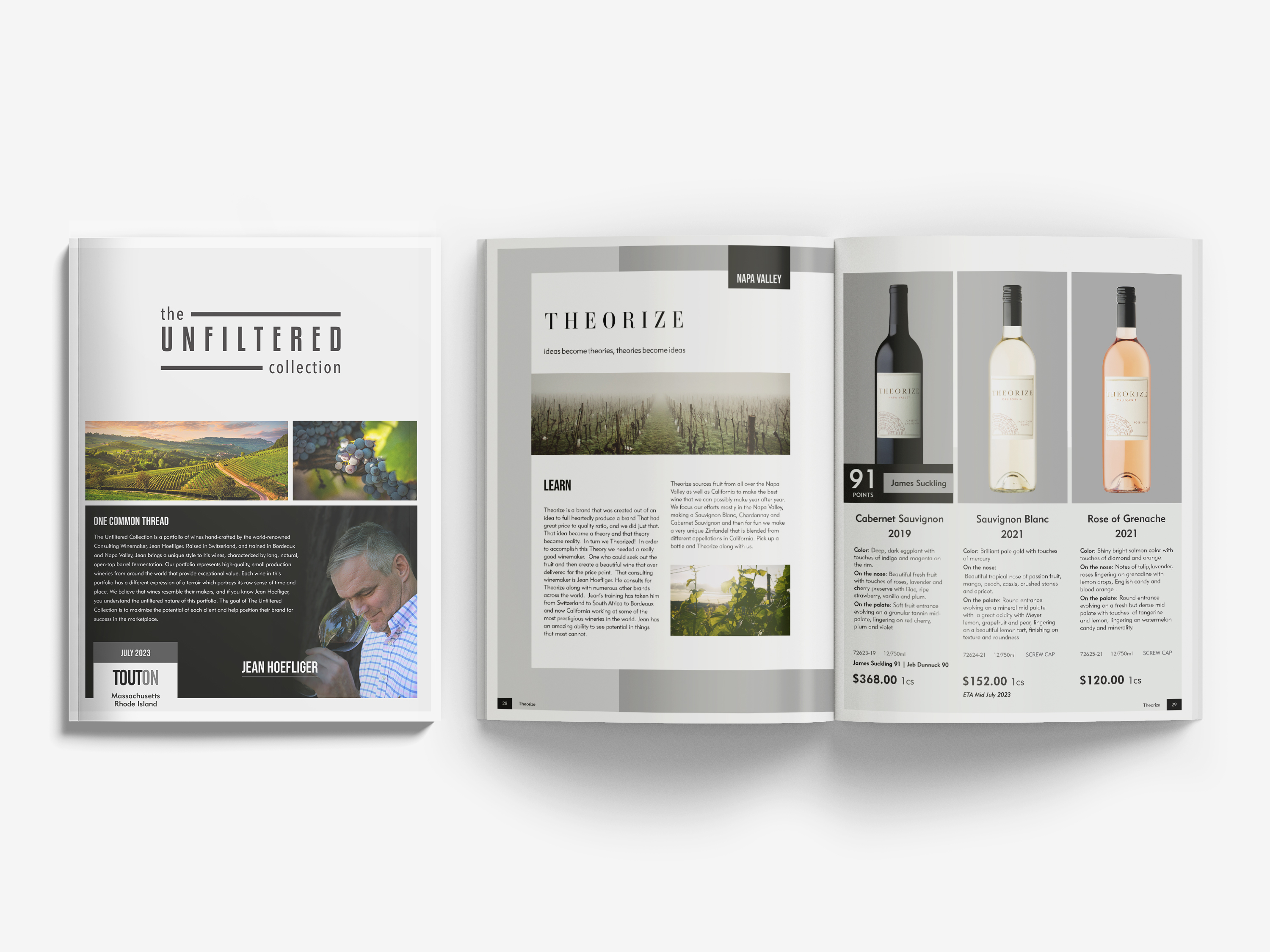
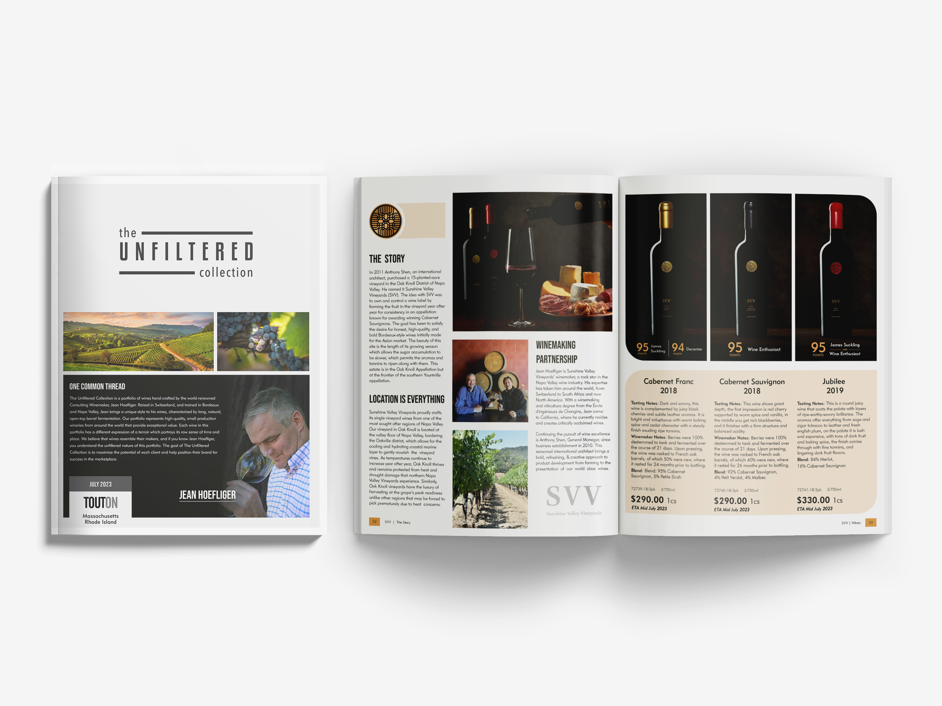
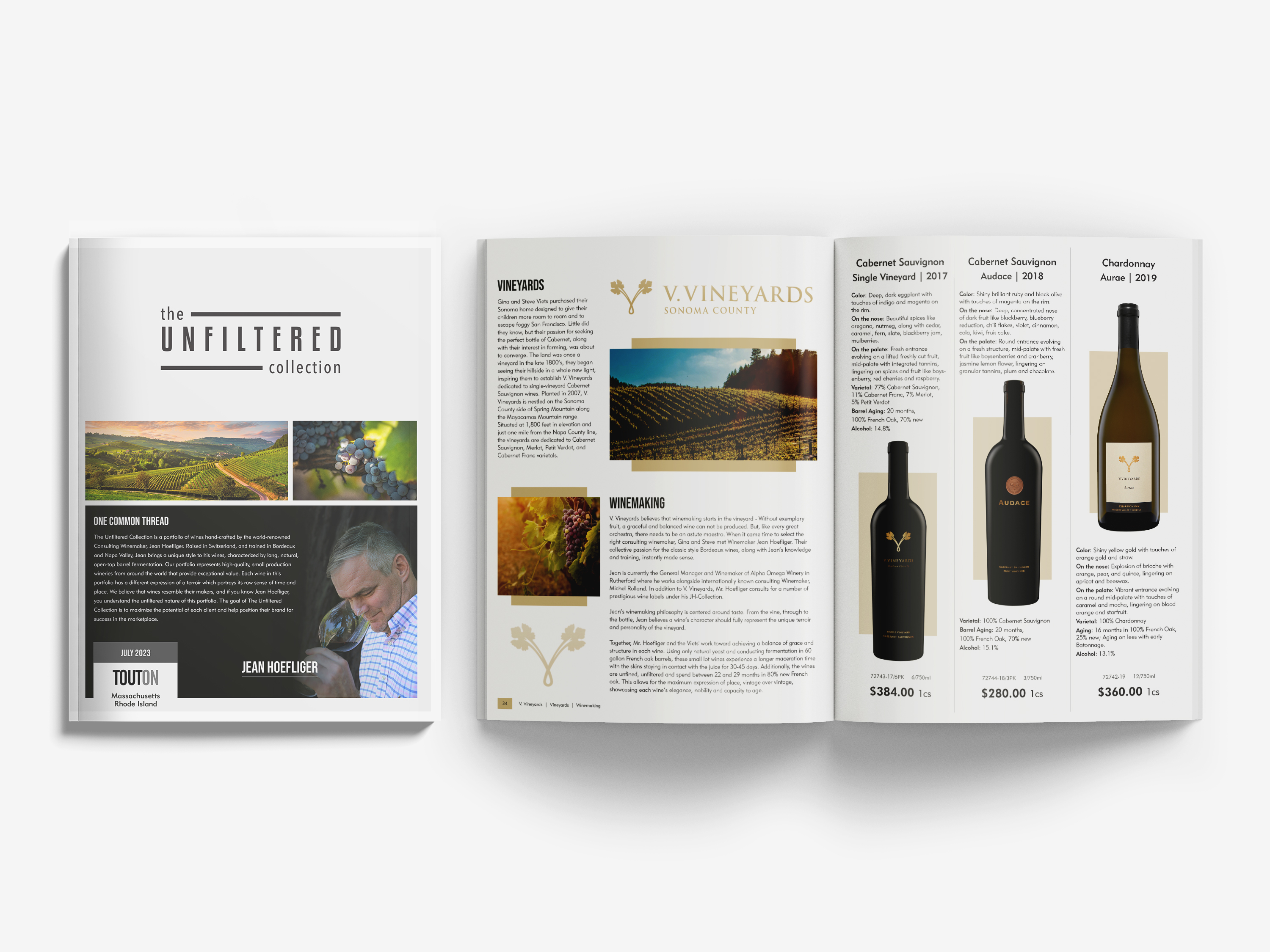
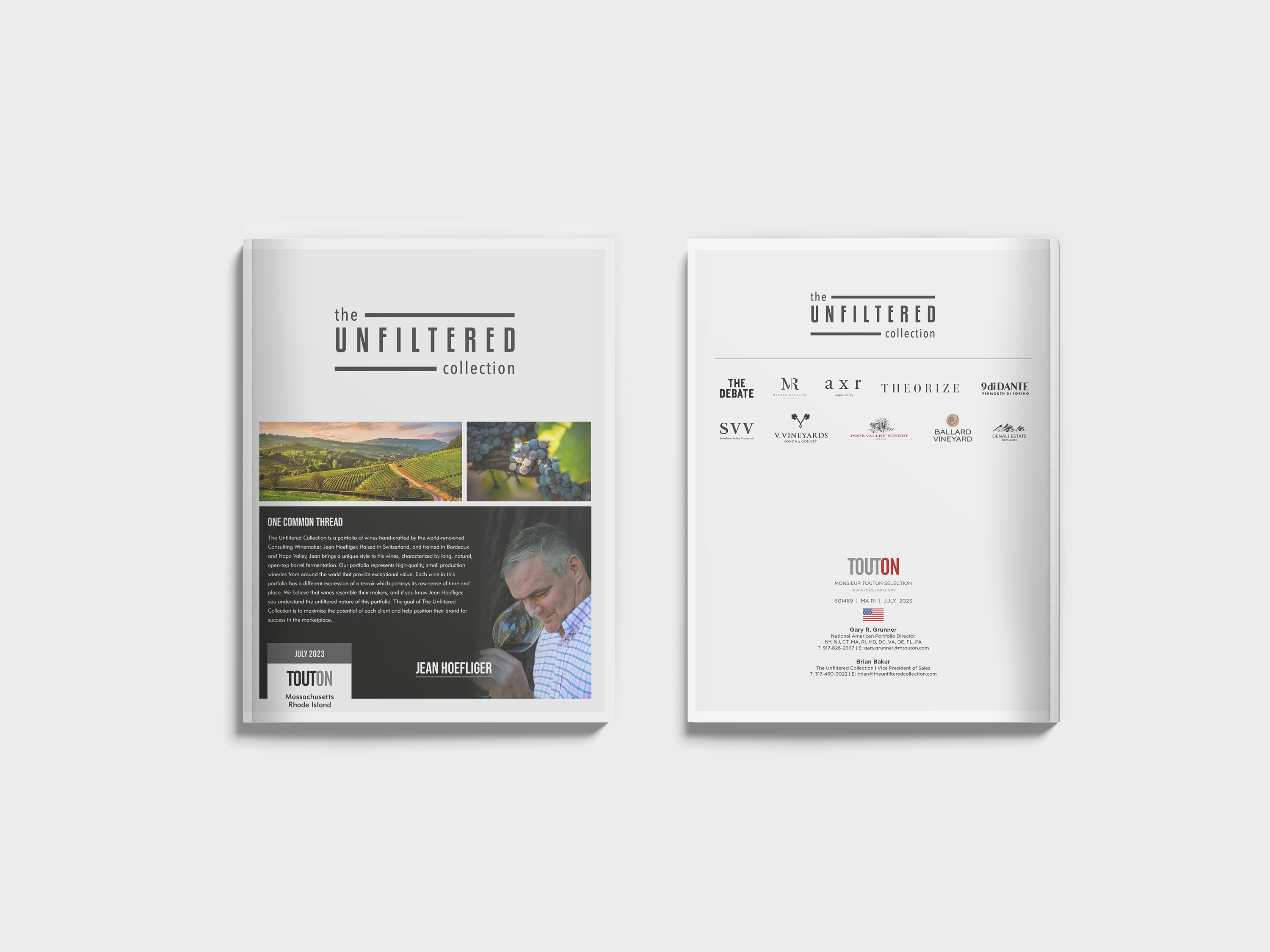
The Unfiltered Collection
Editorial & Publication Design
Overview
Designed a curated editorial publication showcasing a portfolio of wine brands, combining storytelling, product presentation, and structured content into a cohesive catalog experience.
Editorial Concept
The publication is built around a clean, contemporary editorial language that emphasizes authenticity, craftsmanship, and vineyard heritage. Each brand is presented as a distinct narrative while contributing to a unified visual system.
Execution
Developed a modular editorial system to ensure consistency across multiple brands while accommodating varying content types. Layouts integrate image-driven storytelling, structured typography, and product-focused compositions, supported by a flexible grid system. Hierarchy, spacing, and pacing were carefully controlled to maintain readability and visual rhythm throughout the publication.
Outcome
A scalable publication framework that balances editorial storytelling with commercial clarity, delivering a refined and cohesive catalog that strengthens brand presentation and enhances usability for trade audiences.
Tools
Brochure Designs
Editorial & Marketing Design
Overview
Designed a series of editorial-driven brochures for premium wine brands, combining product presentation with structured storytelling to support sales and marketing communication.
Design Concept
Each brochure translates brand identity into a clear editorial format, balancing lifestyle imagery, product focus, and narrative content. The system allows each brand to maintain a distinct voice while operating within a consistent visual framework.
Read More
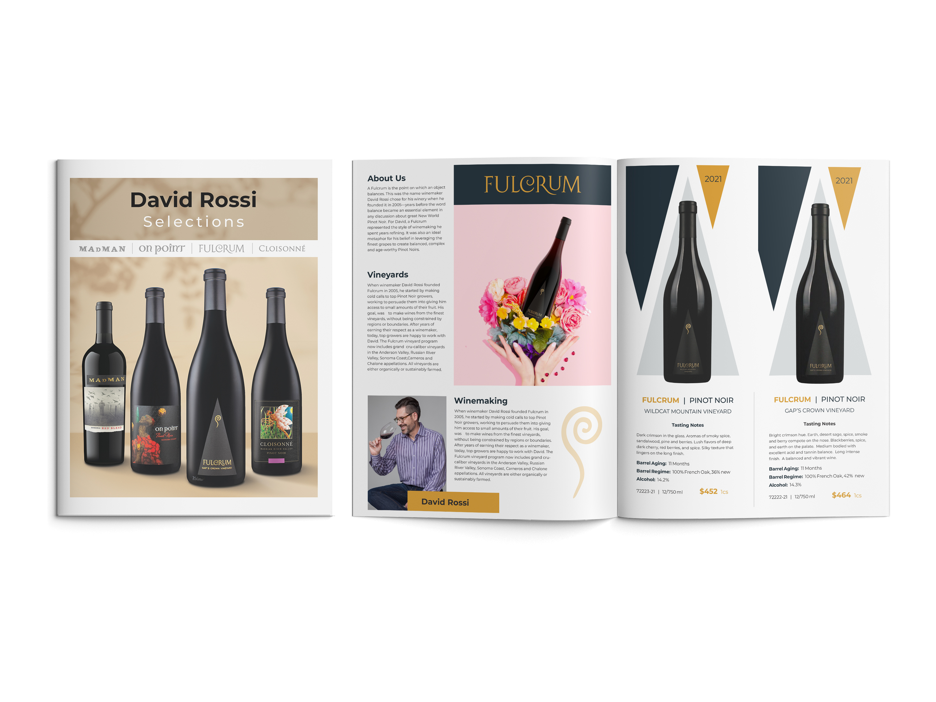
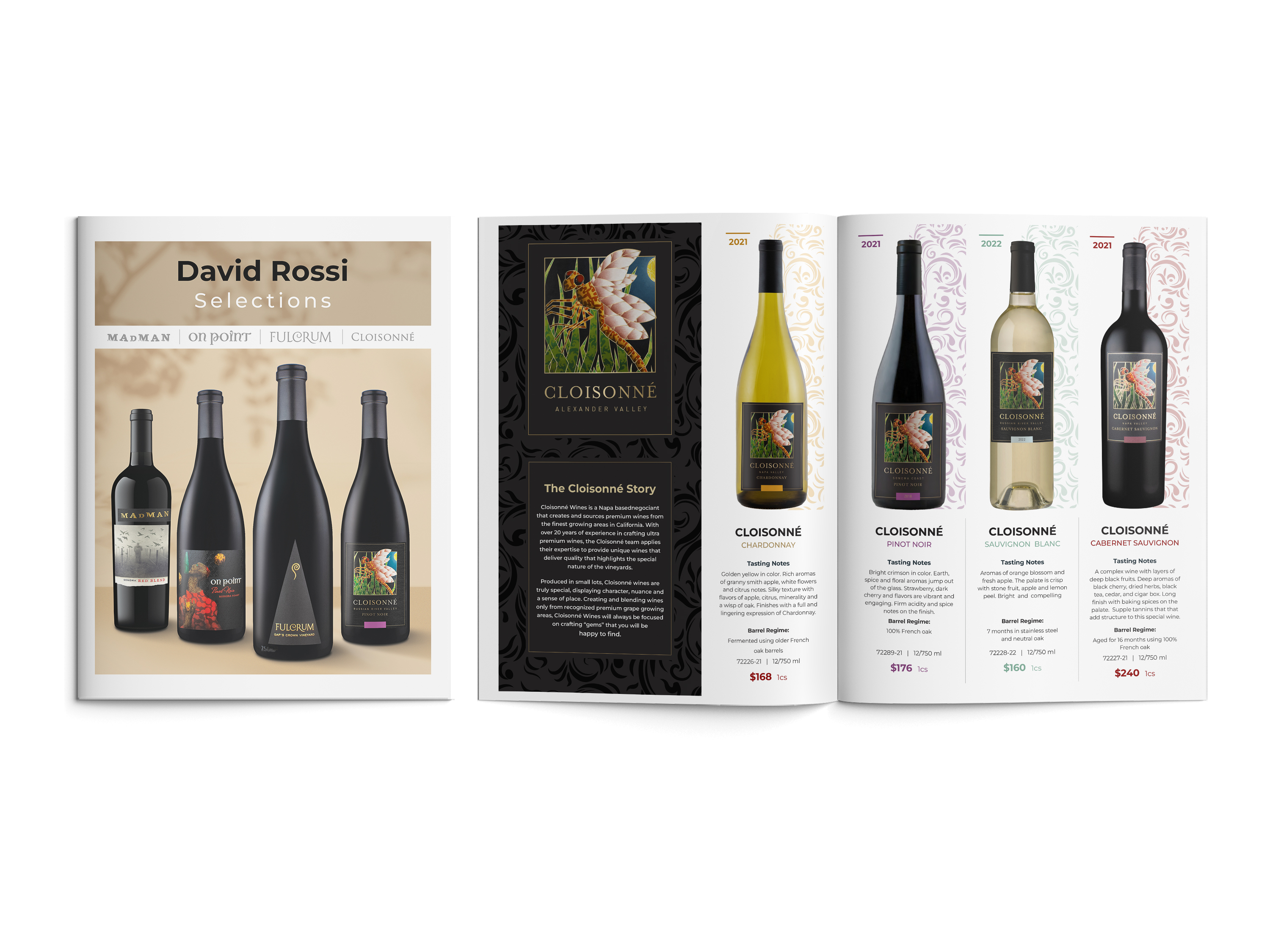
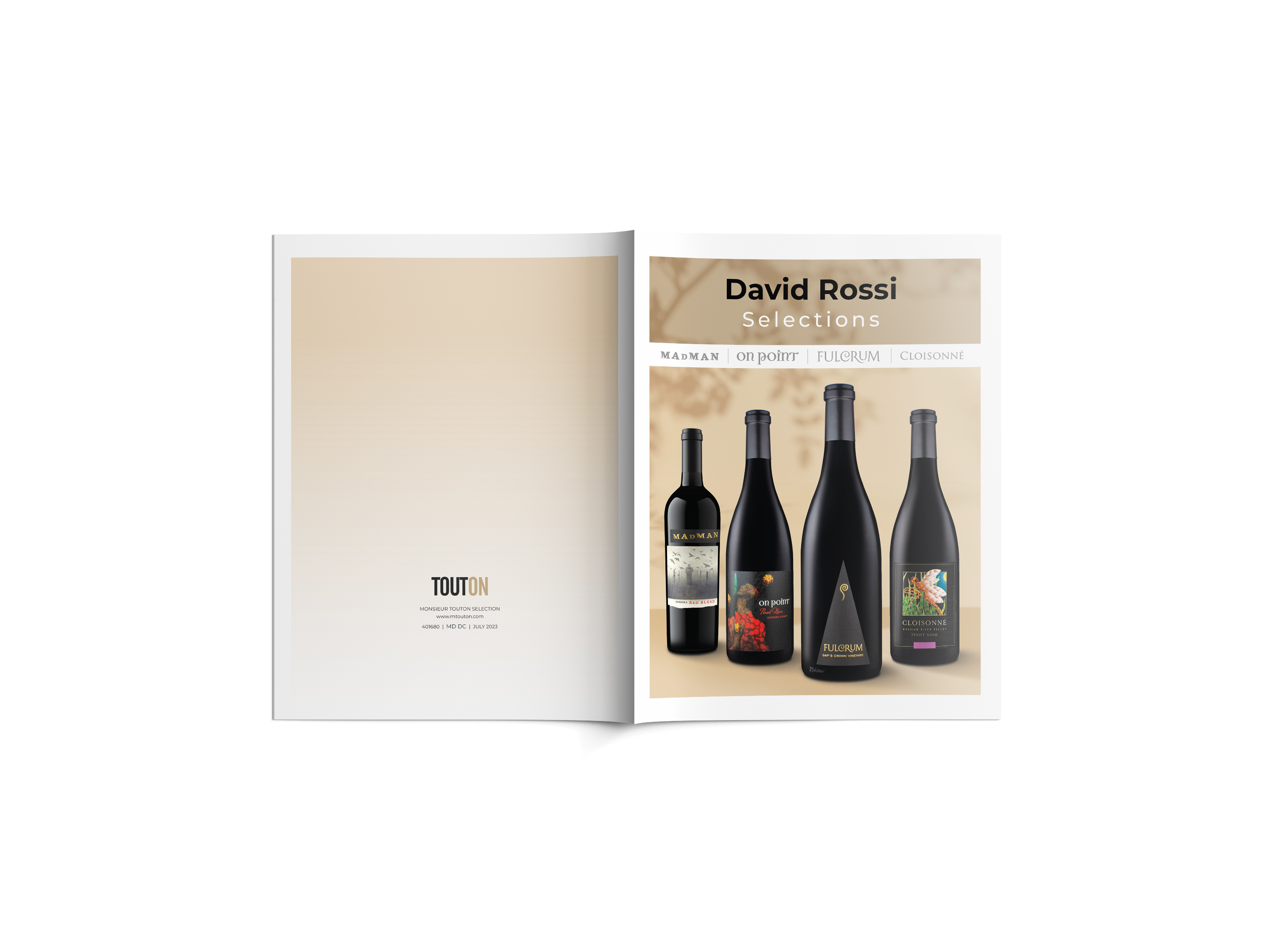
Project 1 | David Rossi Selections
8-Page Editorial Wine Brochure
This brochure presents a curated selection of wines produced by winemaker David Rossi. The publication introduces four different wine brands — Fulcrum, Cloisonné, On Point, and Madman — each with its own identity and product story.
The layout was designed to guide the reader through the wine portfolio using a structured editorial system that combines product imagery, tasting notes, vineyard information, and ratings. Typography and spacing were carefully balanced to maintain readability while allowing the bottle designs to remain the visual focal point.
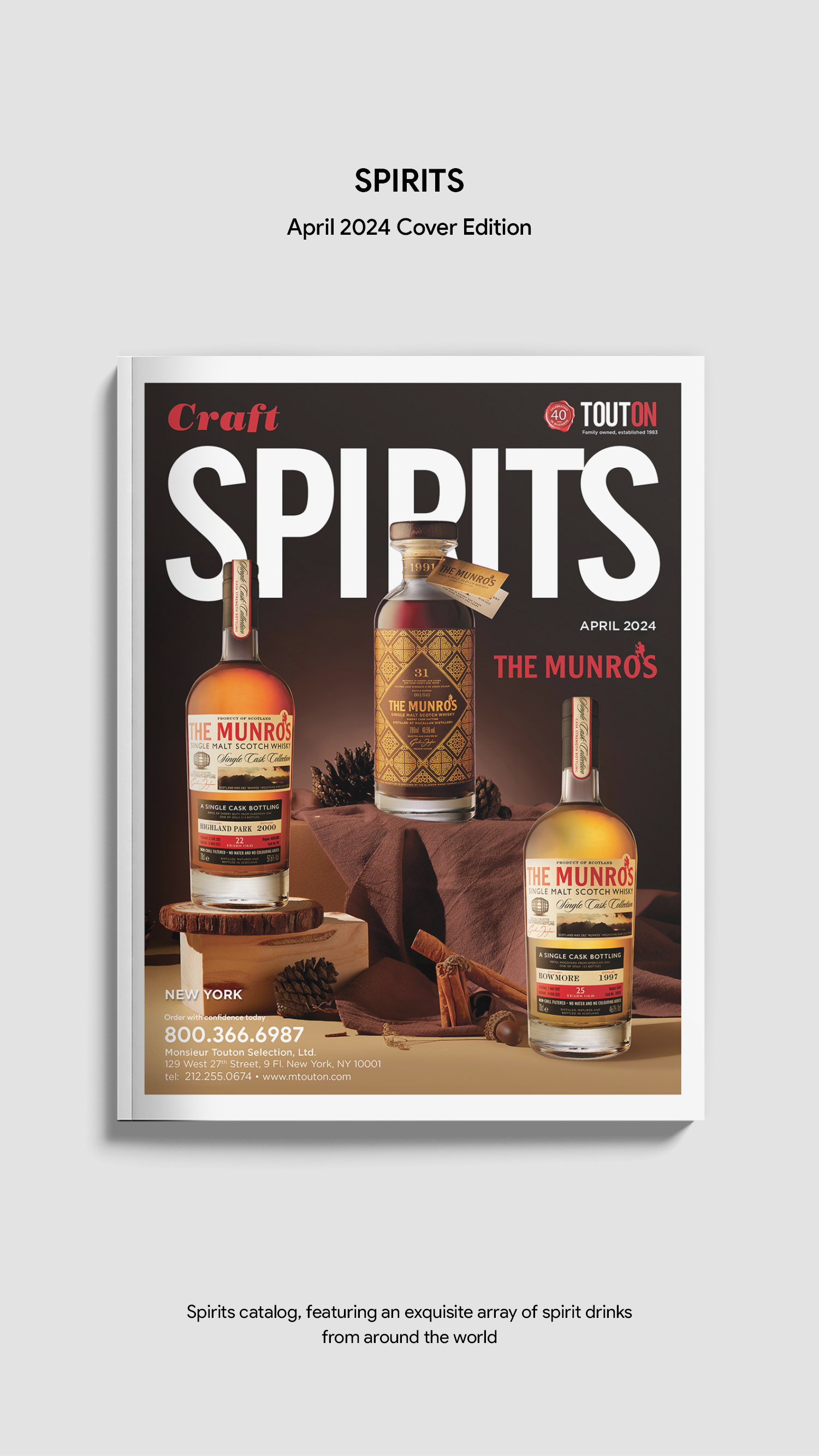
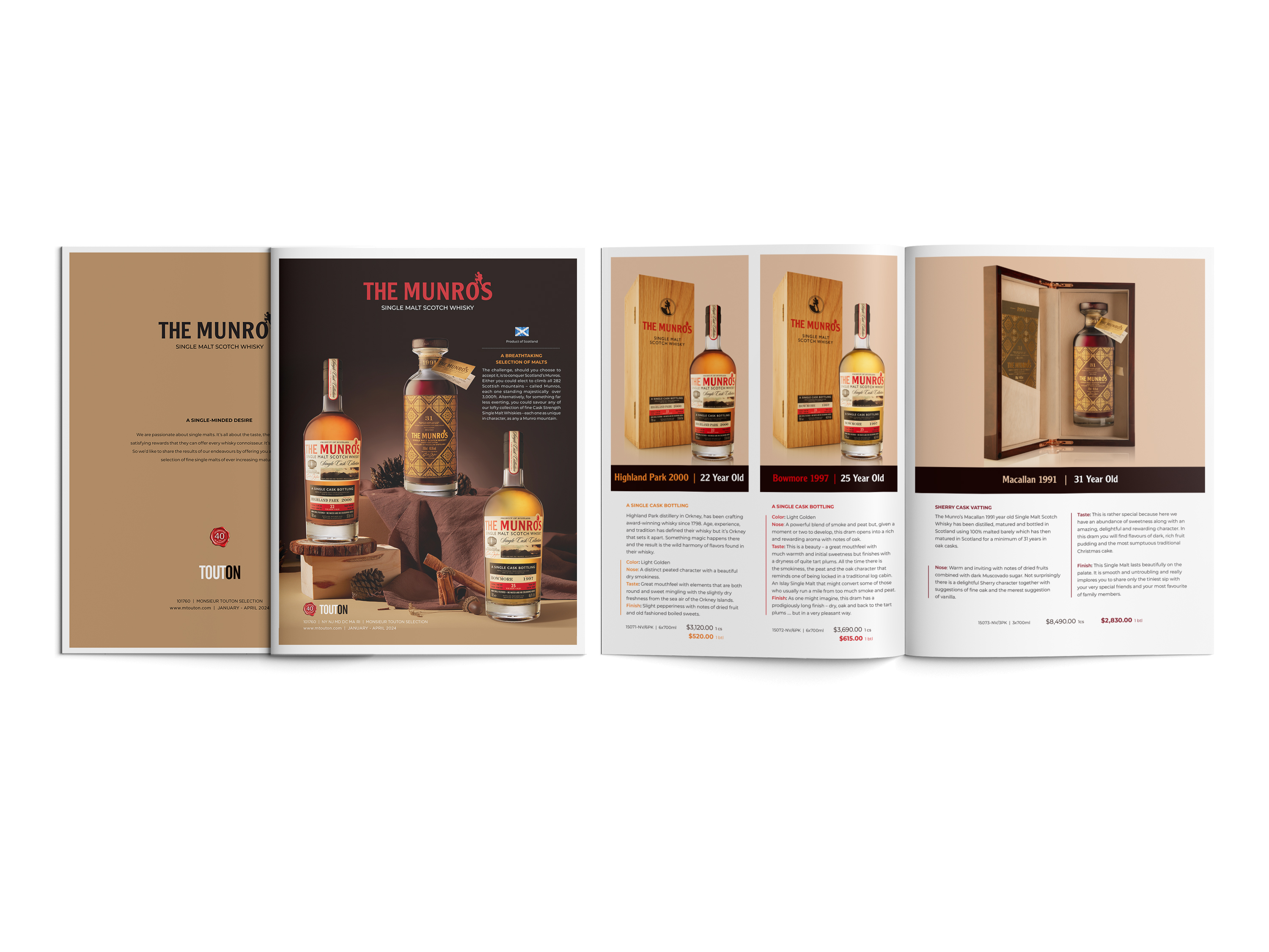
Project 2 | The Munro’s Whisky
4-Page Luxury Product Brochure
The Munro’s brochure showcases a premium collection of rare and high-value whiskies. The design focuses on creating a luxury presentation through strong visual hierarchy, warm color tones, and product-centered compositions.
The cover and hero visuals were created using Photoshop compositing techniques to elevate the perception of exclusivity and craftsmanship associated with the brand.
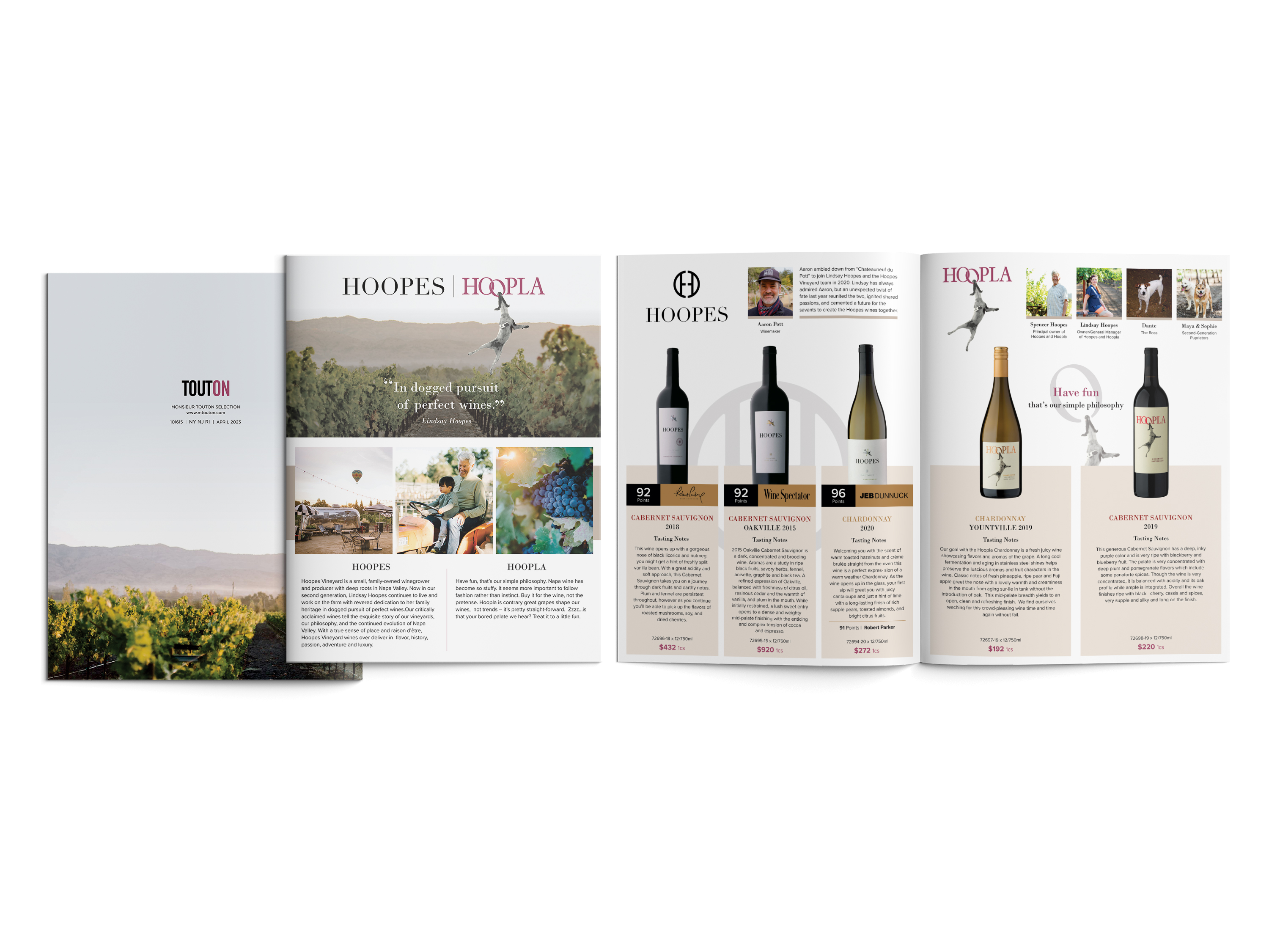
Project 3 | HOOPES / HOOPLA Wine
4-Page Brand Presentation
This brochure introduces the HOOPES and HOOPLA wine brands through an editorial layout that blends lifestyle imagery, vineyard storytelling, and product presentation. The design emphasizes the brand’s connection to landscape and winemaking tradition while maintaining a clean and structured layout suitable for marketing materials.
Execution
Developed modular layouts that integrate typography, imagery, and product information within a cohesive grid system. Compositions prioritize the product as the focal point while supporting content through clear hierarchy and structured pacing. Image treatment and layout variations were adapted to reflect each brand’s character while maintaining overall consistency across the series.
Outcome
A flexible brochure system that enhances product visibility, supports brand storytelling, and delivers clear, sales-driven communication across multiple print formats.
Tools
The Munro's Whisky | HOOPES / HOOPLA
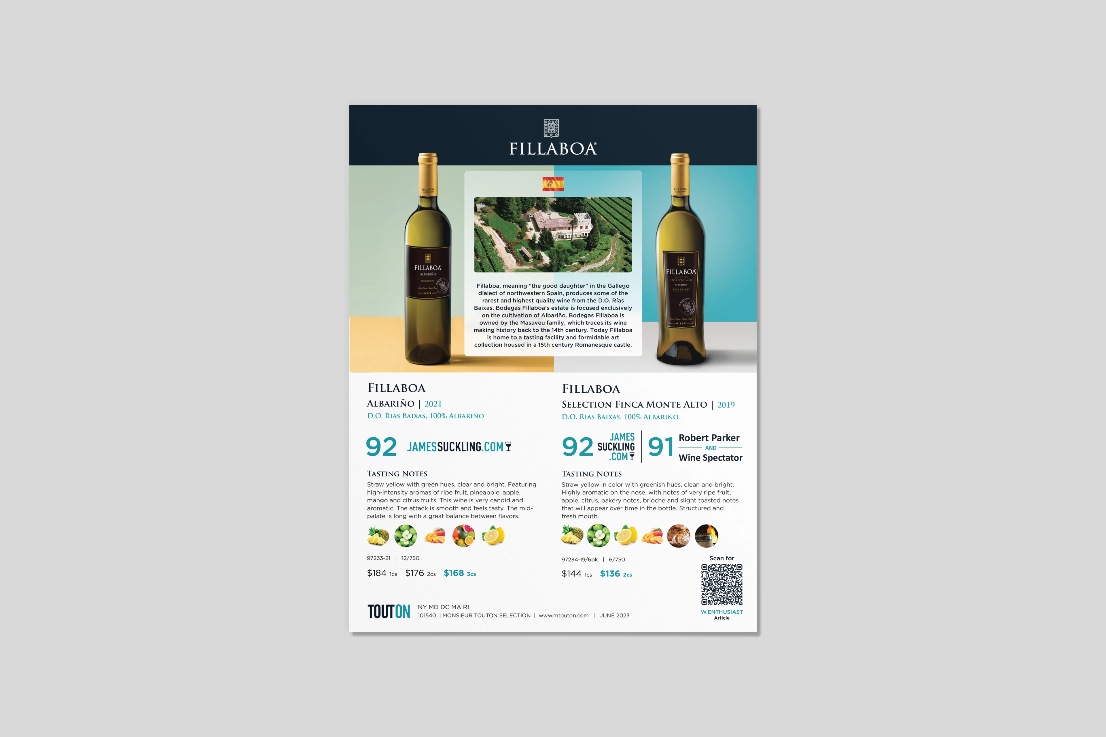
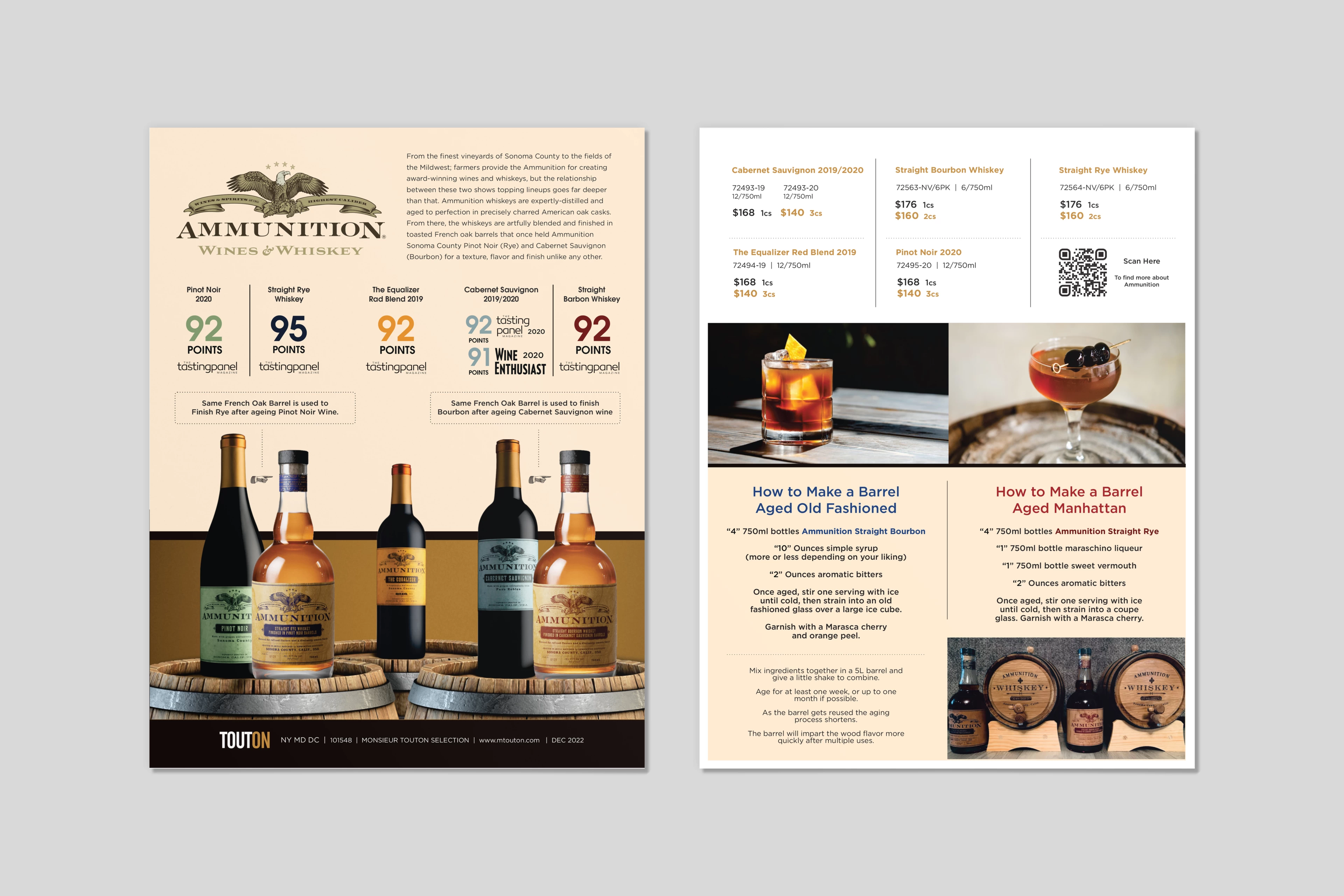
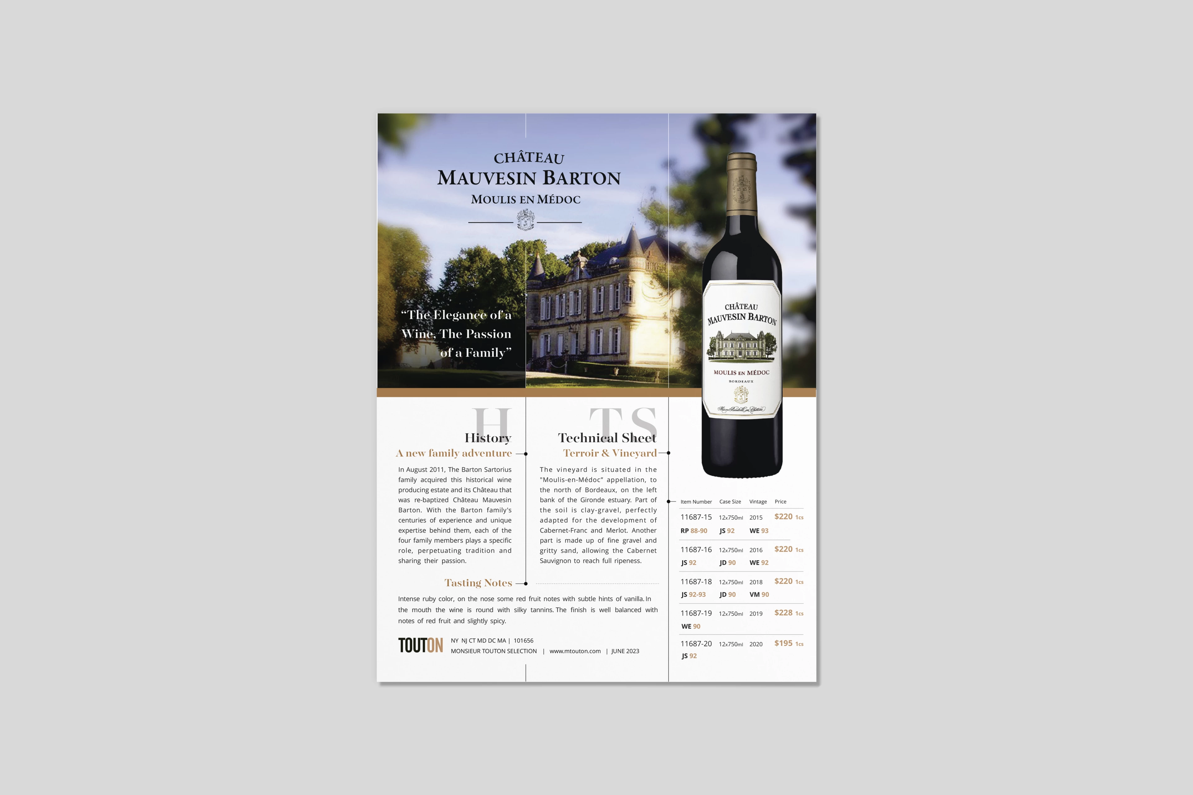
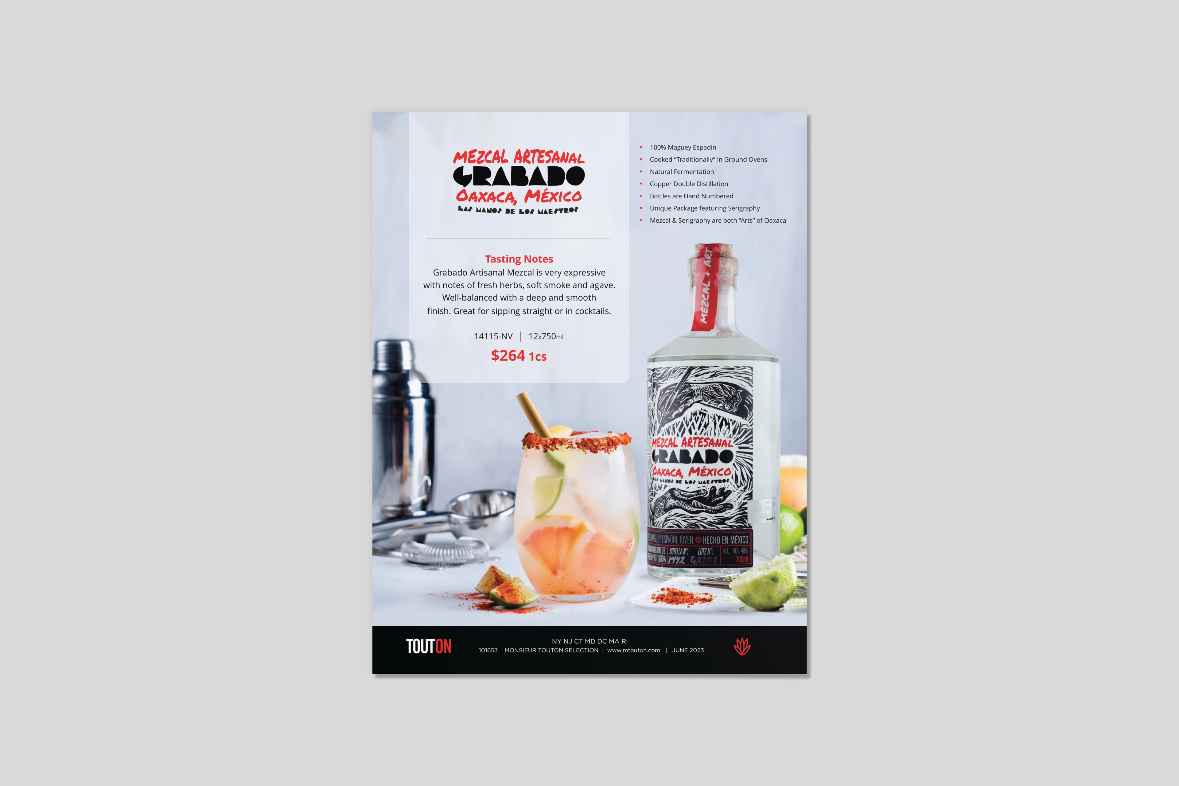
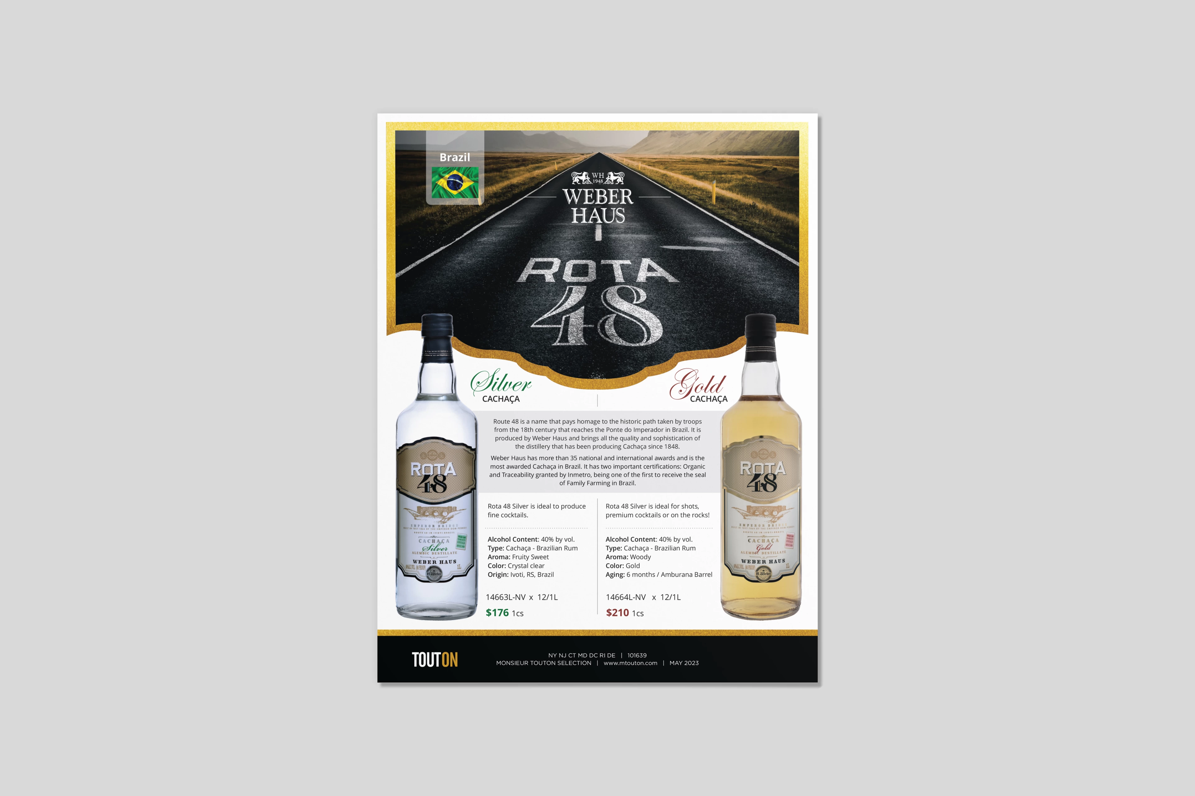
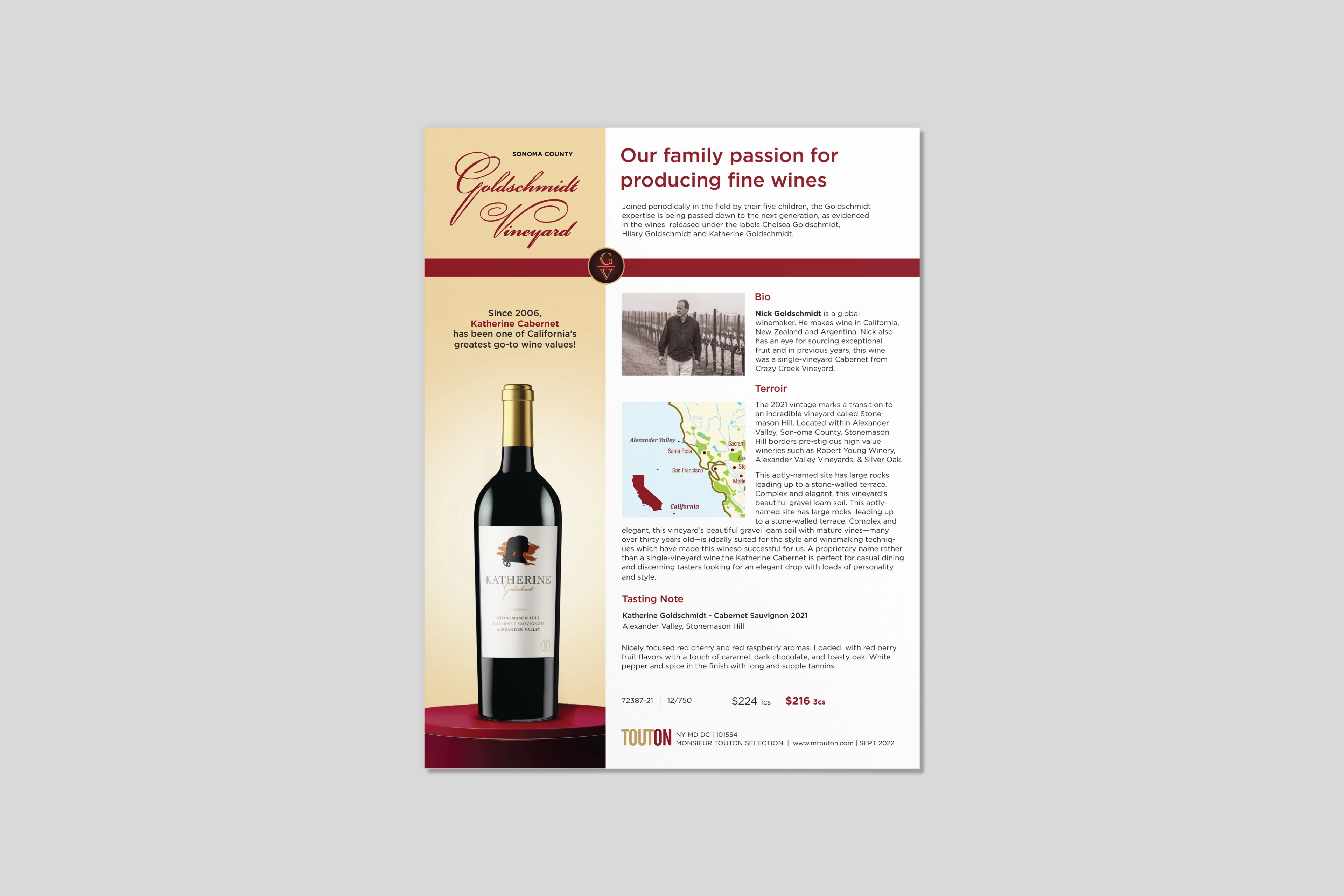
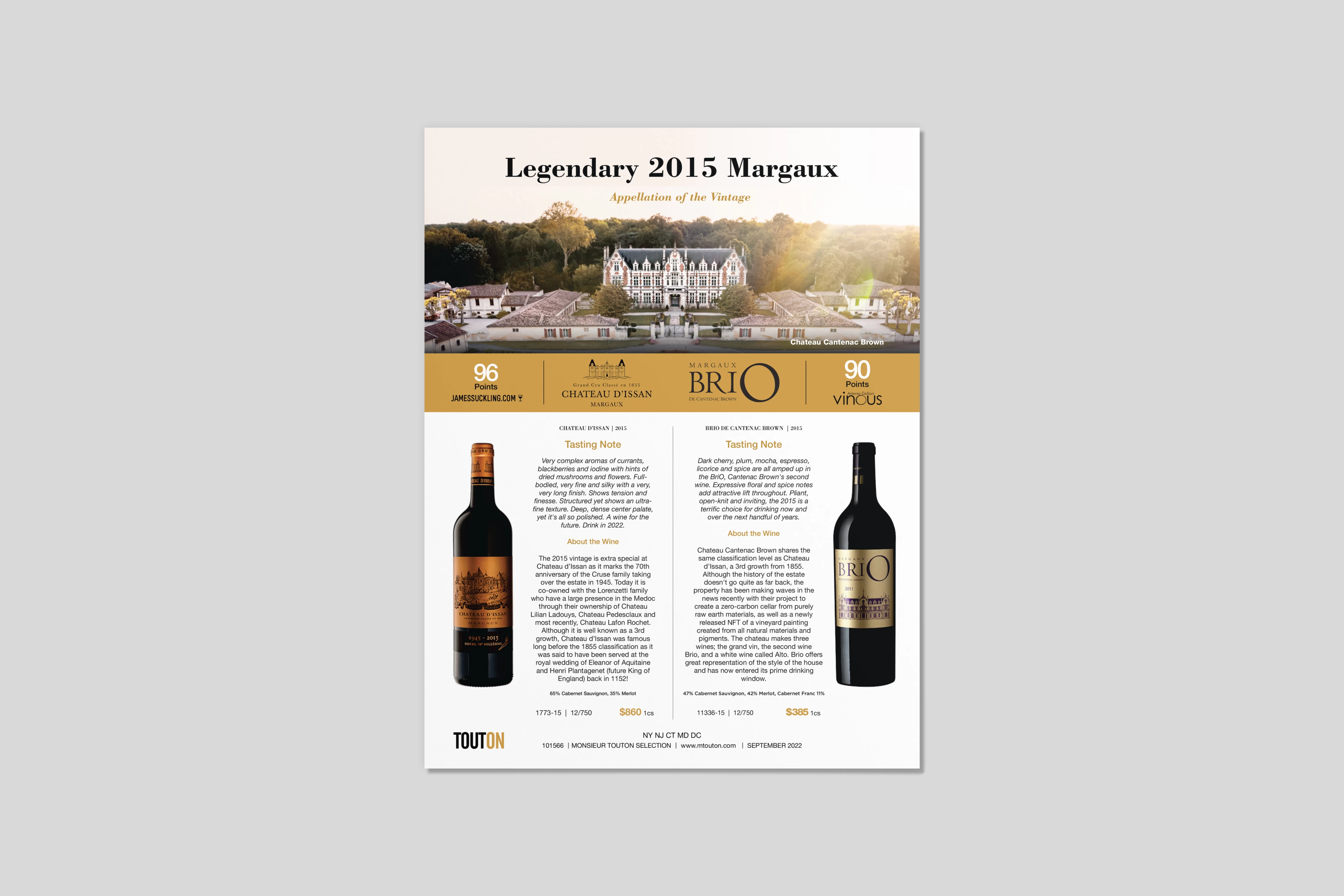
Marketing Flyer Design
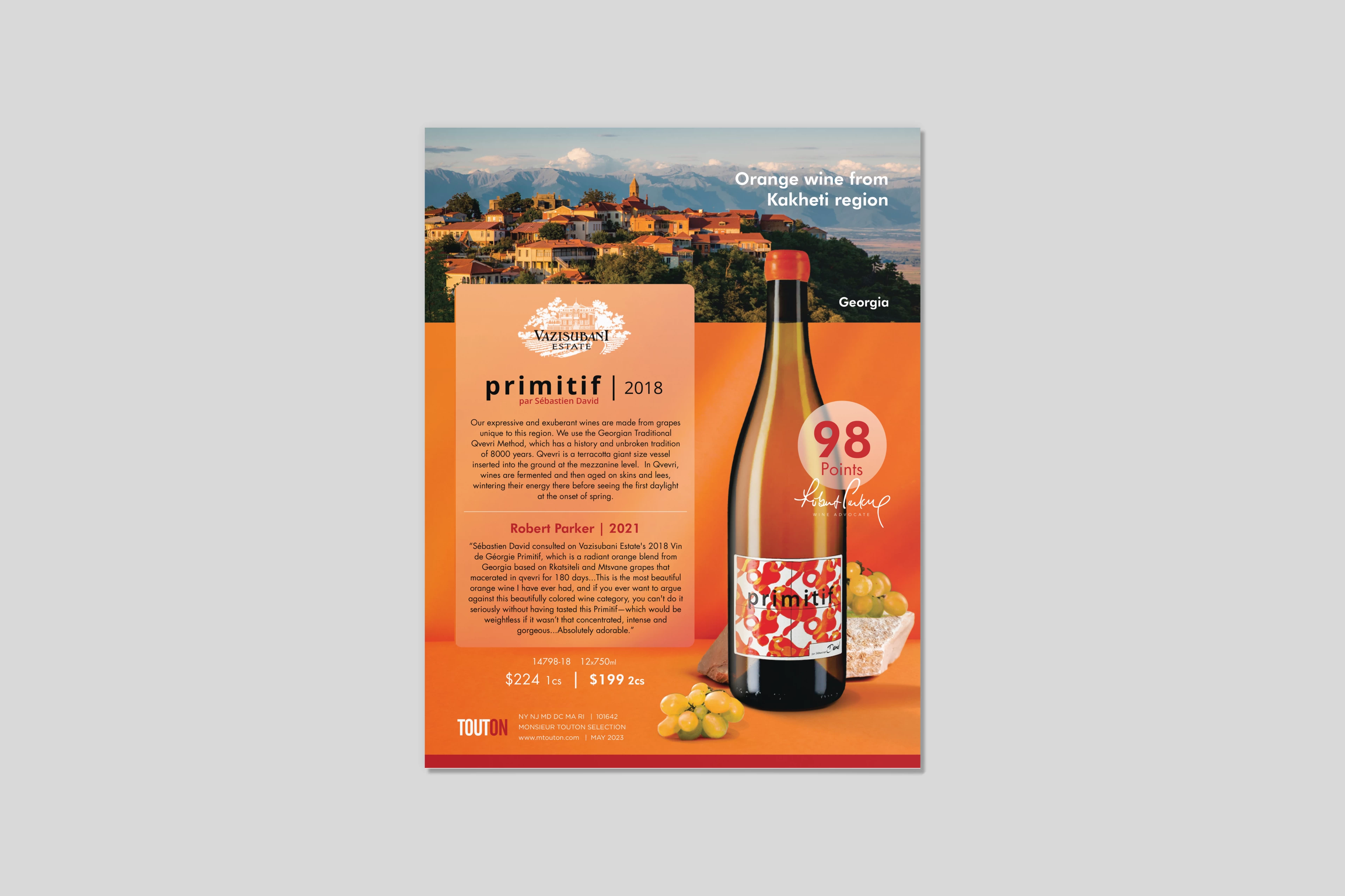
Marketing Flyers - Editorial & Product Communication Design
Overview
Designed a series of marketing flyers for wine and spirits brands, focusing on clear product communication, structured information hierarchy, and consistent brand presentation across high-volume outputs.
Design Concept
Each flyer is built around a product-first approach, translating brand identity into concise, visually engaging layouts that balance storytelling with essential product information.
Execution
Established a consistent layout system to organize pricing, ratings, tasting notes, and technical details with clarity and efficiency. Compositions prioritize product visibility while supporting content through strong typographic hierarchy and structured information flow. Visual language, color, and imagery were adapted per brand while maintaining consistency across formats.
Outcome
A scalable flyer system that enhances readability, supports sales-driven communication, and ensures cohesive brand representation across retail and trade environments.
Tools
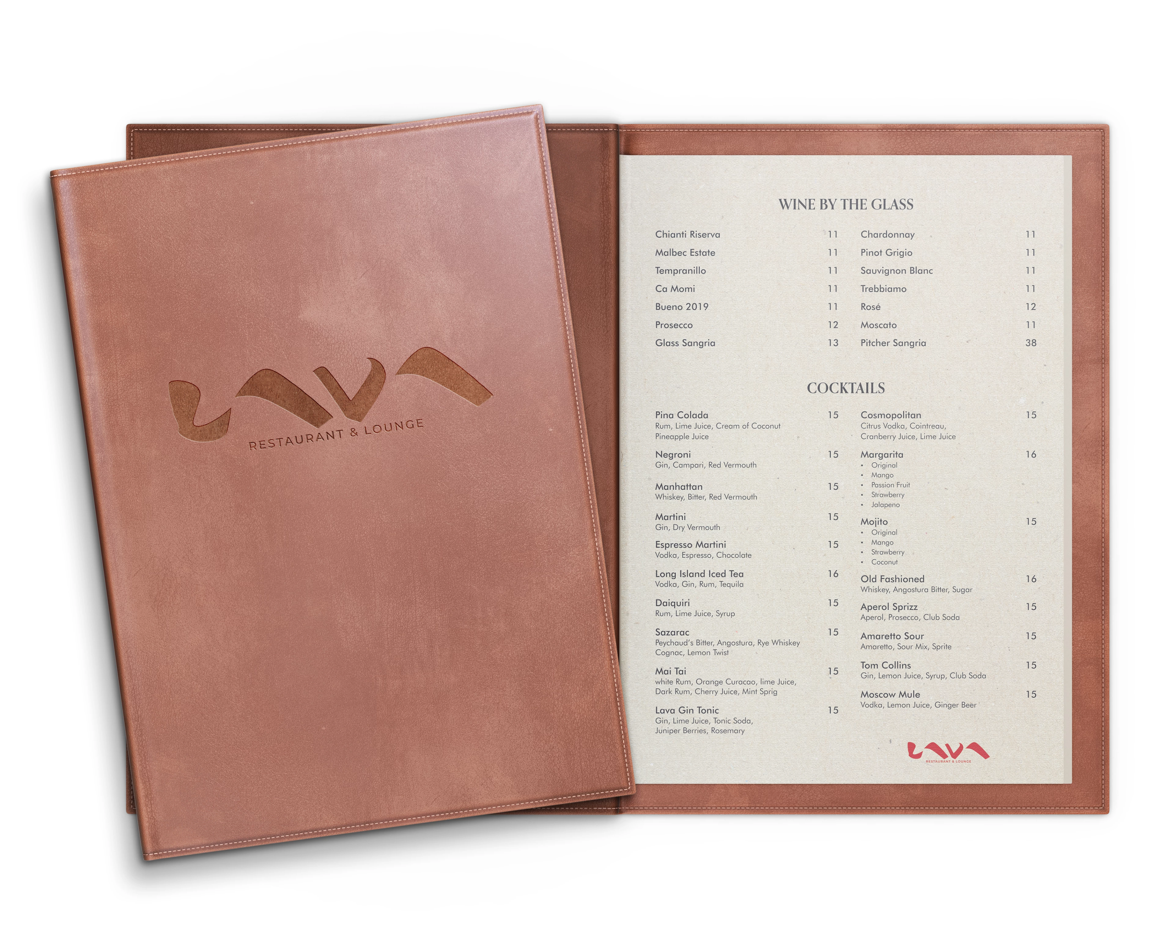
Menu Designs
Restaurant & Hospitality Menu Layouts
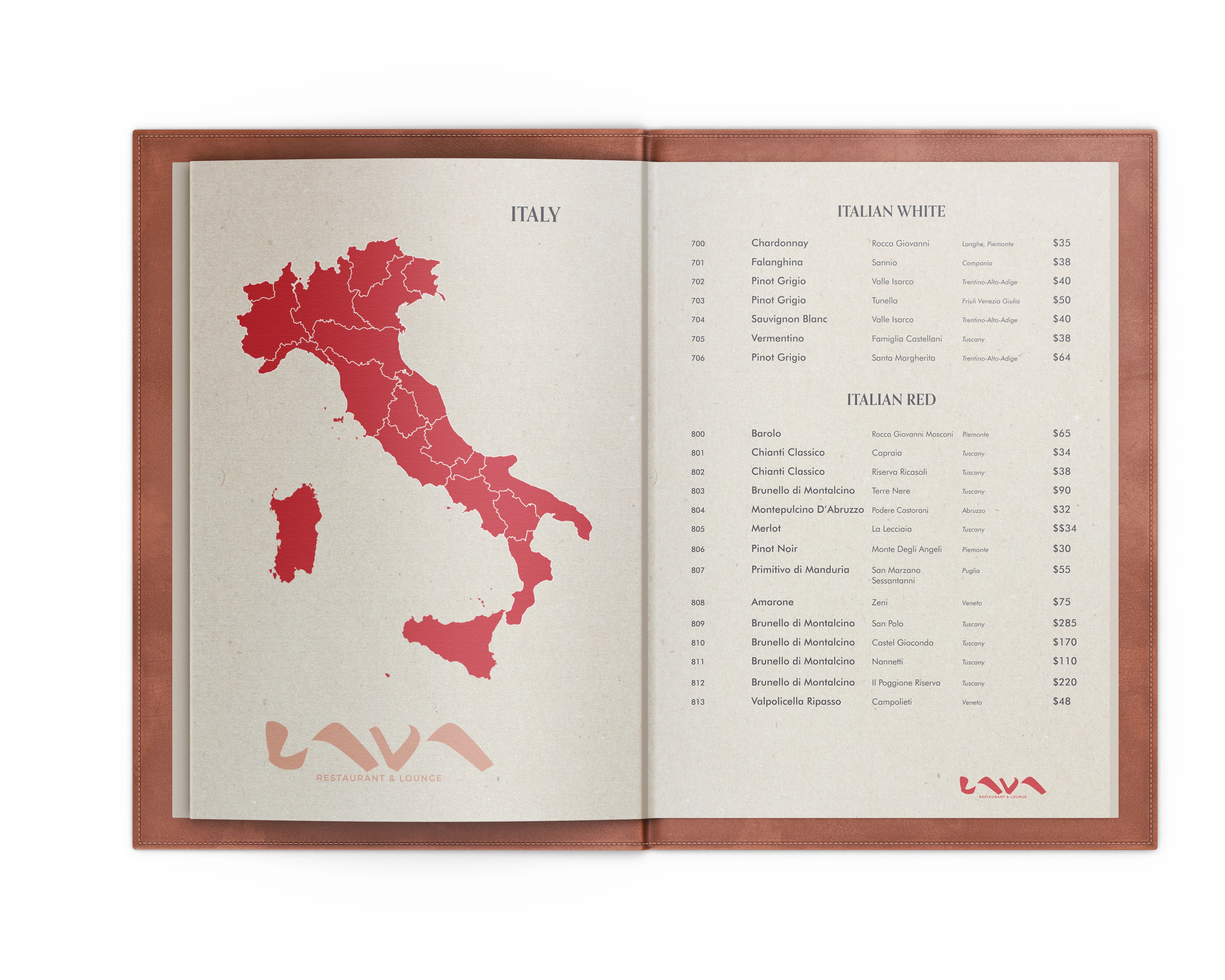
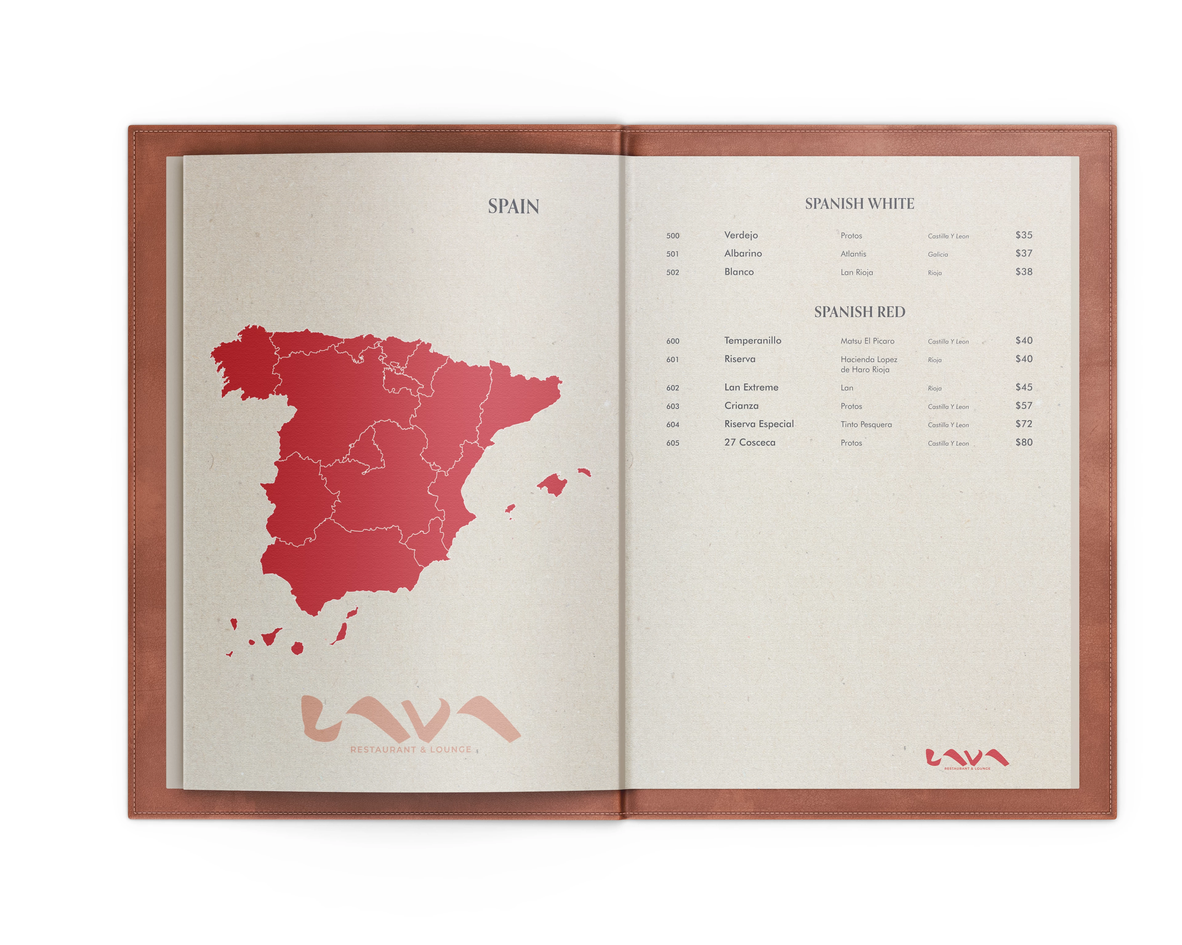
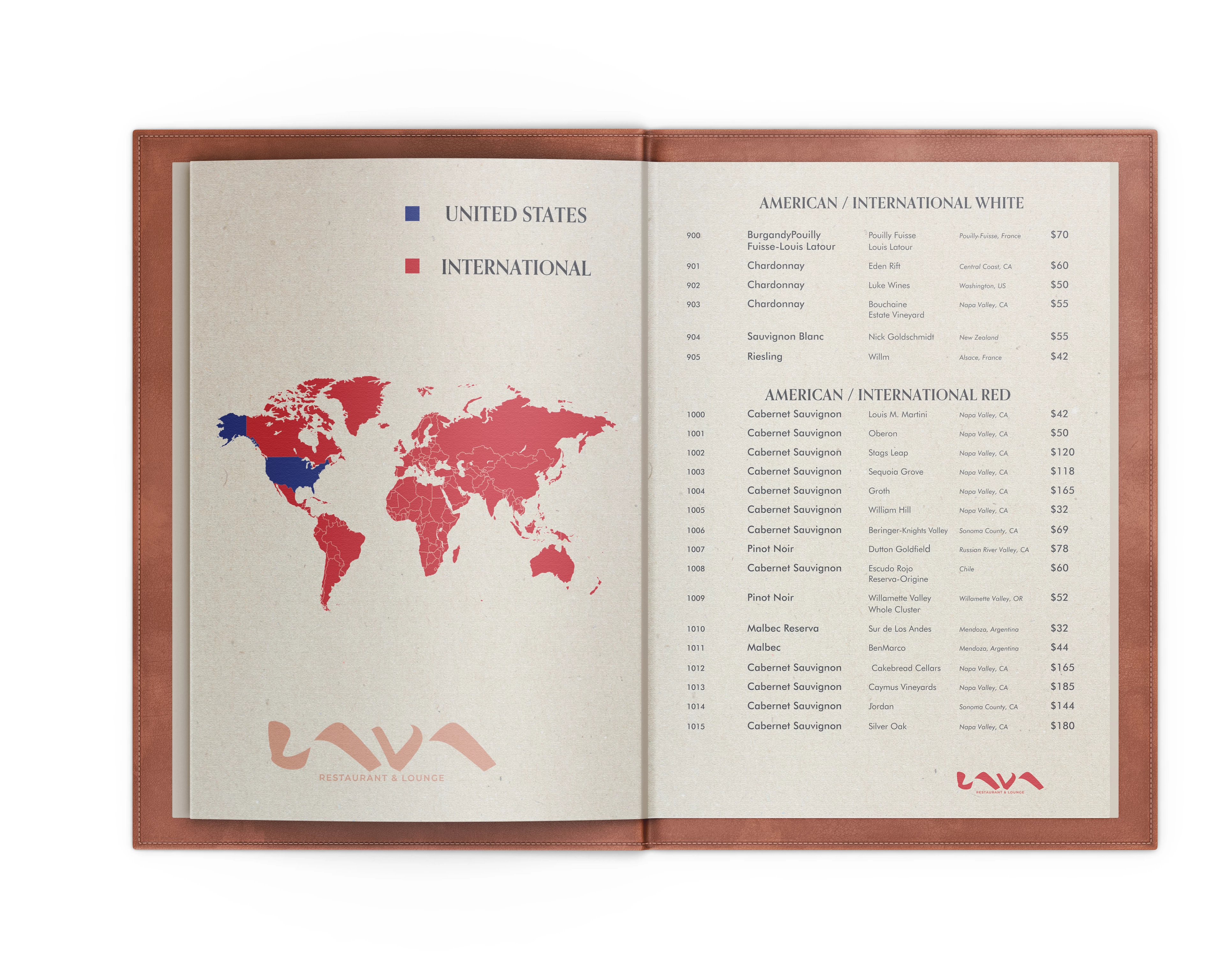
Overview
Designed menu systems for hospitality environments where clarity, speed, and usability are critical. Each layout is built to support real-world dining behavior, translating complex offerings into intuitive, easy-to-navigate formats.
Design Concept
Approached menus as information systems rather than static layouts. The goal was to reduce cognitive load while maintaining a strong brand presence, ensuring guests can quickly scan, compare, and make decisions without friction.
Key Design Elements
Developed structured typographic hierarchies to define clear pathways across categories, items, and pricing. Leveraged spacing, alignment, and grouping to enhance scanability and readability in dense content environments. Integrated supporting visual elements-such as regional maps and section markers-to guide navigation while reinforcing brand identity.
Outcome
Delivered menu systems that improve usability, streamline decision-making, and elevate the dining experience through precise, structured, and brand-driven design.
Tools
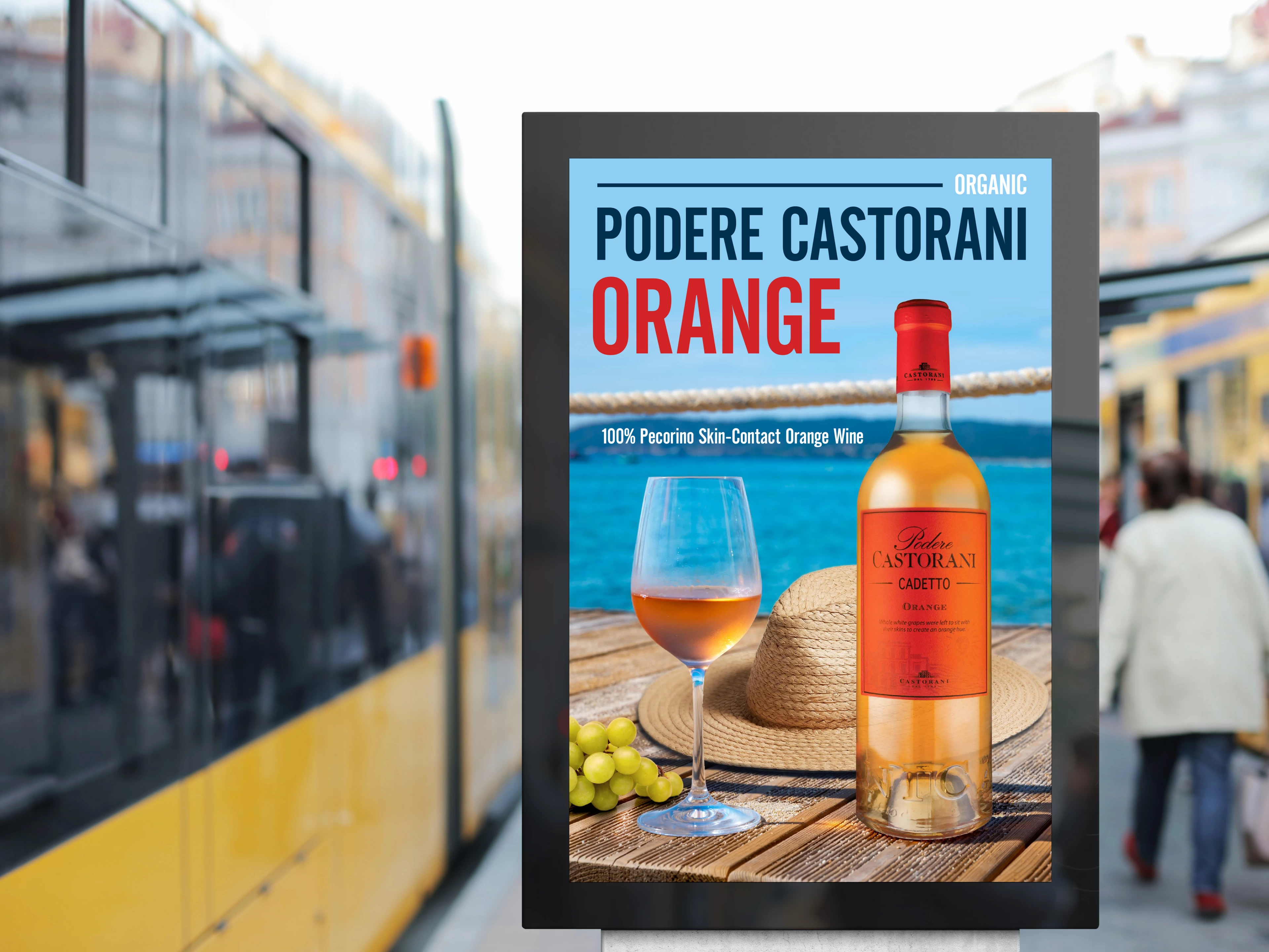
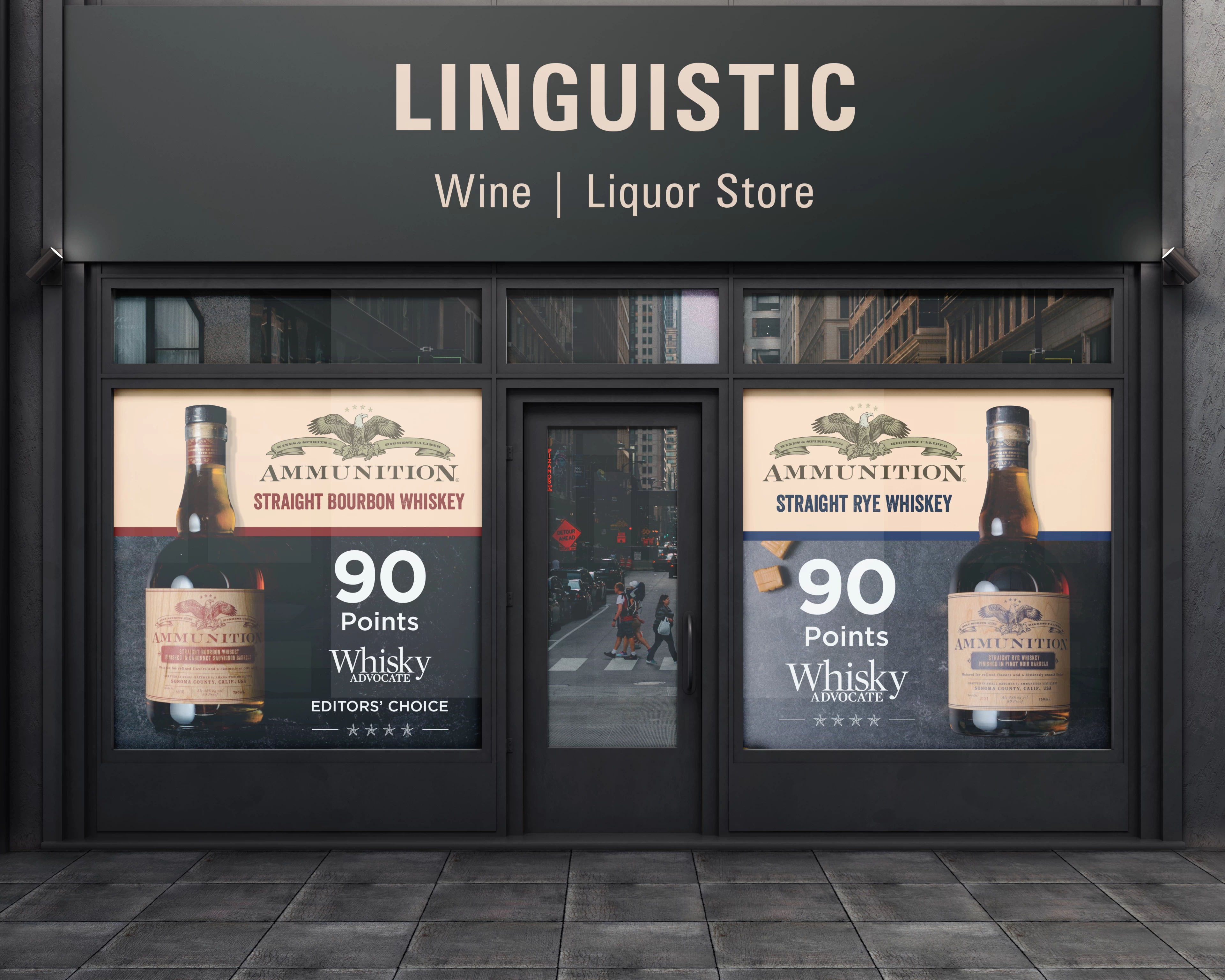
Poster Designs
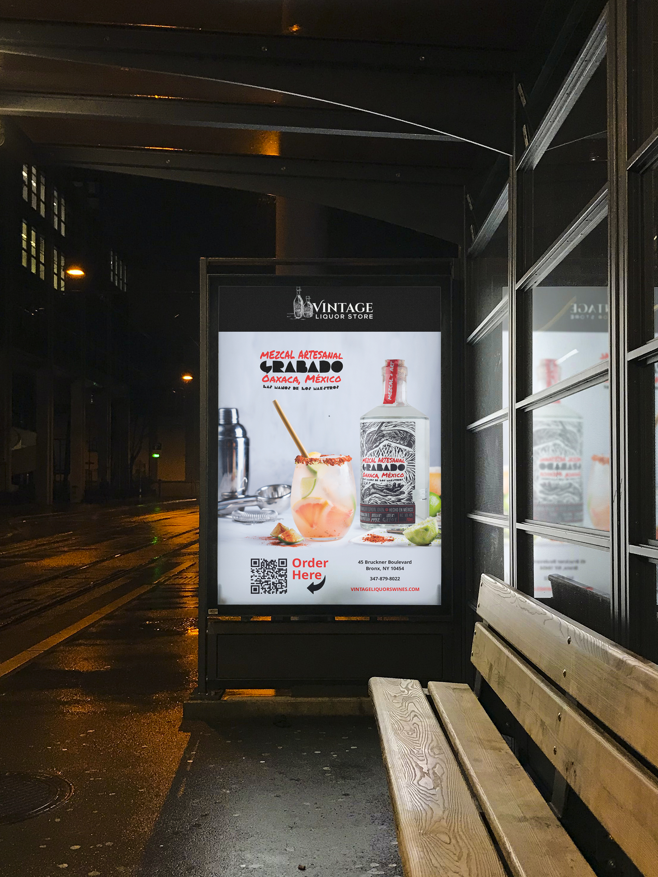
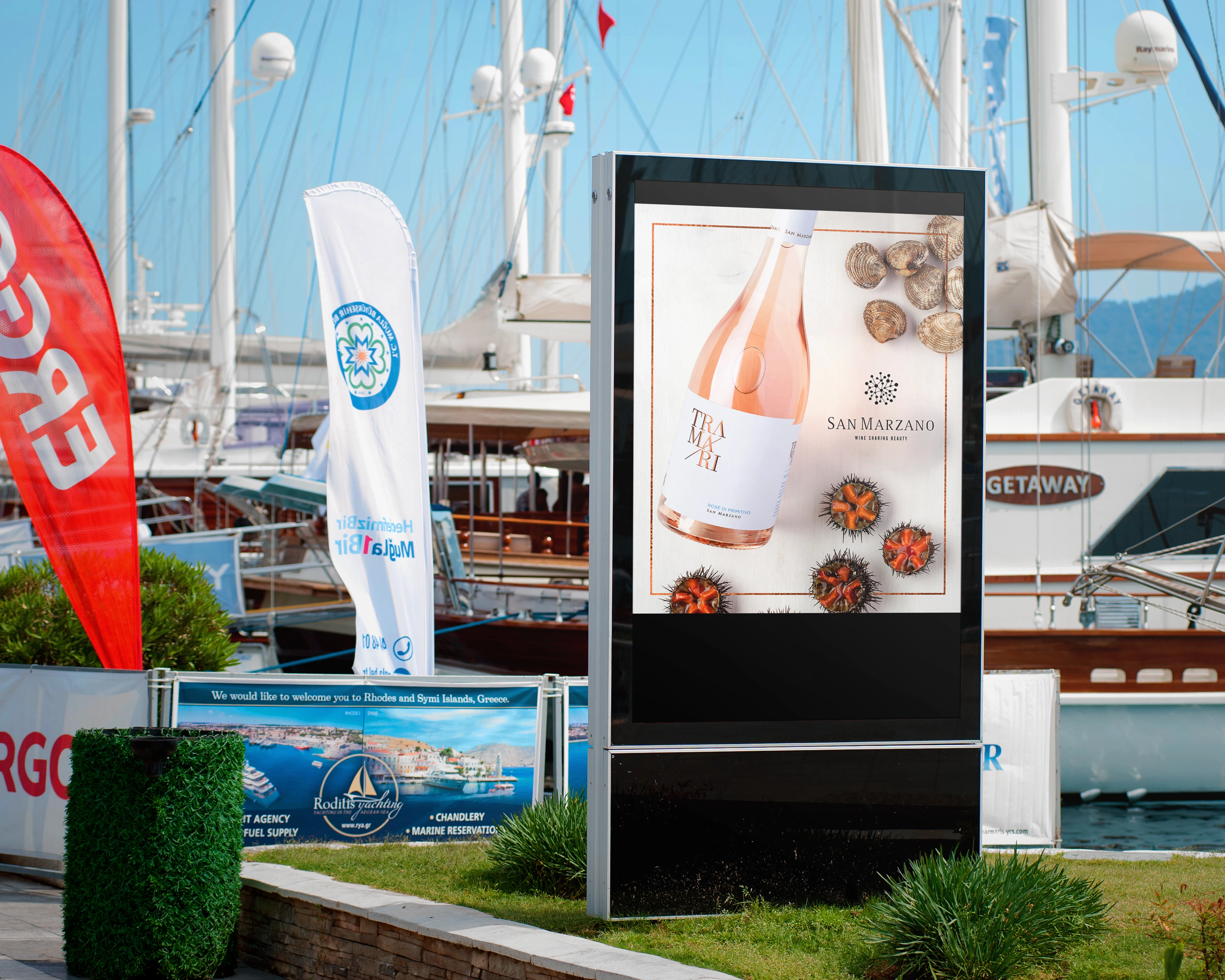
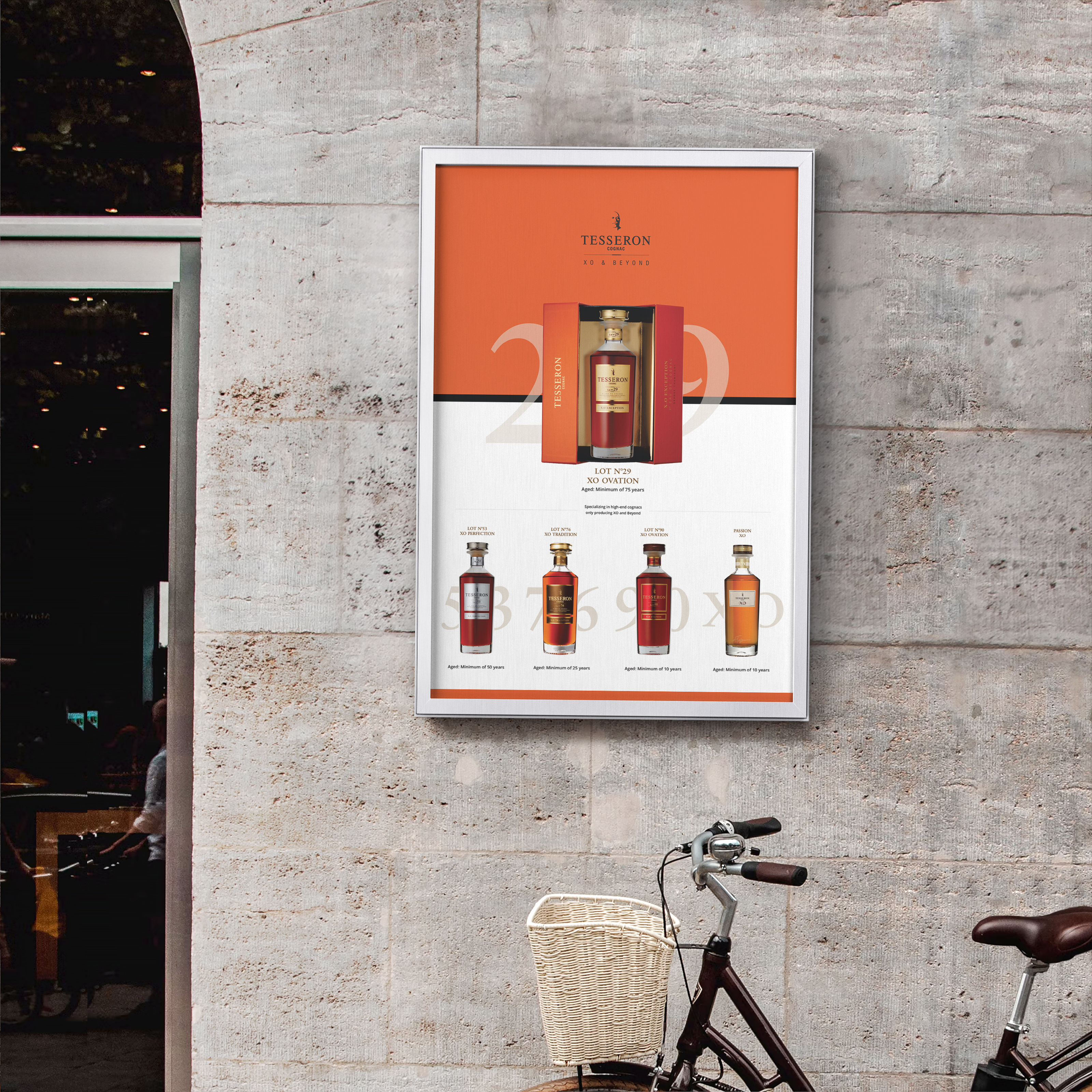
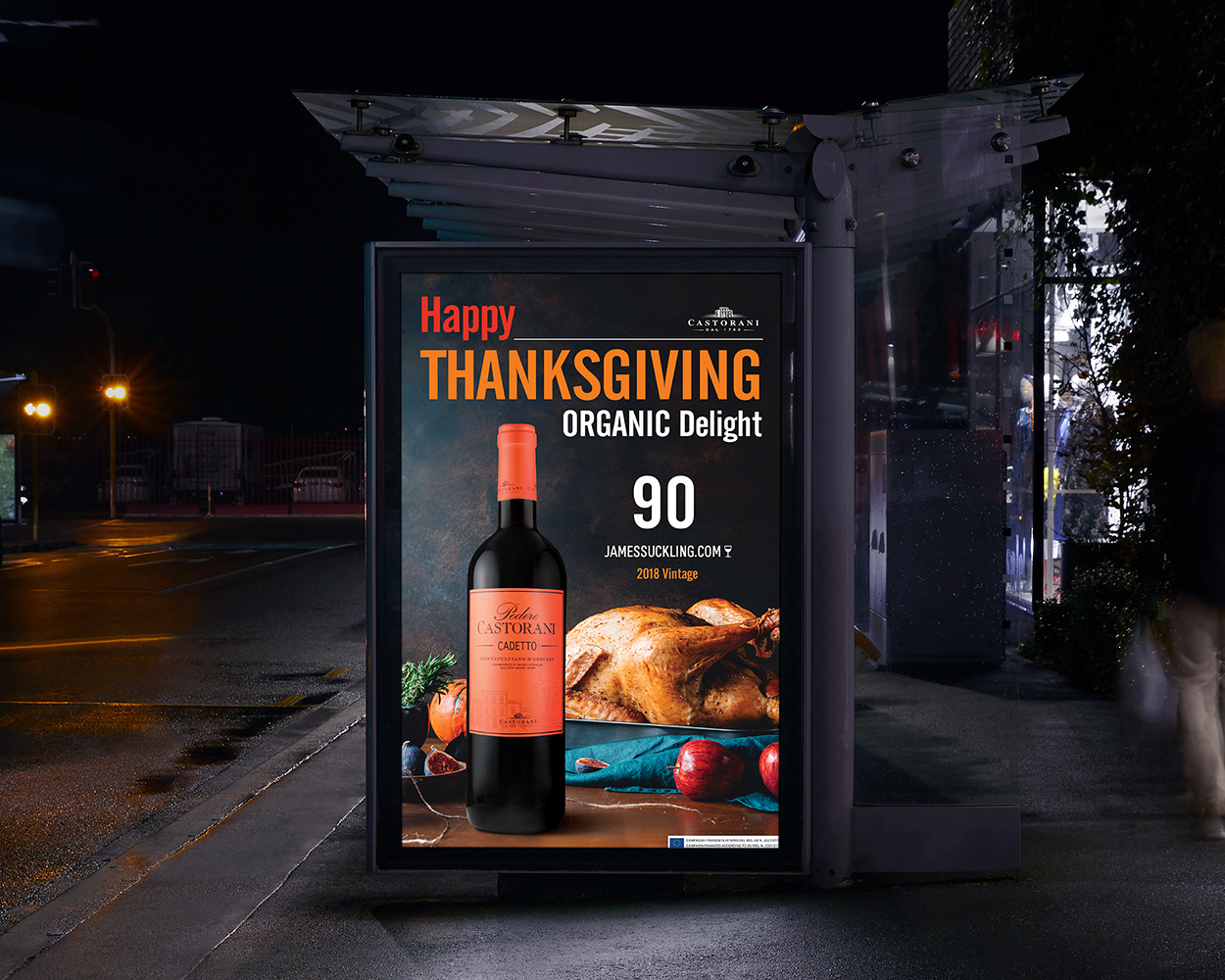
Product & Retail Advertising Posters
Overview
A collection of poster designs created to promote wine and spirits brands across retail and outdoor advertising environments. The posters combine product-focused compositions with strong visual storytelling to capture attention and communicate brand identity in high-visibility spaces.
Design Approach
Poster design focuses on creating immediate visual impact while communicating the product and brand clearly. Each design was developed to highlight the bottle as the central visual element while supporting it with atmospheric backgrounds, lighting, and environmental storytelling.
Through Photoshop na InDesign compositing and careful layout balance, the posters combine photography, typography, and product placement to create striking visuals suited for retail displays, storefronts, and outdoor advertising spaces.
Key Design Elements
• Product-centered visual composition
• Photoshop photo manipulation and compositing
• Strong contrast and lighting for outdoor visibility
• Clear hierarchy between product, headline, and supporting information
• Adaptability across retail displays and outdoor advertising formats
Outcome
These poster designs function as promotional visuals for retail and advertising environments, using strong product imagery and bold visual composition to capture attention and communicate brand identity quickly. The designs support product visibility while creating memorable and visually engaging brand moments in public spaces.
Tools
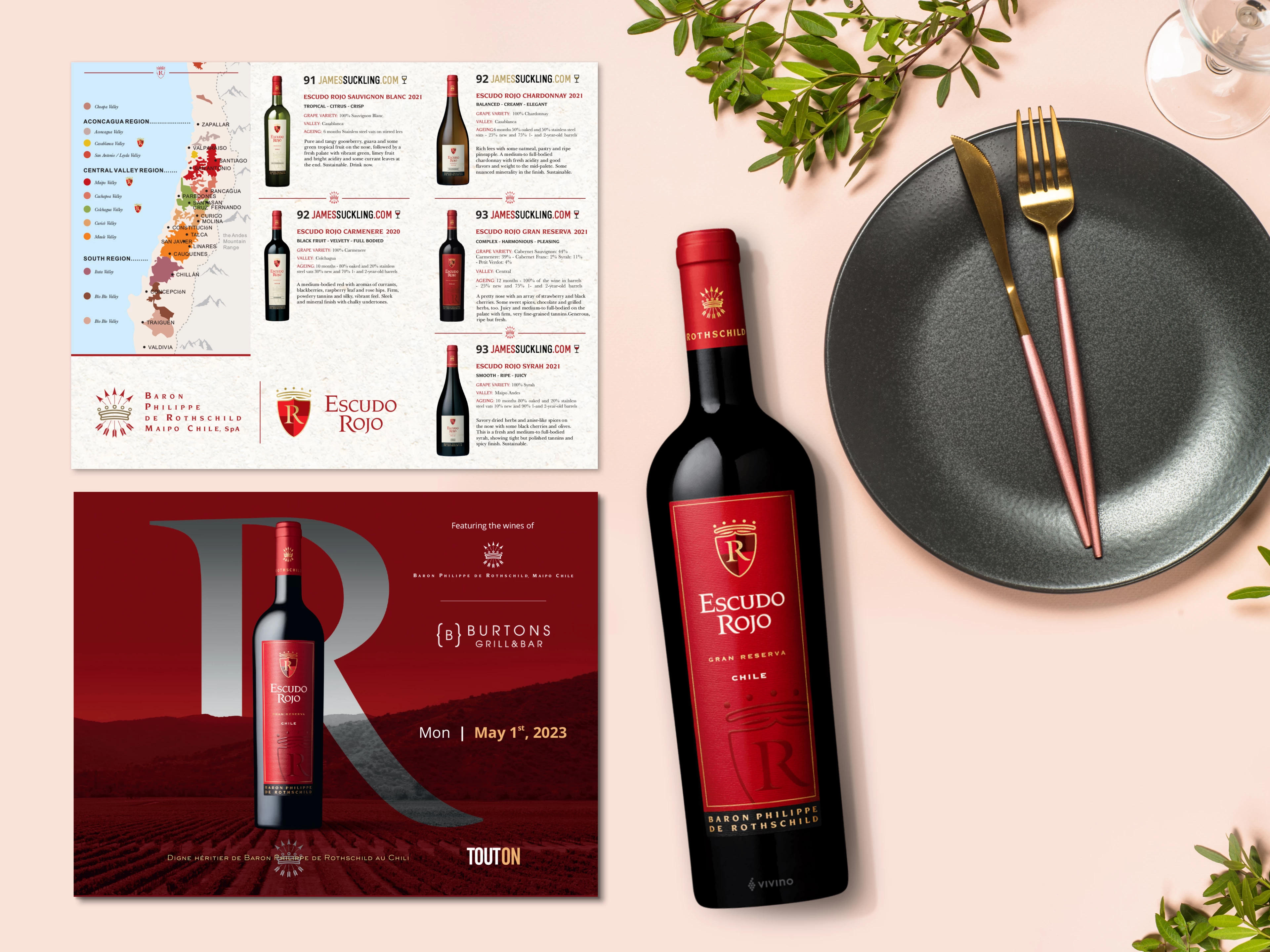
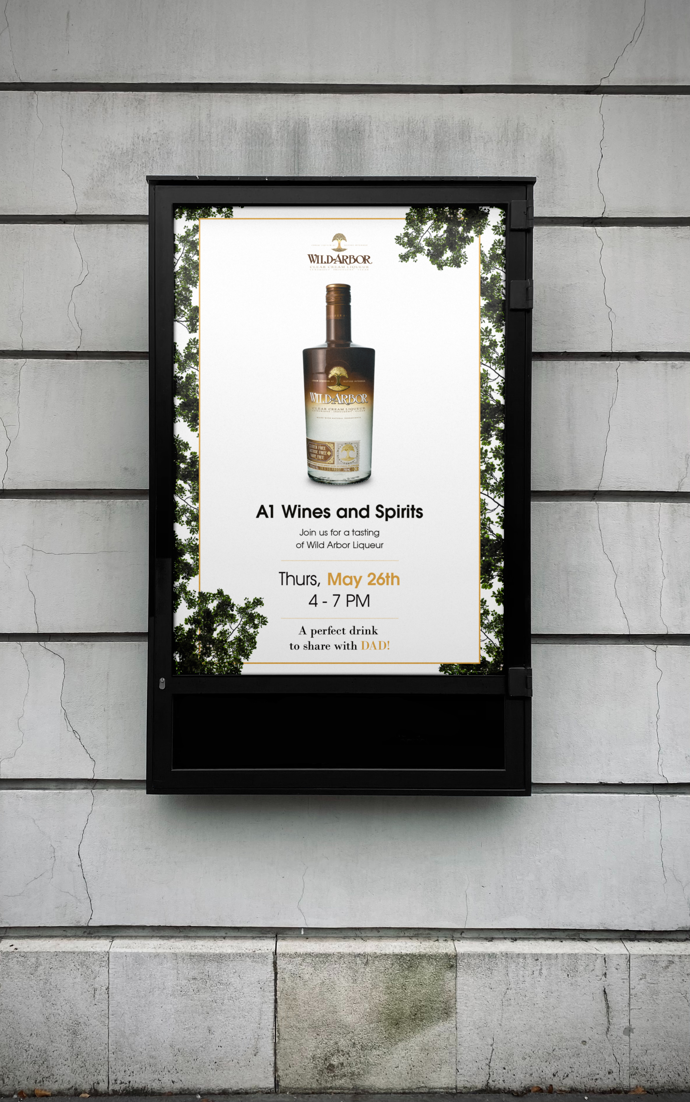
Event Invitation Design
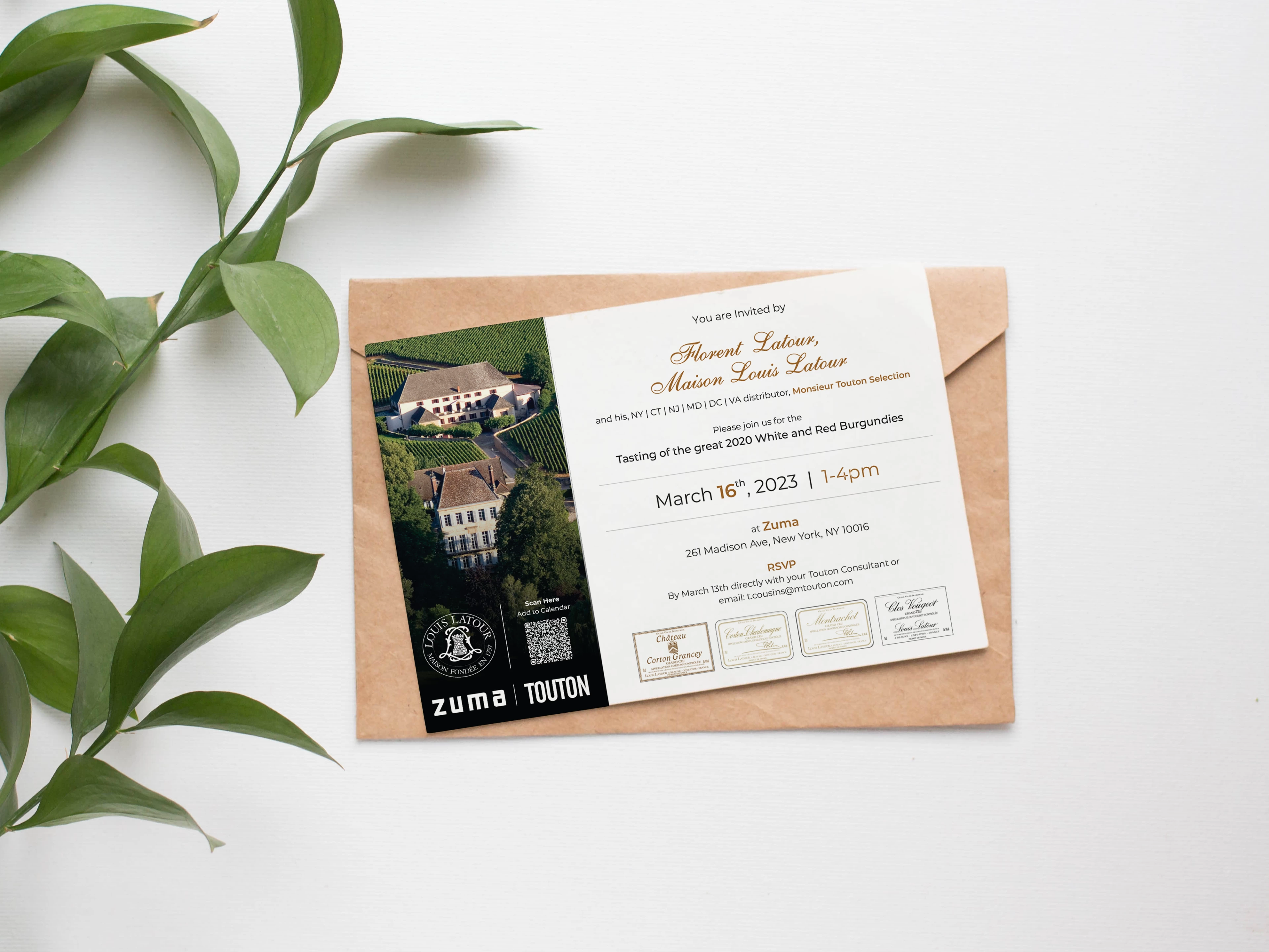
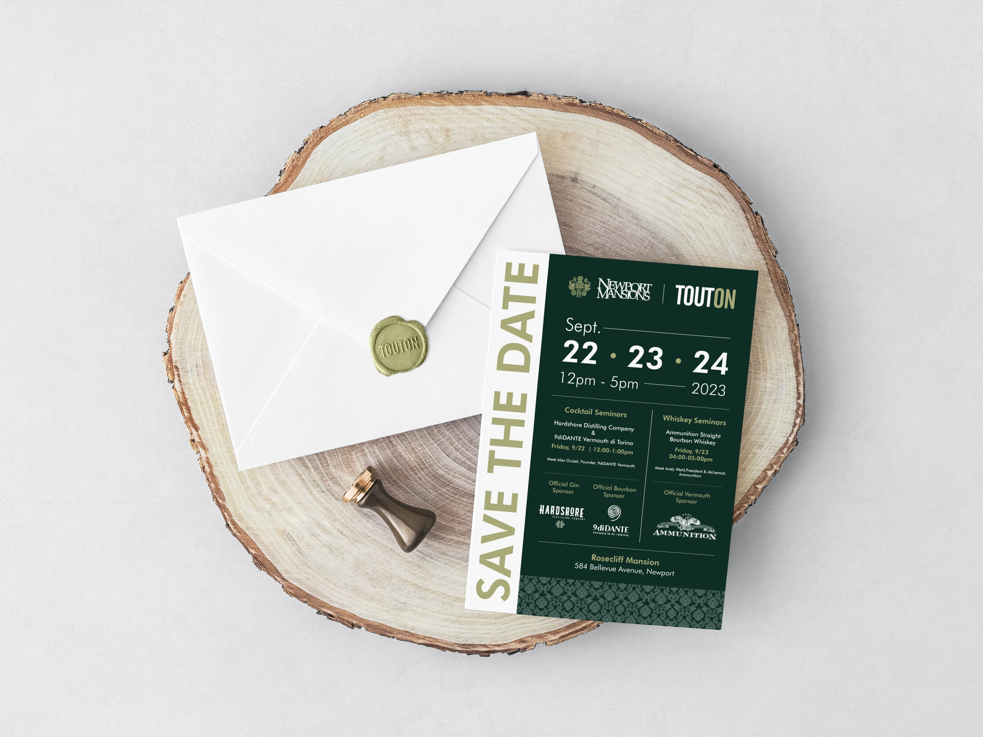
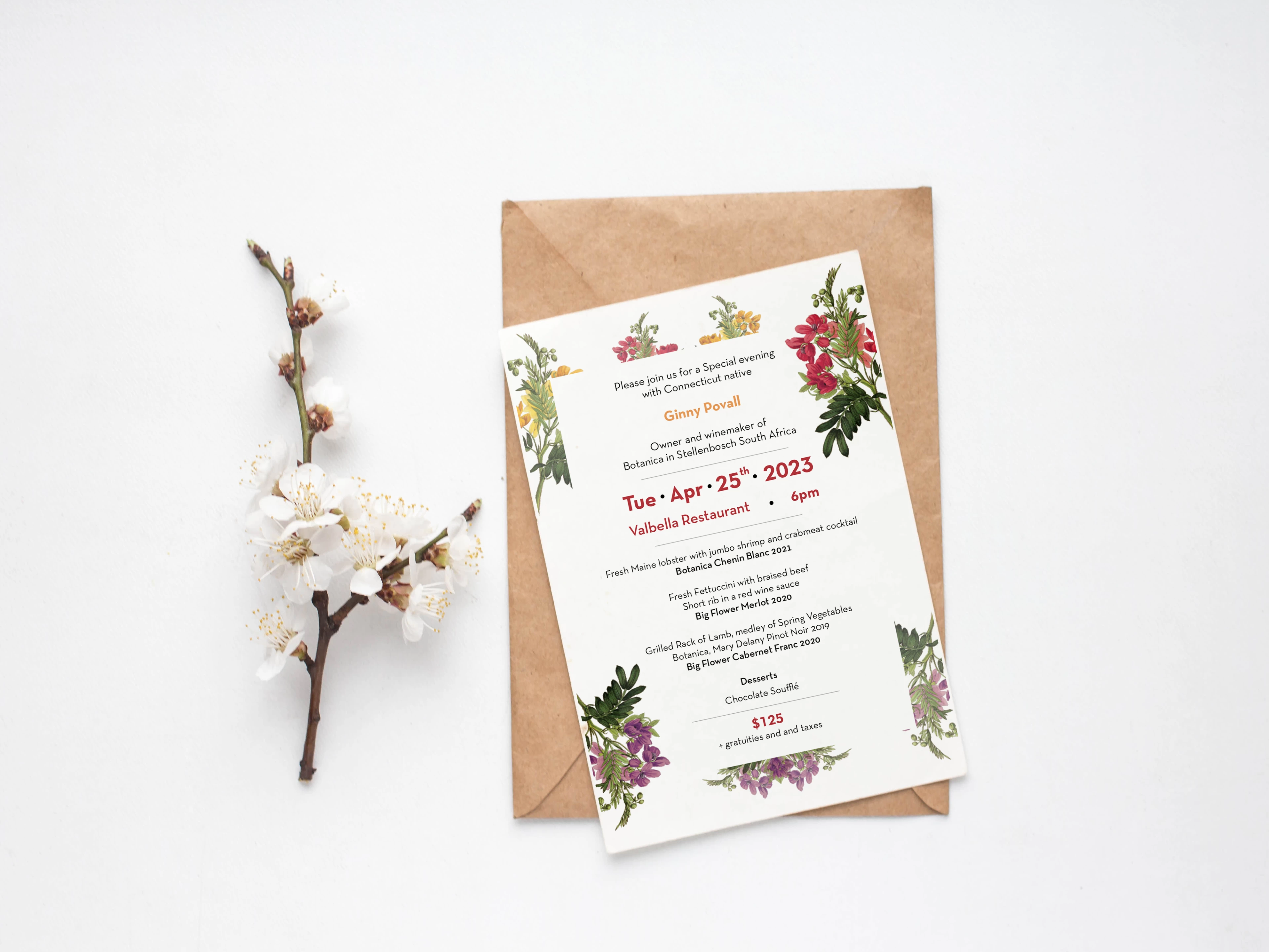
Wine Tasting & Hospitality Event Invitations
Overview
A collection of invitation designs created for wine tasting events, brand showcases, and hospitality gatherings. These invitations combine elegant typography, refined layouts, and brand-aligned visuals to communicate event details clearly while creating an inviting and sophisticated presentation.
Design Approach
Invitation design focuses on presenting event information in a clear and elegant format while reflecting the tone of the occasion. For wine tasting events, the layouts balance structured typography with refined visual elements to create invitations that feel both informative and visually engaging.
Each design was developed to highlight key details such as date, location, host, and featured wines while maintaining a clean and inviting composition suitable for both digital and printed distribution.
Key Design Elements
• Elegant typography hierarchy for event information
• Balanced layout for date, location, and event details
• Brand-aligned visual elements and imagery
• Print-ready design for invitations and event materials
• Clean compositions suitable for digital and physical invitations
Outcome
These invitation designs support wine tasting events and hospitality gatherings by presenting key information in a refined and visually engaging format. The designs help set the tone for each event while ensuring guests can quickly understand the details and purpose of the invitation.
Tools
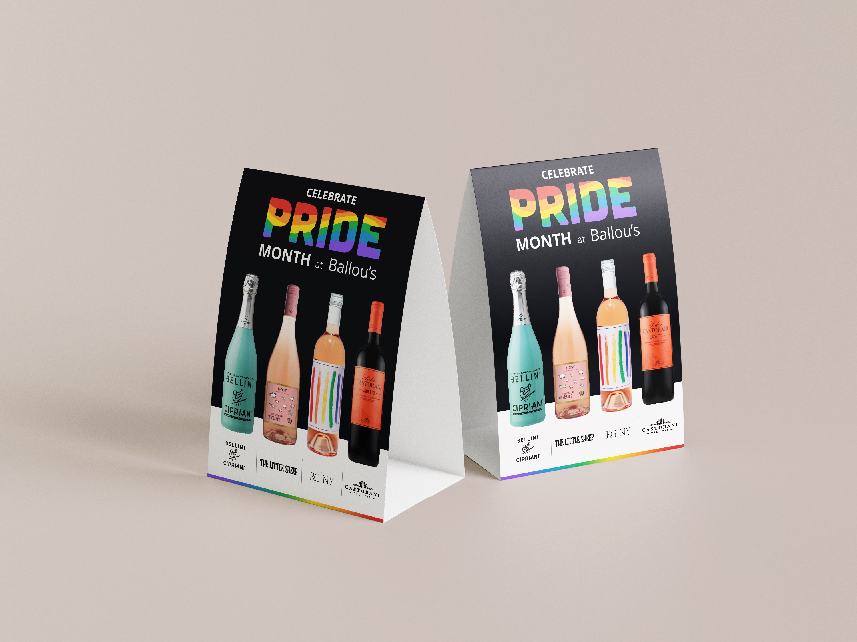
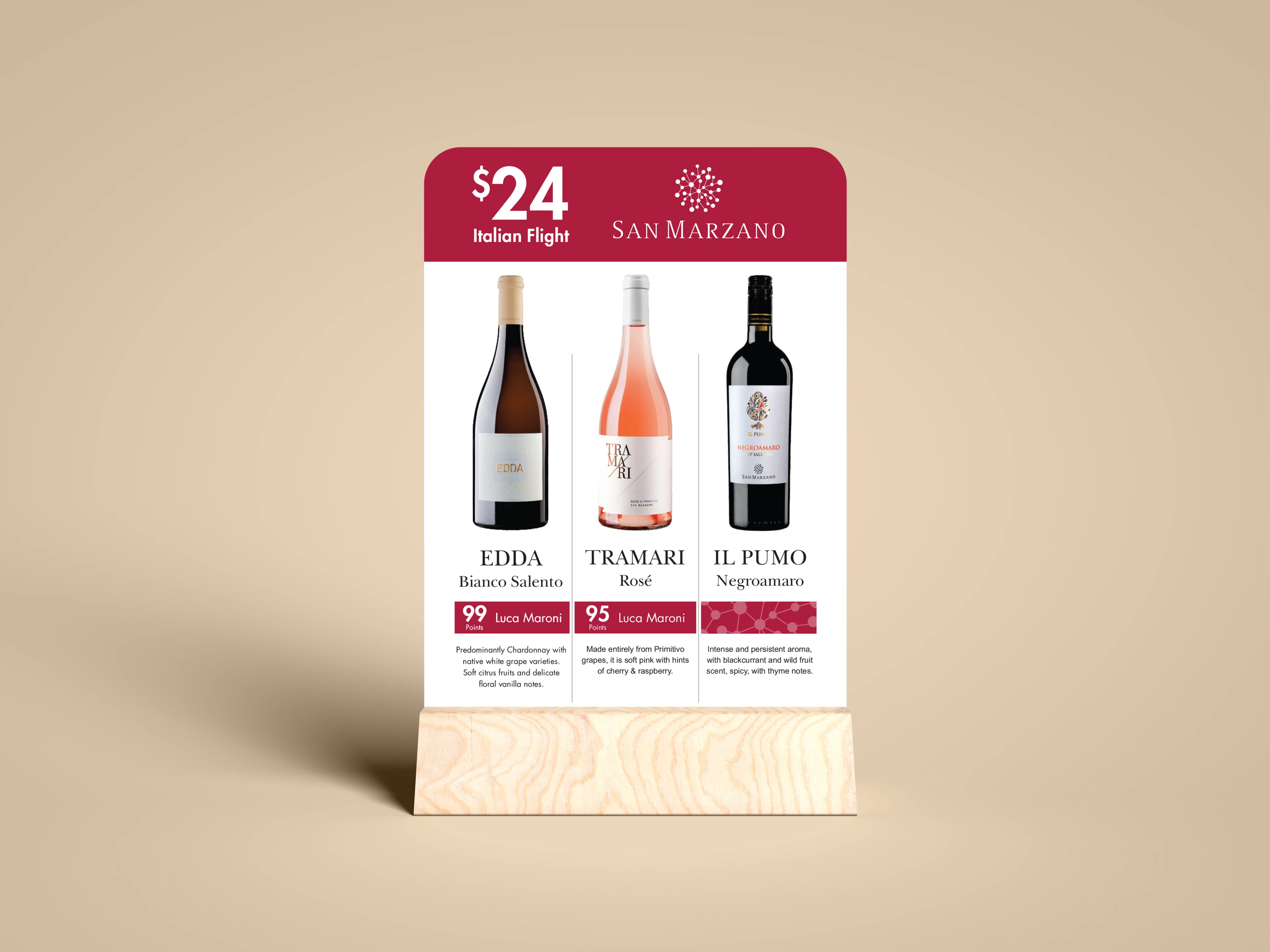
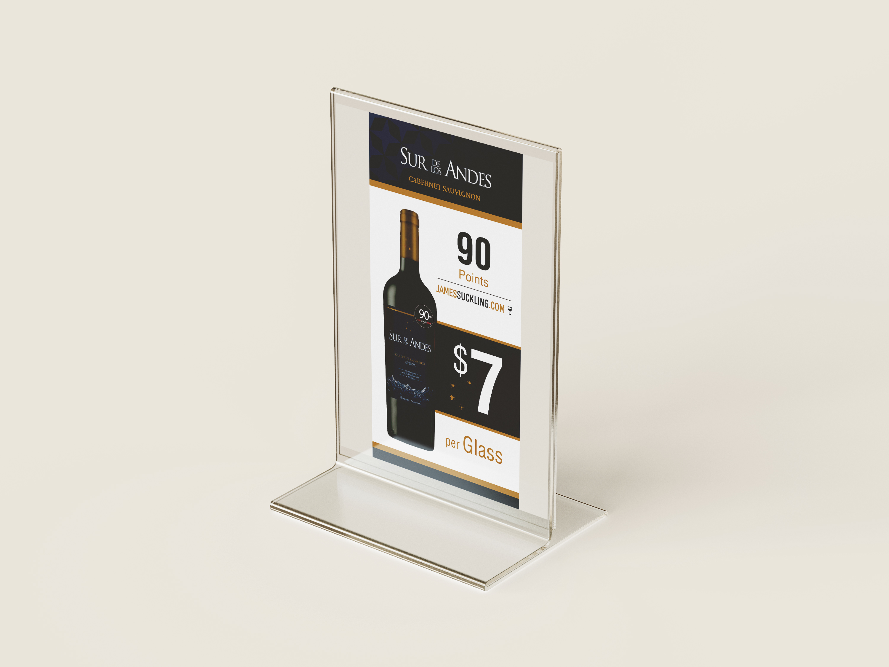
Table Tent Designs
Wine Tasting & Hospitality Event Invitations
Overview
A collection of table tent designs created for restaurants, bars, and retail environments to promote wines, spirits, and seasonal offerings directly at the point of sale. These designs combine product-focused visuals with clear messaging to capture attention and encourage customer engagement within dining and hospitality spaces.
Design Approach
Table tent design focuses on delivering clear and engaging promotional messaging in a compact format. Each layout was structured to highlight key elements such as featured products, pricing, ratings, or seasonal promotions while maintaining strong visual hierarchy for easy readability from a seated dining position.
Product imagery, bold headlines, and concise information were carefully balanced to ensure the designs remain visually appealing while quickly communicating the promotion to guests.
Key Design Elements
• Compact layout optimized for tabletop visibility
• Strong typographic hierarchy for pricing and promotions
• Product-focused imagery and branding
• Clear messaging for featured wines and special offers
• Print-ready designs for restaurant and retail environments
Outcome
These table tent designs support in-venue marketing by promoting featured wines, spirits, and seasonal offerings directly at the dining table. By combining clear messaging with strong product visuals, the designs help attract guest attention and encourage product discovery within hospitality environments.


